brands the city of Ancona
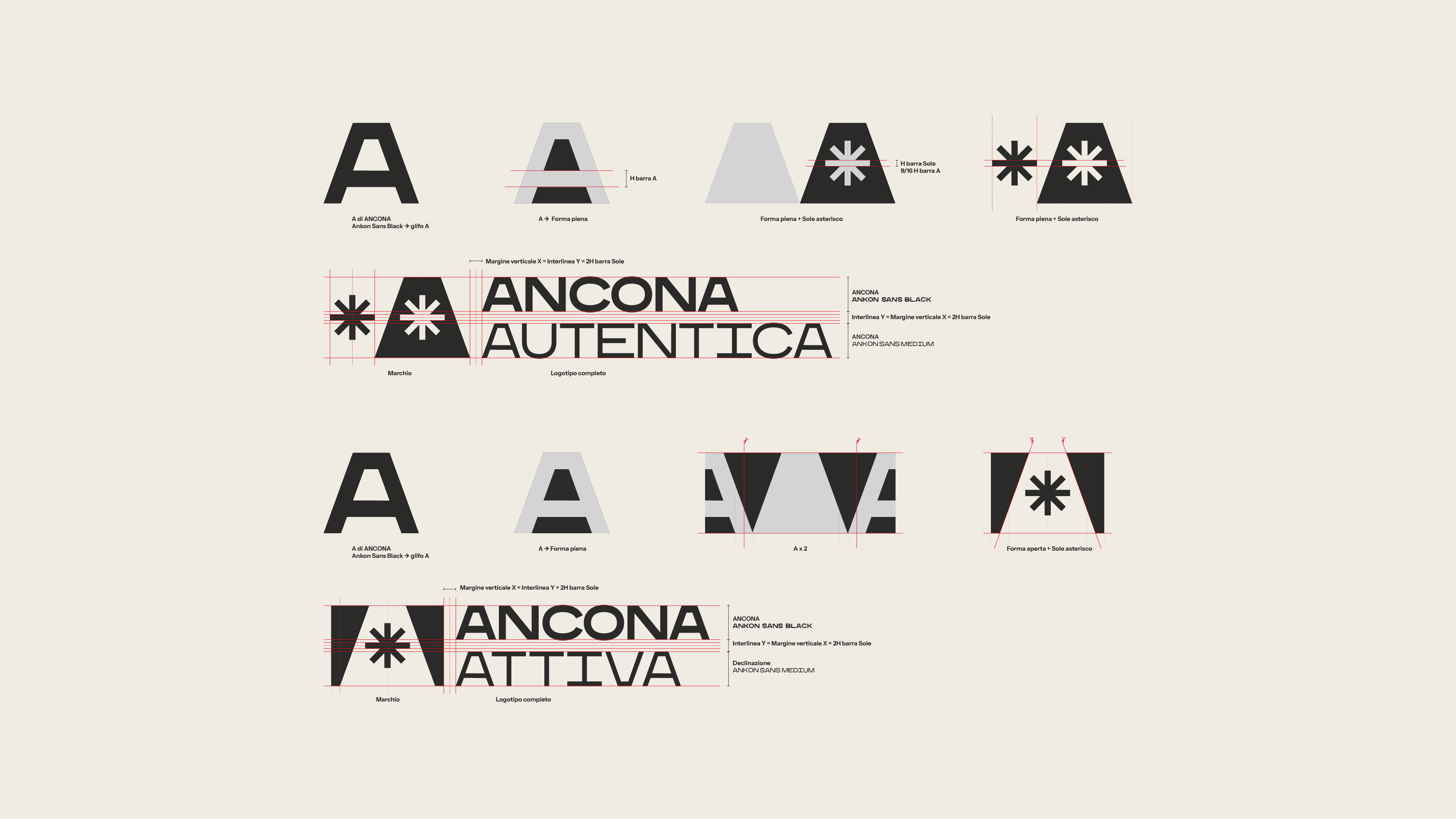
Ancona shows itself through a single letter: the "A". A di Ancona is also A di Ankon, the custom typeface designed to represent the city's dualities: two seas, two lighthouses, two arches facing the water. This idea of duality doubles in the payoff: Ancona is Aperta, Accogliente, Accessibile (open, welcoming, accessible), above all, Ancona is Autentica (authentic).
ANCONA AUTENTICA
Ancona City Branding International Competition: 2nd place
for: Comune di Ancona
team: Pierluigi Anselmi, Pietro Buffa, Alessandro C. Busseni, Andrea Elena Febres Medina, Marco Gabriele, Giada Fiorenza, Laura Bortolotti, Giada Germanò, Noemi Mauri
︎
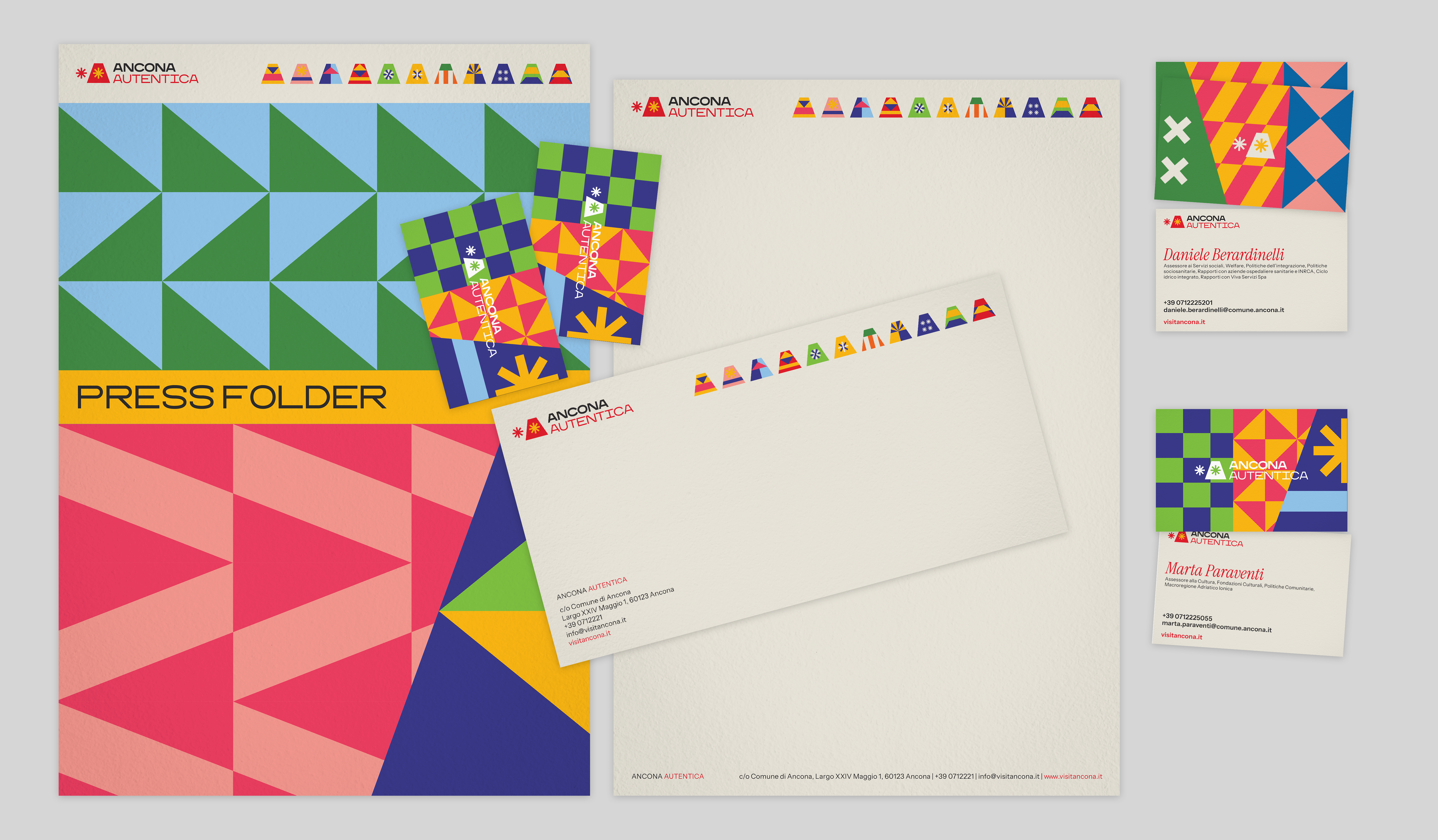
Ancona Autentica
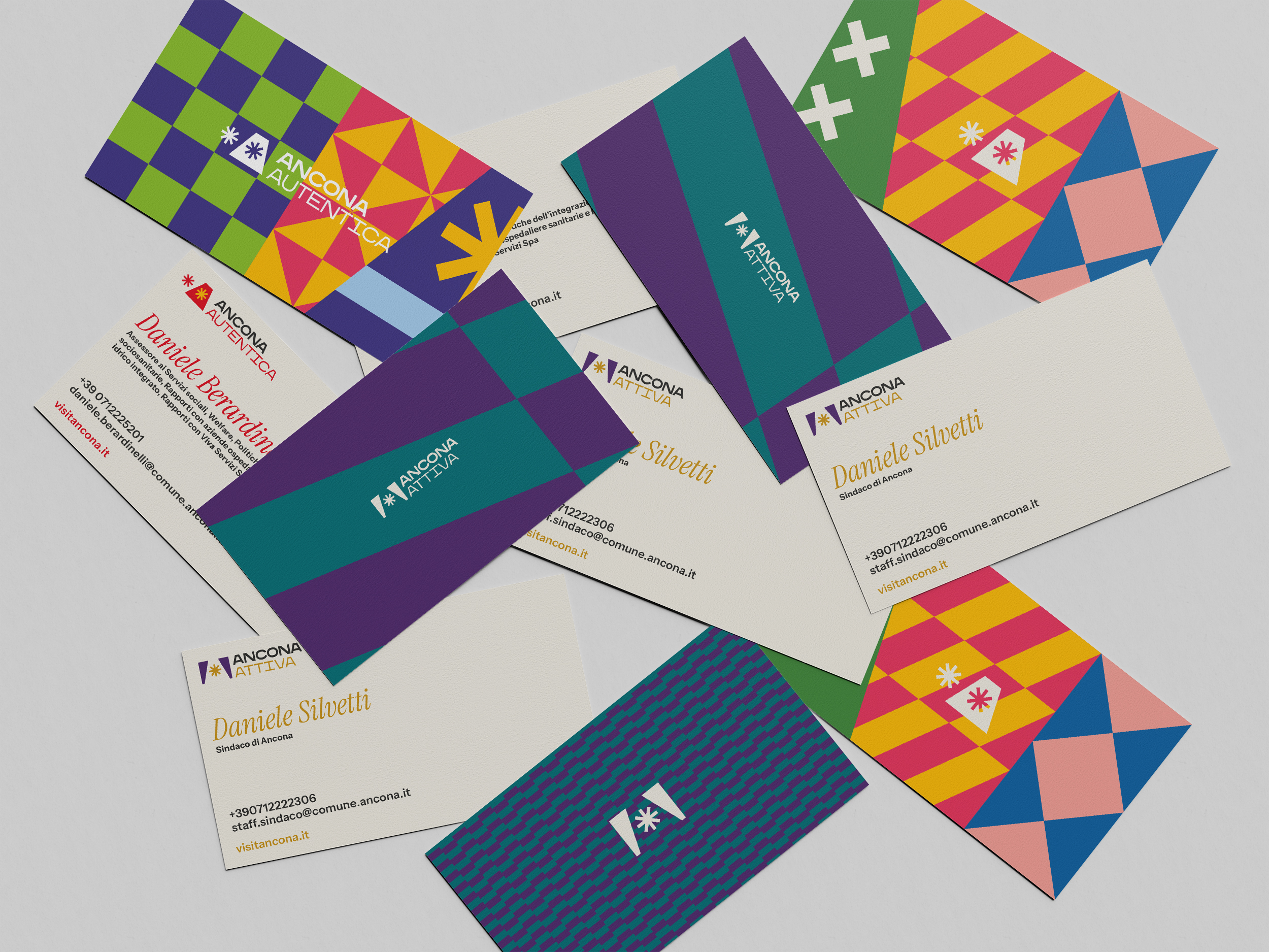
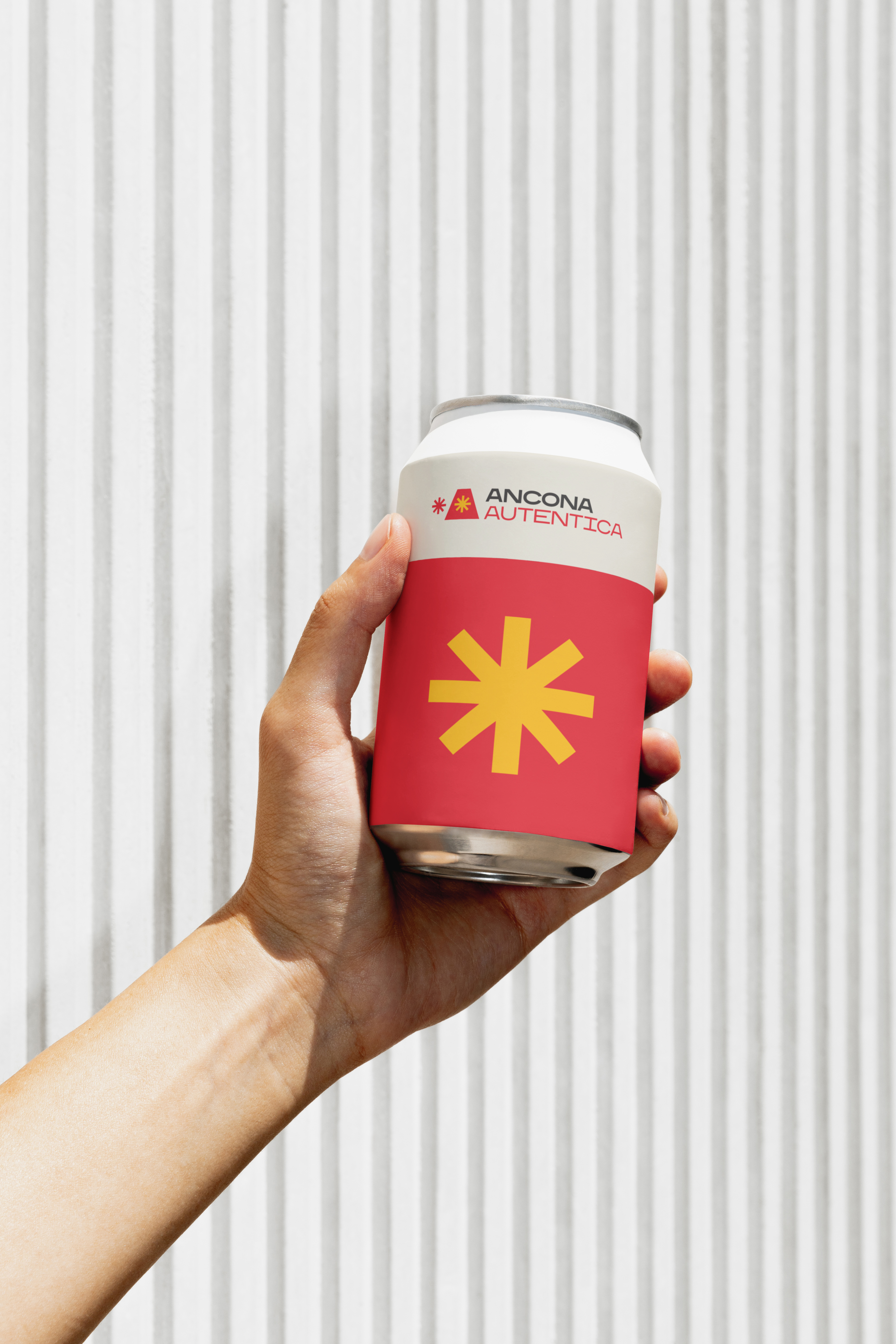
Ancona Autentica's logo is simple and immediate: a trapezoid evokes the land reaching into the Adriatic Sea, hugged by the city’s two suns represented as two asterisks. It is dedicated to the city’s artistic, cultural, social and territorial promotion.
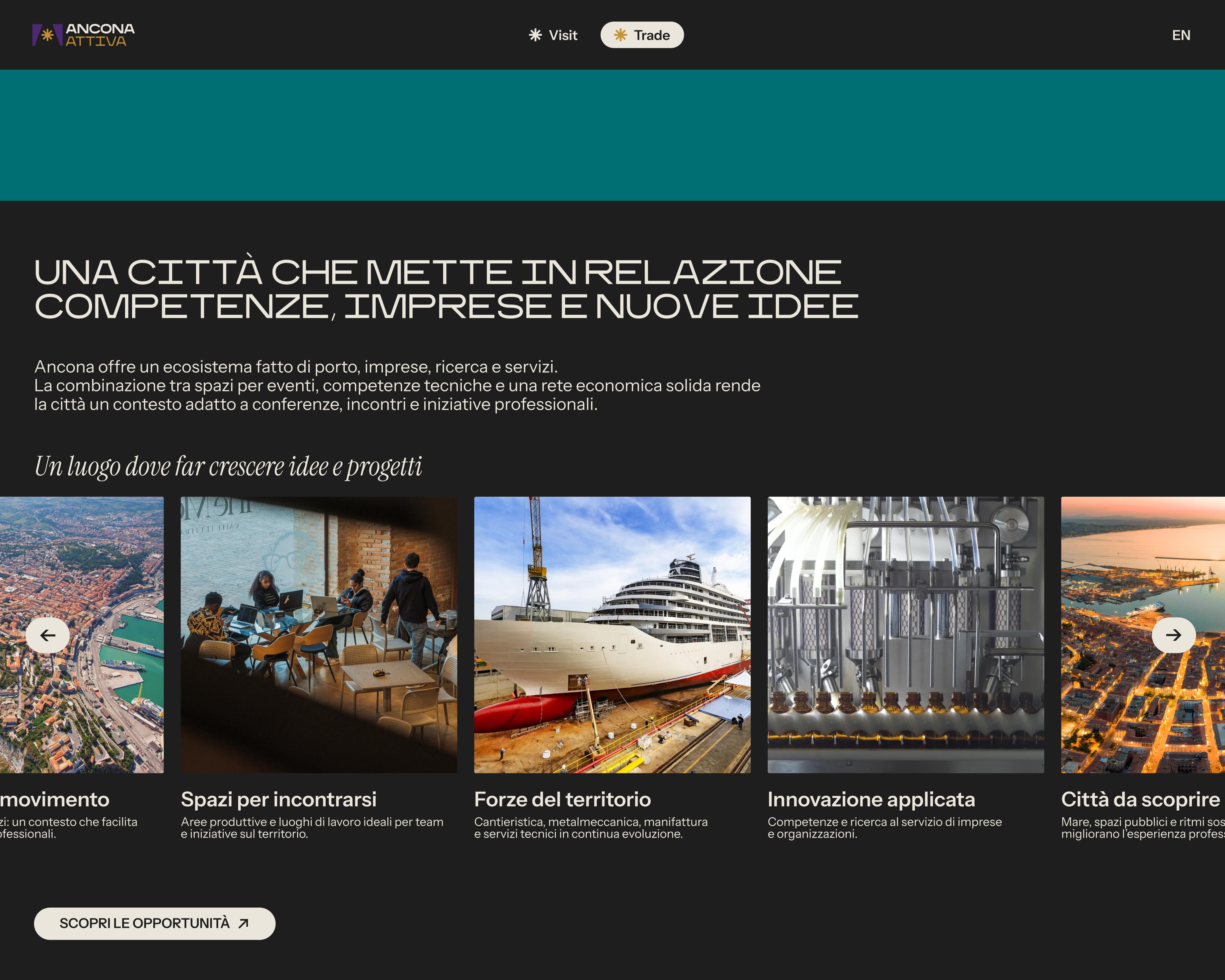
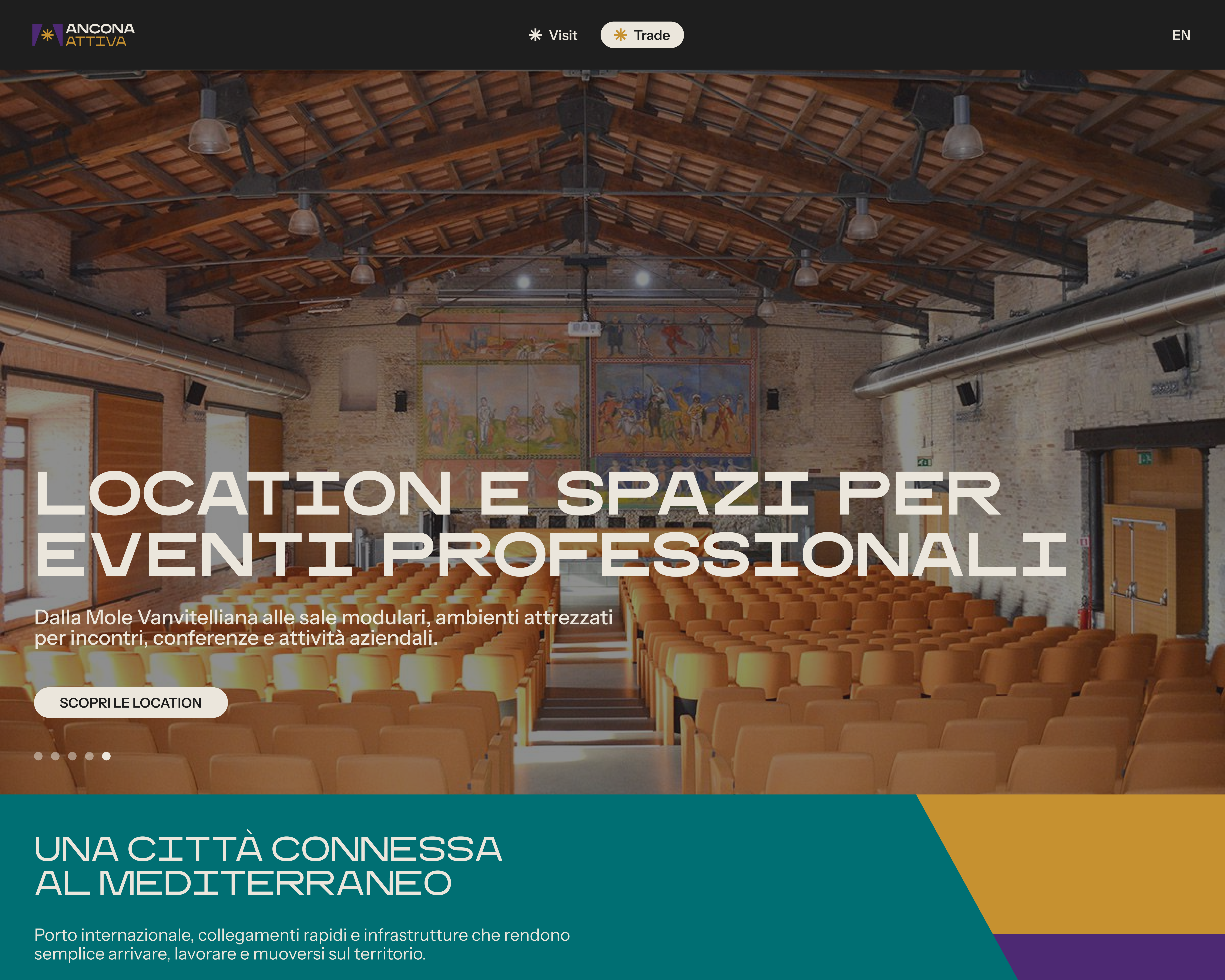
Ancona Attiva
Ancona Attiva's mark is a negative trapezoid: an open shape that suggests a stage or a road leading forward, toward light. It is dedicated to business, education, research, logistics and economic development.
Ancona Autentica's logo is simple and immediate: a trapezoid evokes the land reaching into the Adriatic Sea, hugged by the city’s two suns represented as two asterisks. It is dedicated to the city’s artistic, cultural, social and territorial promotion.
Ancona Attiva
Ancona Attiva's mark is a negative trapezoid: an open shape that suggests a stage or a road leading forward, toward light. It is dedicated to business, education, research, logistics and economic development.
︎
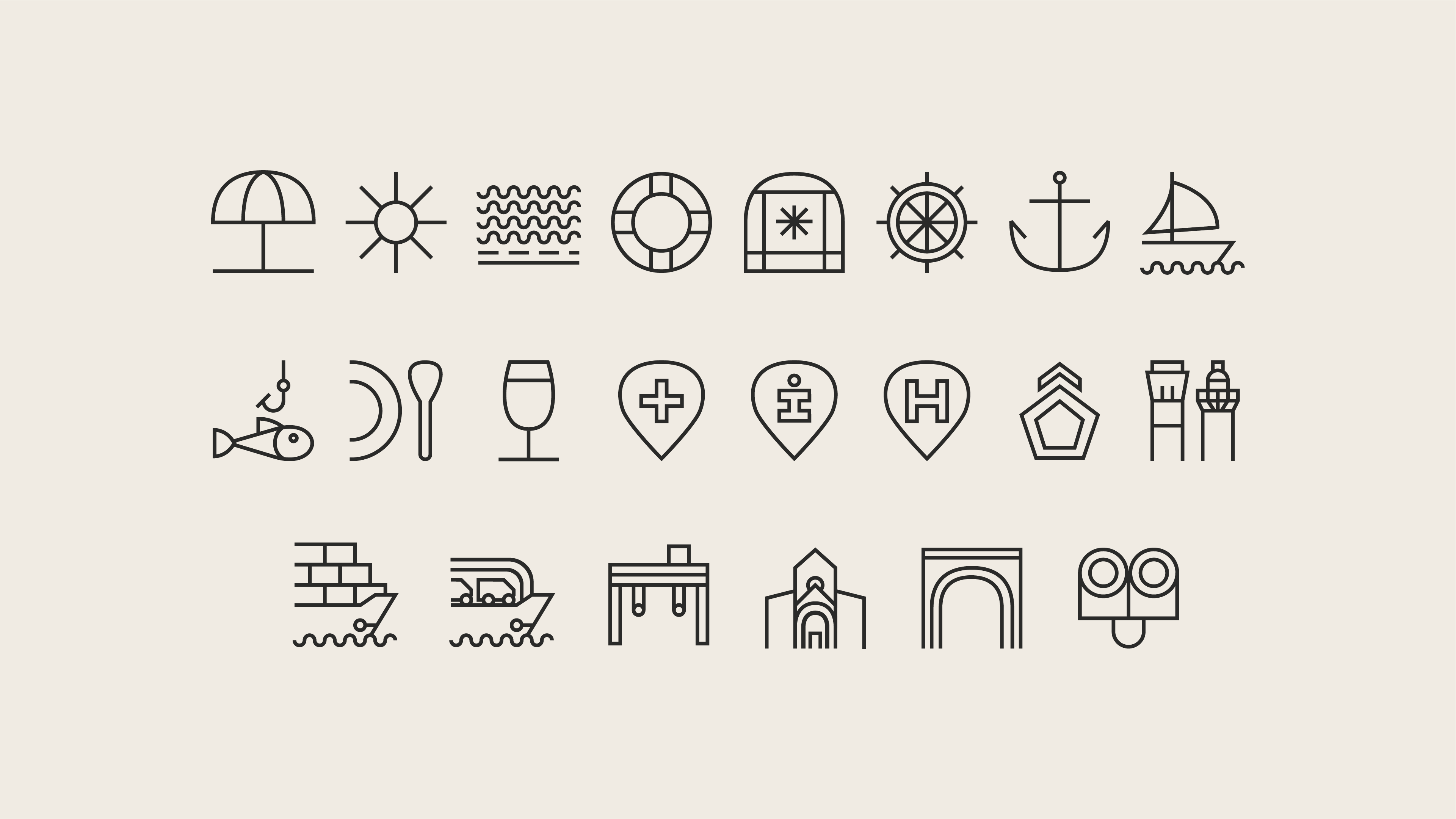
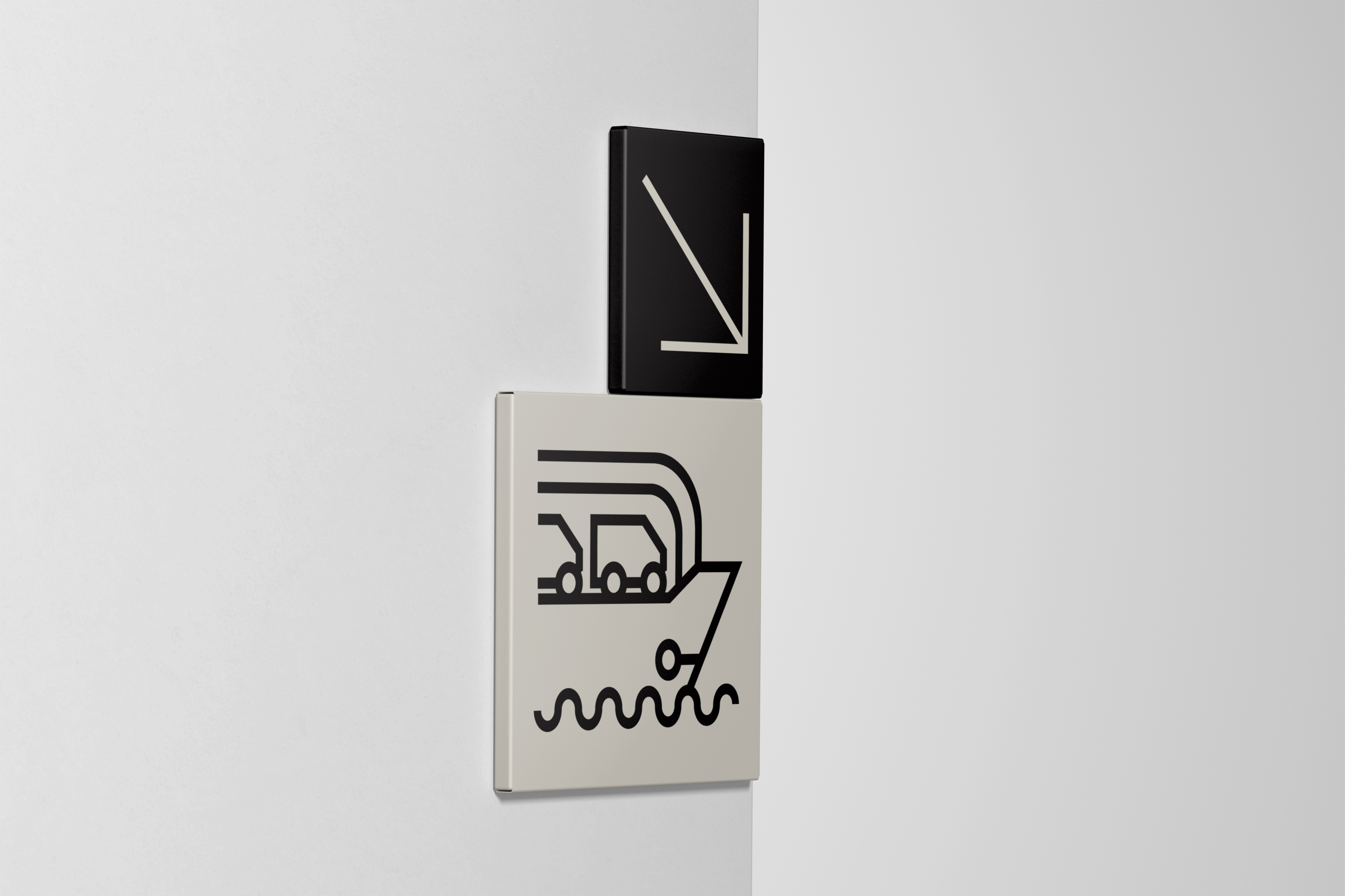
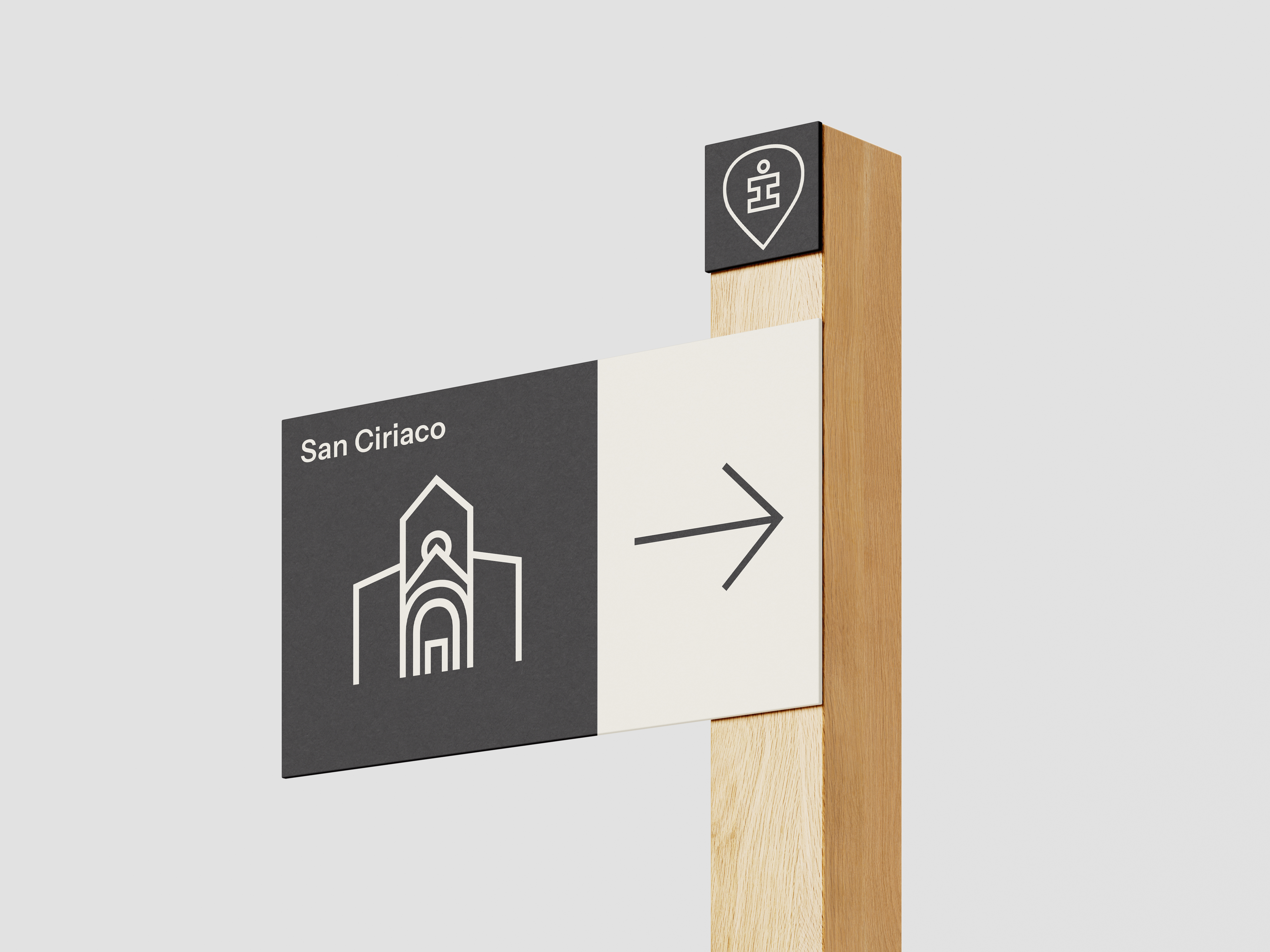
The visual system
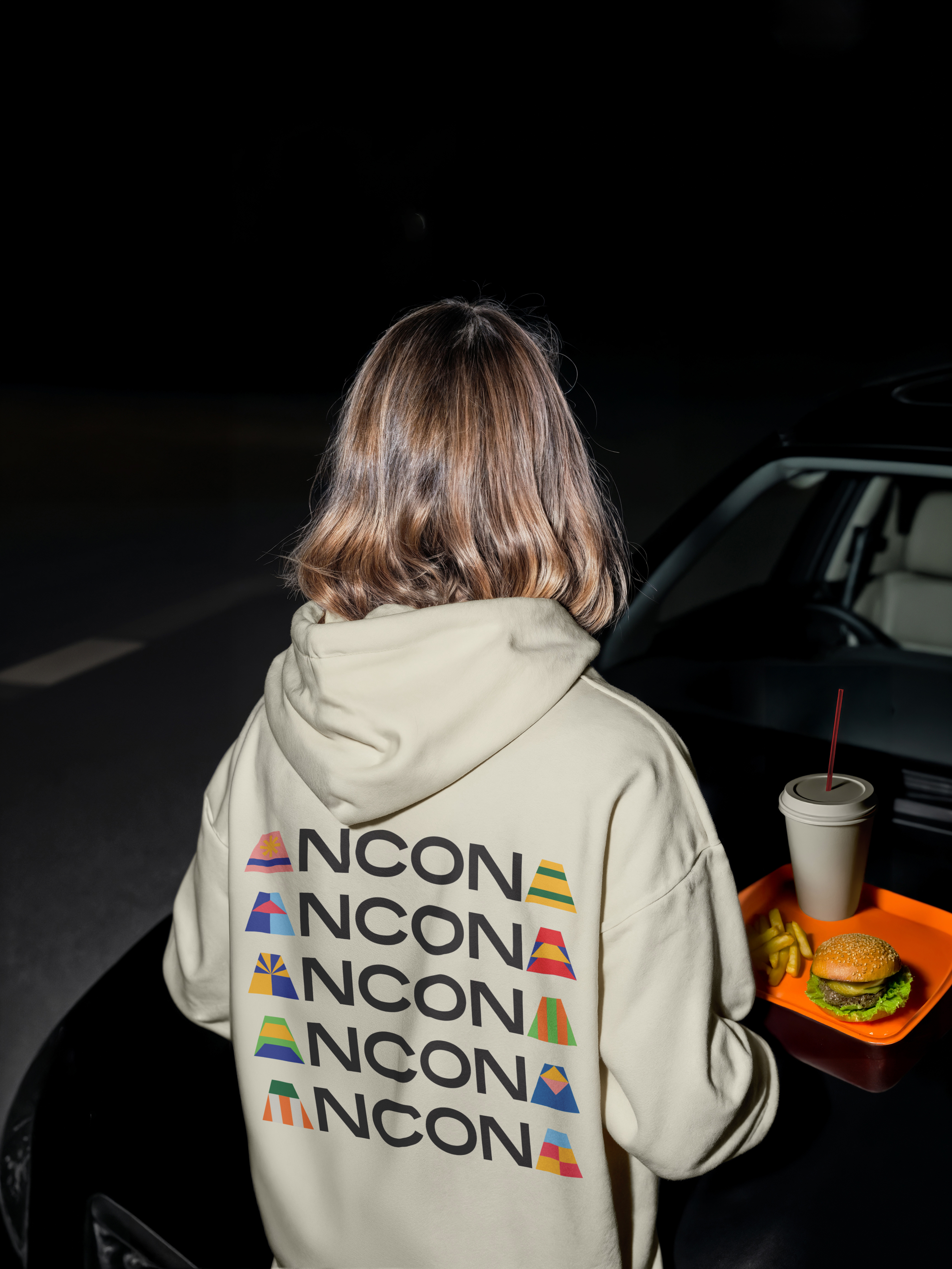
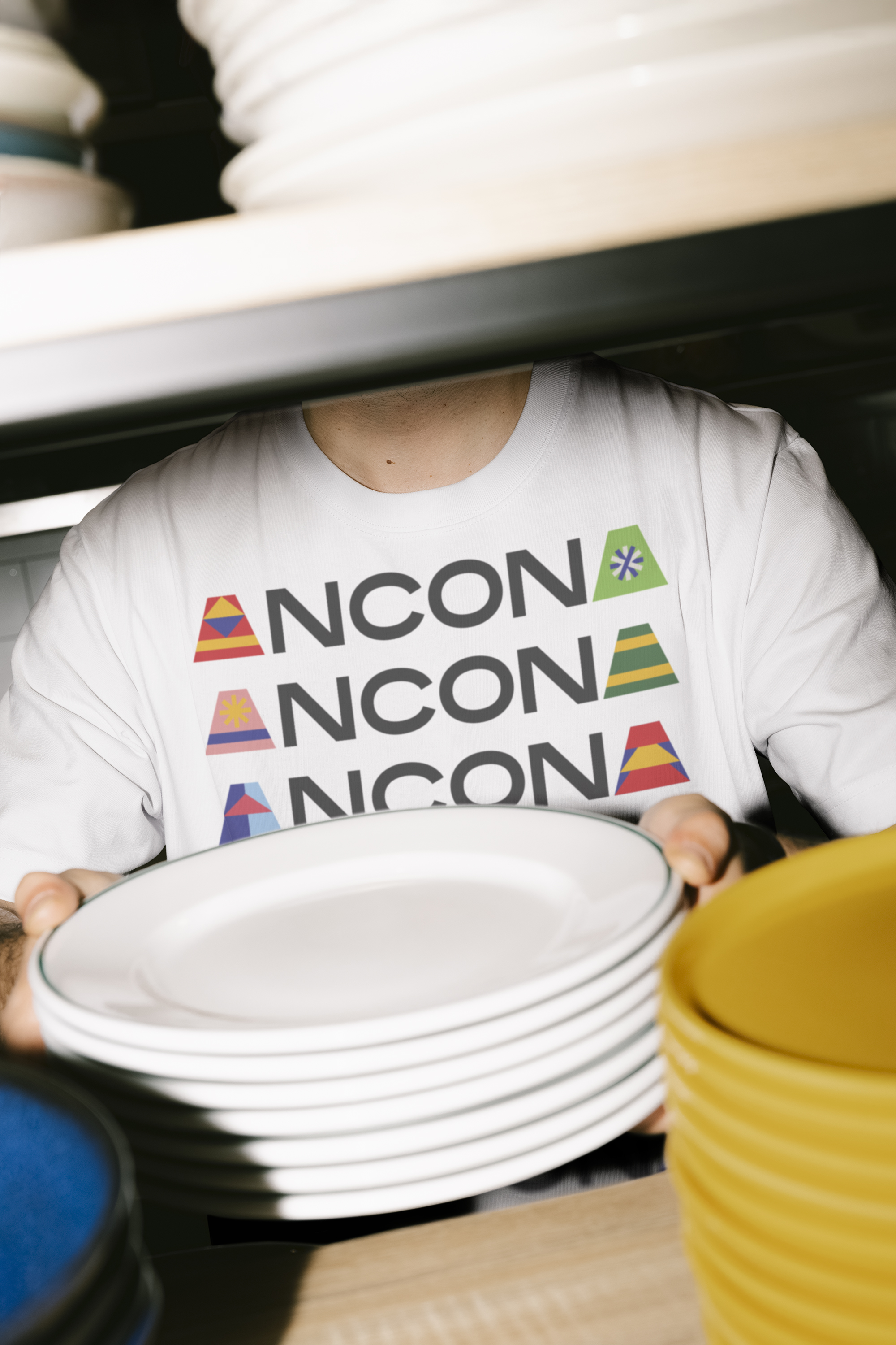
The 120 doors of the Passetto inspire a system of shapes, textures and colors. The city becomes pattern and surface — a living framework for new stories. Everything begins with the A and expands into an alphabet of words, places, events and shared values. The language is simple and direct, reflecting the way people in Ancona speak.
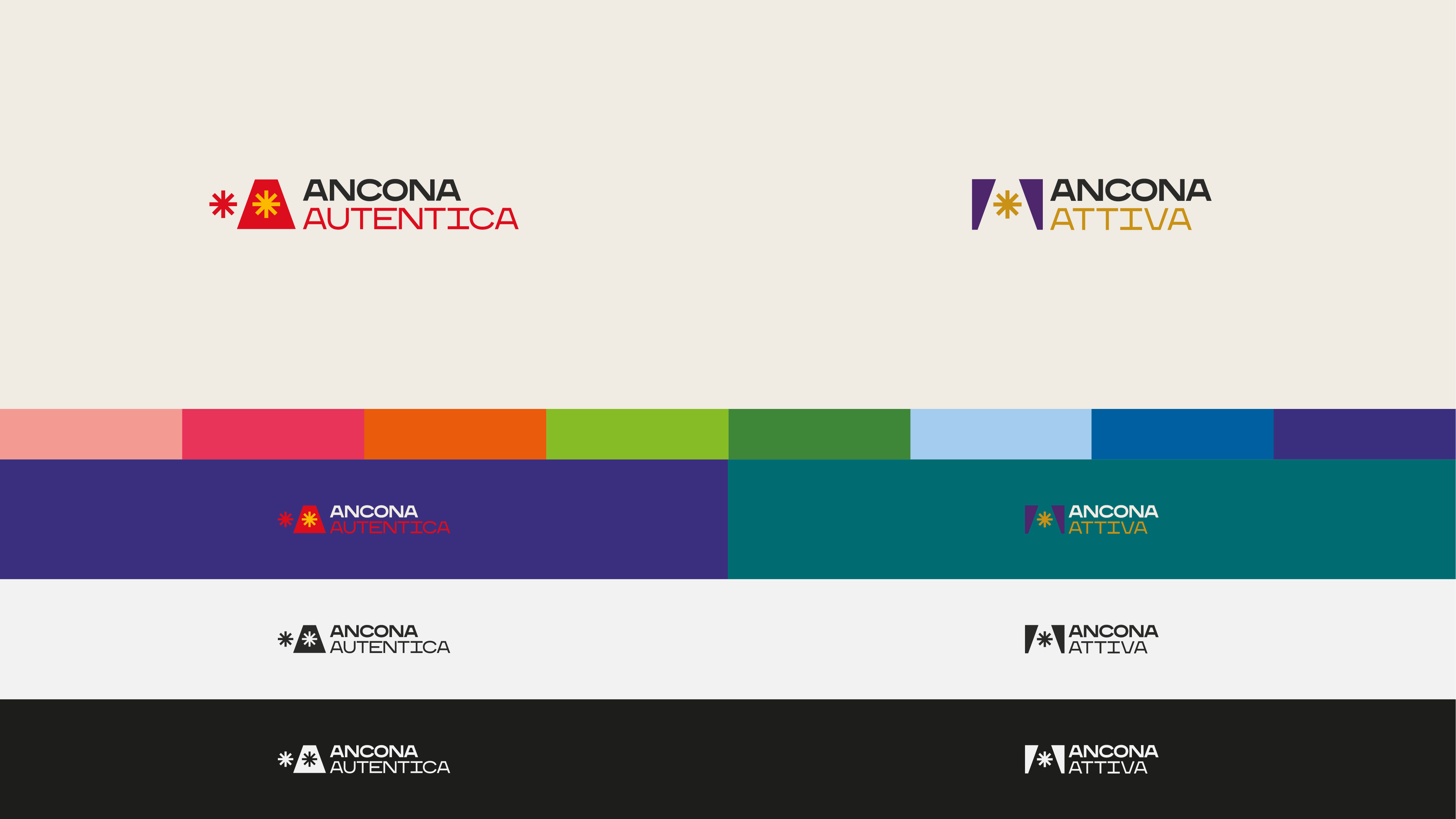
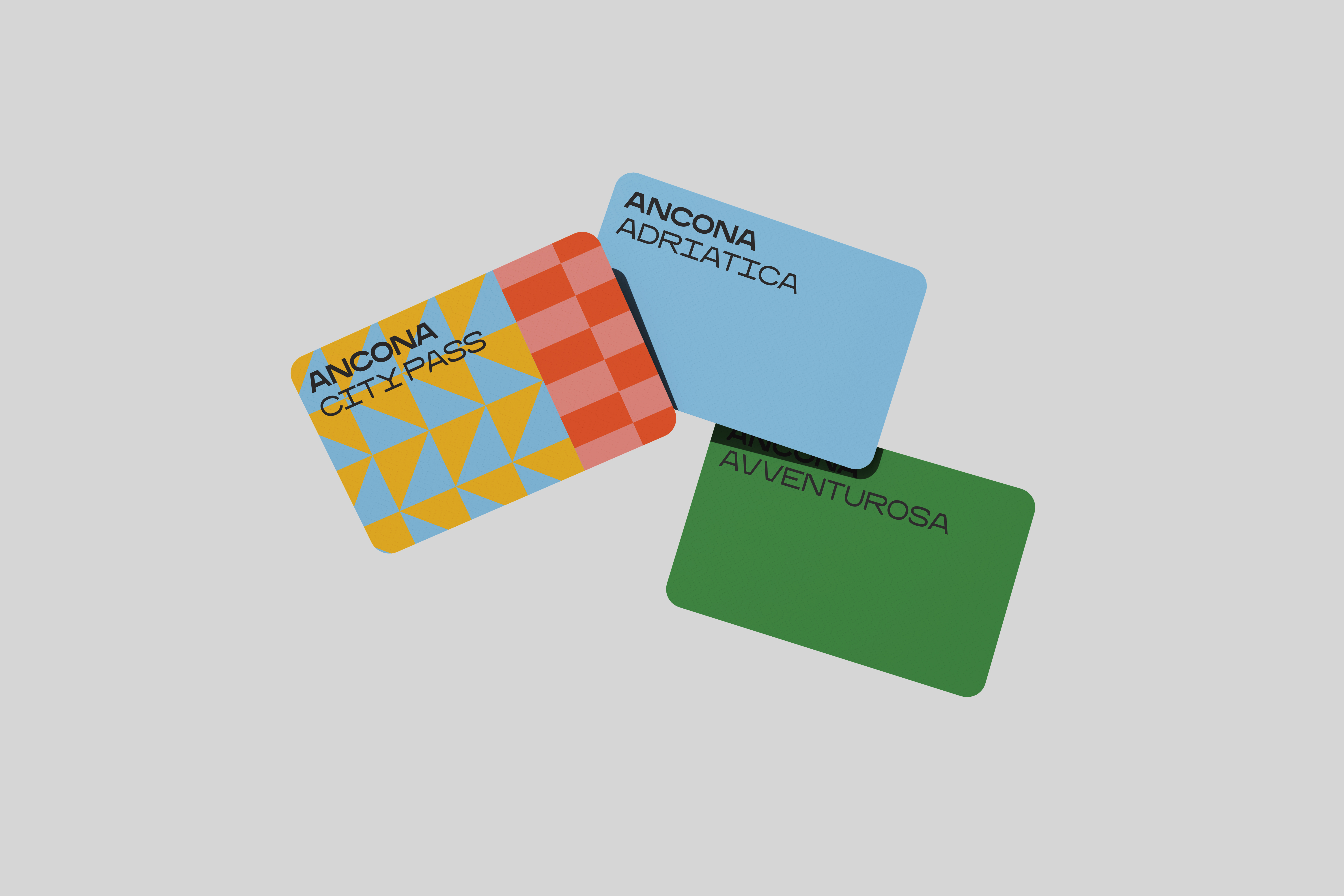
Color
Color is a key element of Ancona’s identity. The palette is rooted in the city’s history, landscape and economy. Red and yellow define Ancona Autentica, supported by tones drawn from the territory. Purple and teal, contrasted with gold, characterize Ancona Attiva and its business focus. In monochrome applications, black and white shift to 7% and 97% black to maintain depth.
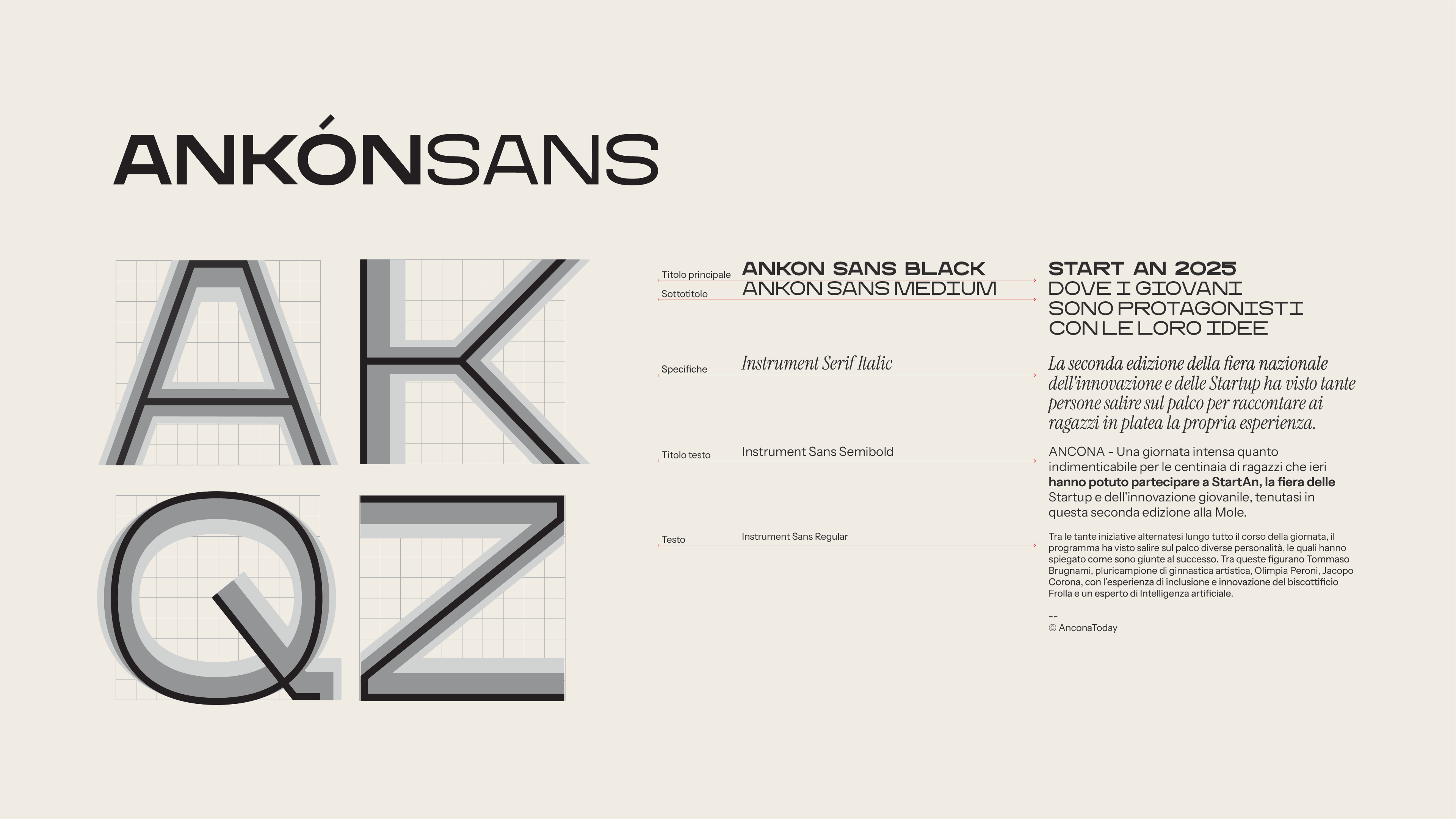
A dedicated typeface: Ankon Sans
Ankon Sans is a custom-designed geometric typeface created exclusively for Ancona. International in scope, it supports multiple languages and alphabets and reflects the brand’s clear, direct voice.
Instrument Sans and Instrument Serif complement the system, used for body text and contrasting headings.
The 120 doors of the Passetto inspire a system of shapes, textures and colors. The city becomes pattern and surface — a living framework for new stories. Everything begins with the A and expands into an alphabet of words, places, events and shared values. The language is simple and direct, reflecting the way people in Ancona speak.
Color
Color is a key element of Ancona’s identity. The palette is rooted in the city’s history, landscape and economy. Red and yellow define Ancona Autentica, supported by tones drawn from the territory. Purple and teal, contrasted with gold, characterize Ancona Attiva and its business focus. In monochrome applications, black and white shift to 7% and 97% black to maintain depth.
A dedicated typeface: Ankon Sans
Ankon Sans is a custom-designed geometric typeface created exclusively for Ancona. International in scope, it supports multiple languages and alphabets and reflects the brand’s clear, direct voice.
Instrument Sans and Instrument Serif complement the system, used for body text and contrasting headings.

︎
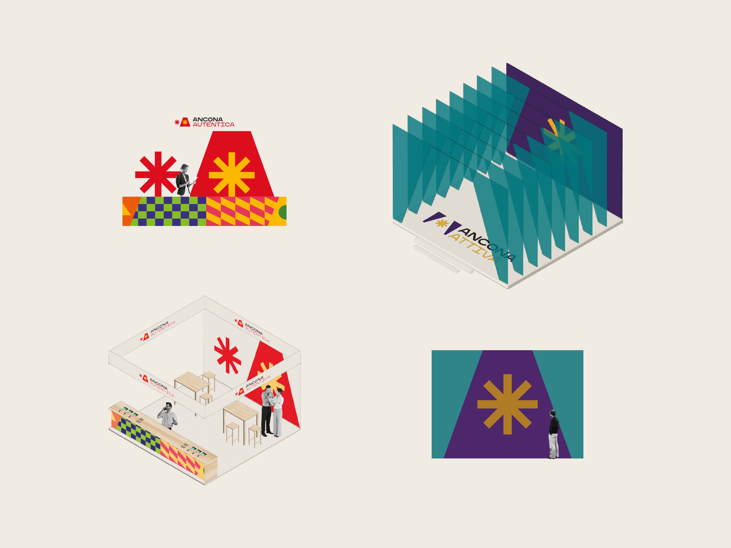
Applications
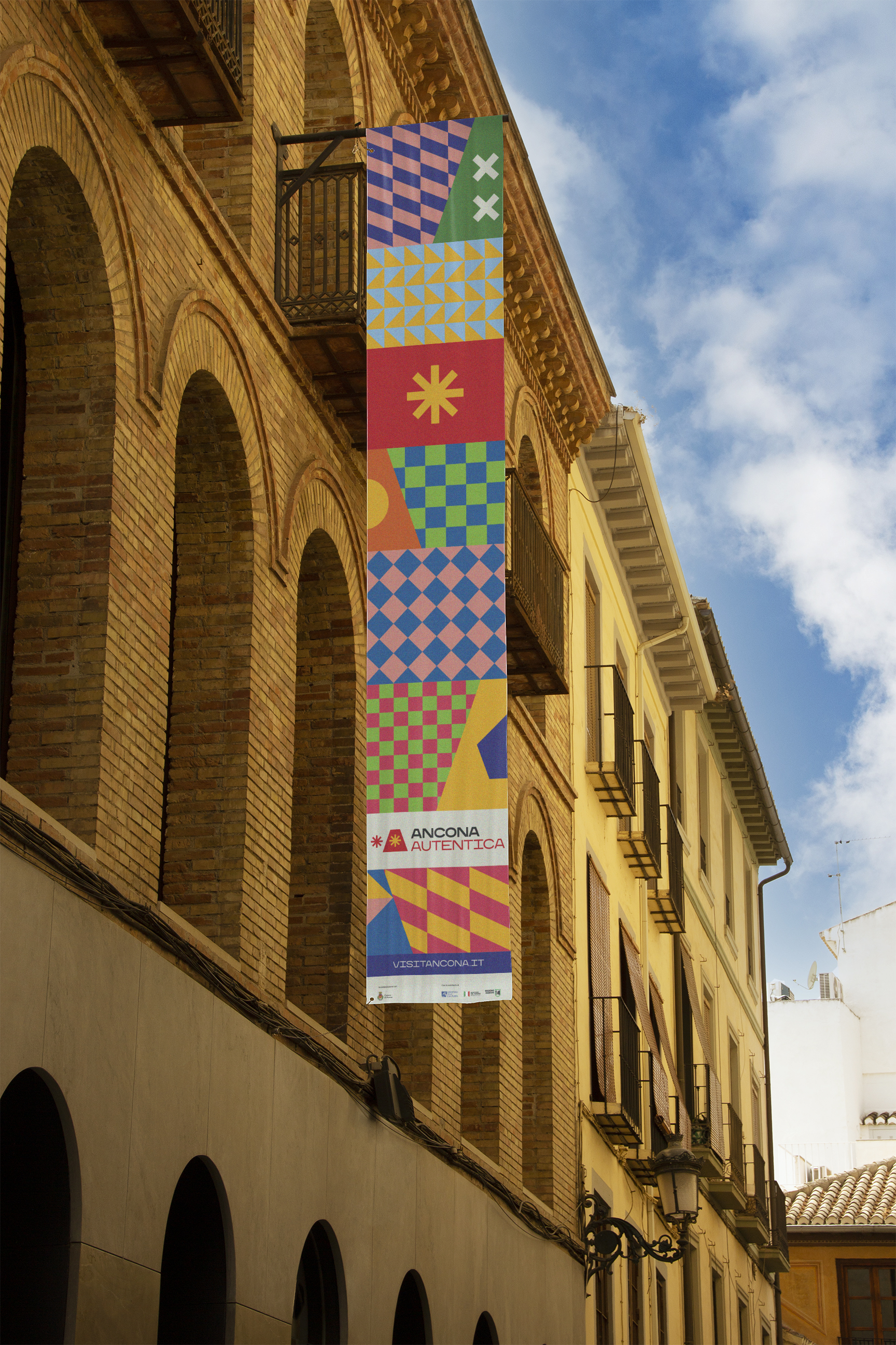
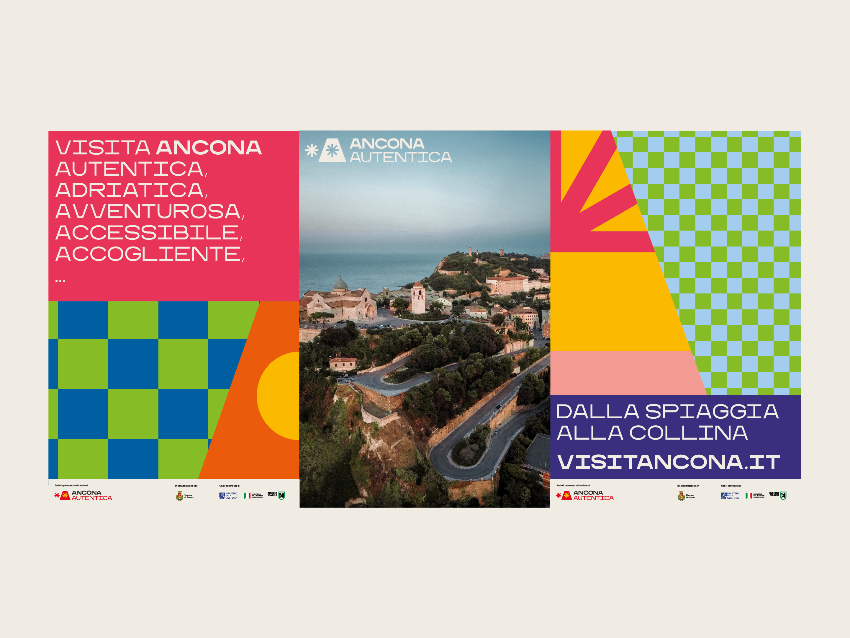
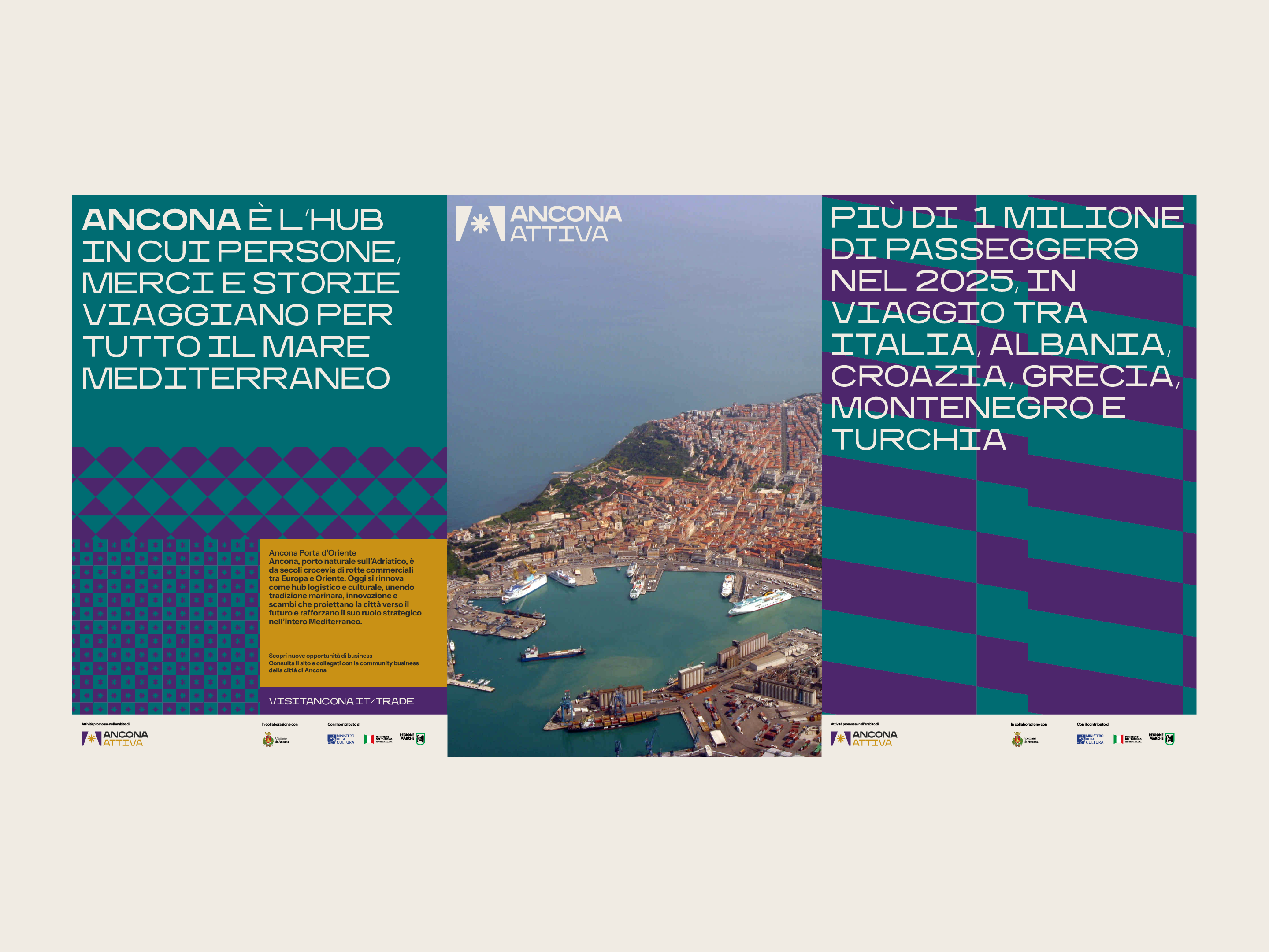
Institutional applications are developed across the two channels: Ancona Autentica is colorful and bold, alternating patterns and festoons with the A and a grammar of symbols derived from the Passetto doors. Ancona Attiva is more elegant, with dark, digital tones contrasted with gold, alternating macro patterns with micro textures.
The wide range of graphic combinations gives rise to patterns, color play and trapezoids that reference the A and sometimes replace it, generating a coherent and flexible system applicable to objects, surfaces and tourism merchandising.
︎
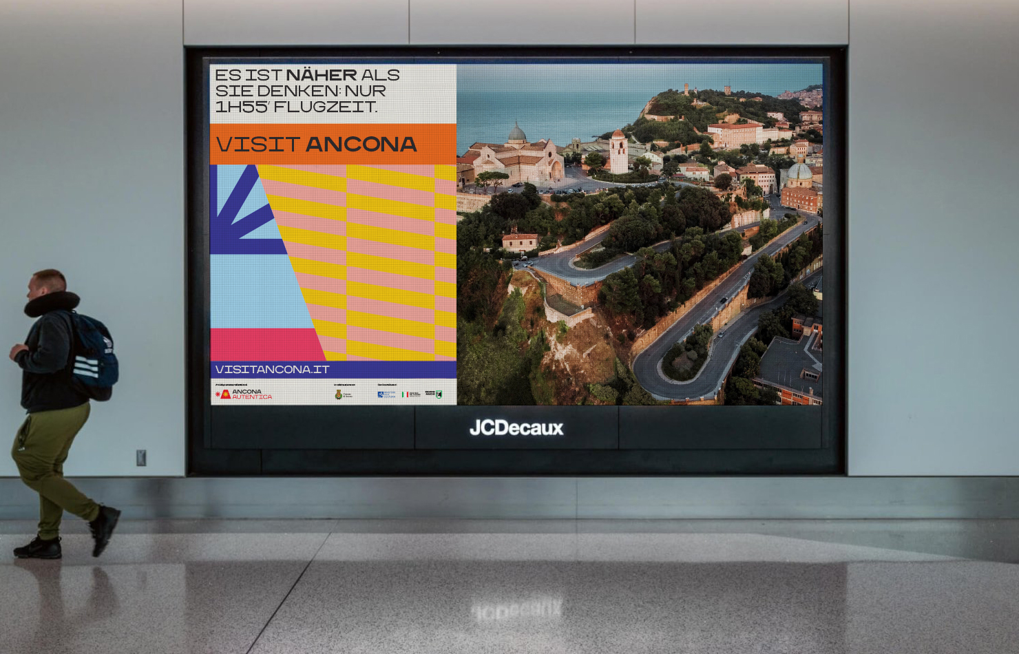
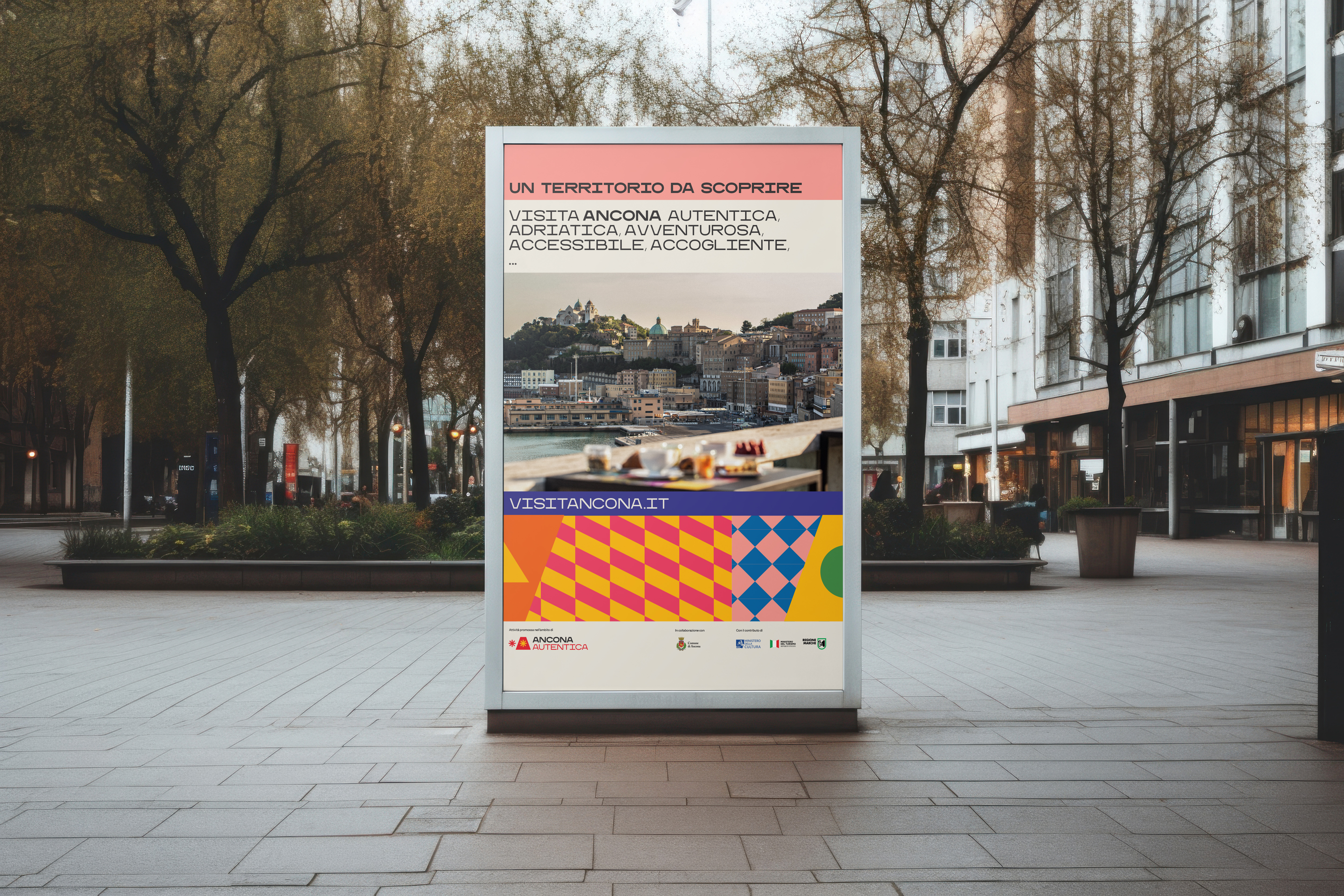
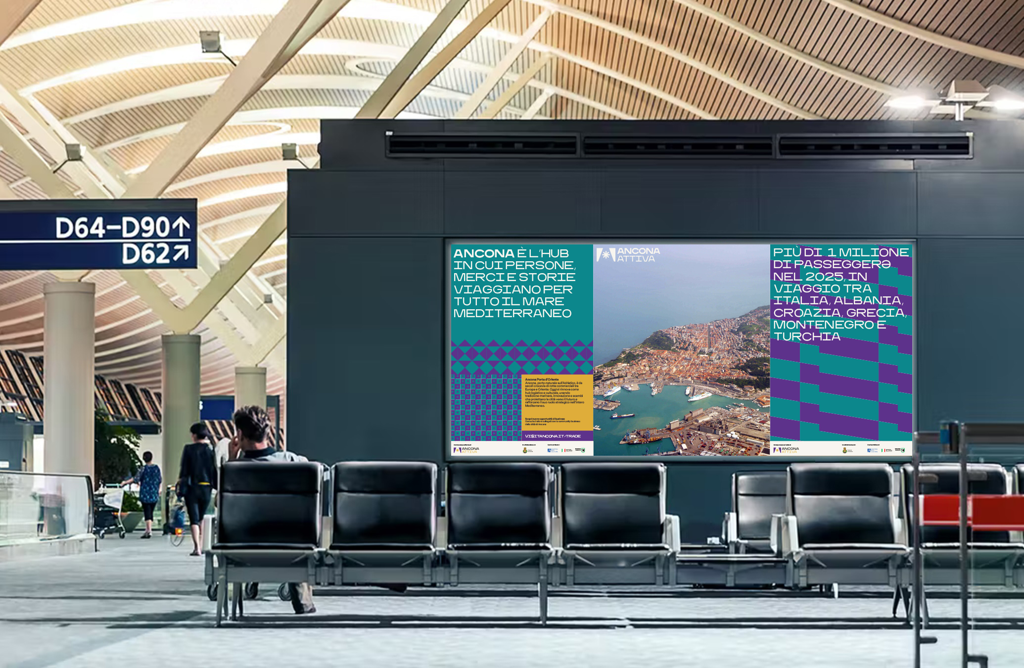
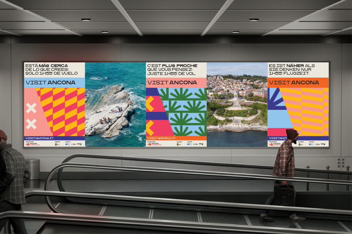
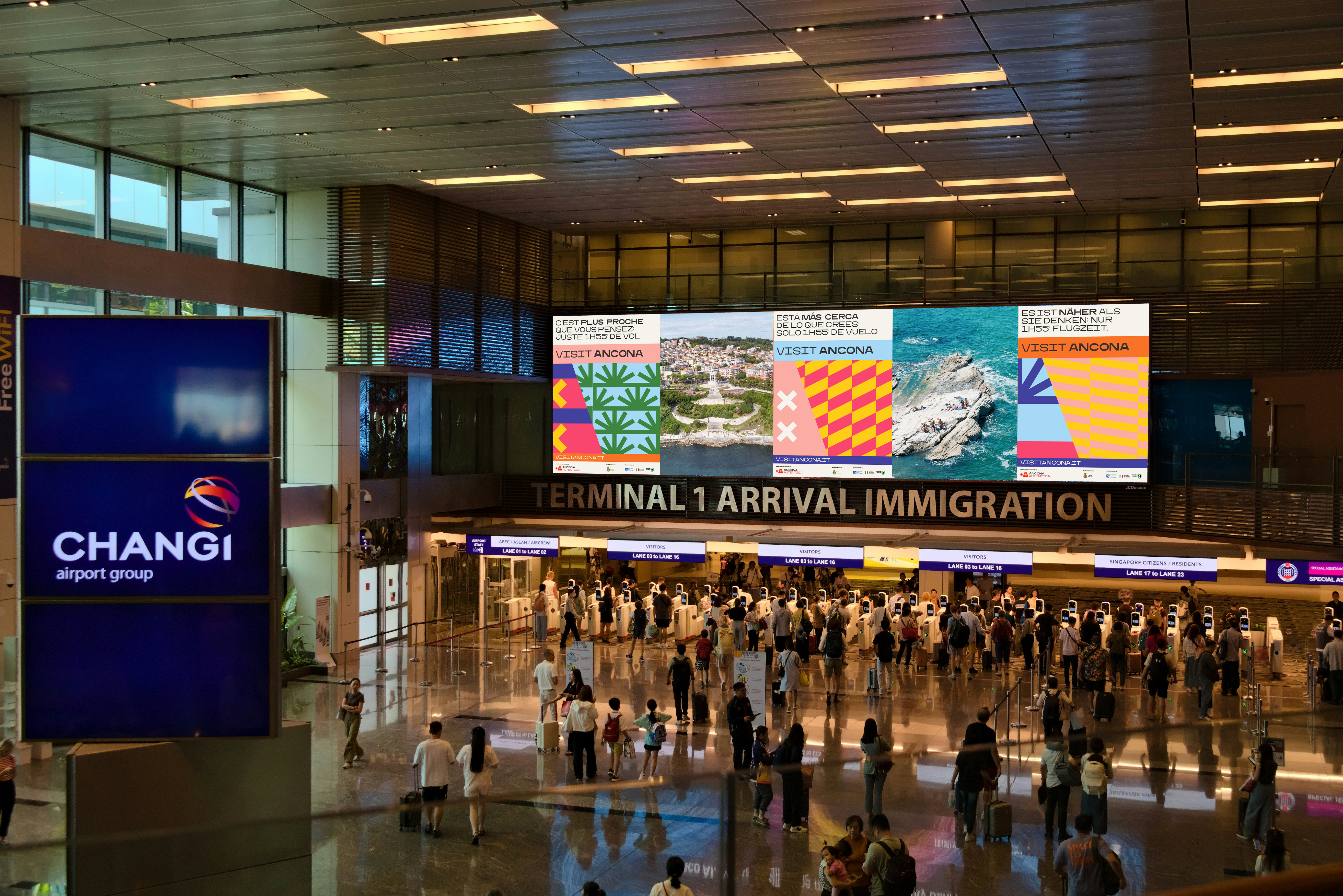
In the city main attractions, all over national and international connected hubs, the identity becomes playful and expressive. Colors, textures and letters combine with city images to promote cultural, sporting and food-related activities. Recurring formats ensure a recognizable and consistent feed.
︎
Local campaign
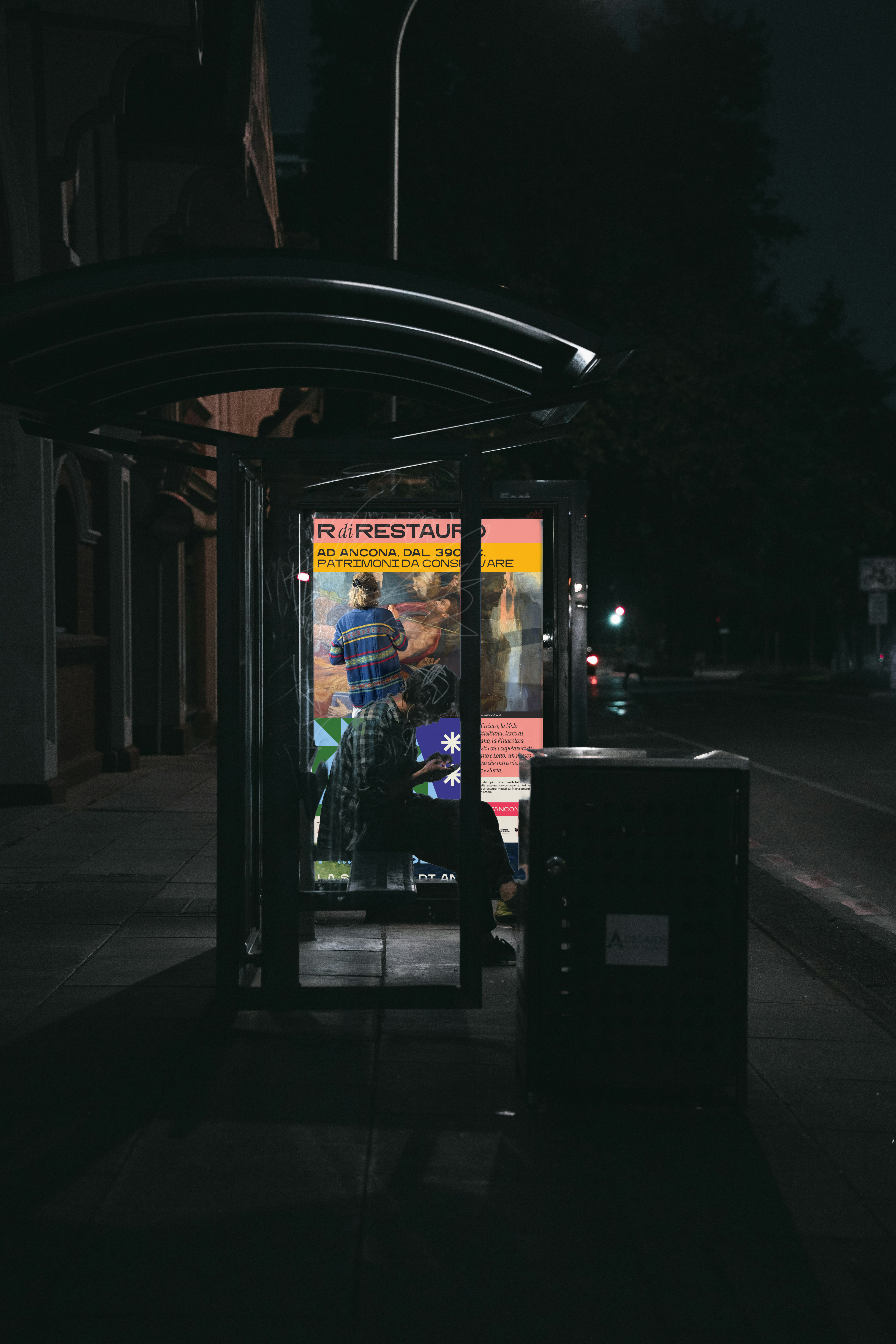
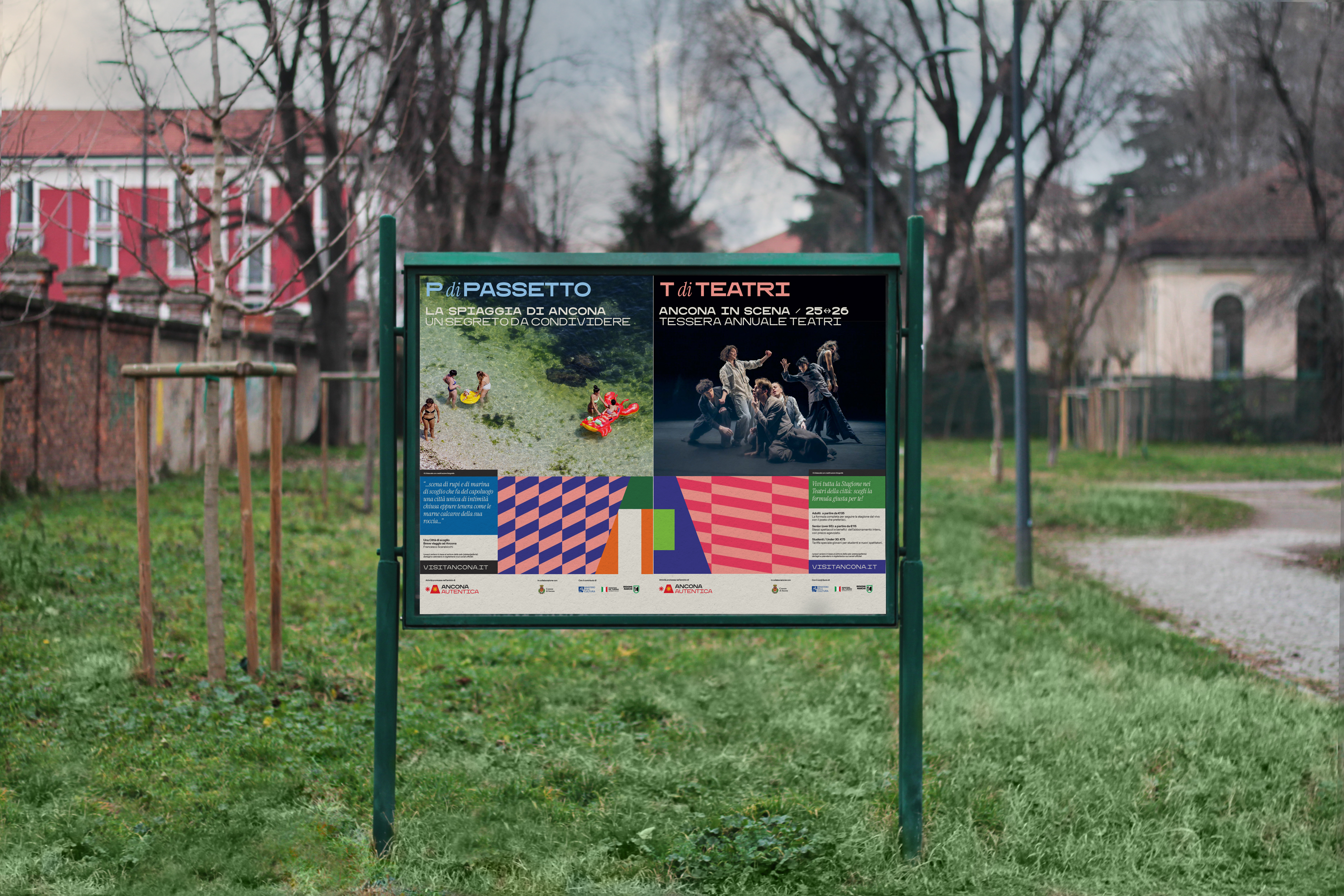
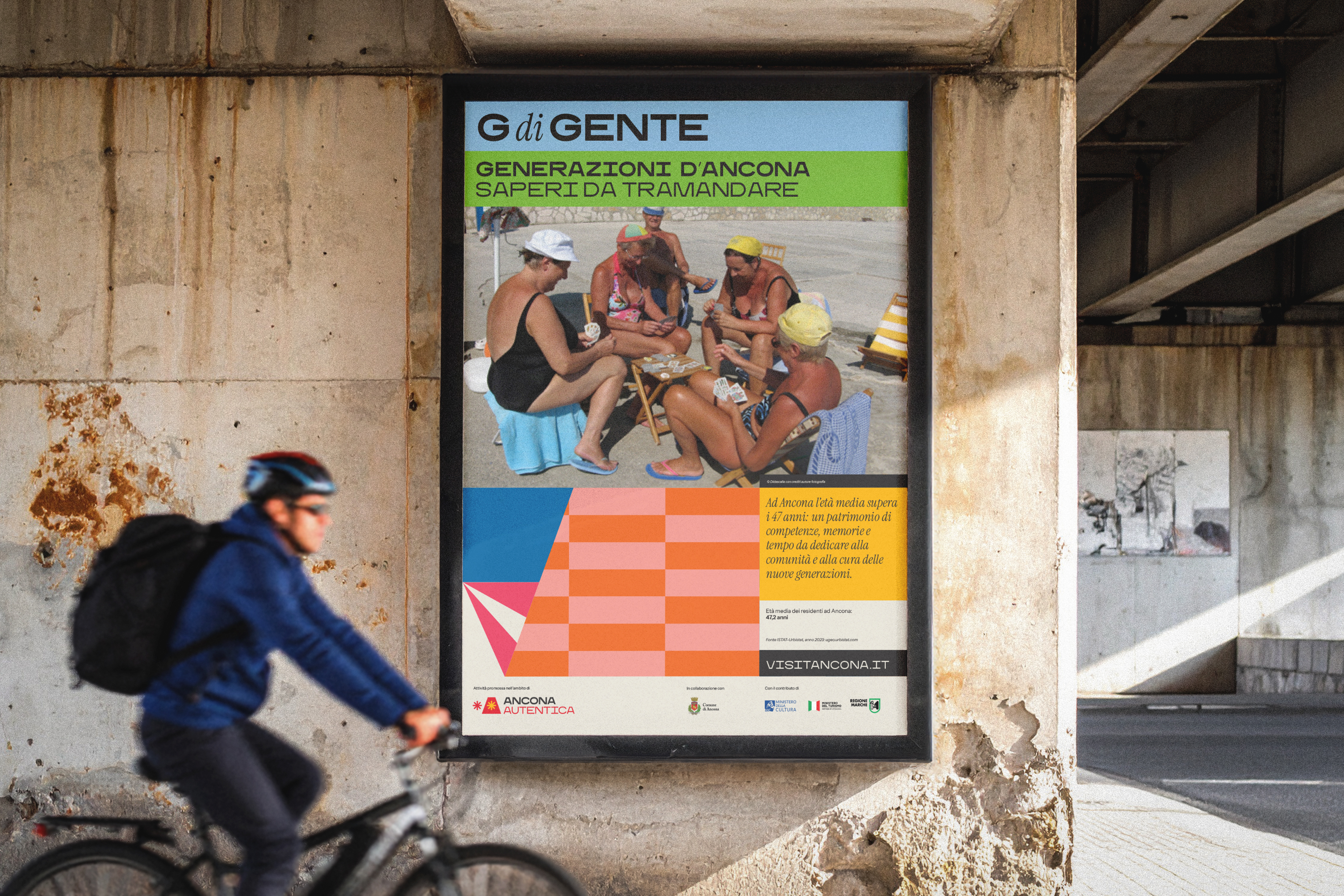
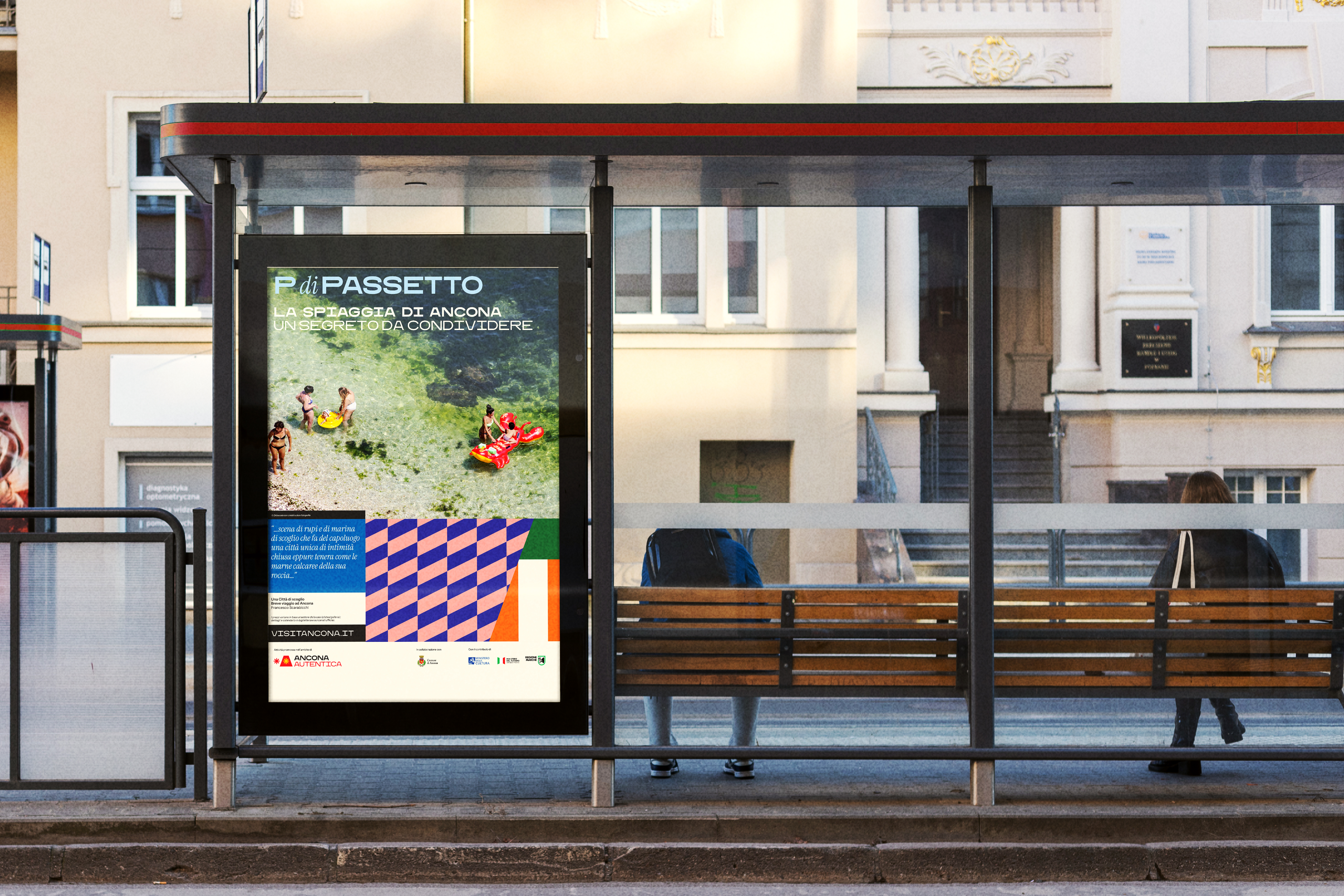
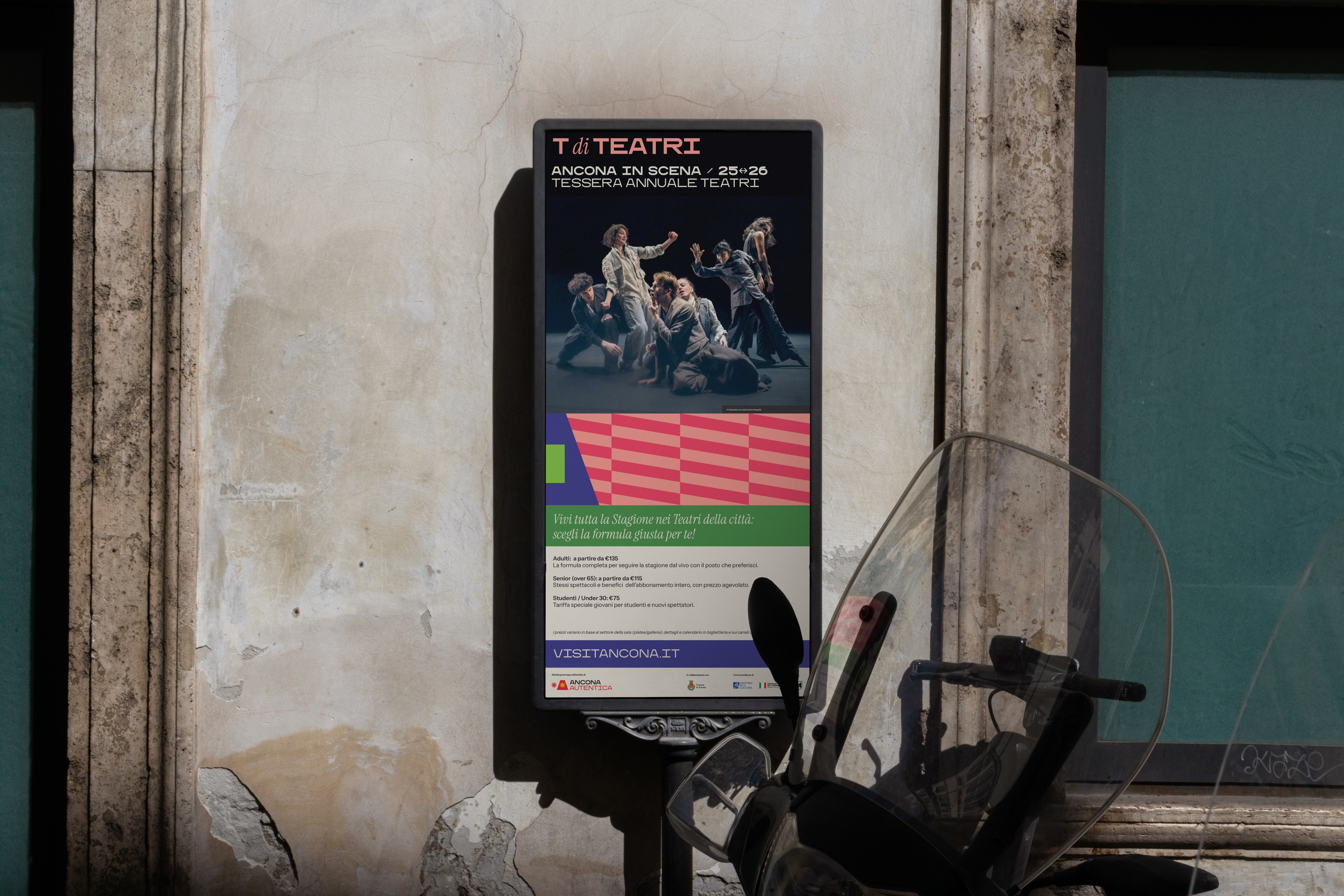
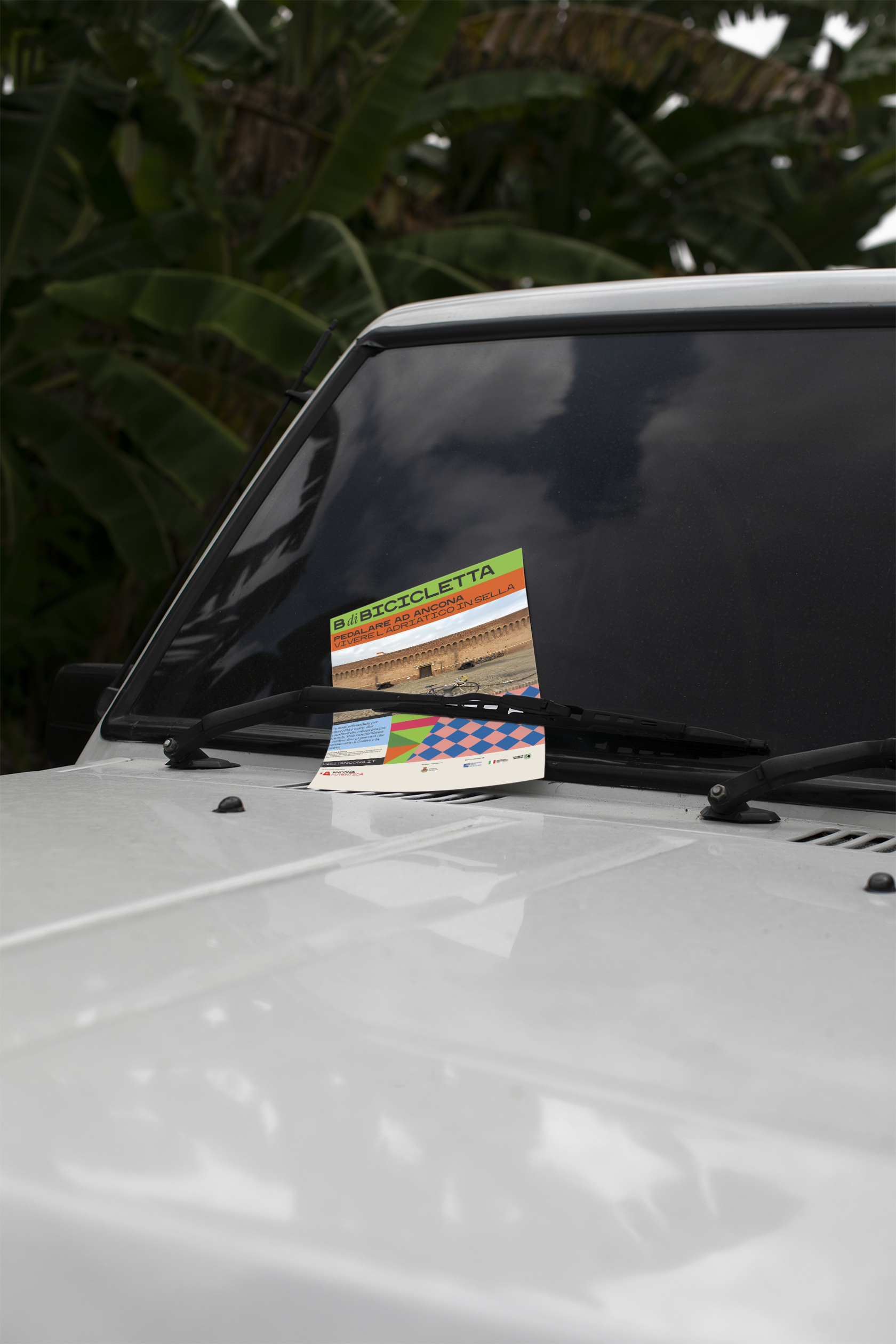
The A di Ancona campaign is the direct expression of a simple, no-nonsense language: a continuous alphabet book that draws citizens’ attention to shared events and initiatives, using words linked to the city’s themes and neighborhoods.
It highlights what happens across Ancona’s different areas, inviting people to rediscover the city from within. At the center remain meaningful words, emphasized by their initial letter: A di Ancona is followed by T di Teatri for seasonal theaters promotion, R di Rispetto for awareness campaigns, P di Passetto, and many other possible variations.
︎
Online
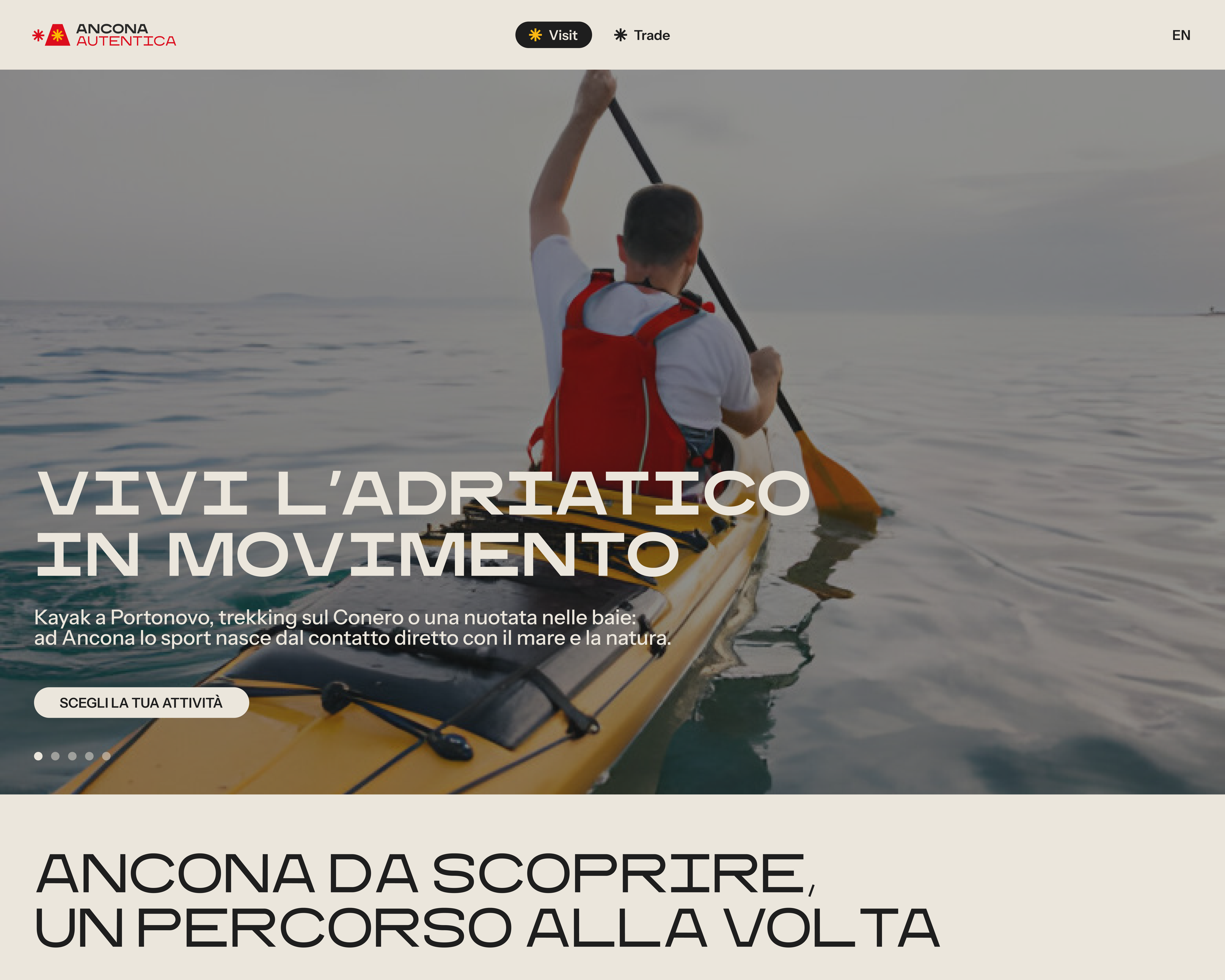
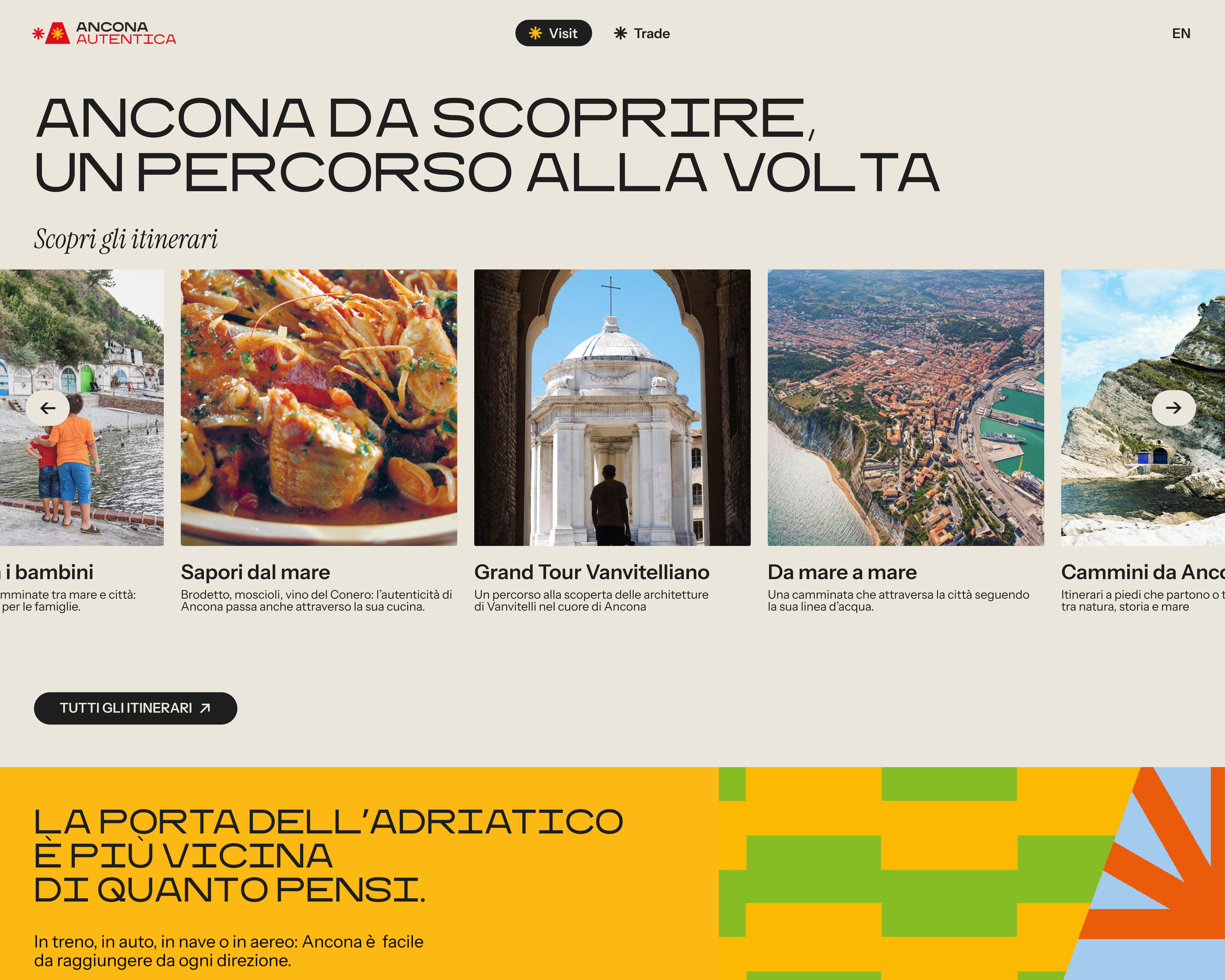
Website and newsletter reflect Ancona’s two identities: tourism and city life on one side, business and development on the other - clear, accessible and consistent - they form a single digital ecosystem for discovering Ancona.
Website and newsletter reflect Ancona’s two identities: tourism and city life on one side, business and development on the other - clear, accessible and consistent - they form a single digital ecosystem for discovering Ancona.
︎
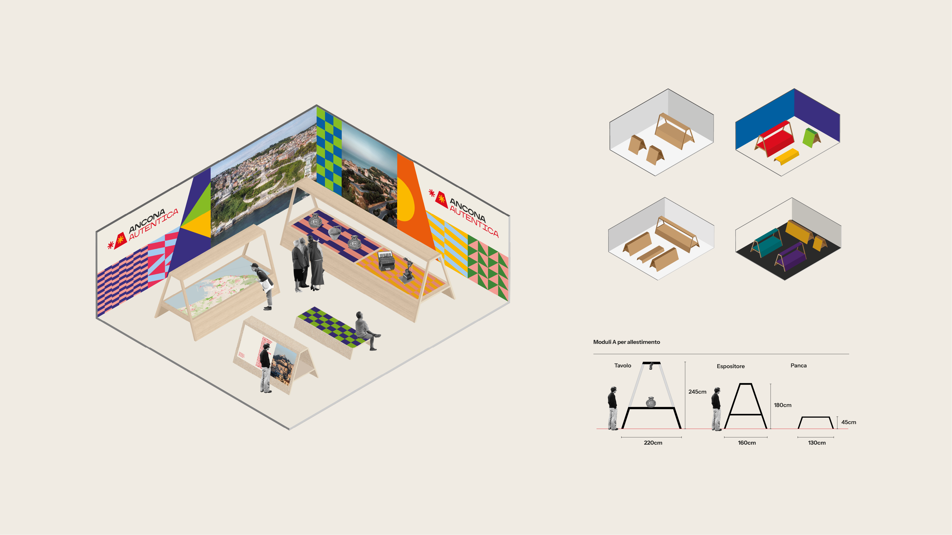
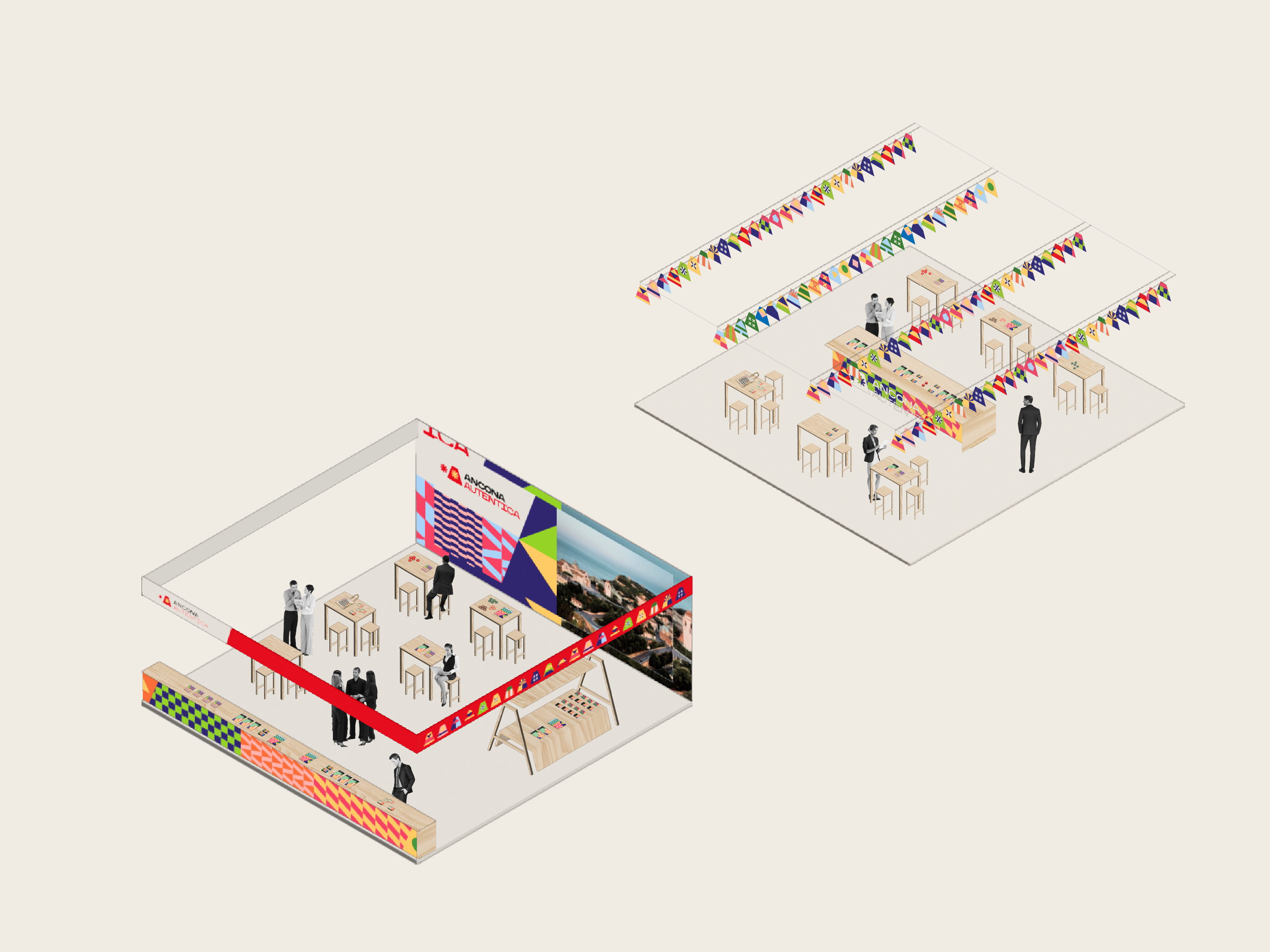
Exhibit
Exhibition stands translate the identity into space using modular structures, patterns and eco-sustainable materials. The A becomes a structural module for tables, displays and seating. All elements are designed to be reusable, scalable and recyclable, ensuring a sustainable approach to communication.
Exhibition stands translate the identity into space using modular structures, patterns and eco-sustainable materials. The A becomes a structural module for tables, displays and seating. All elements are designed to be reusable, scalable and recyclable, ensuring a sustainable approach to communication.