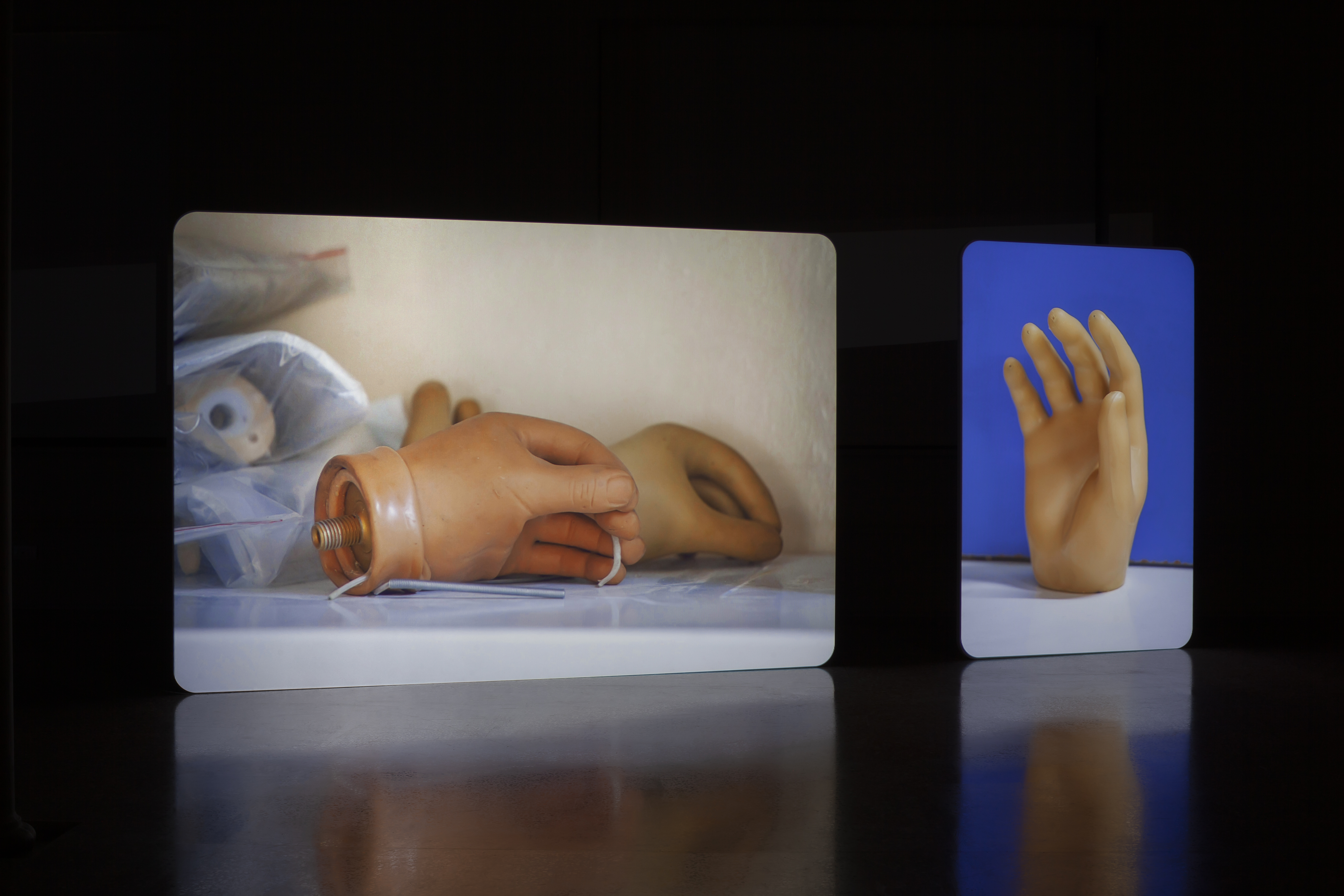
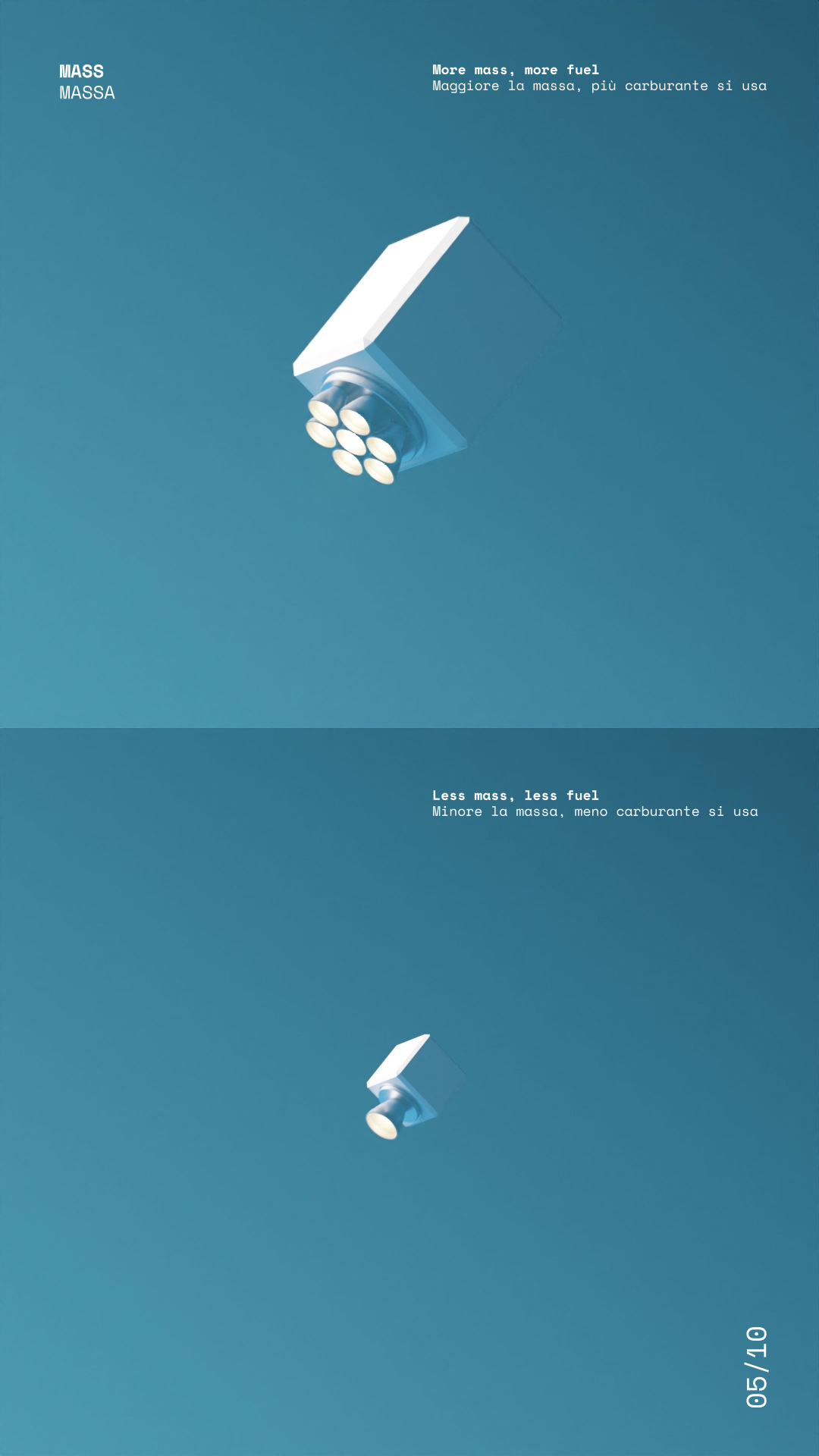
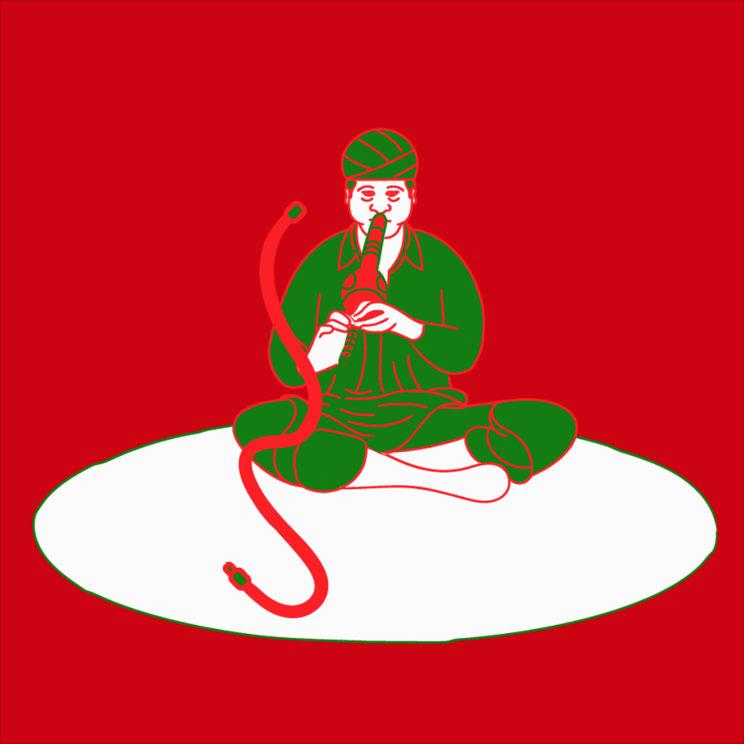
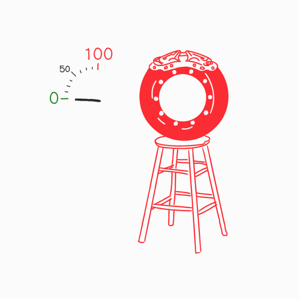
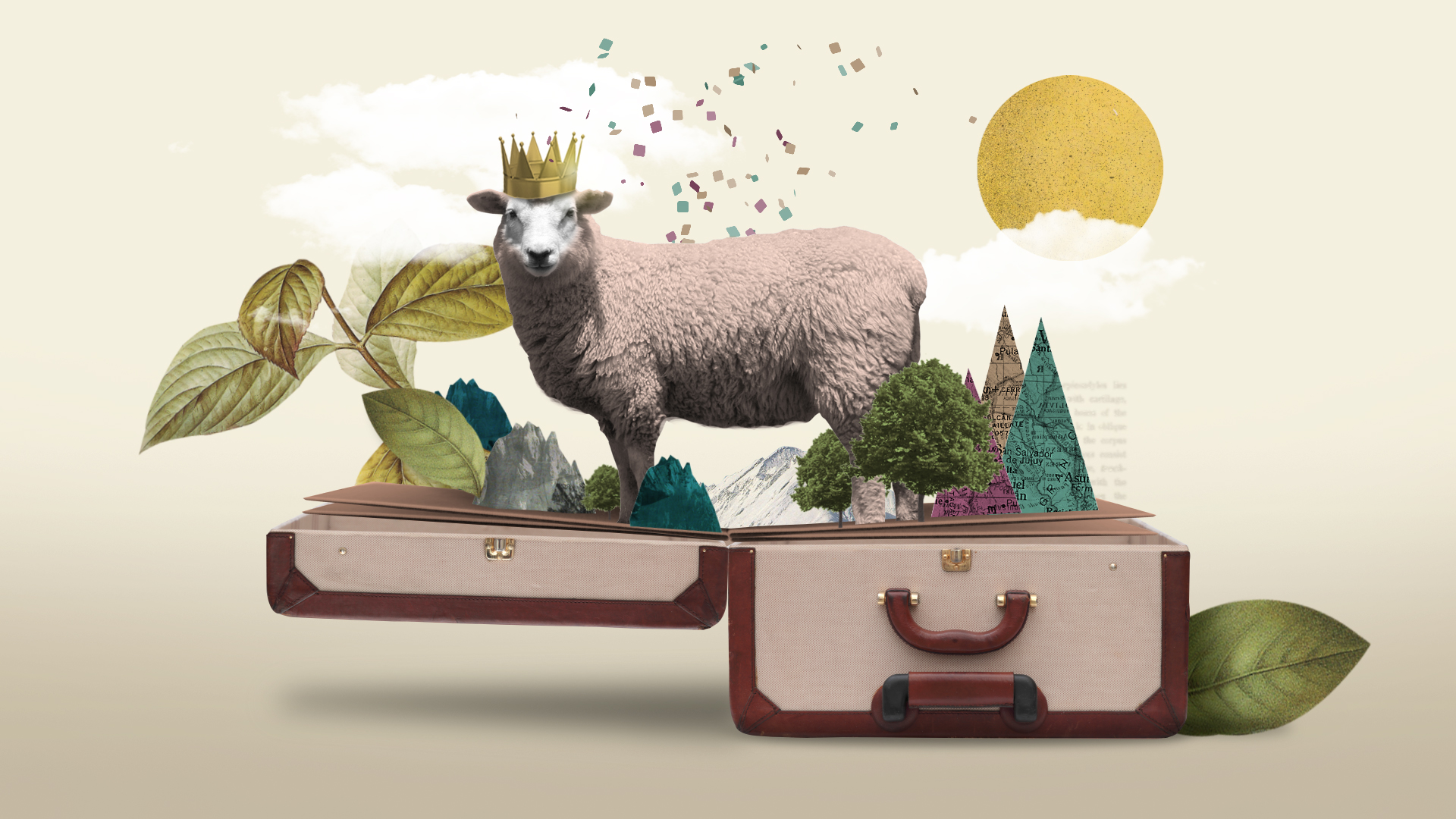
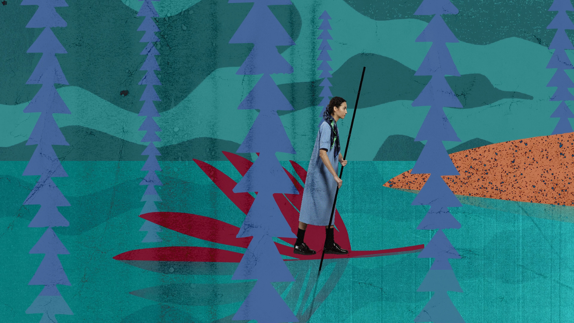
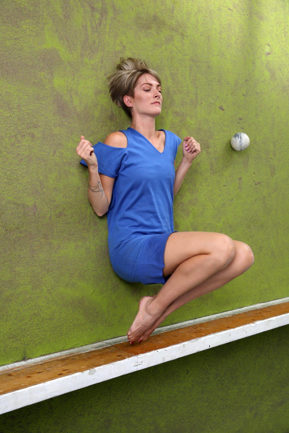
evoleves from point to the 4th dimension
Elle Decor Italia Takeover hosts “The Society of Objects”, a set-up inspired by Edwind Abbott’s “Flatland: A Romance of Many Dimensions” novel as a space to showcase products and share knowledge with designers, architects, entertainers and entrepreneurs. We designed the logo titles, invitations and some digital graphics to support elledecor.it’s intense programme of activities during the Design Week.


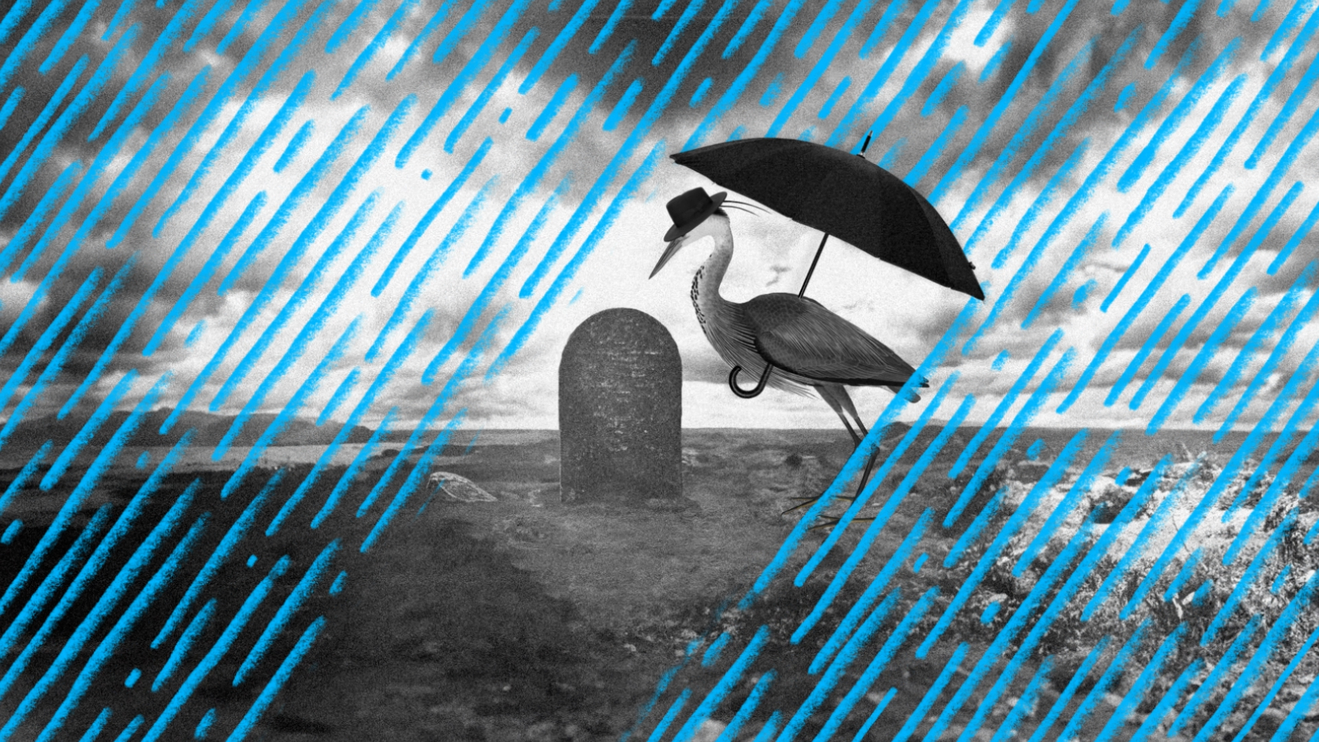
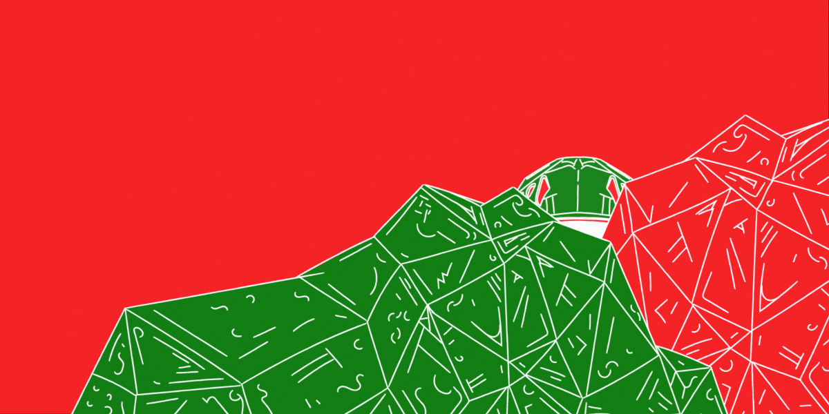
touches the sky
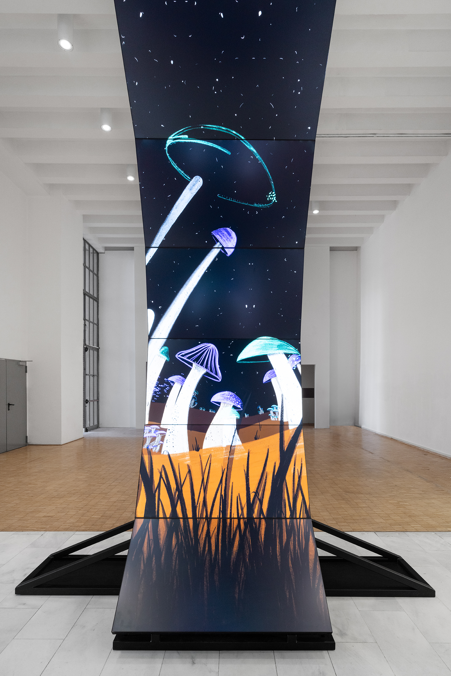
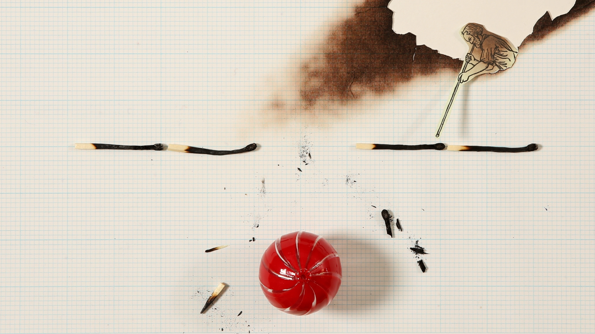
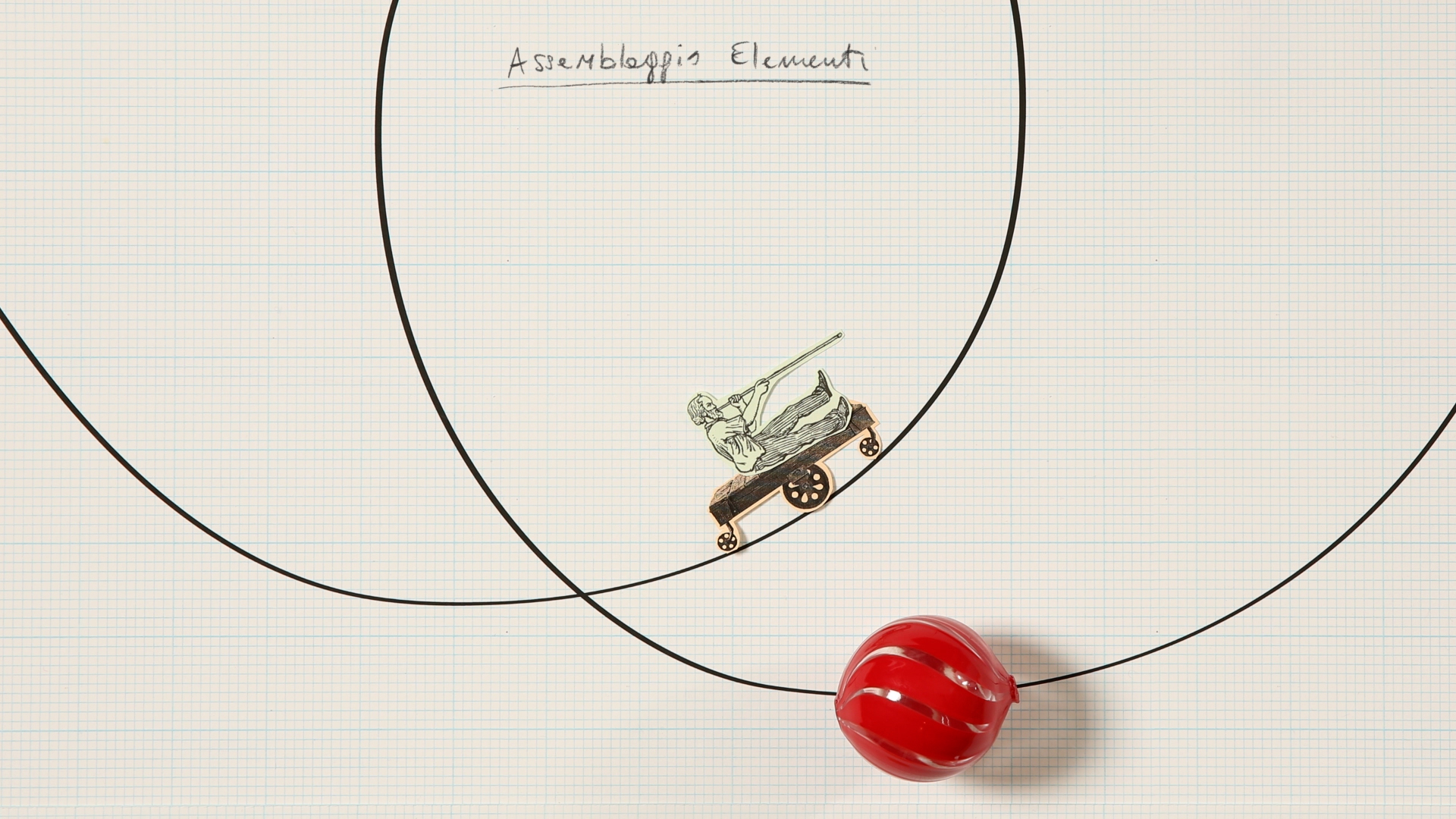
Clouds are a metaphor for our mental projections, in which earthly themes are transfigured into a universal dimension —journeys, desires, the unknown.
We designed the overall communication and the exhibition graphics with architect Massimo Ferrari for XNL Piacenza's Oltre le nuvole, a celebration of the sky through an art exhibition, a theatrical triptych, and a sound journey dedicated to the contemporary imagery of the sky and its metamorphoses.
We designed the overall communication and the exhibition graphics with architect Massimo Ferrari for XNL Piacenza's Oltre le nuvole, a celebration of the sky through an art exhibition, a theatrical triptych, and a sound journey dedicated to the contemporary imagery of the sky and its metamorphoses.
XNL PIACENZA — OLTRE LE NUVOLE
for: XNL Piacenza, Fondazione di Piacenza e Vigevano
team: Alessandro C. Busseni, Ginevra Ceccarani, Giada Fiorenza, Giada Germanò
installation views by Daniele Signaroldi


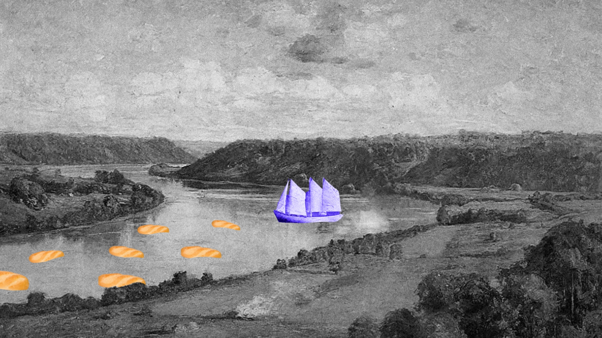
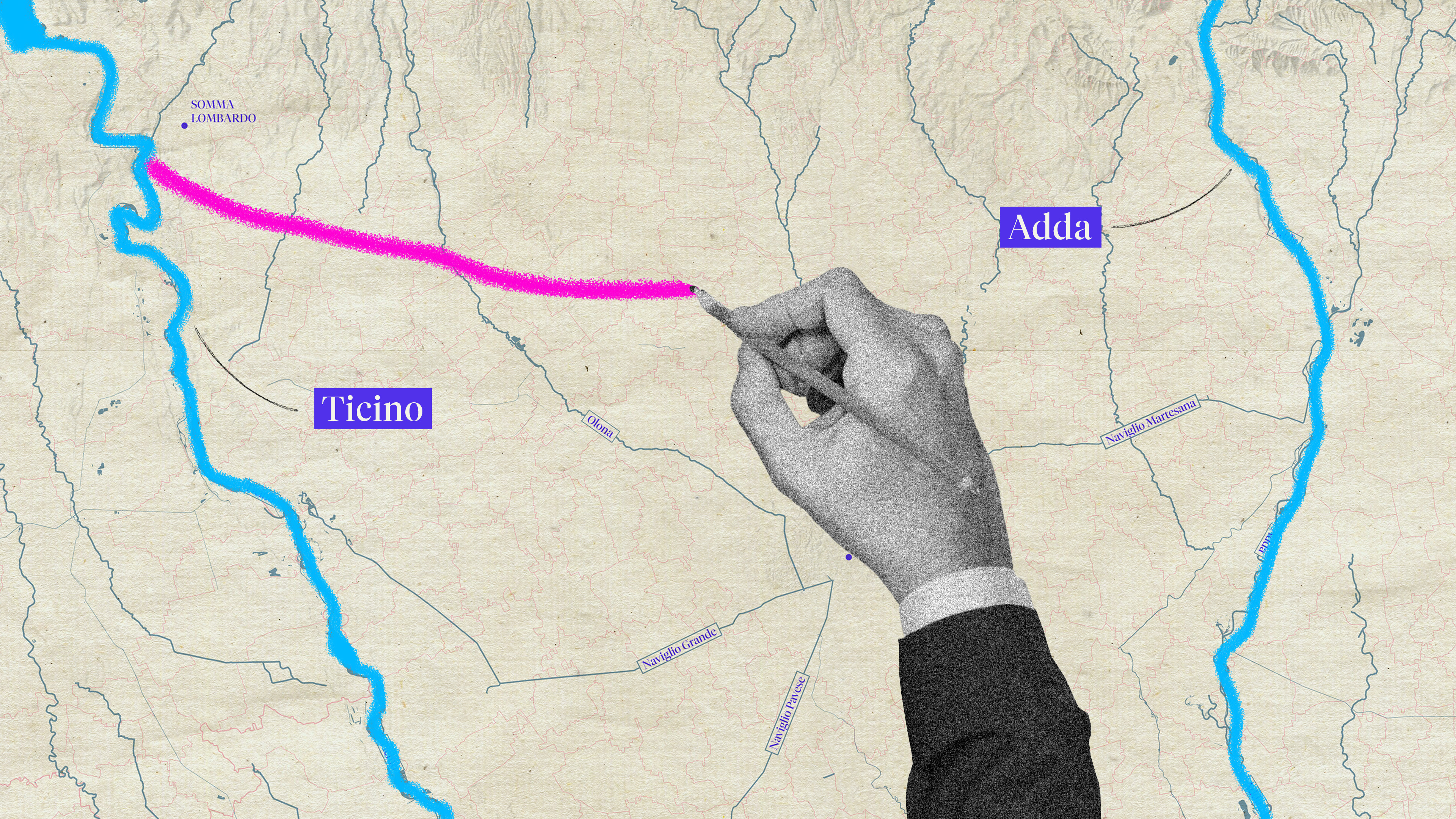
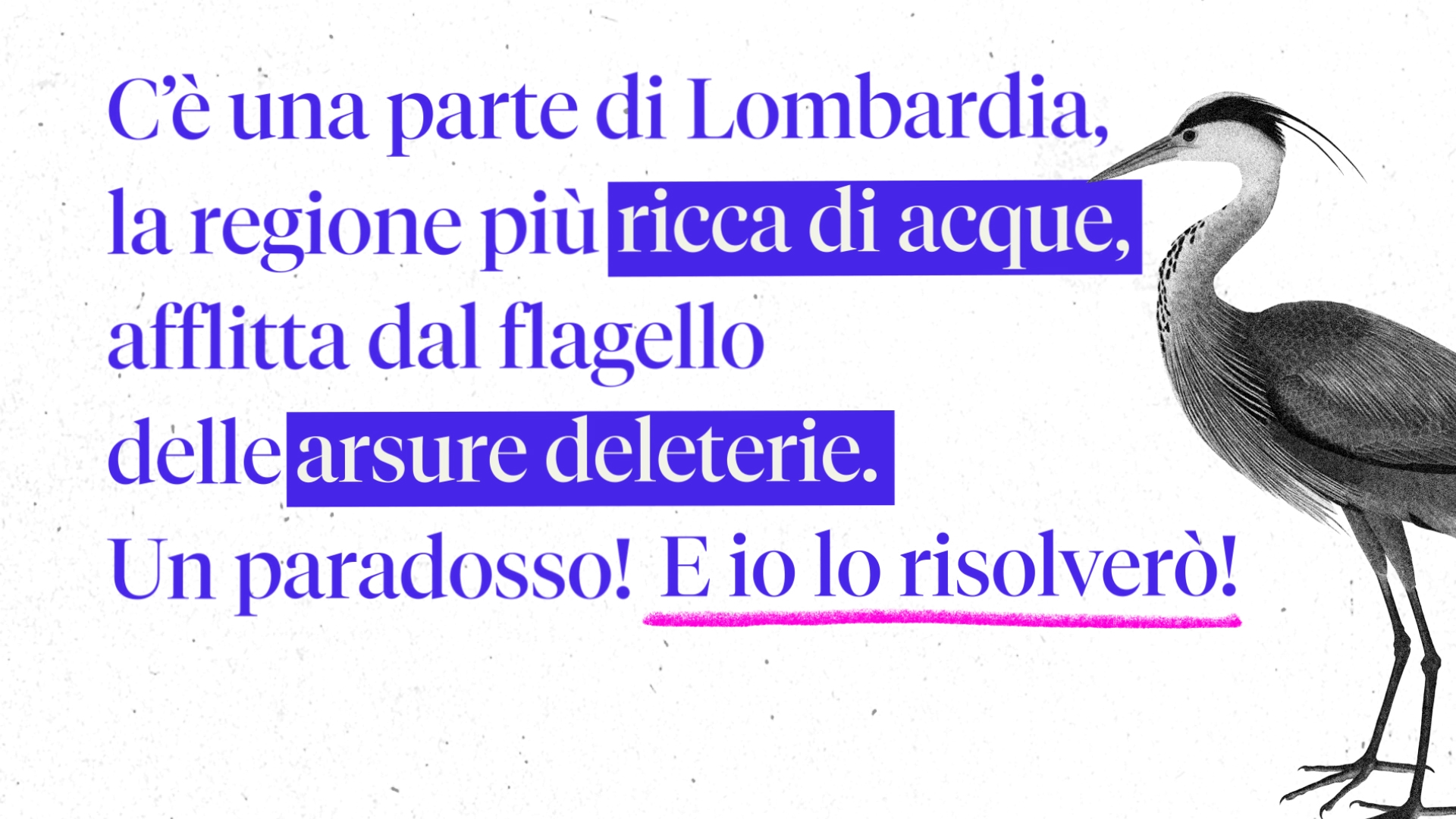
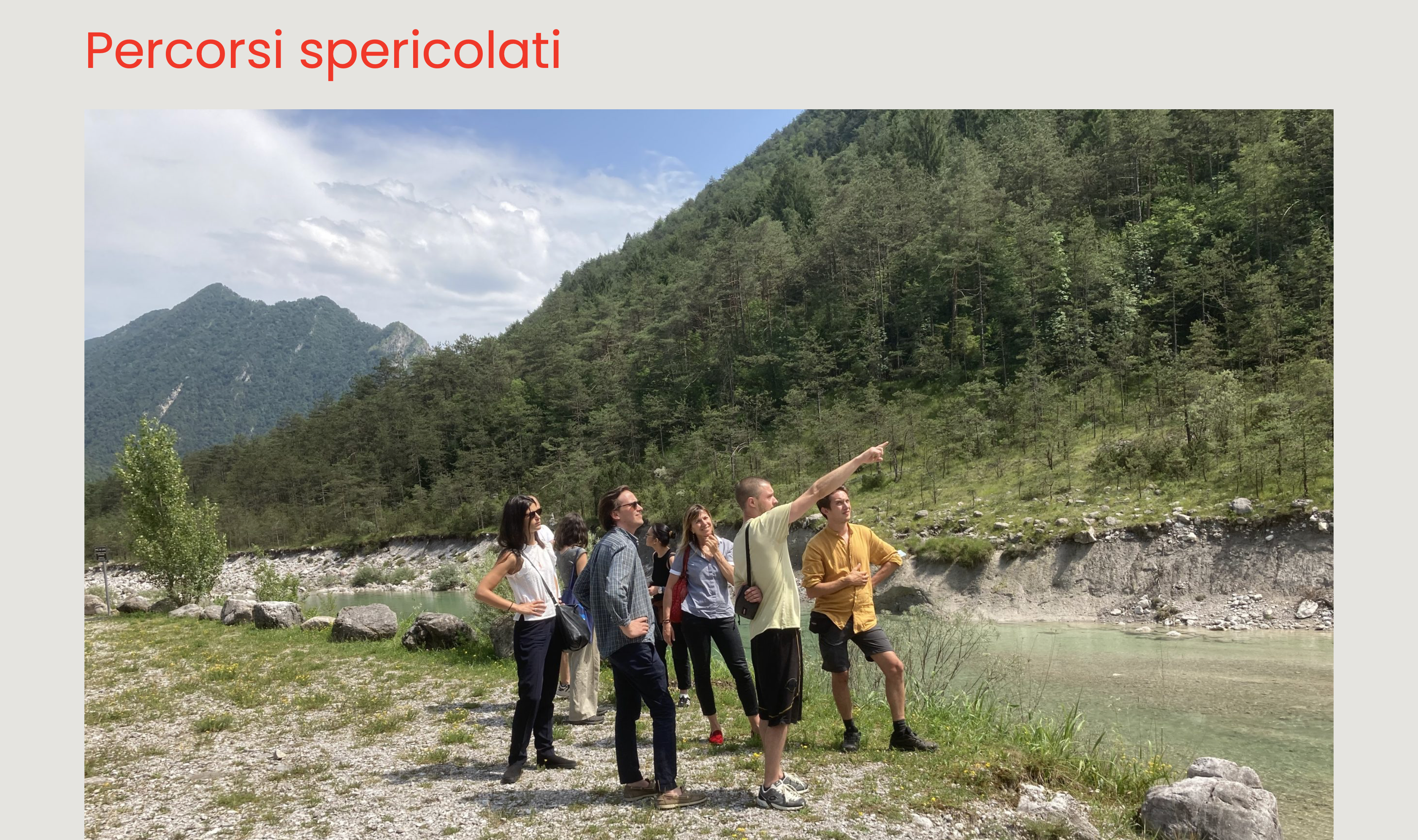
discovered how best to make use of the water flowing through a cornfield
Lombardy is home to one of the most complex and fascinating artificial water systems in Europe — a vast network of canals connecting the Ticino and Adda rivers through the main Villoresi channel. A living infrastructure, centuries in the making.
Together with Consorzio Est Ticino Villoresi, the Agronomy Research Hub of the University of Milan, and with the support of Fondazione Cariplo, we produced a series of videos documenting years of research behind CSIS — a new certification system designed to improve and optimize surface irrigation, the method used across the secondary and tertiary canals derived from the Villoresi network.
The videos combine animation and documentary footage to tell the story of a system worth preserving — not just for agriculture, but for the entire Lombardy ecosystem it quietly sustains.


celebrates italian design worldwide
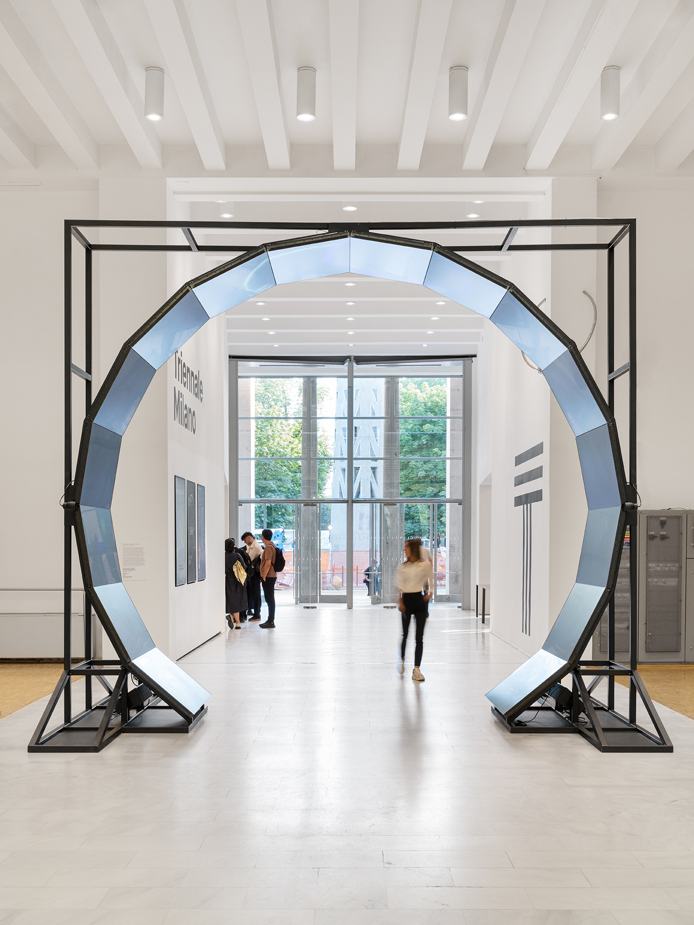
Italian Design Day is a series of cultural missions led by Italian designers, architects, curators, journalists and thinkers in more than 100 different cities around the world to talk about Italian design to local communities of professionals, diplomats or simply design lover. This year theme “Redesign — Regenerating spaces, objects, ideas, relations” required and abstract and dynamic interpreation that we developed through a delicate yet bold visual approach not to overload all the design testimonials’ own interpretation.
Visit ︎ italiandesignday-official.it
Visit ︎ italiandesignday-official.it
ITALIAN DESIGN DAY
for: Ministero degli Affari Esteri e dalla Cooperazione Internazionale, Ministero della Cultura
with: Triennale Milano
team: Pierluigi Anselmi, Pietro Buffa, Alessandro C. Busseni, Laura Bortolotti, Giada Fiorenza, Marco Gabriele, Giada Germanò


︎
Alongside the visual identity and main application we interviewed some of the testimonials before their mission to feed the conversation about Italian design
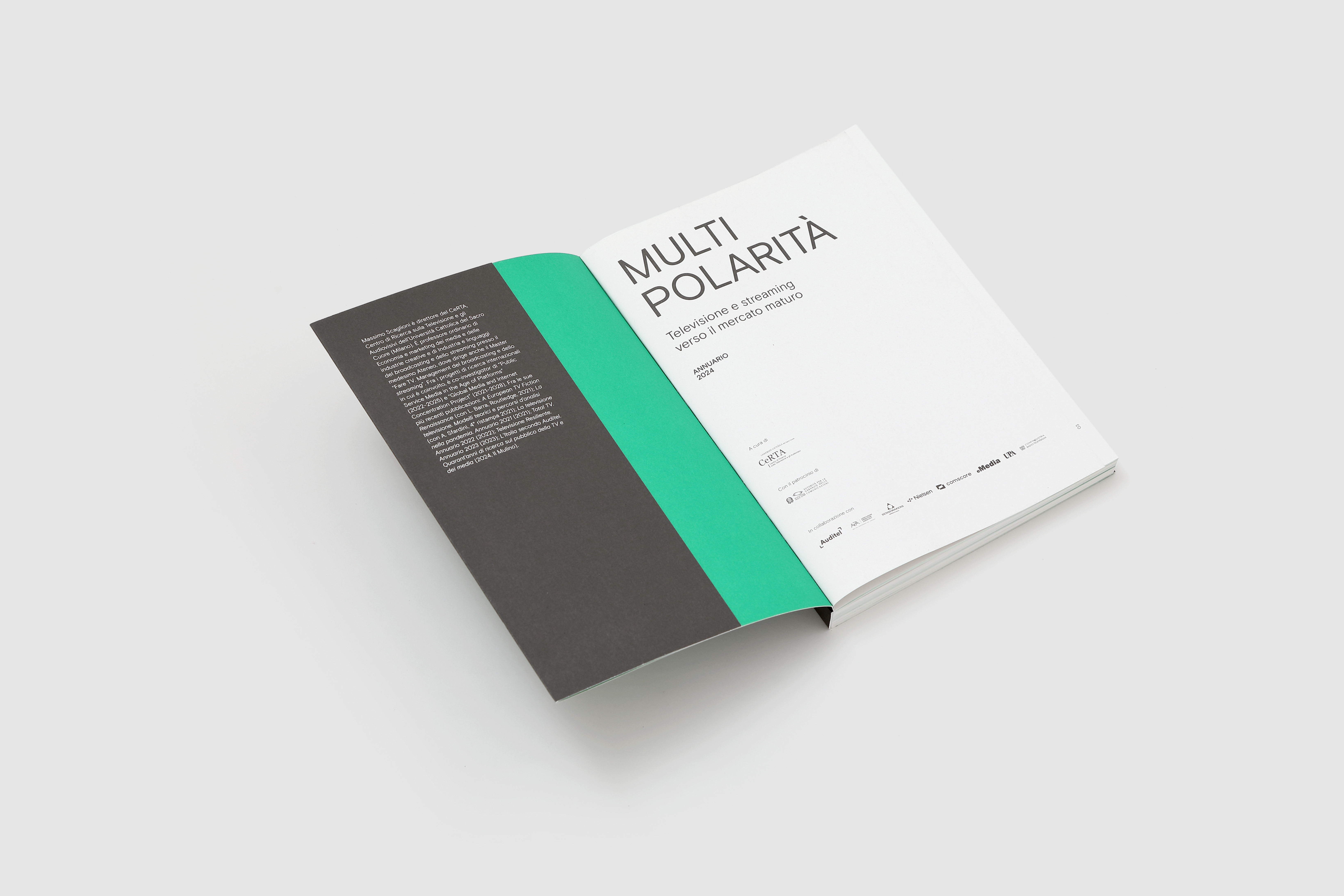
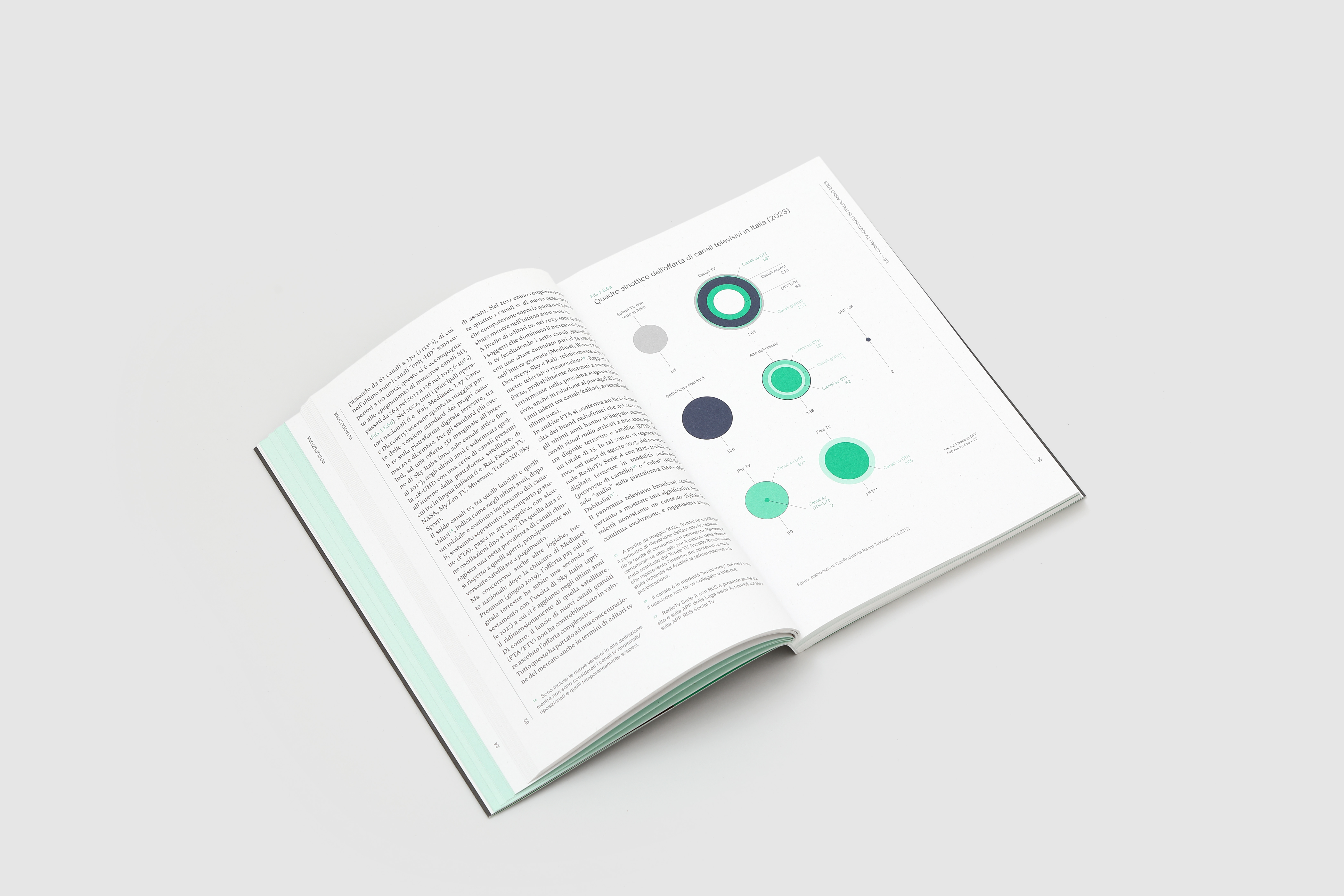
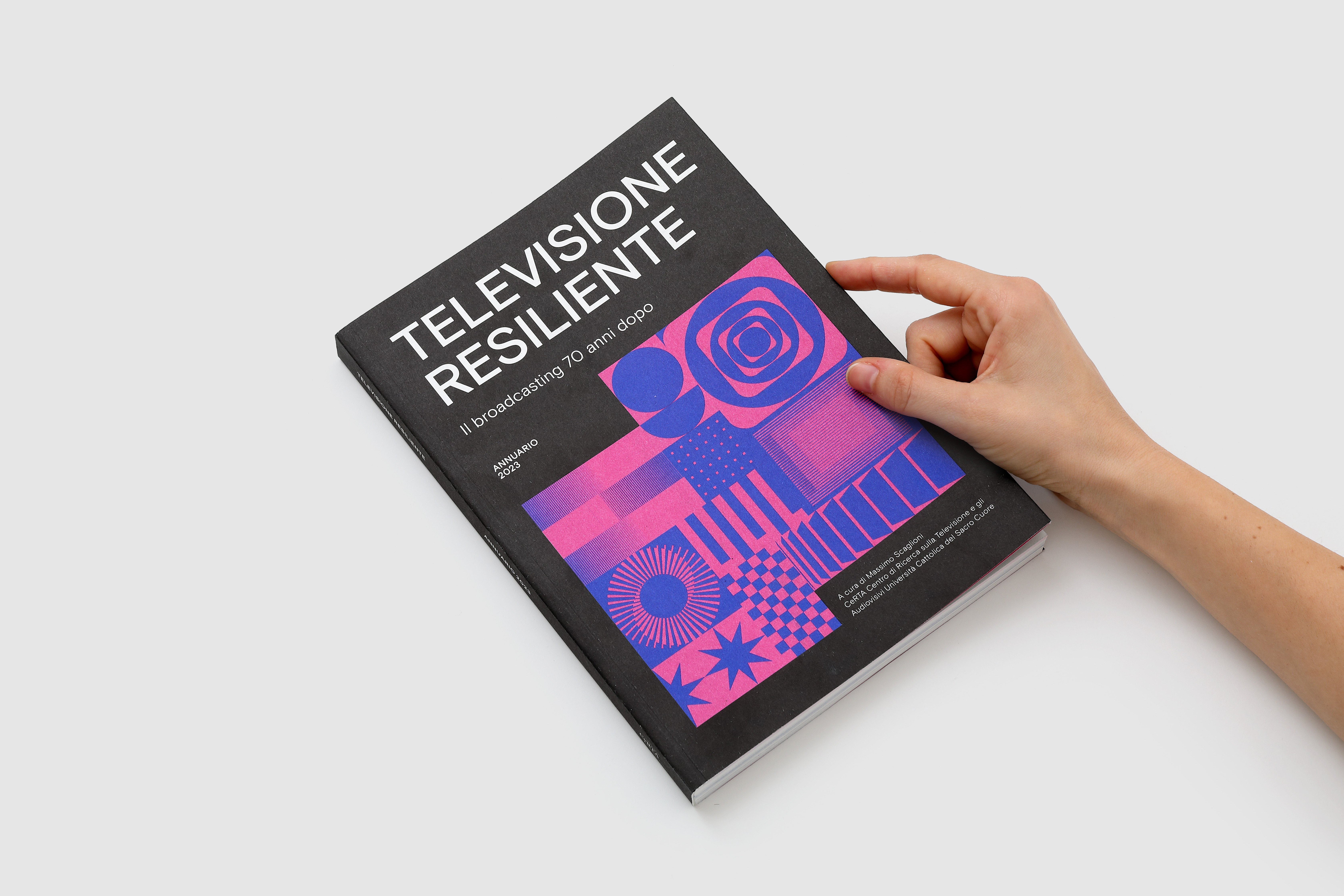
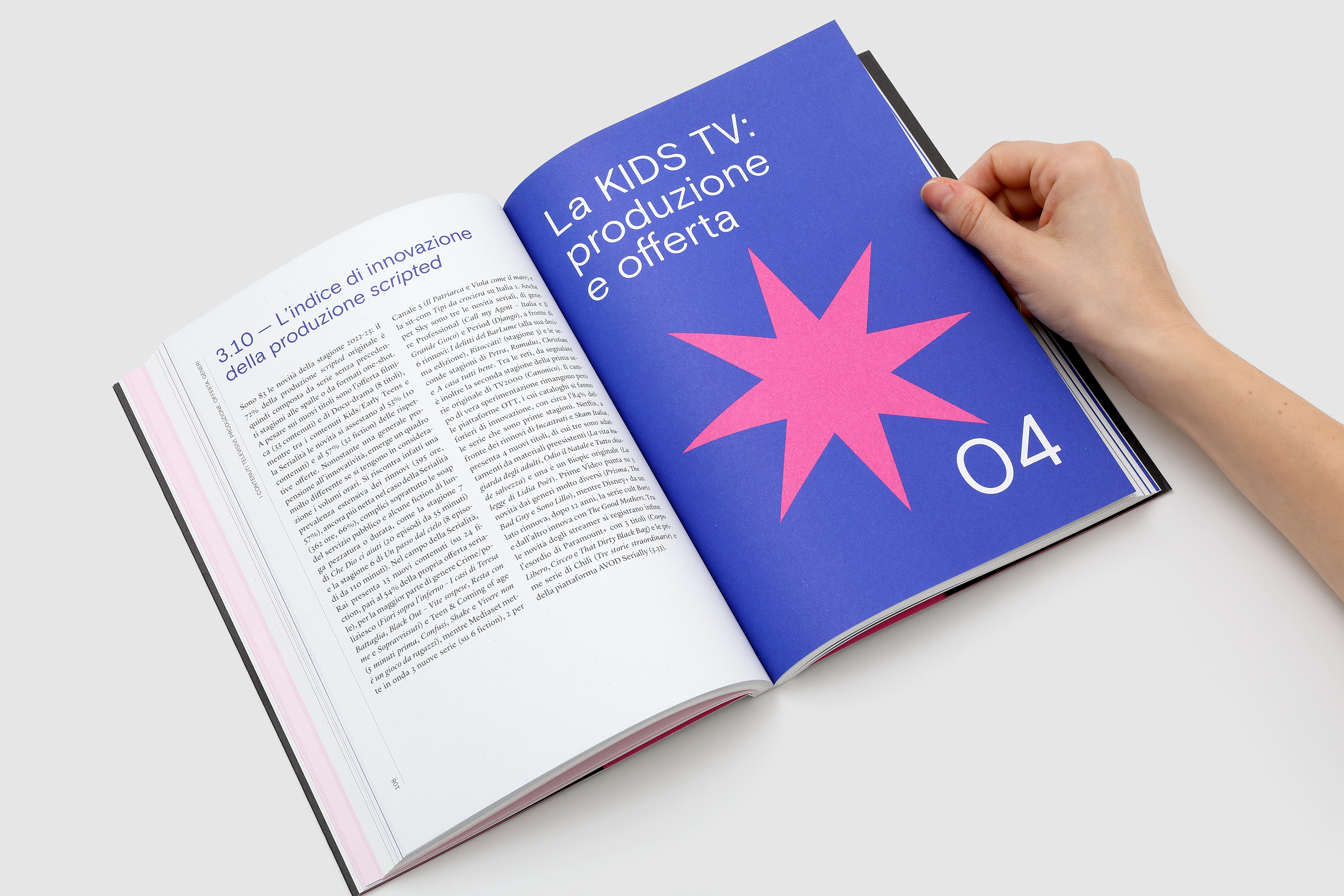
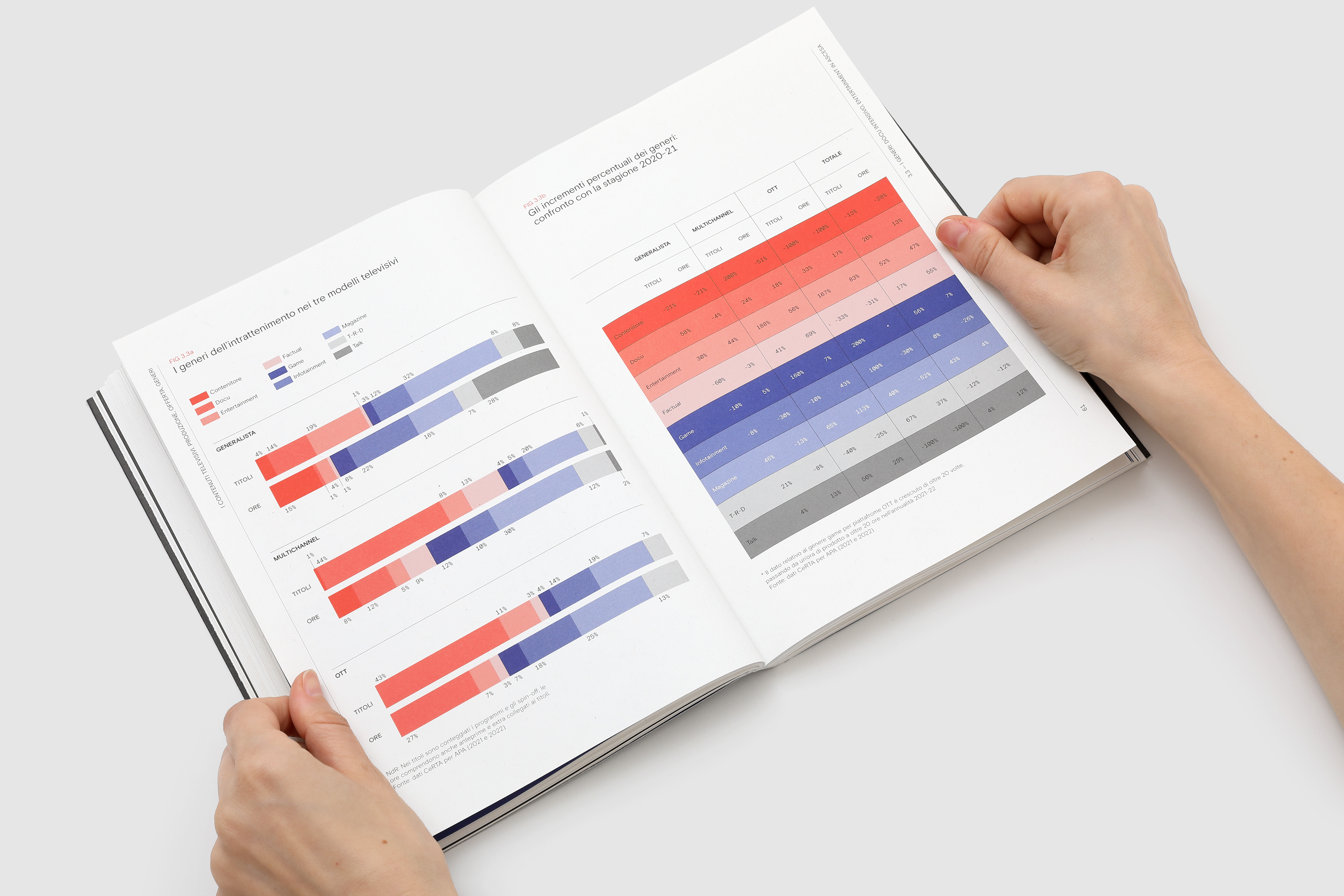
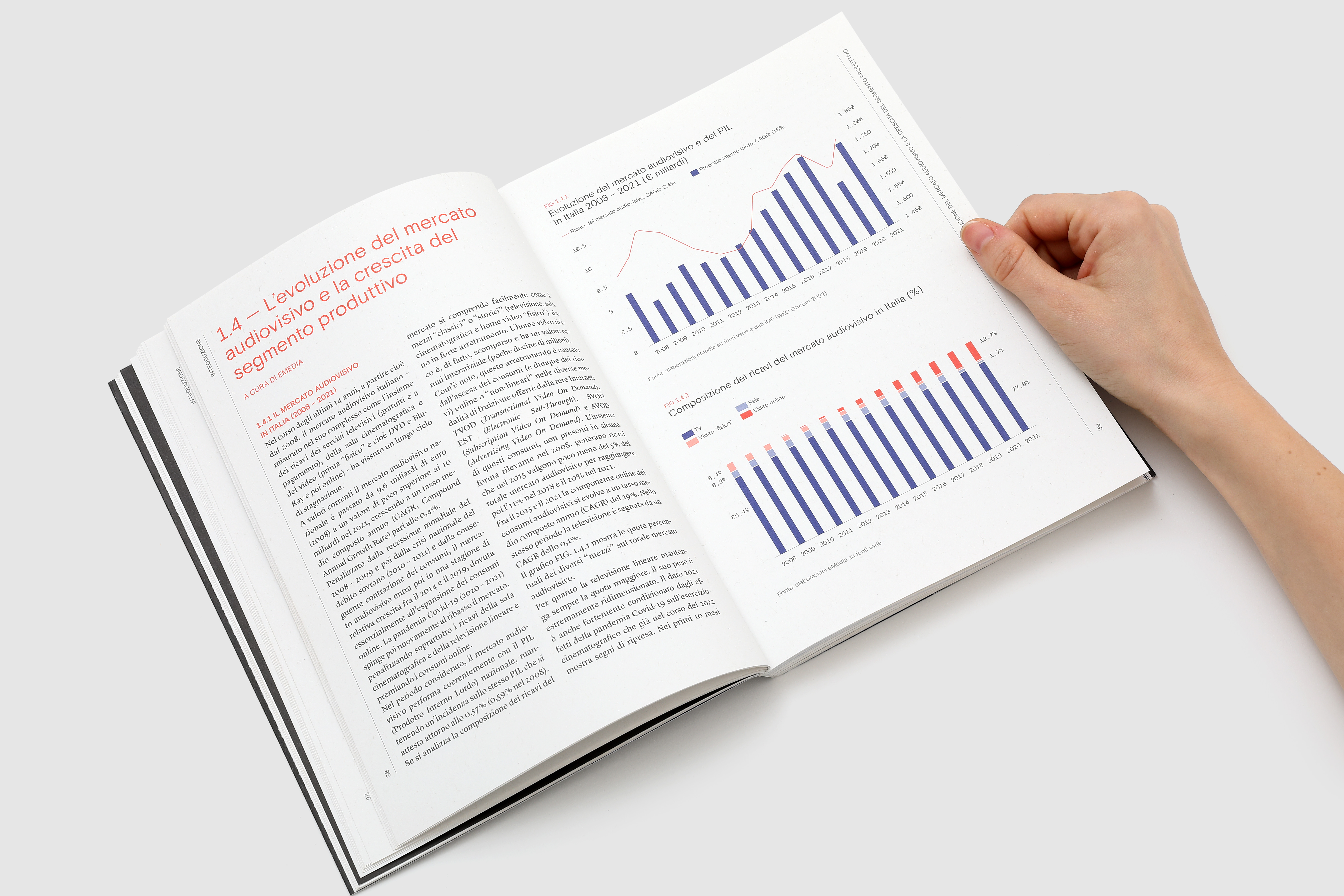
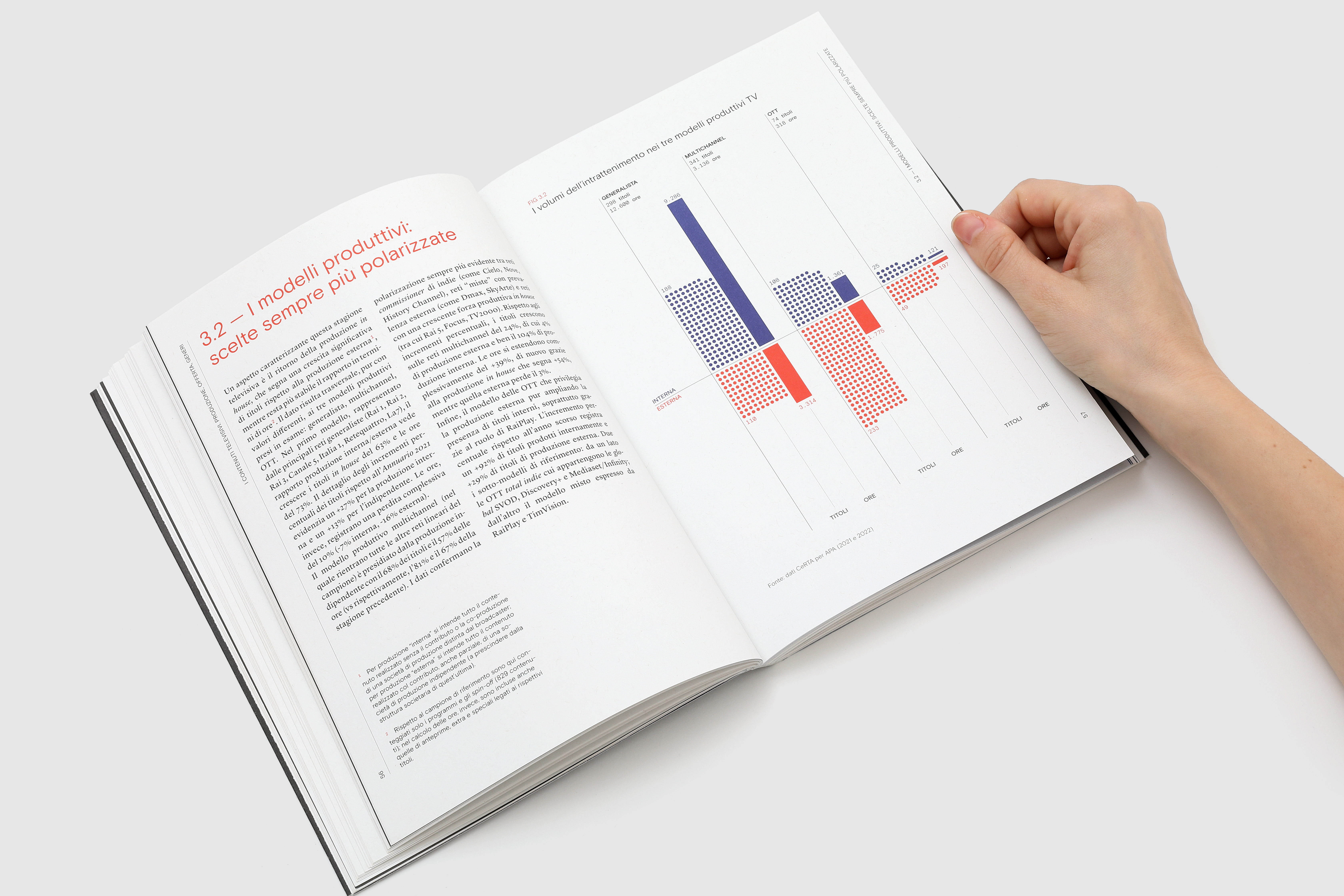
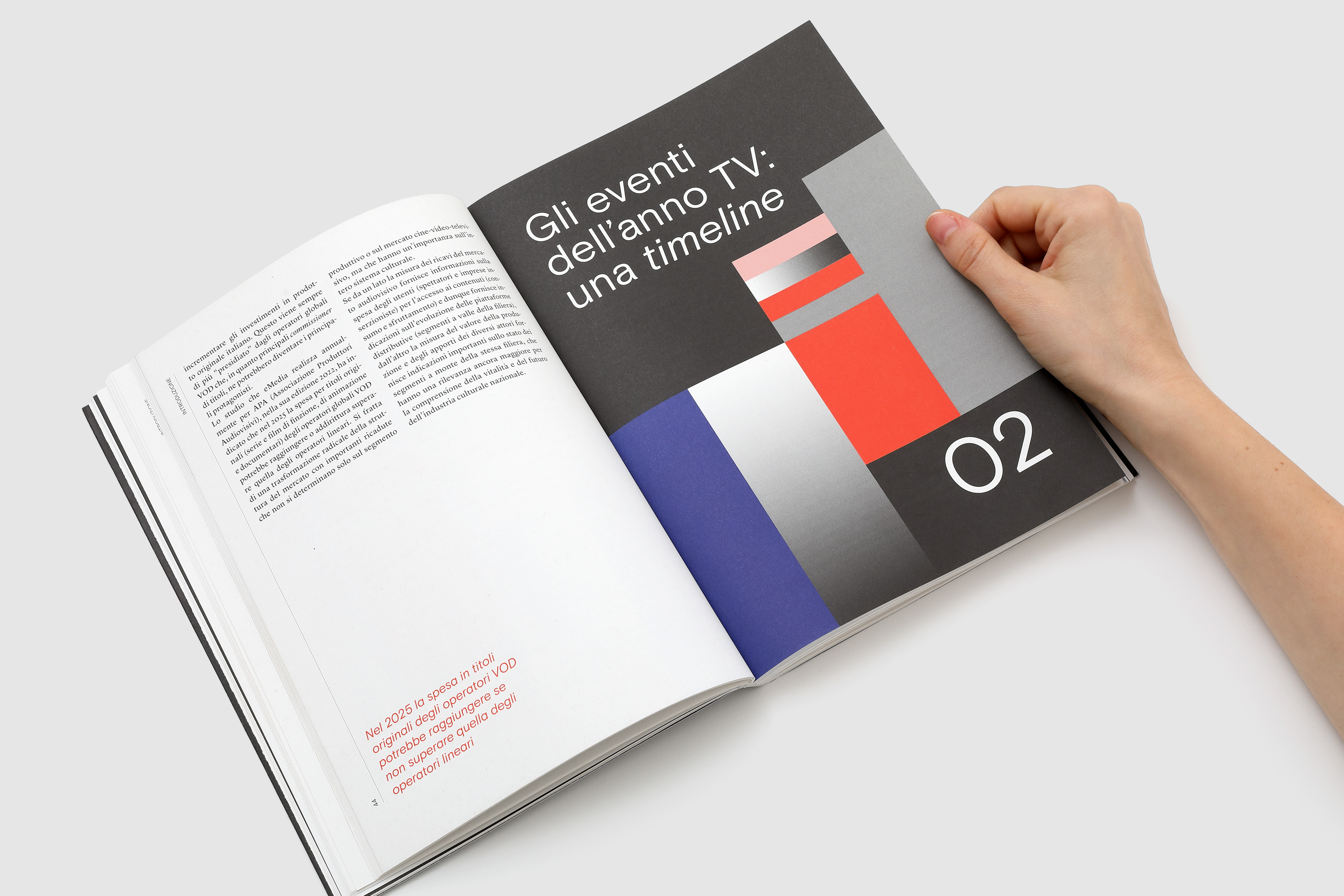
displays three years of Italian television
A box set containing 3 books: “Total TV”, “Televisione resiliente” and “Multipolarità” for Università Cattolica del Sacro Cuore - Audiovisual Research Department (CeRTA) uses data to understand the current shifts in television production and consumption. The annual publication we have been working on since 2022 by Massimo Scaglioni, is home to more than 240 dataviz that paint a picture of the current state of italian tv industry from every angle.
ANNUARIO DELLA TV
for: Università Cattolica del Sacro Cuore, C.e.R.T.A. Centro di Ricerca sulla Televisione e gli Audiovisivi
team: Pietro Buffa, Alessandro C. Busseni, Giacomo Quinland, Giada Fiorenza, Beatrice Savoldelli


︎
2024 - Multipolarità


︎
2023 - Televisione resiliente


︎
2022 - Total TV


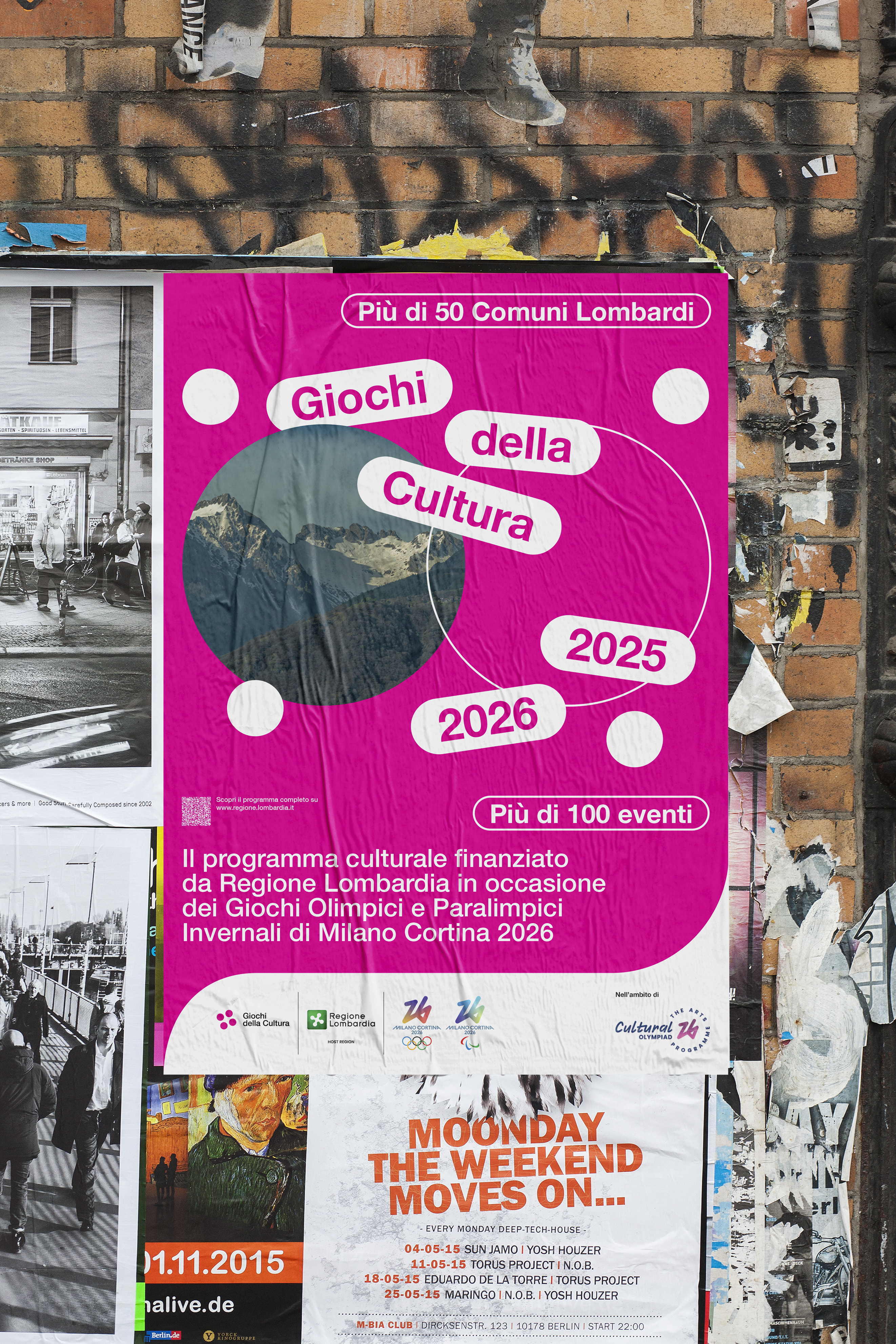
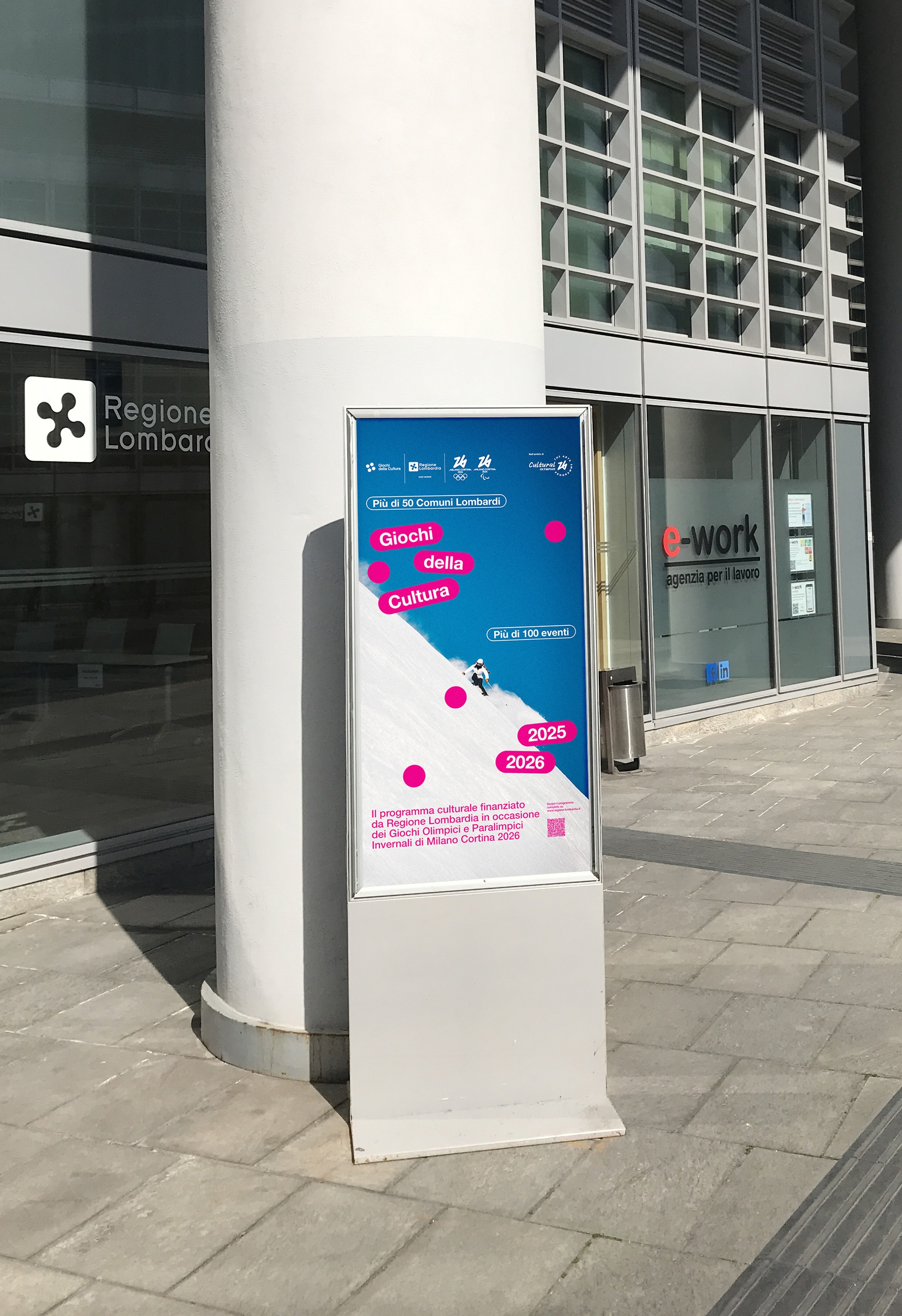
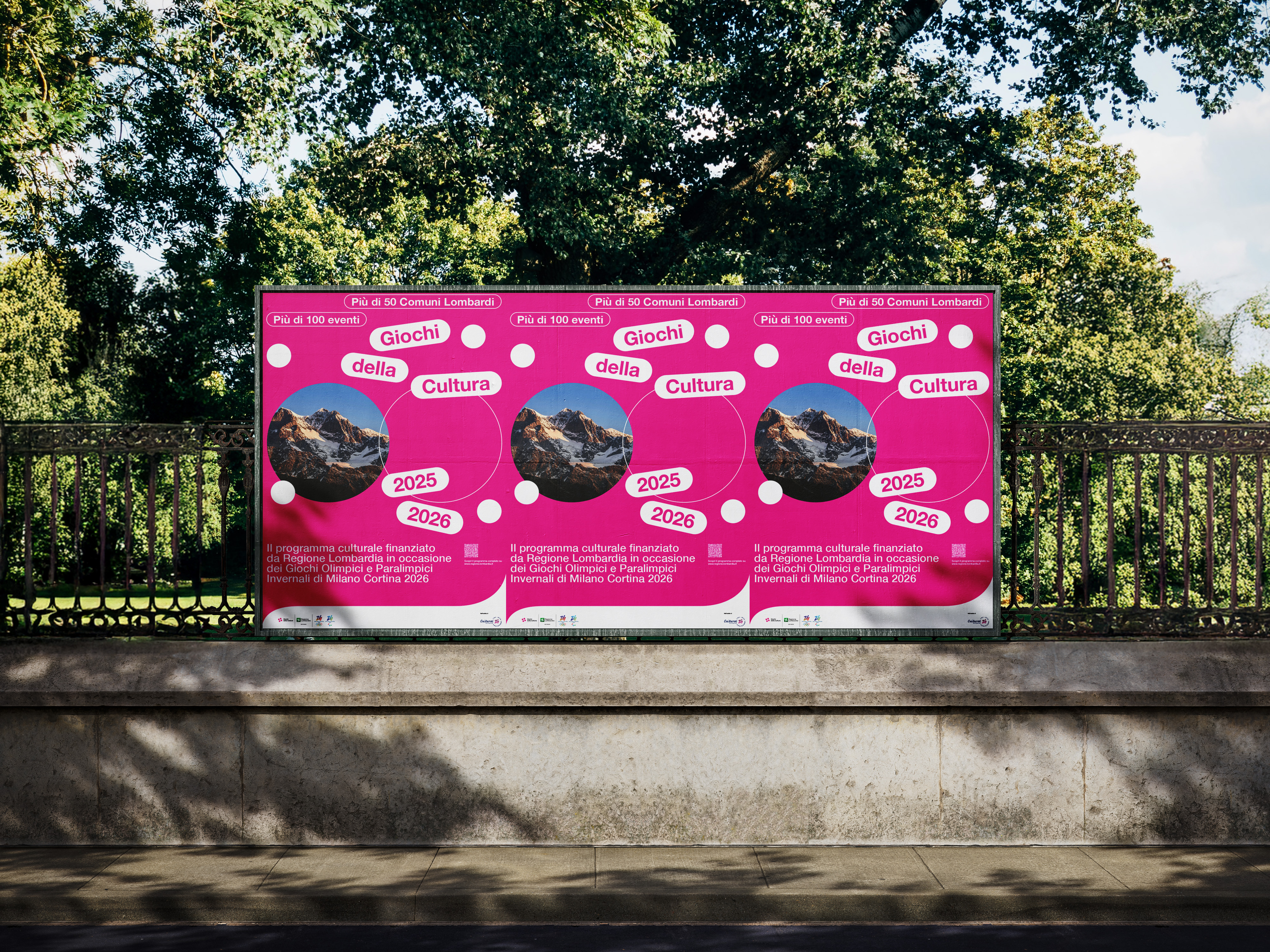
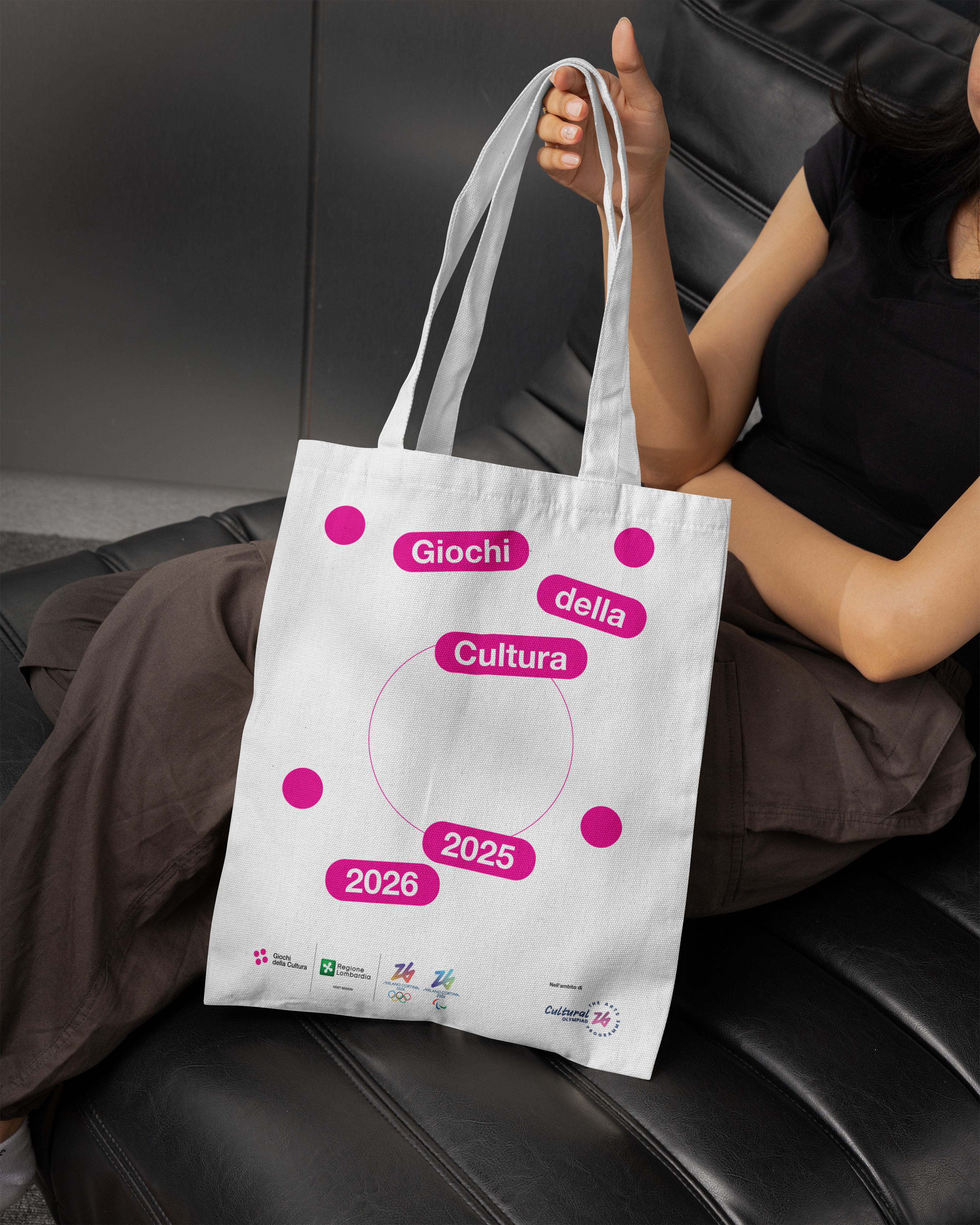
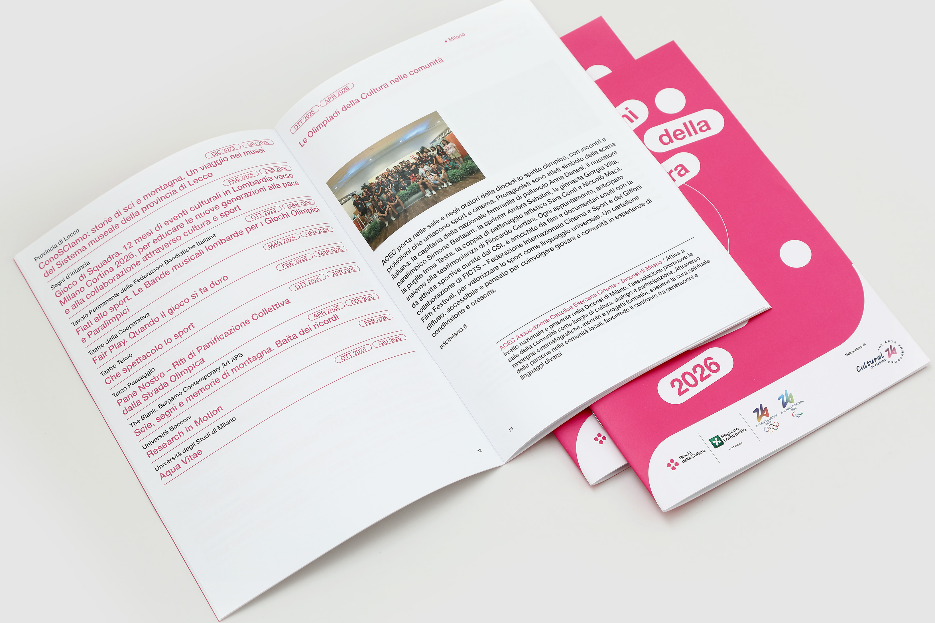
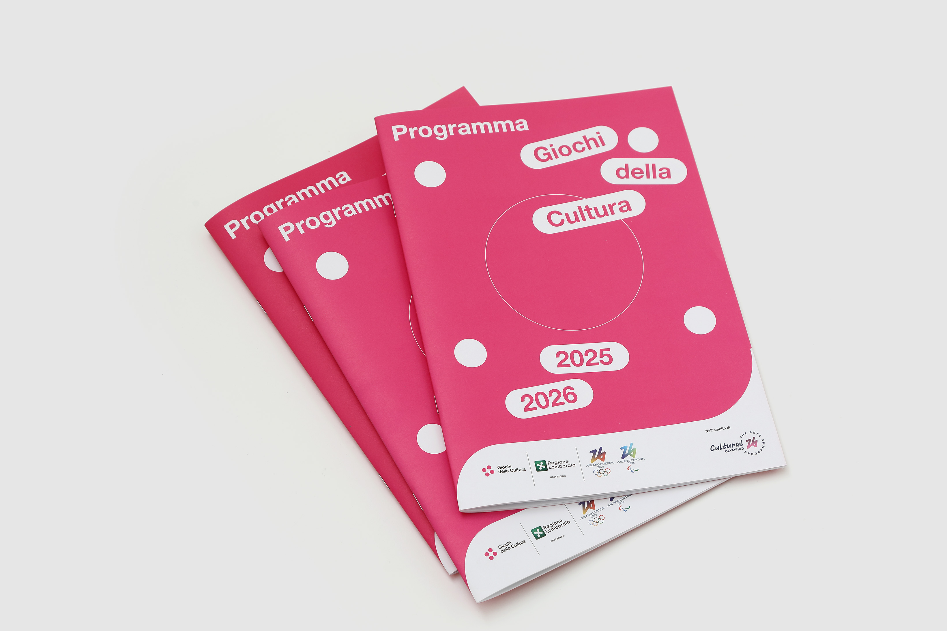
snowshoes from the Alps to the Po Valley
We designed, in collaboration with Triennale Milano, the identity and communication system for “Giochi della Cultura”, a programme of cultural activities founded by Regione Lombardia to promote culture, tradition, heritage and sports as part of the Winter Olympic Games’ collateral activities.
We reinterpreted Bruno Munari’s Rosa Camuna, turning it into a dynamic symbol driven by the power of colour—fluorescent pink—chosen in deliberate contrast to the Region’s institutional green. We also defined four key elements that anchor every application, acting as a bridge between the Region’s institutional identity and the bold, disruptive imagery of the Giochi.
We reinterpreted Bruno Munari’s Rosa Camuna, turning it into a dynamic symbol driven by the power of colour—fluorescent pink—chosen in deliberate contrast to the Region’s institutional green. We also defined four key elements that anchor every application, acting as a bridge between the Region’s institutional identity and the bold, disruptive imagery of the Giochi.
GIOCHI DELLA CULTURA 25-26
for: Regione Lombardia
with: Triennale Milano
team: Pierluigi Anselmi, Pietro Buffa, Alessandro C. Busseni, Laura Bortolotti, Giada Fiorenza, Marco Gabriele


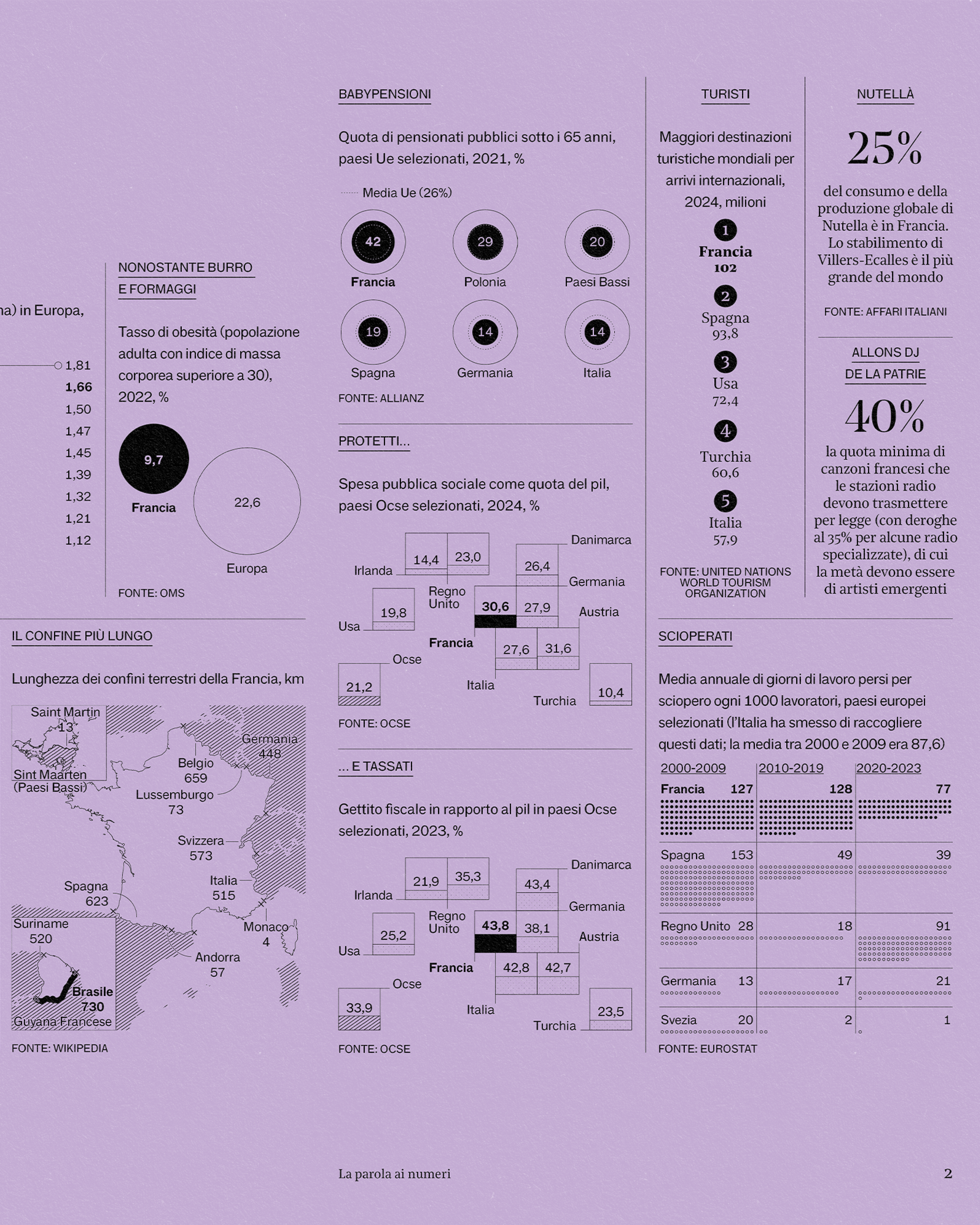
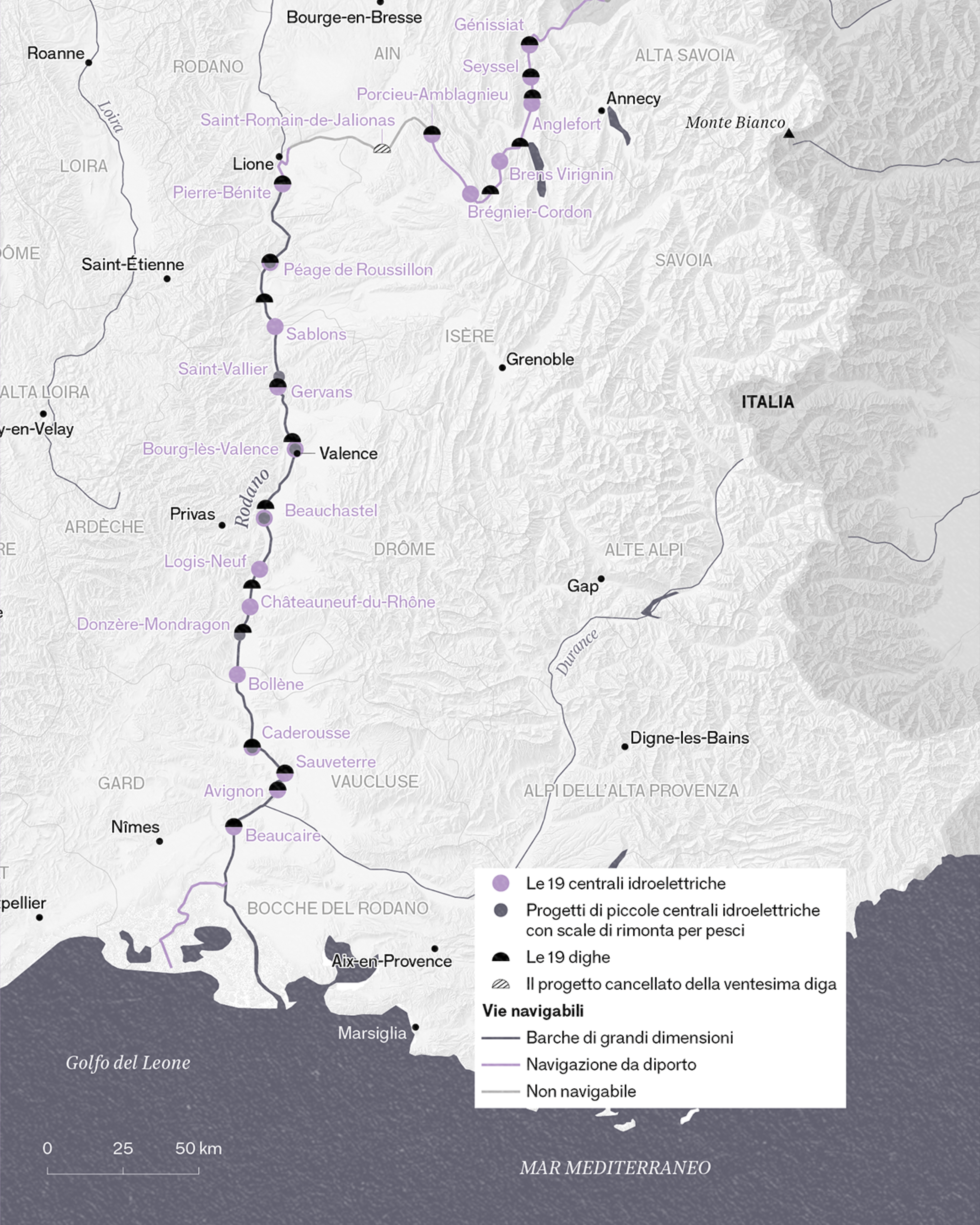
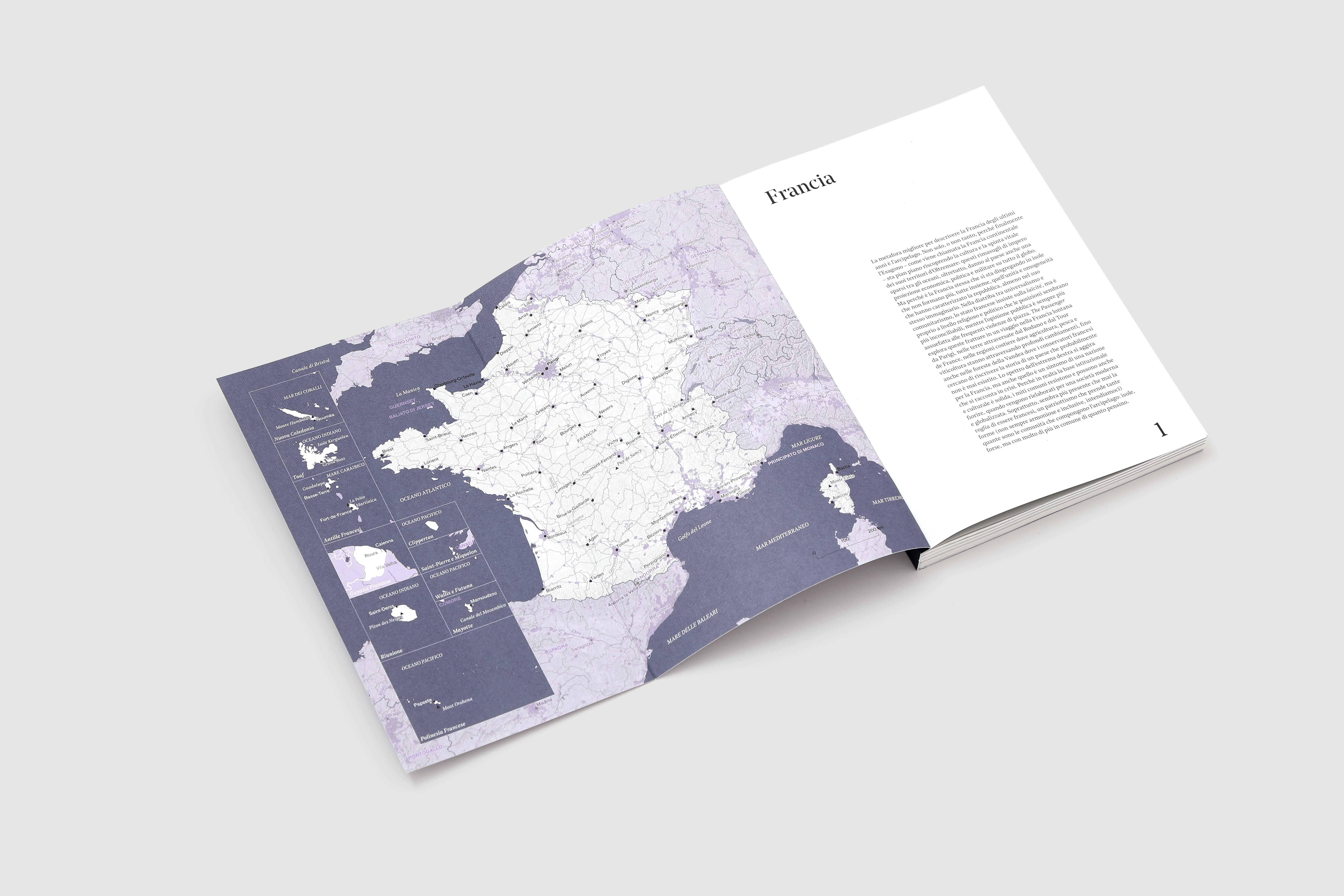
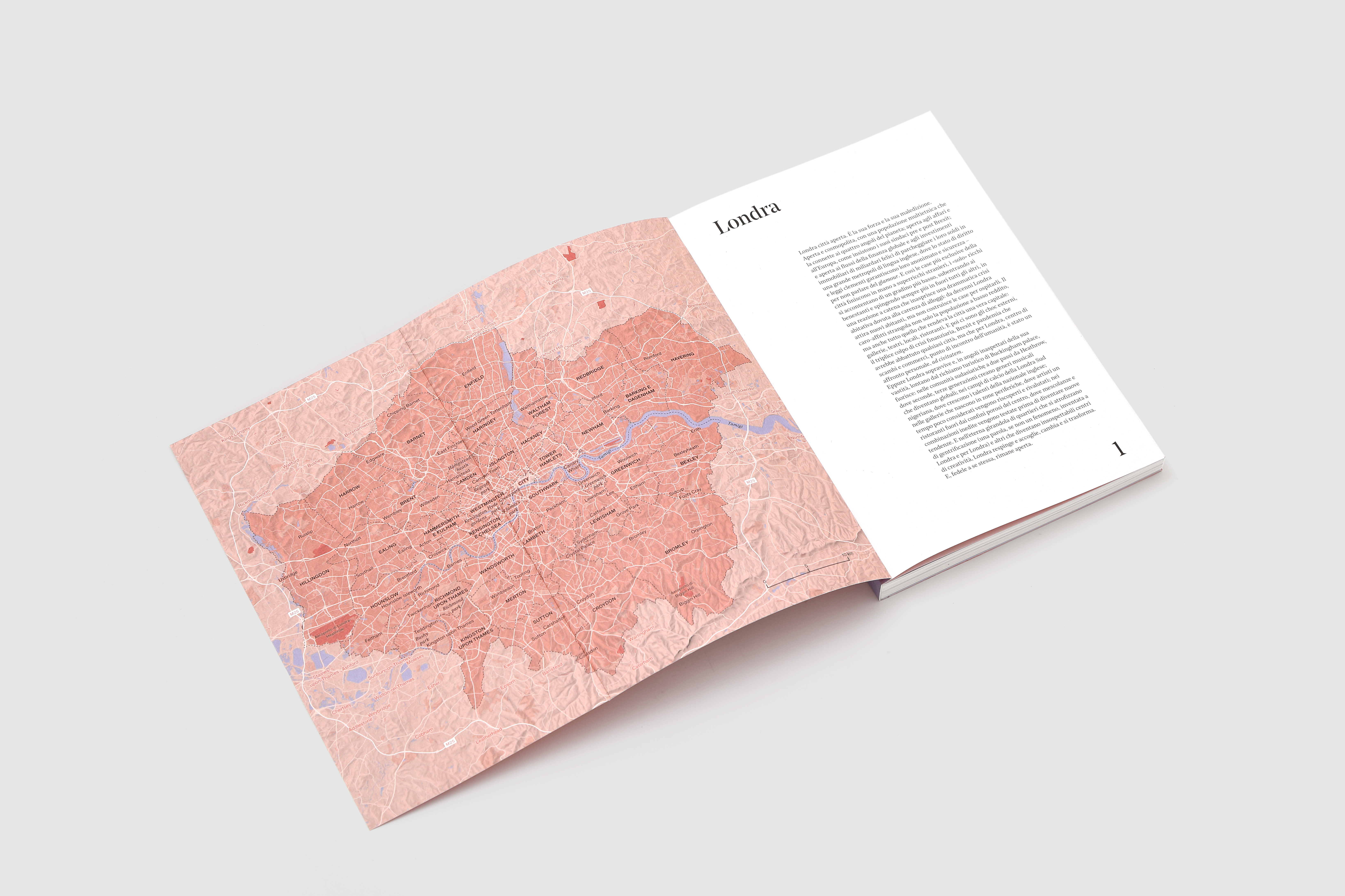
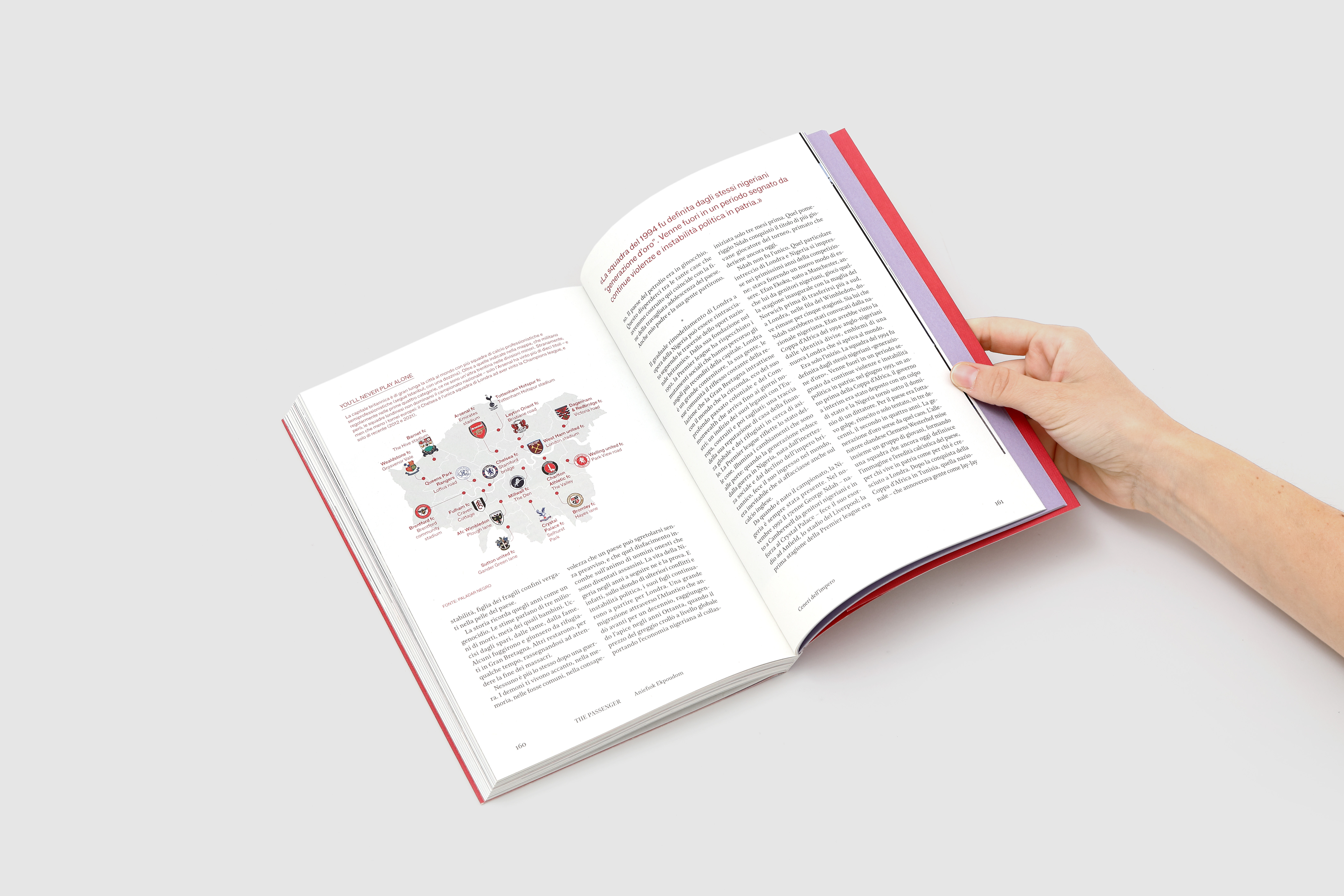
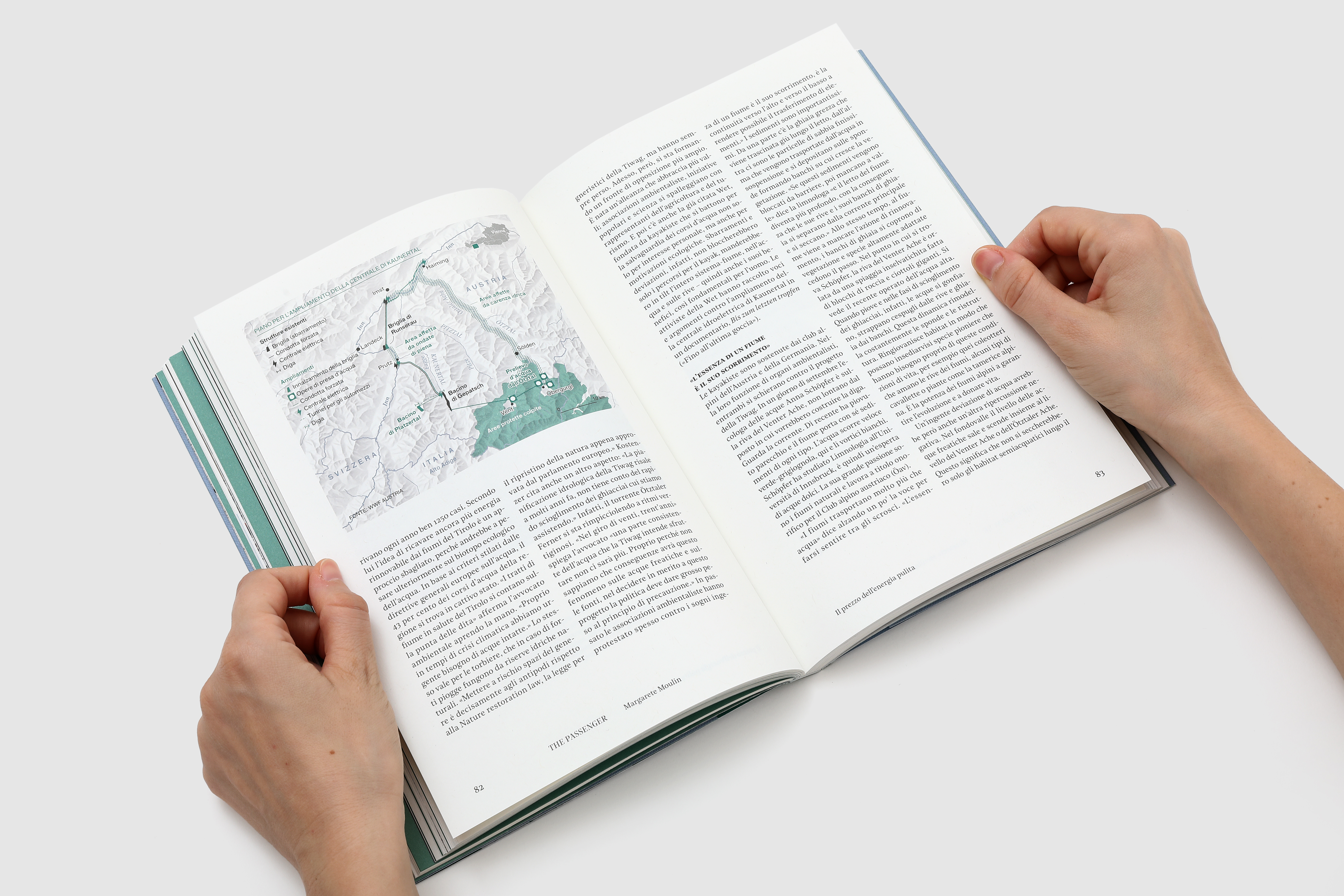
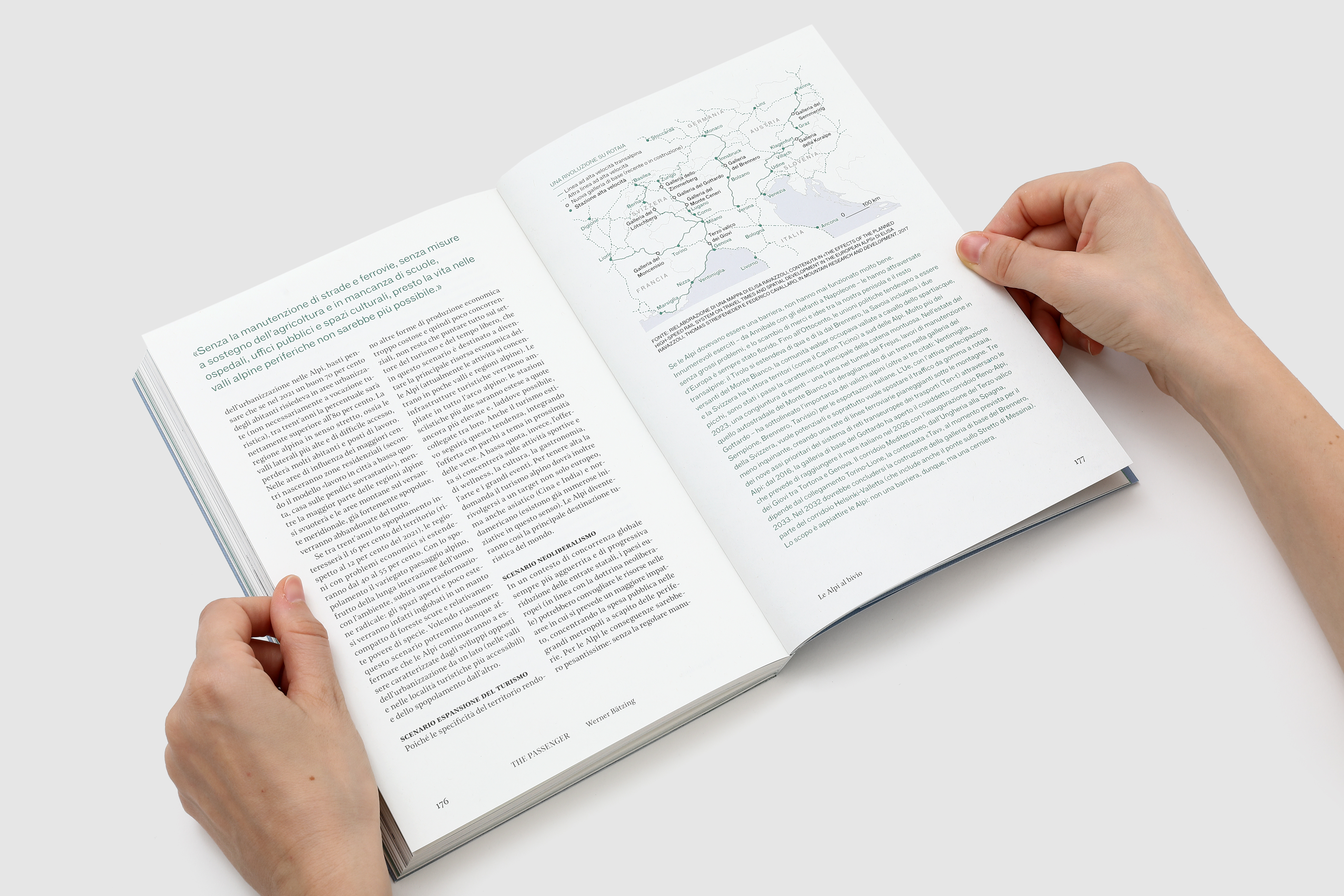
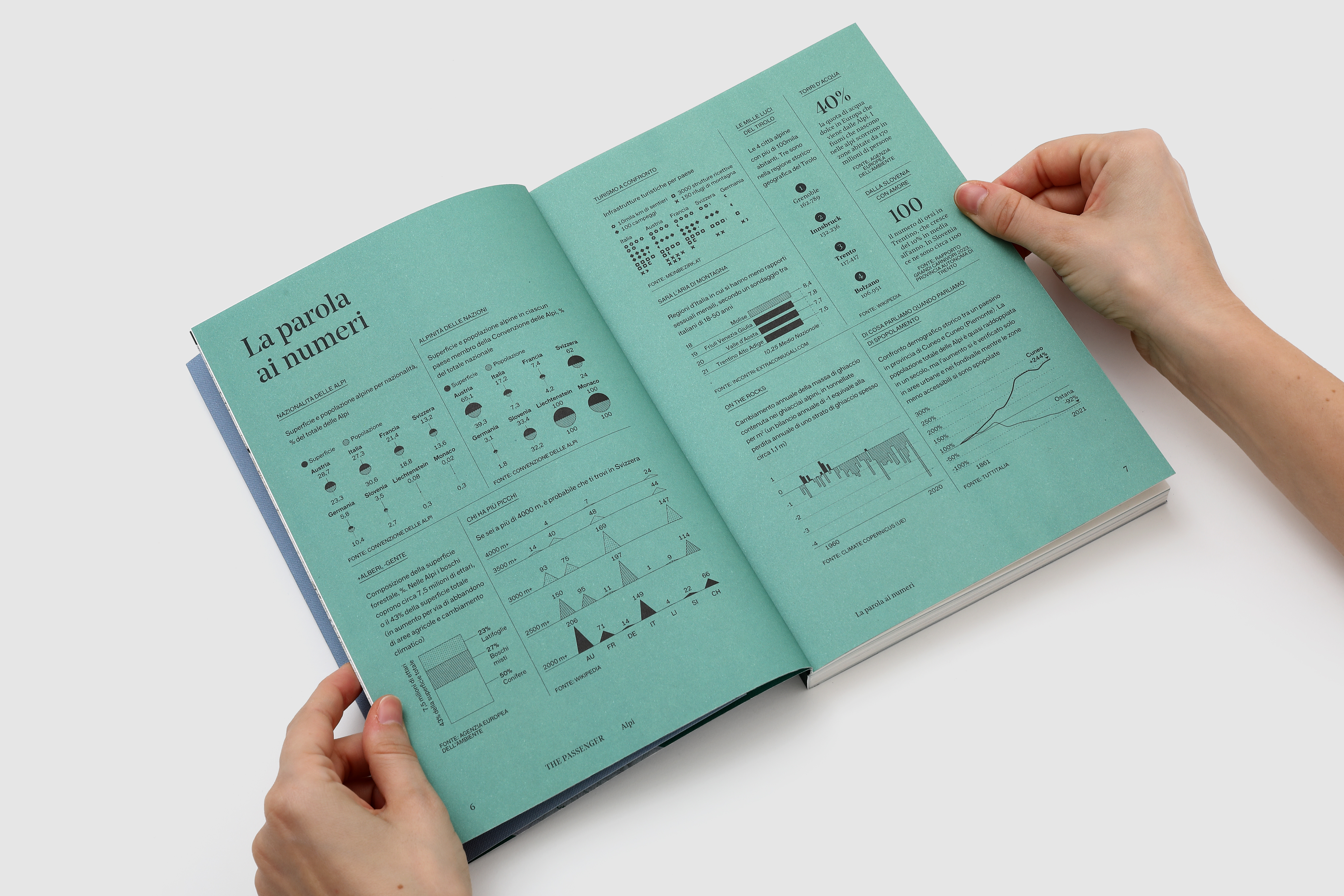
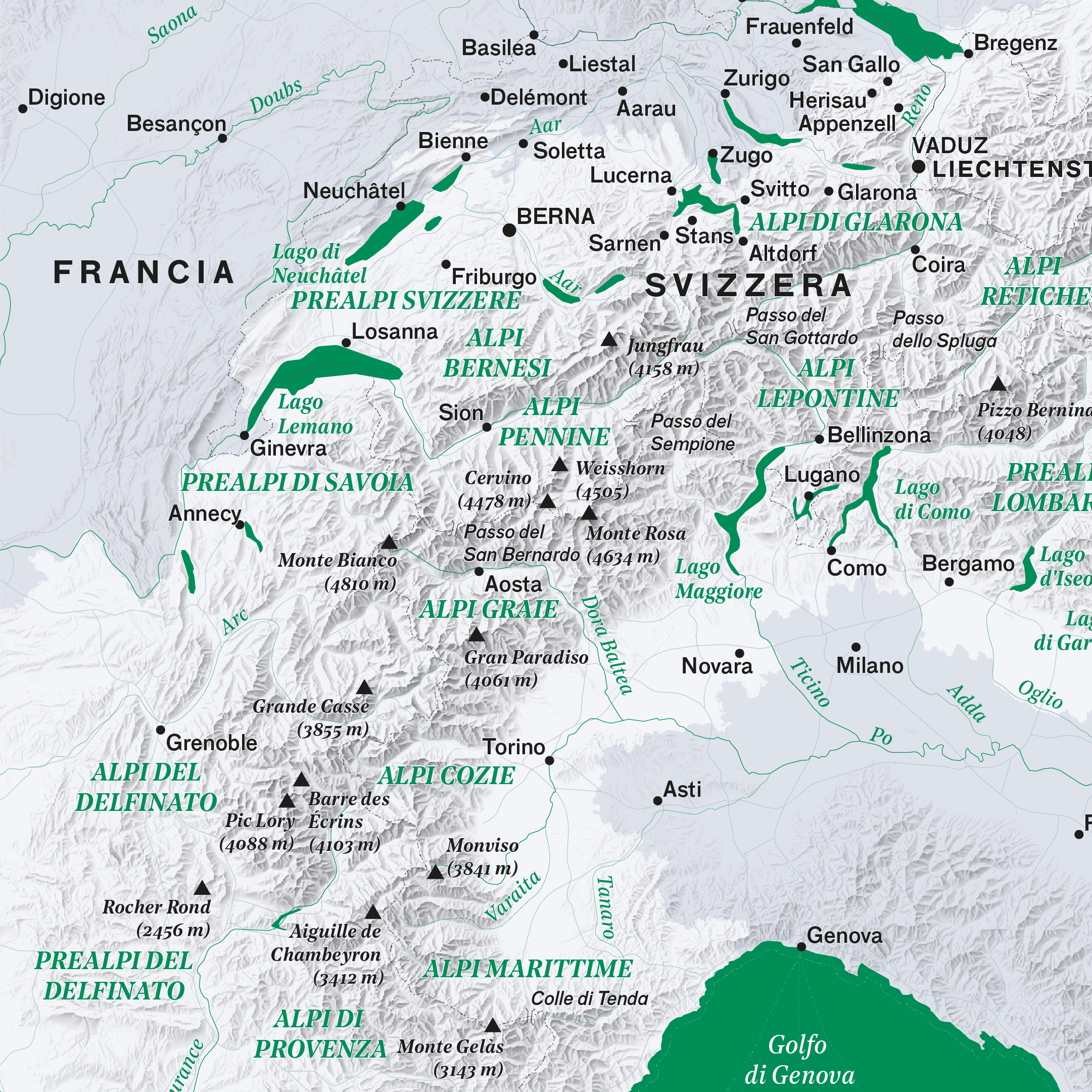
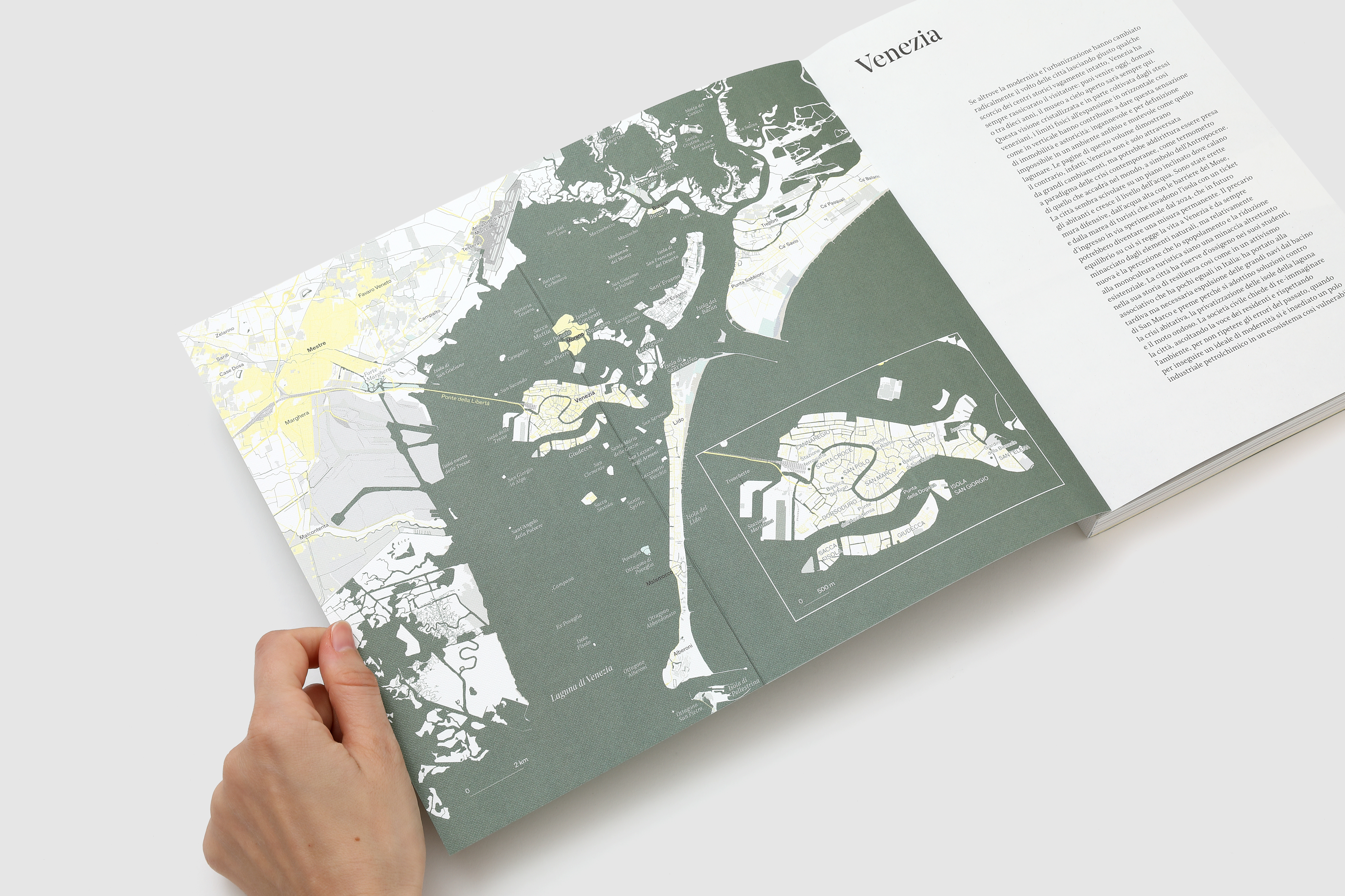
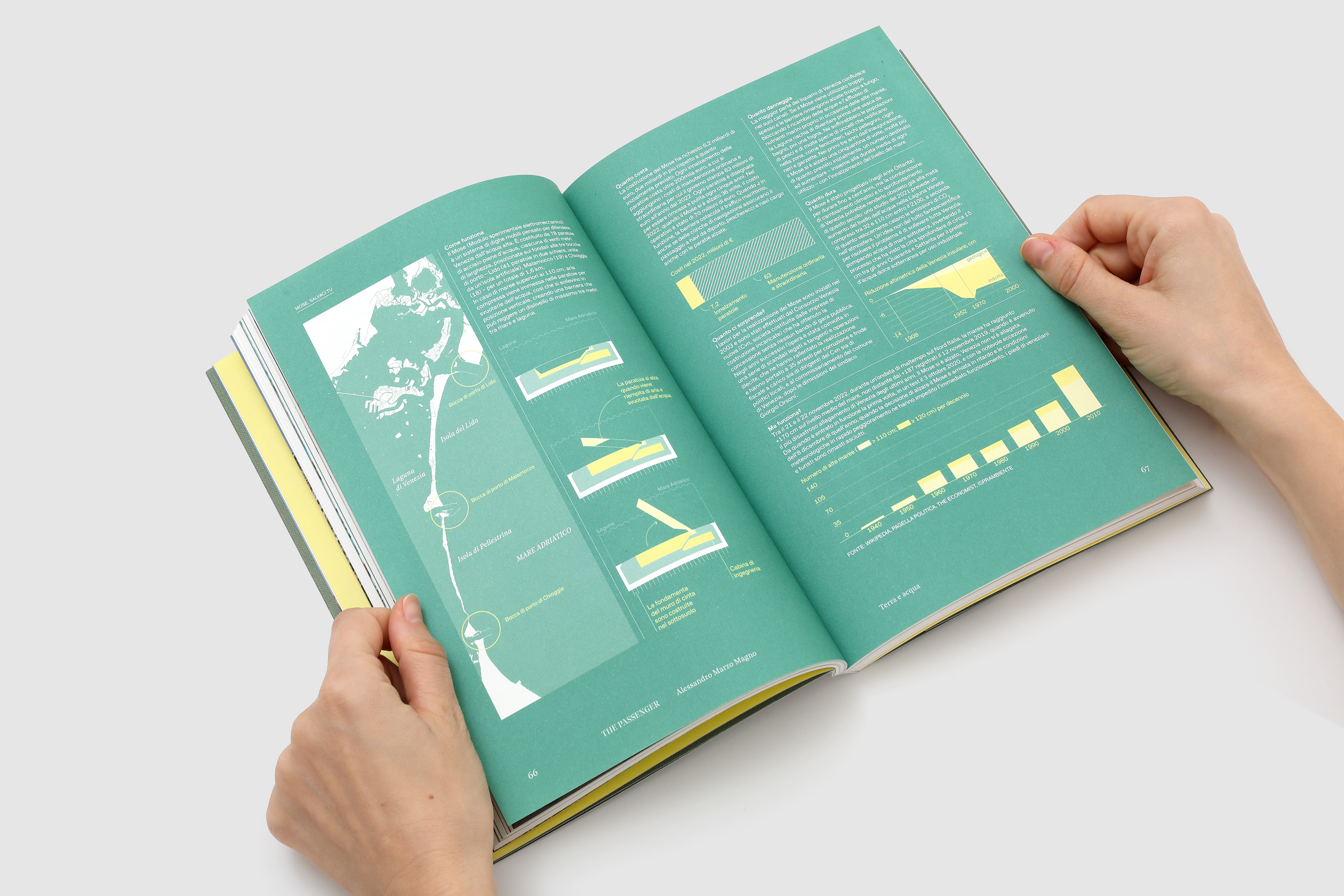
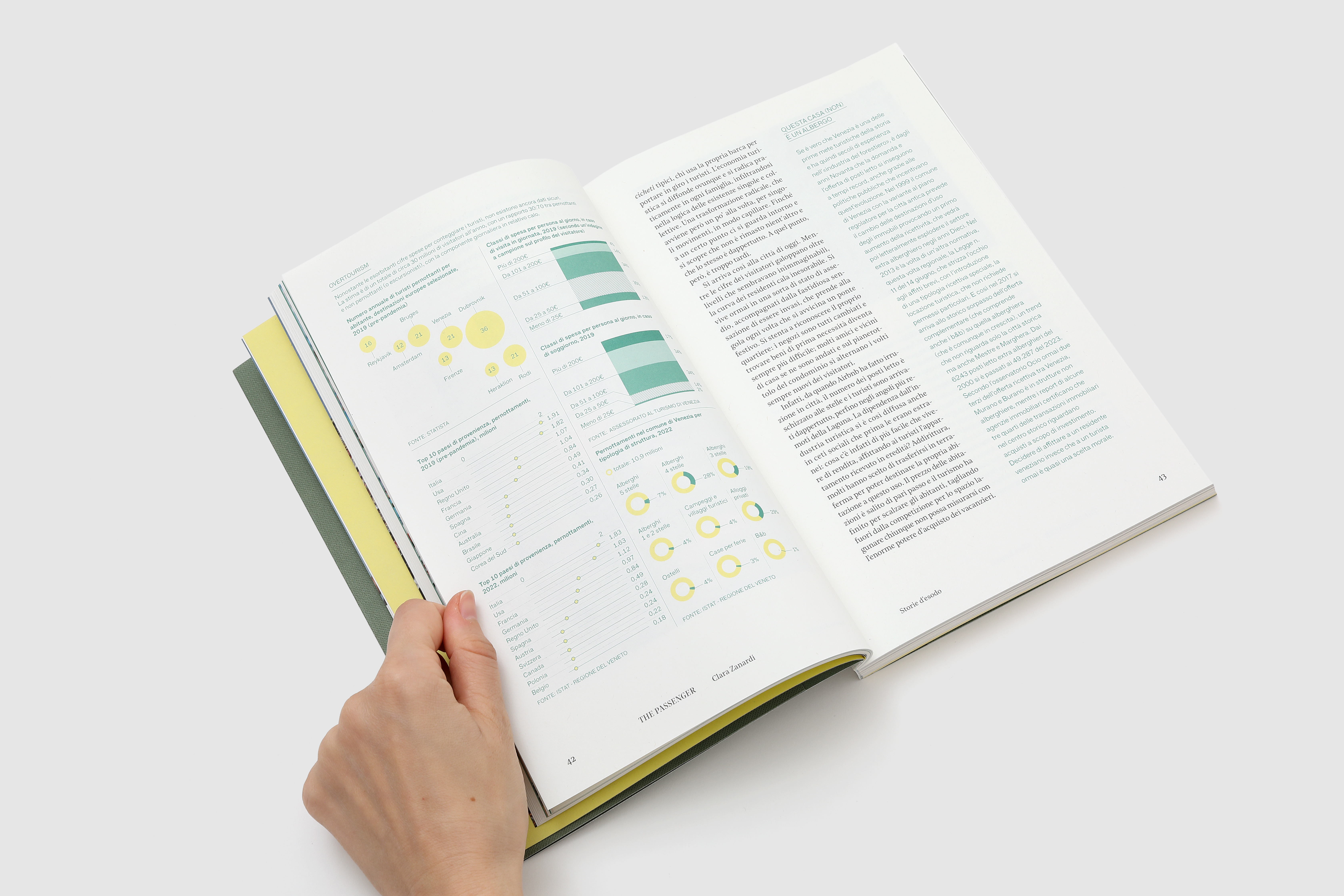
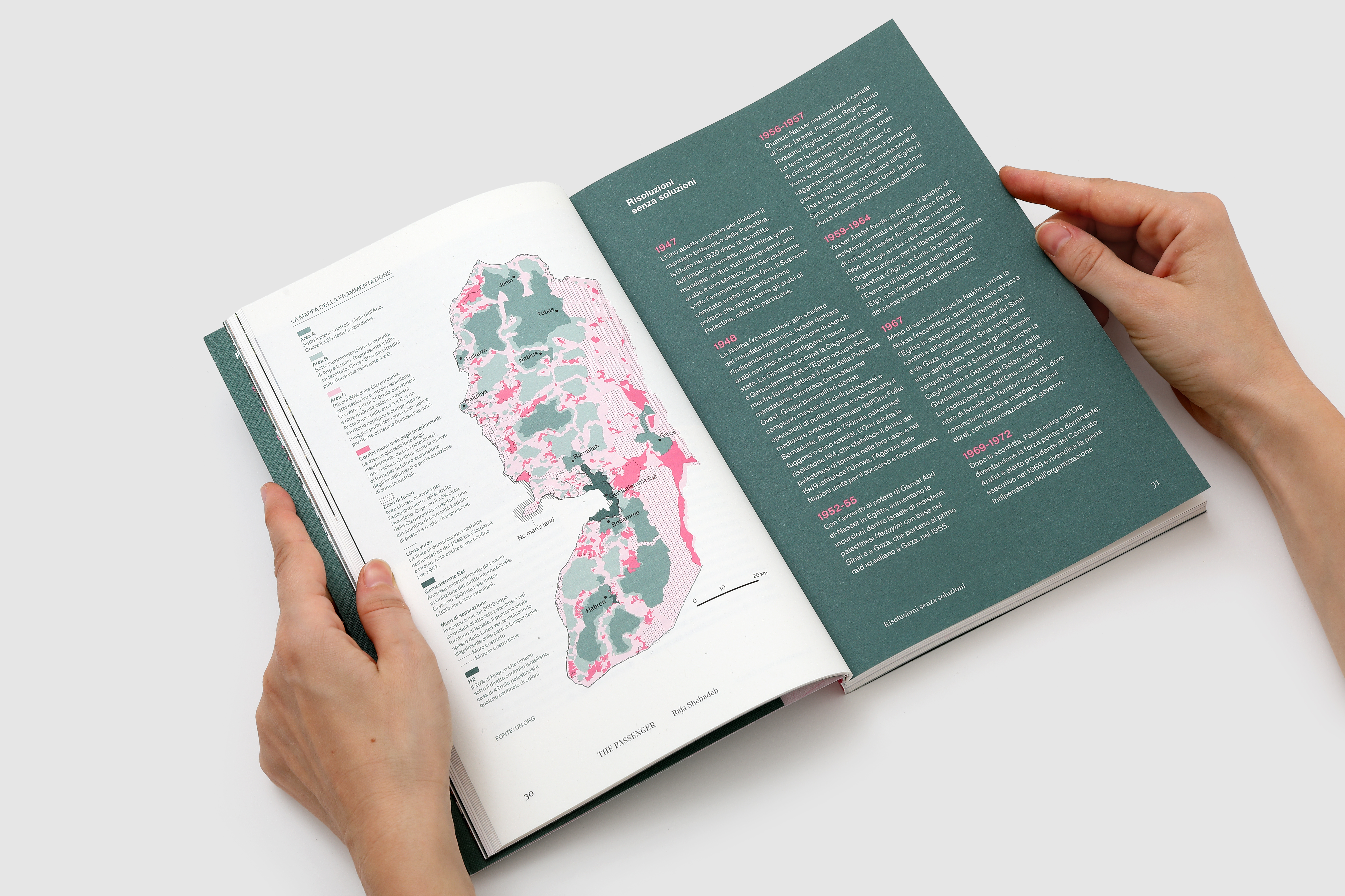
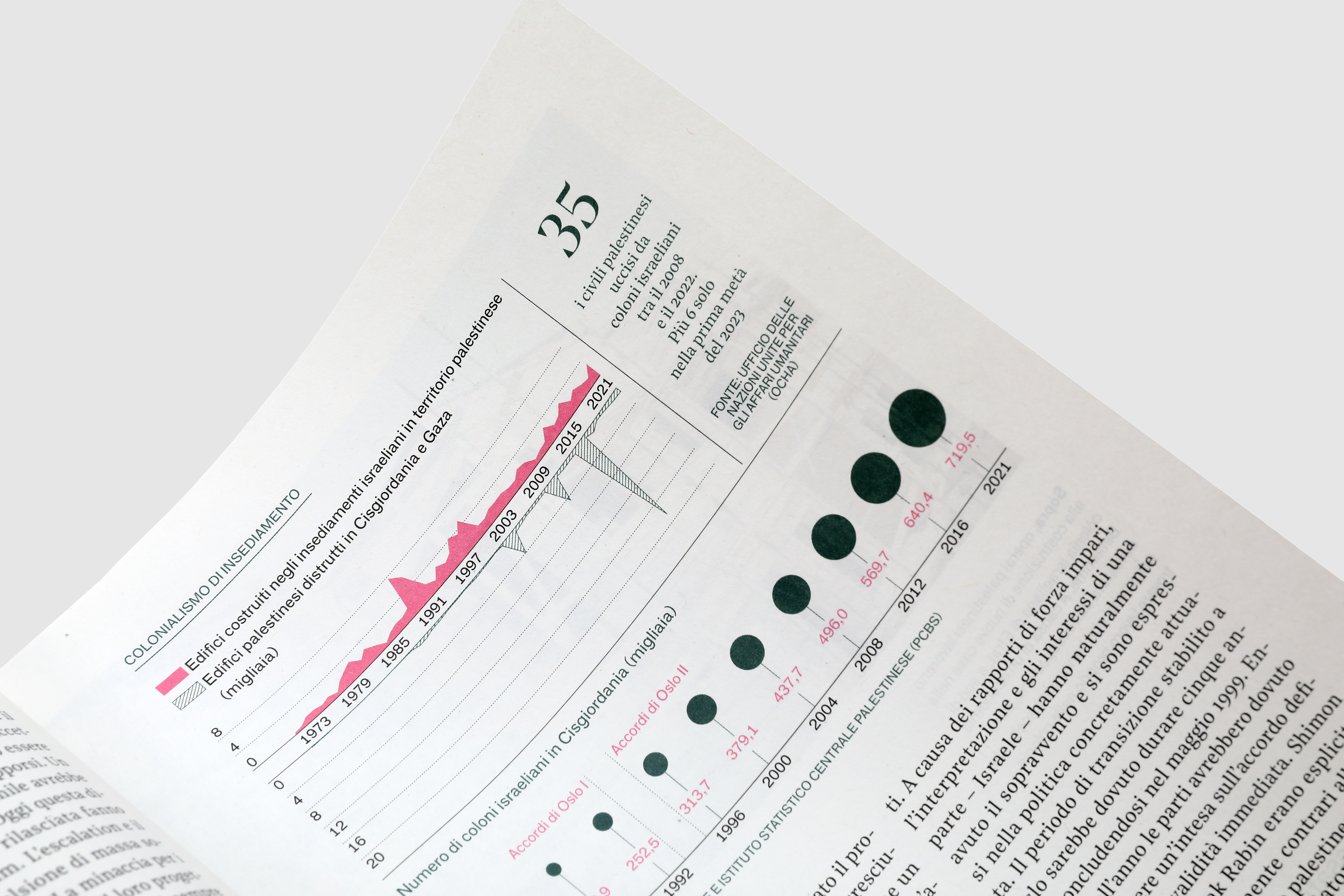
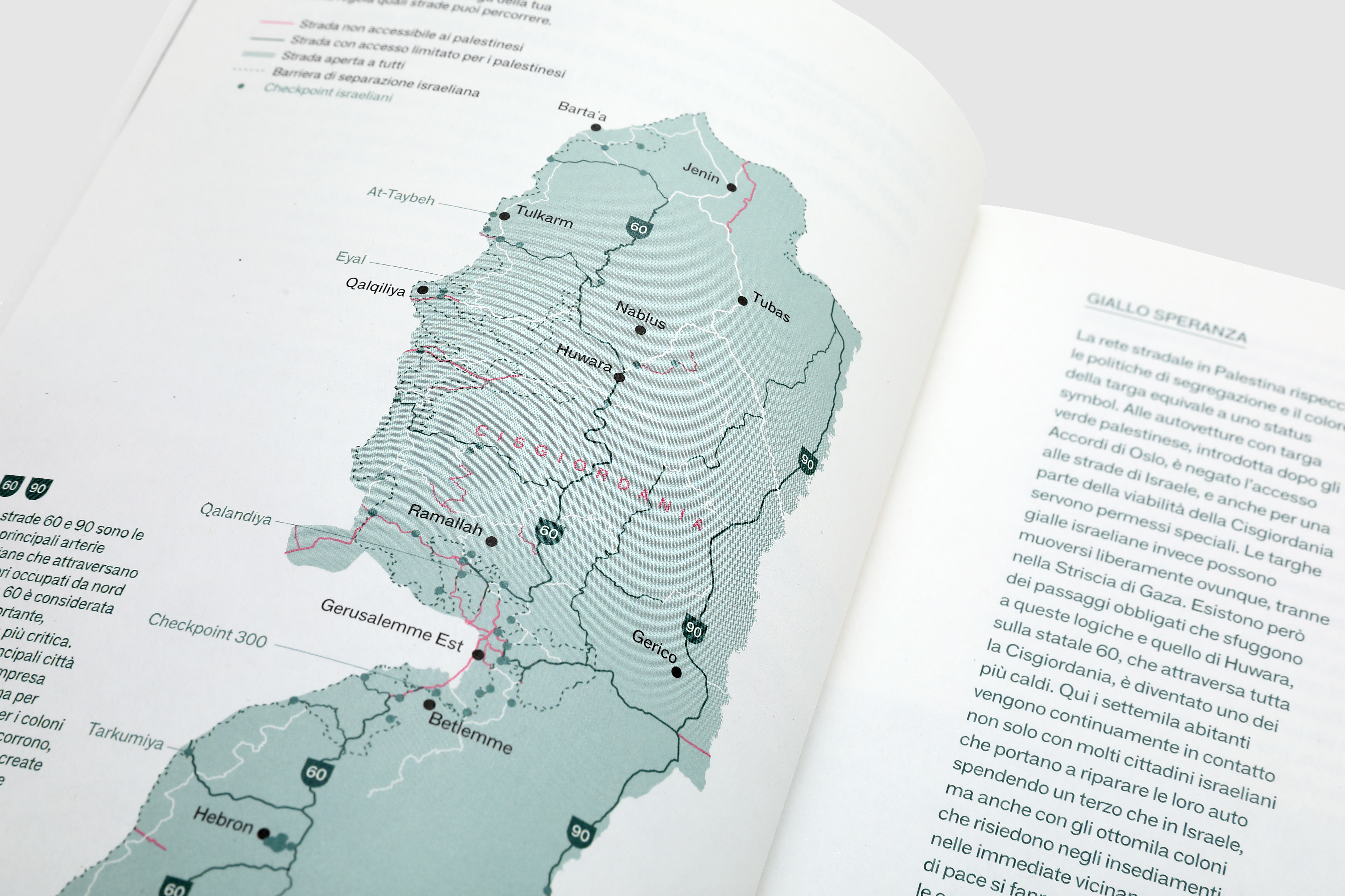
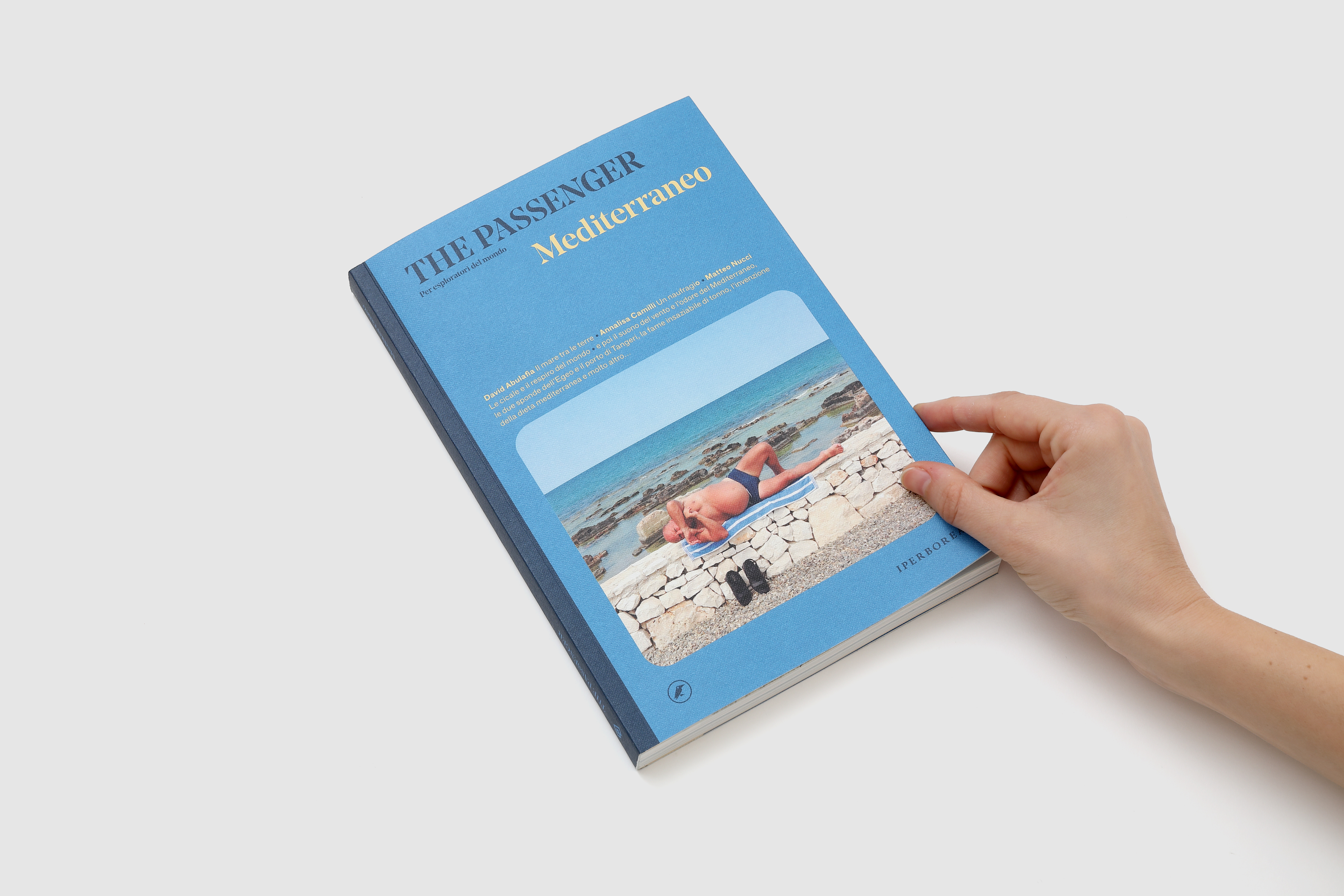
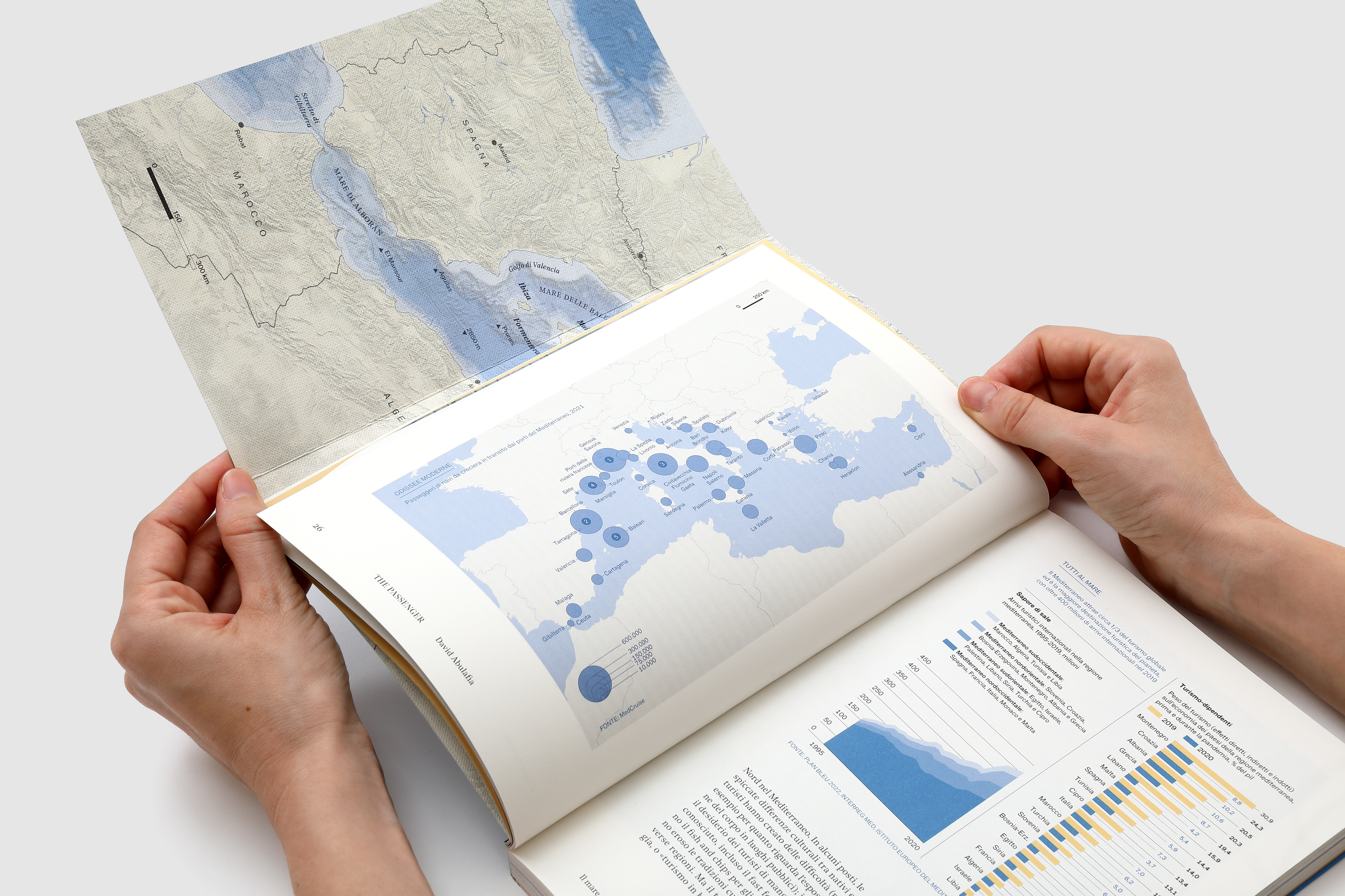
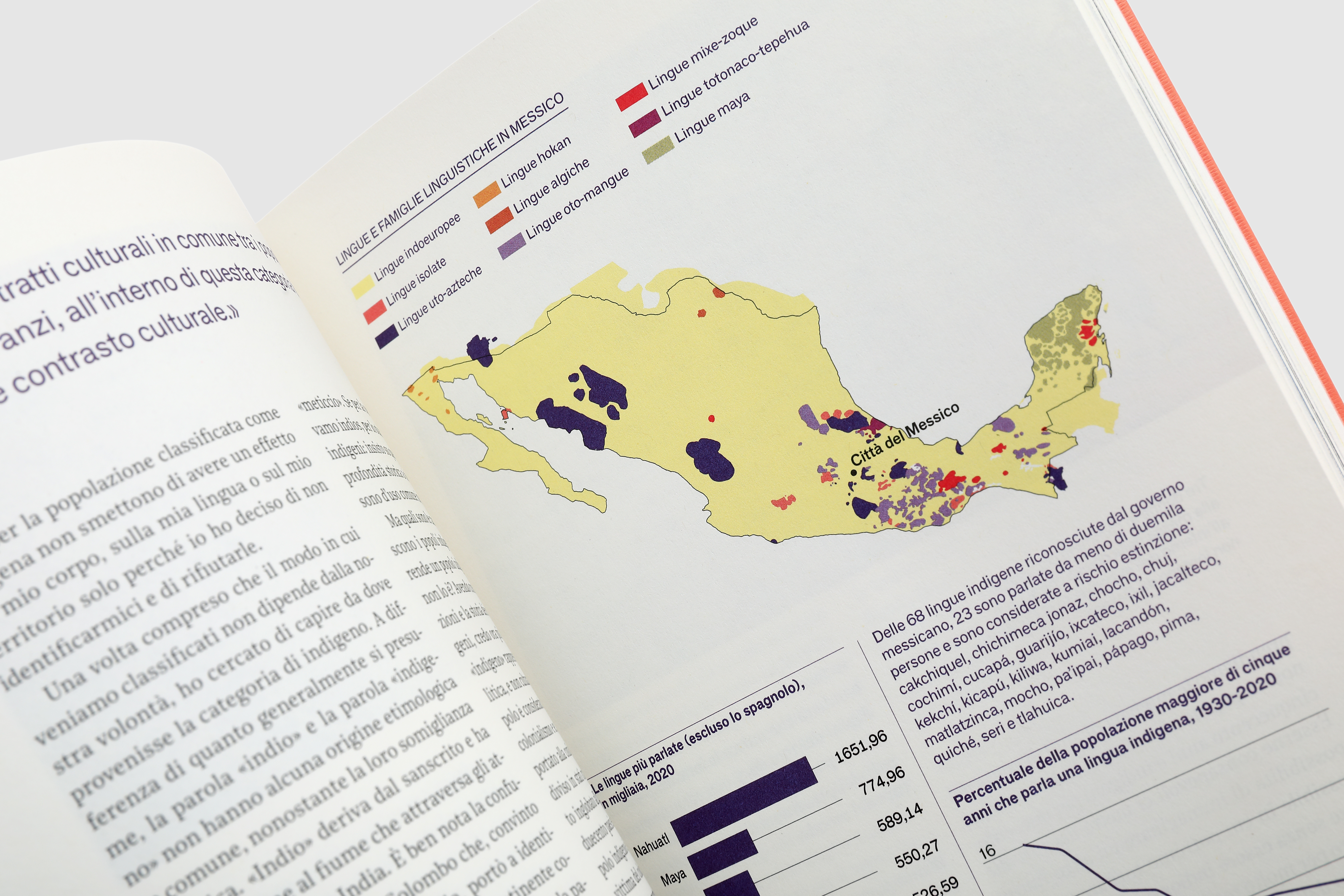
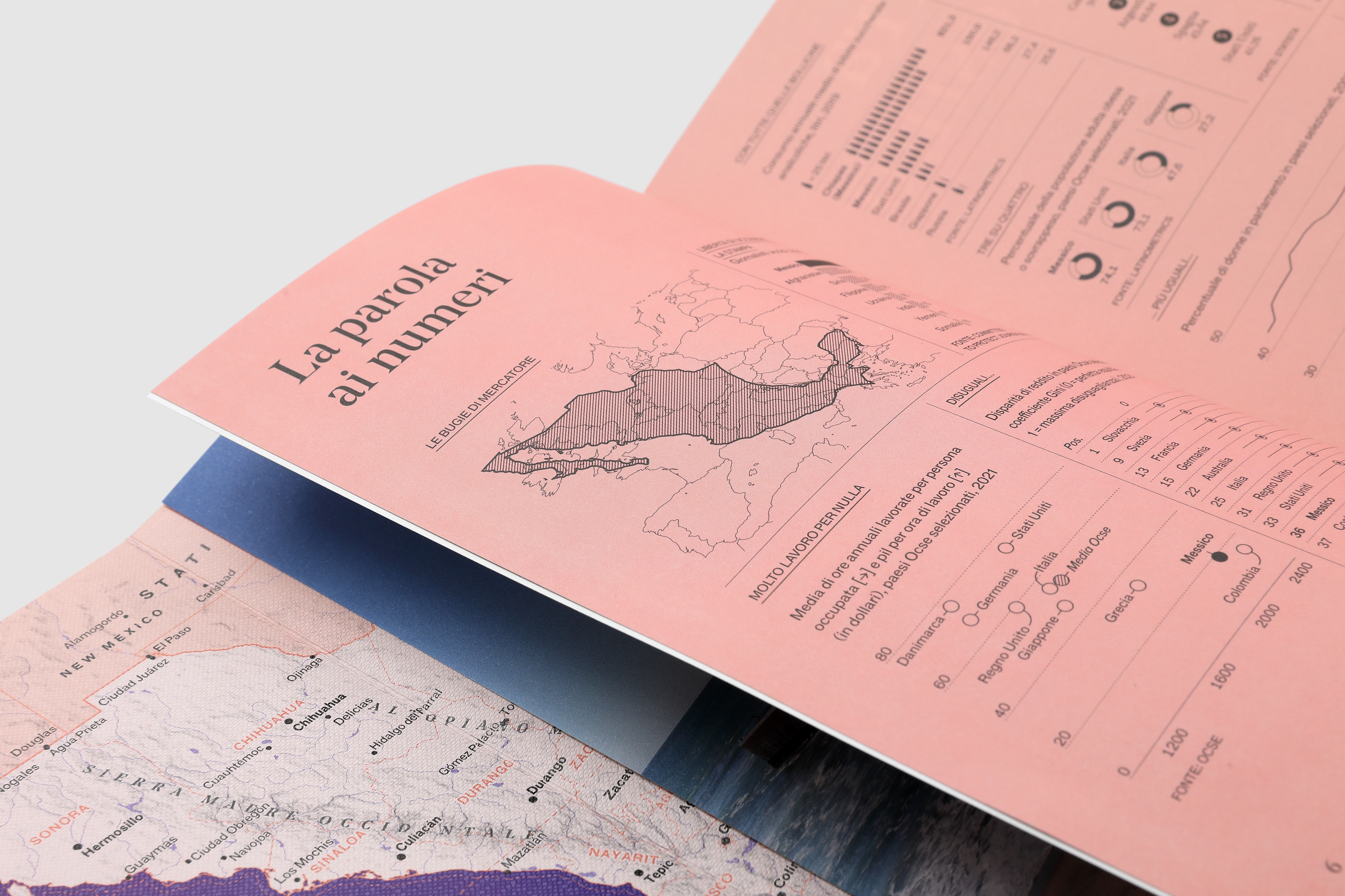
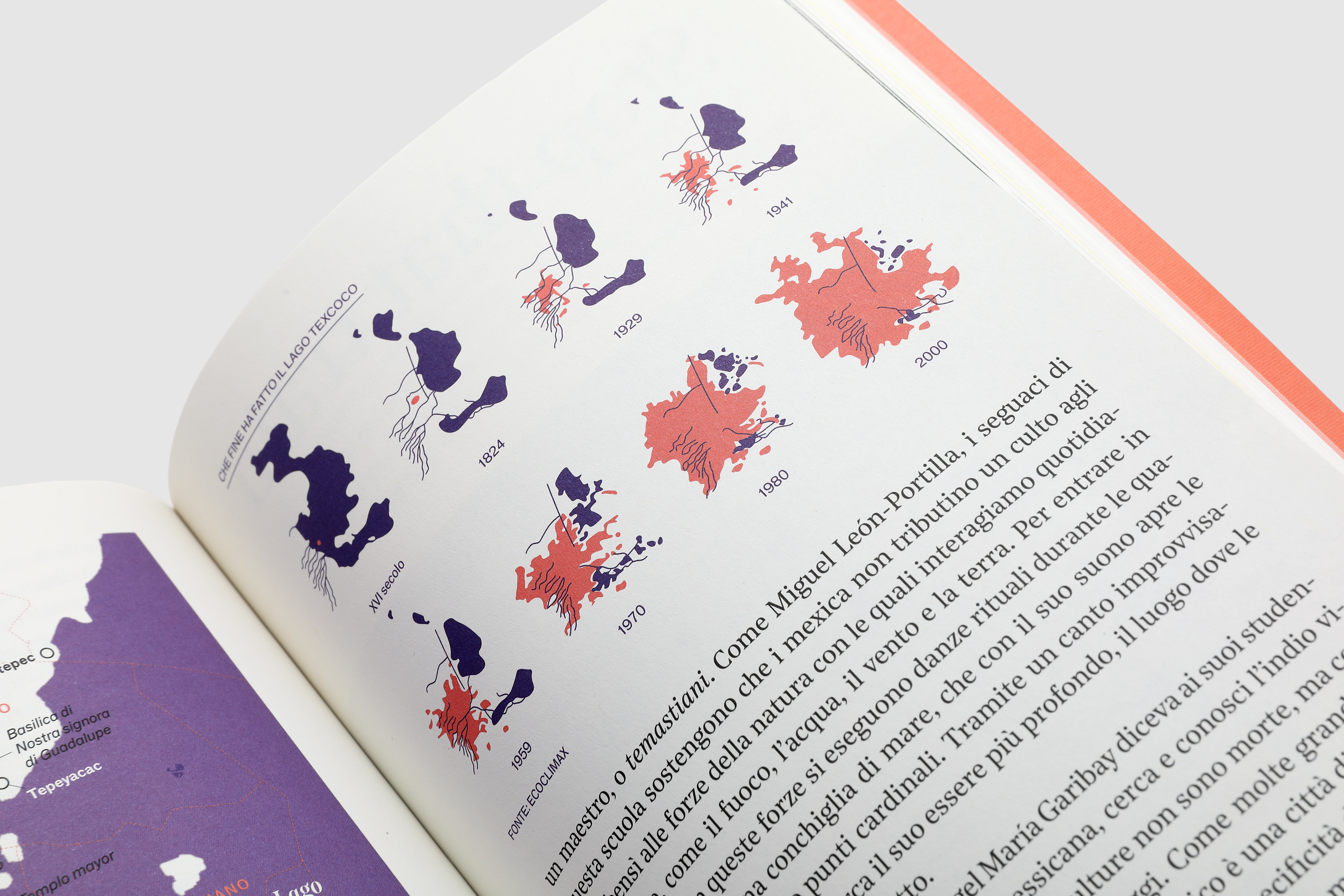
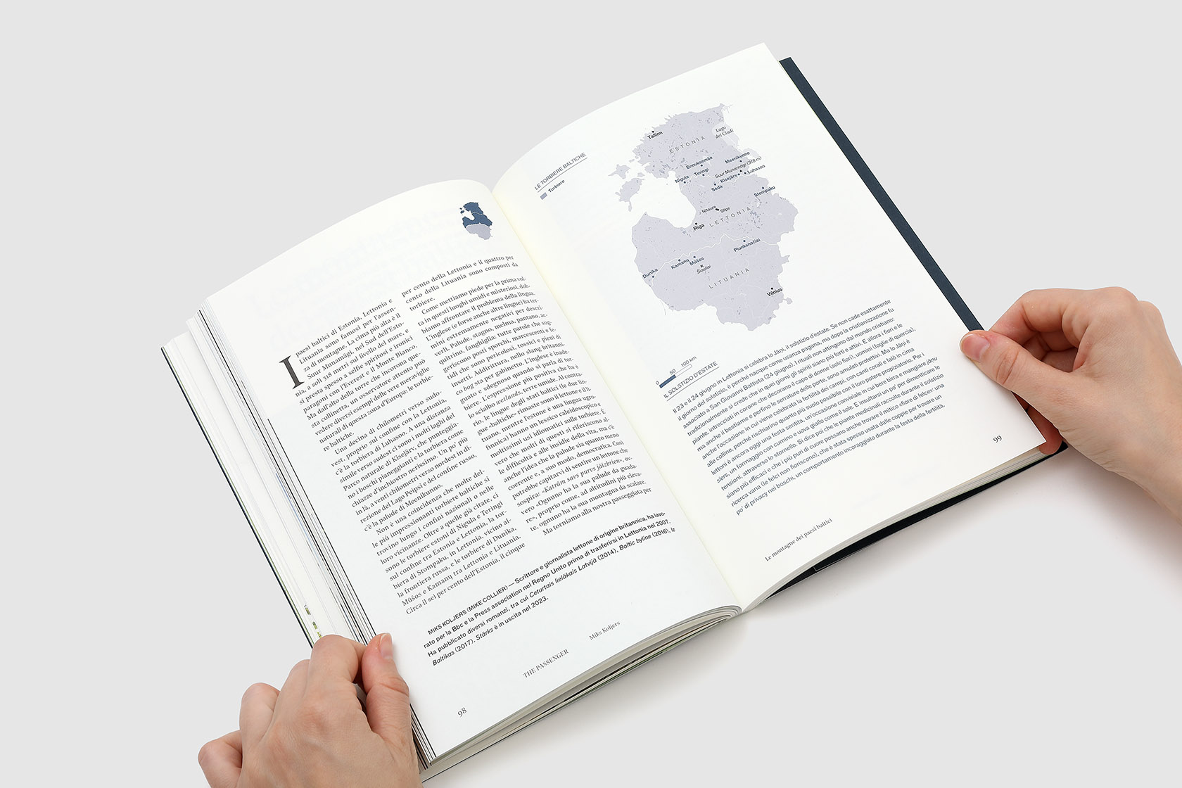
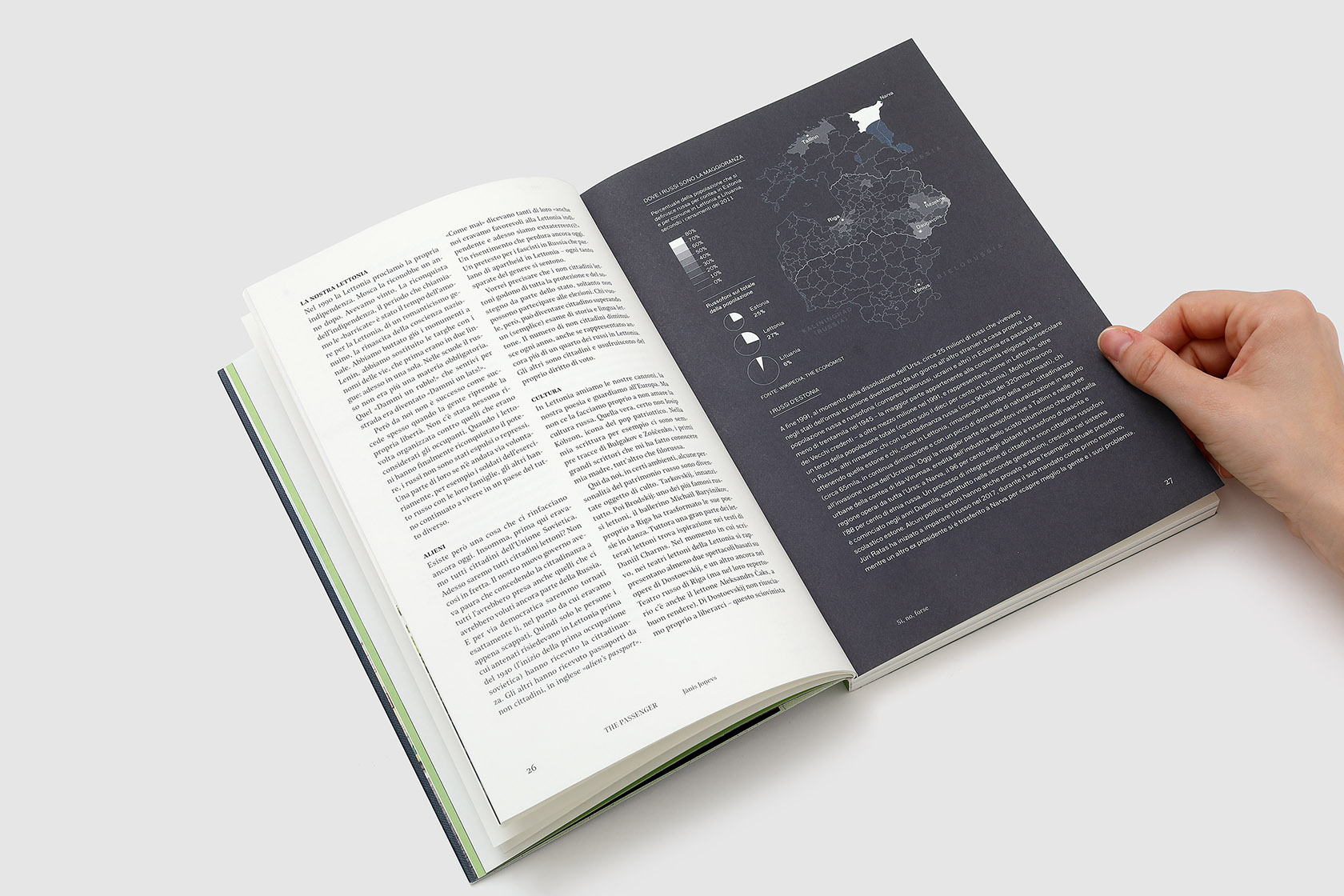
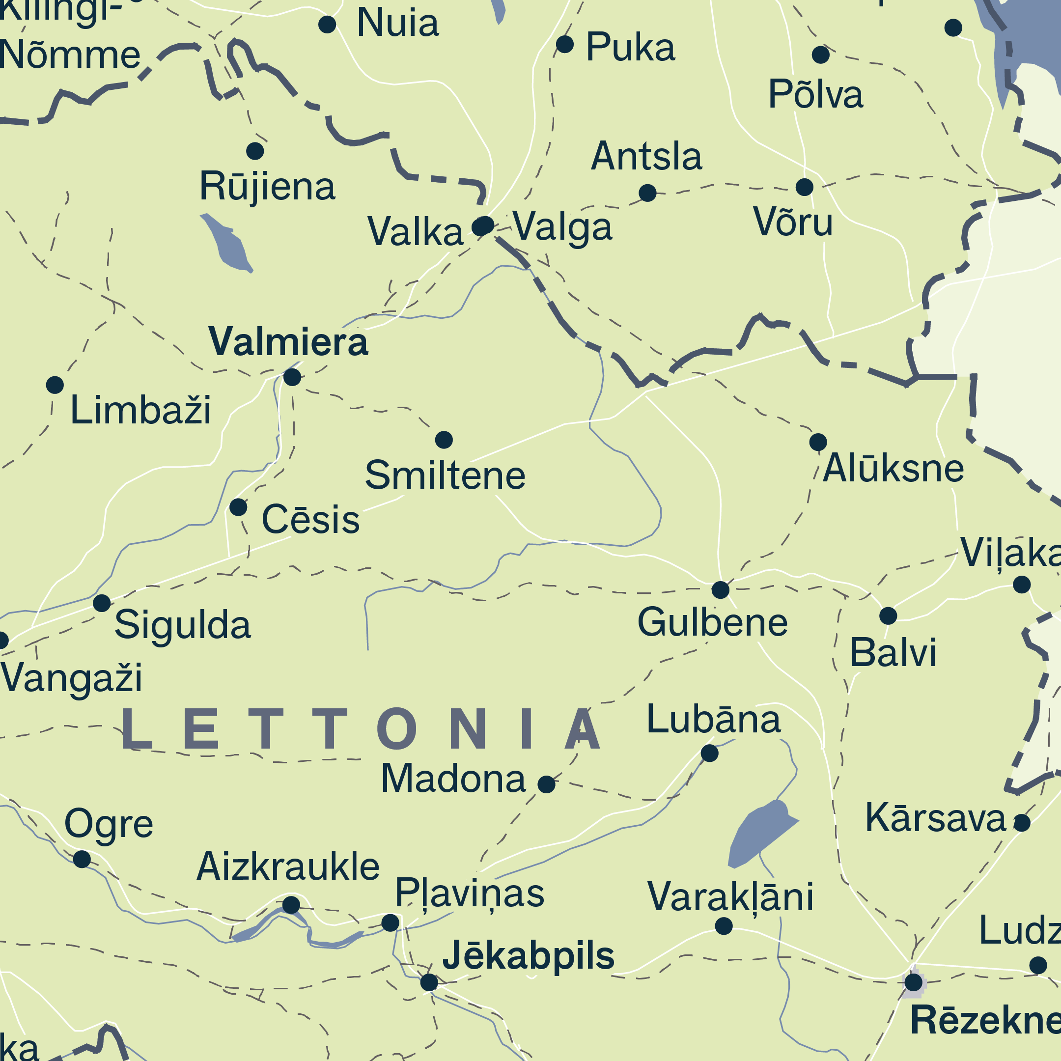
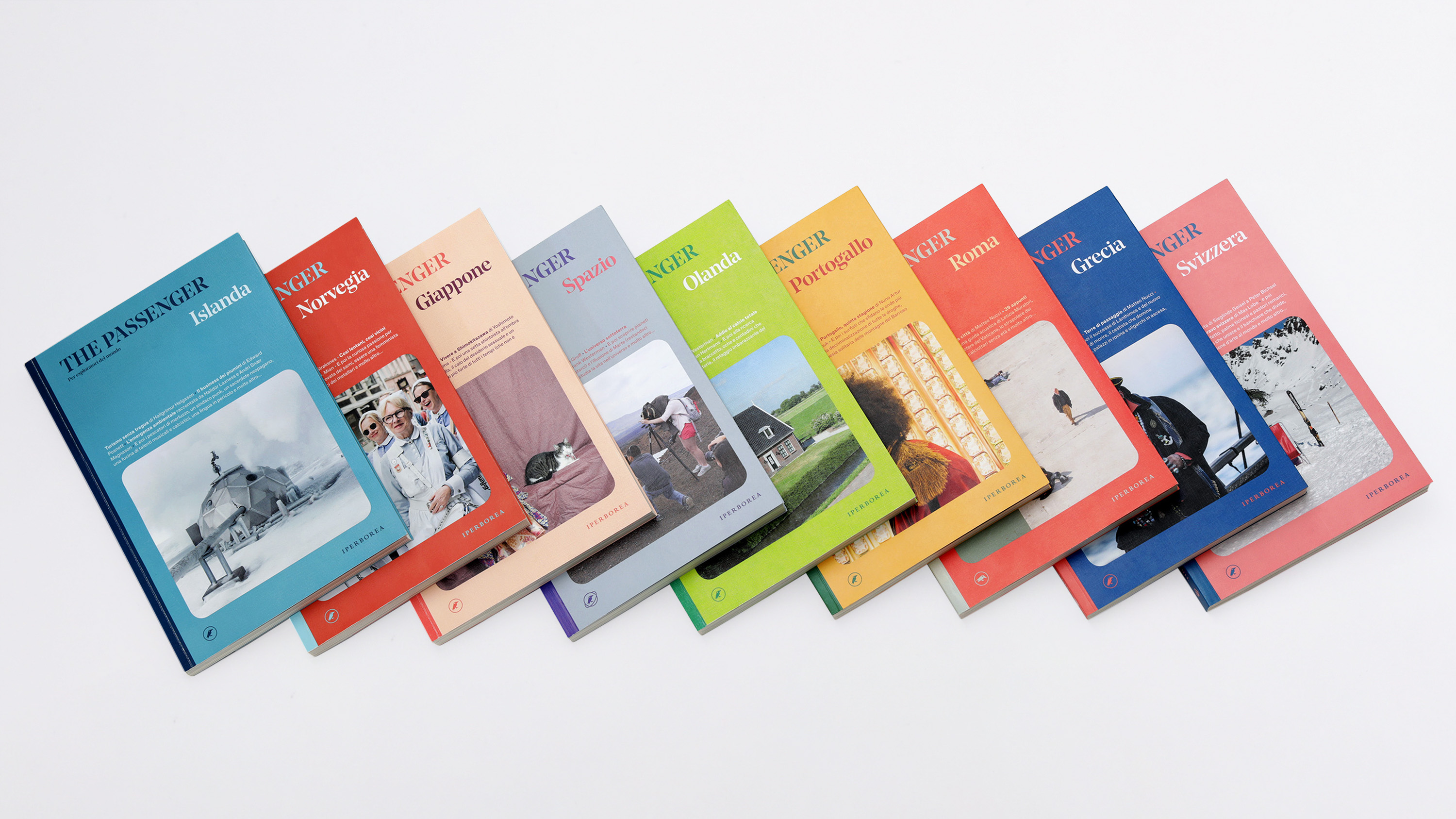
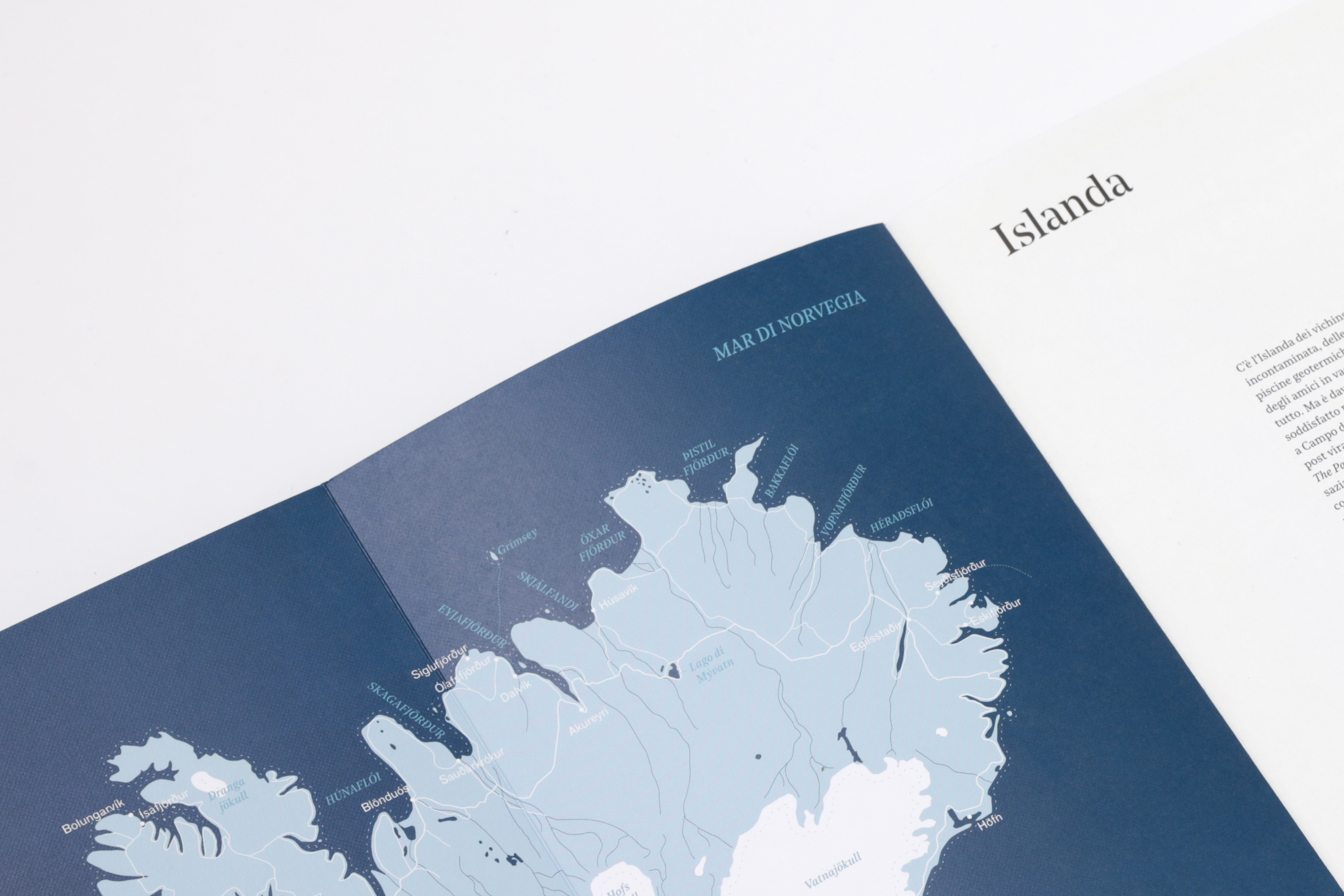
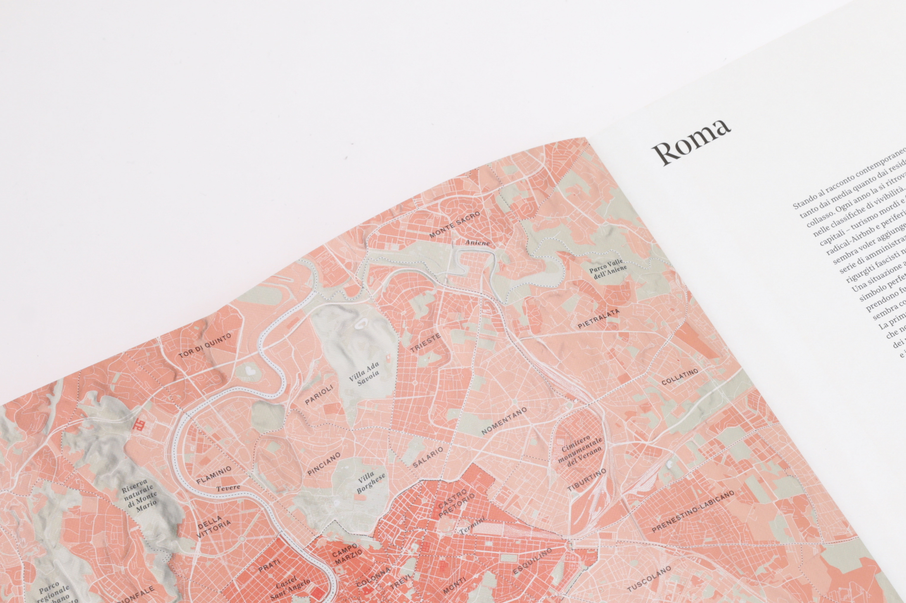
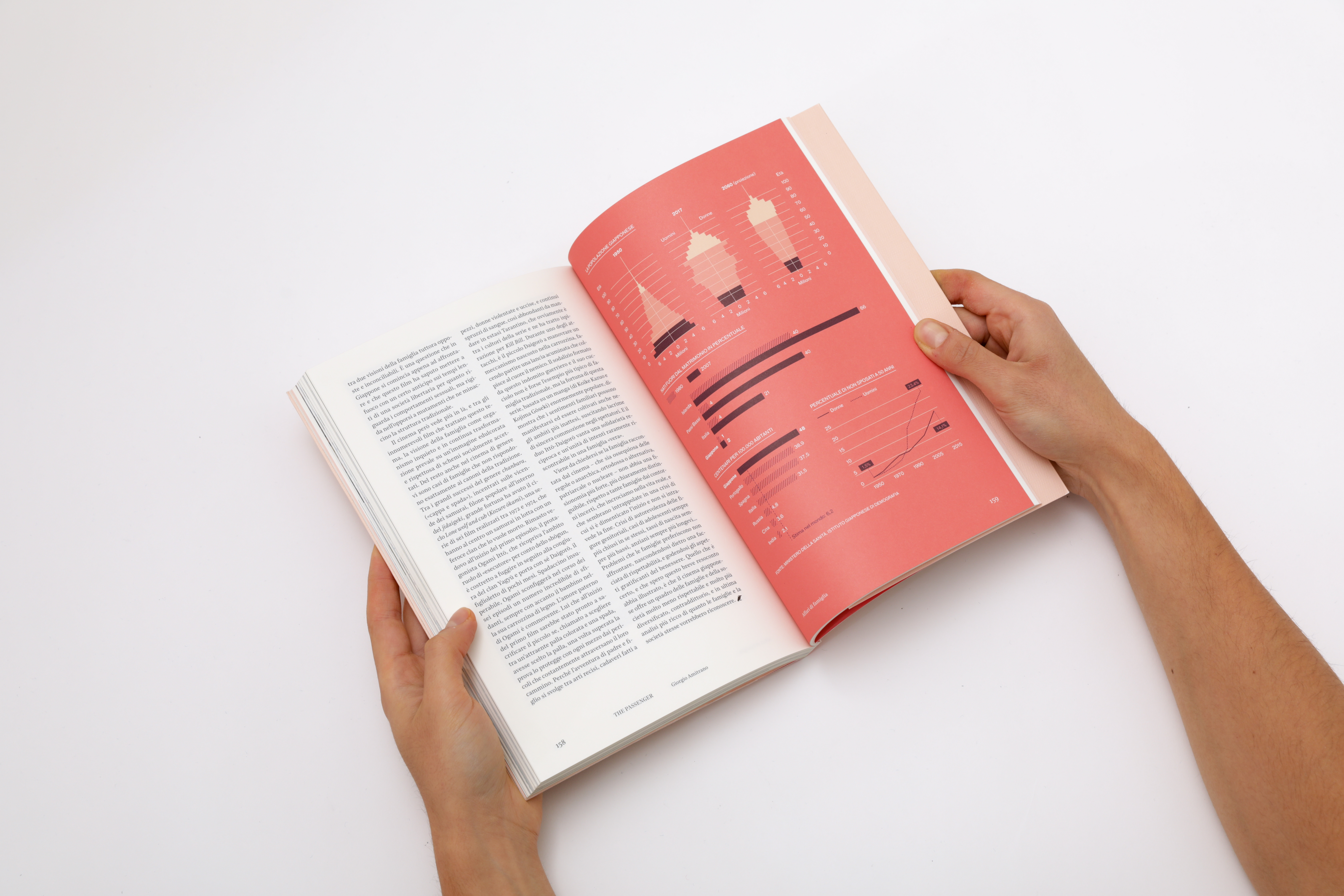
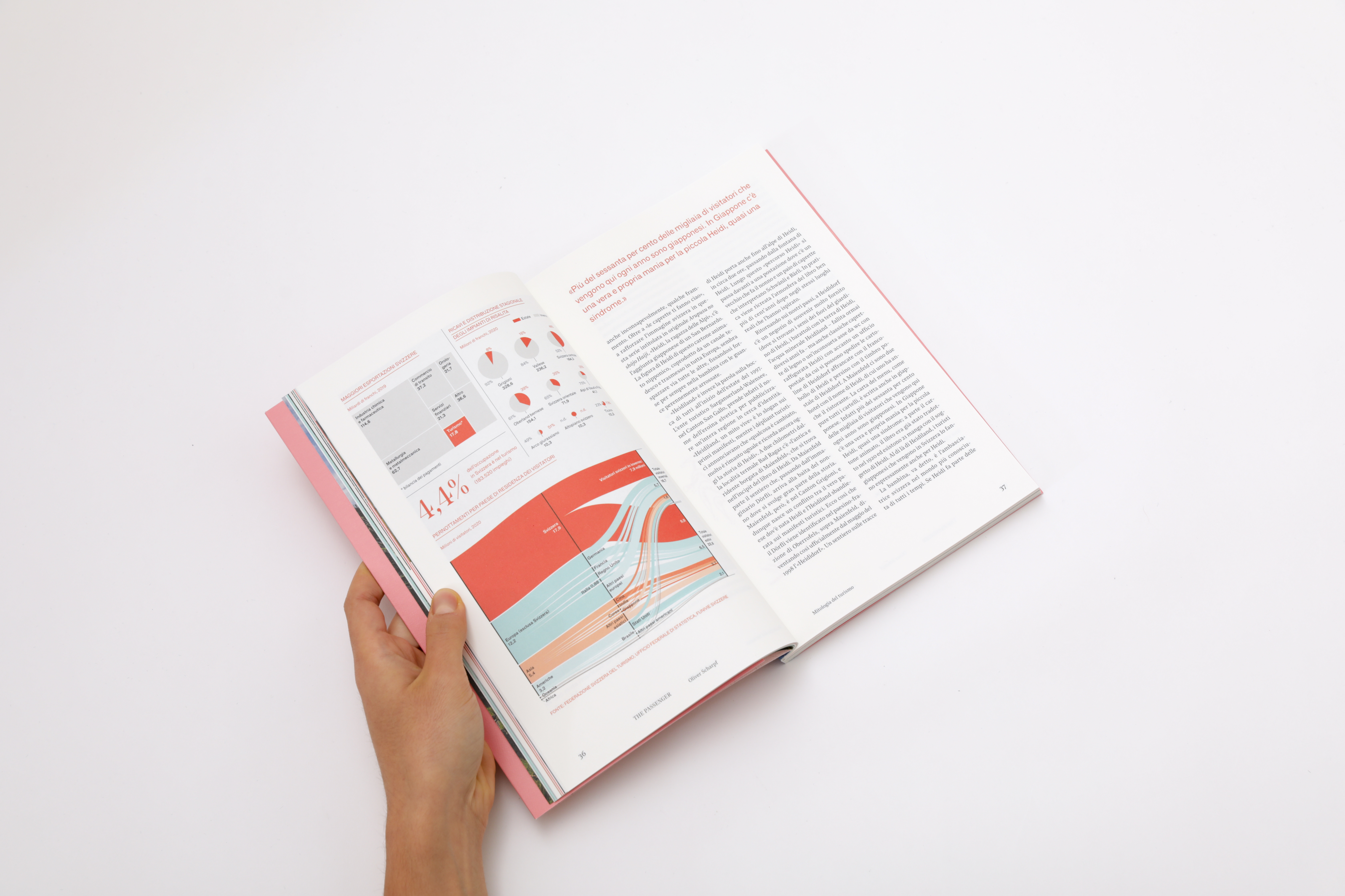
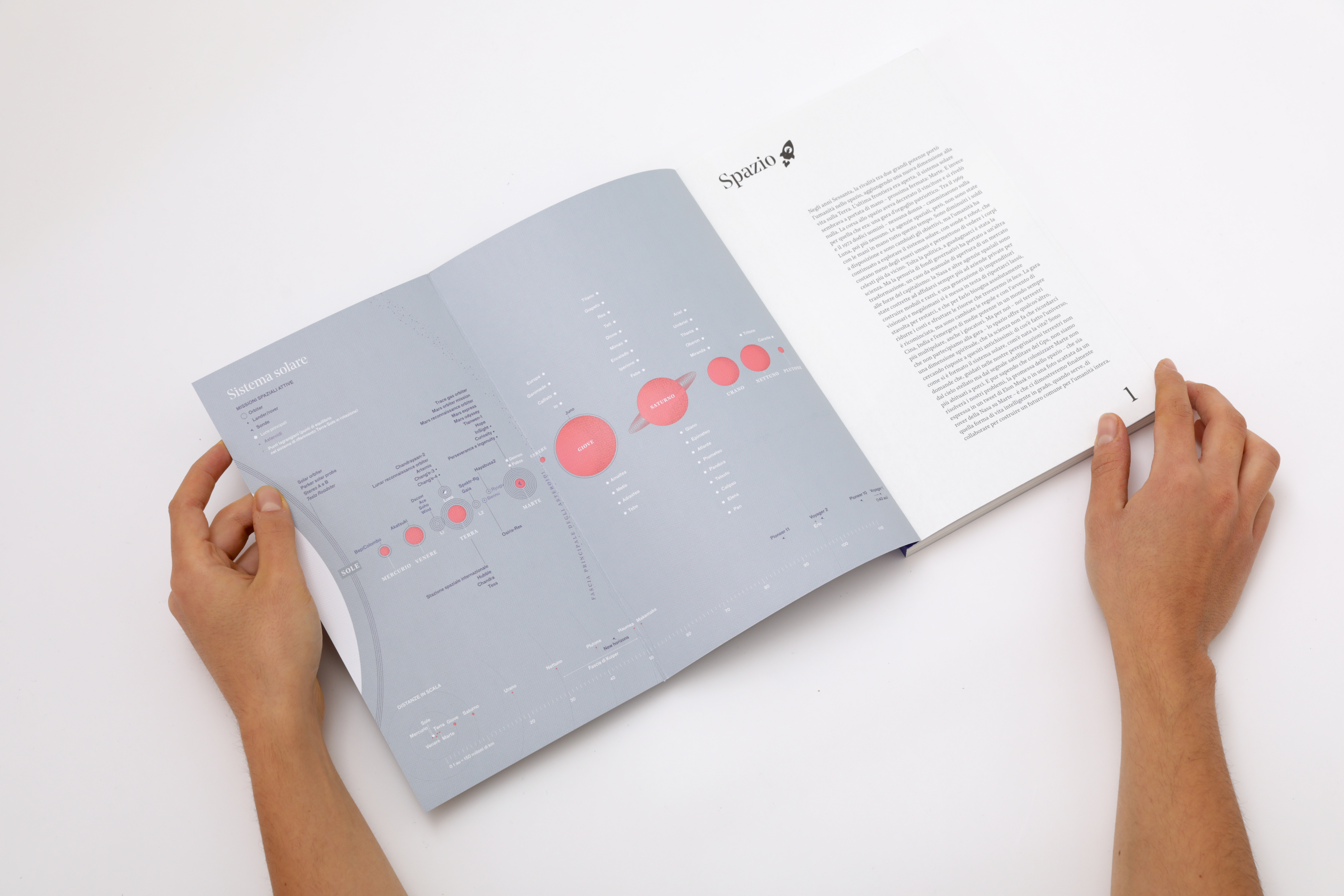
plans the hero’s journey
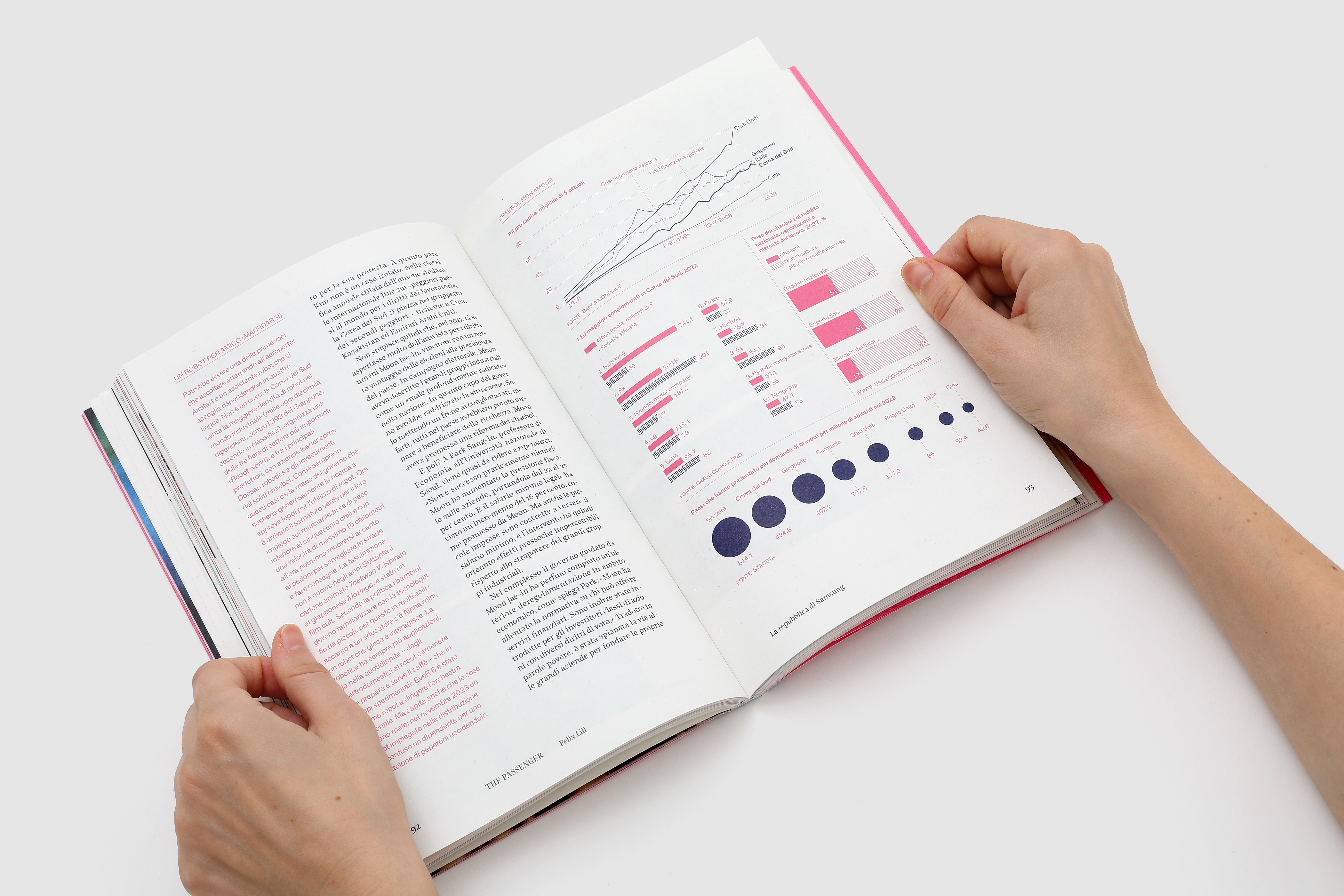
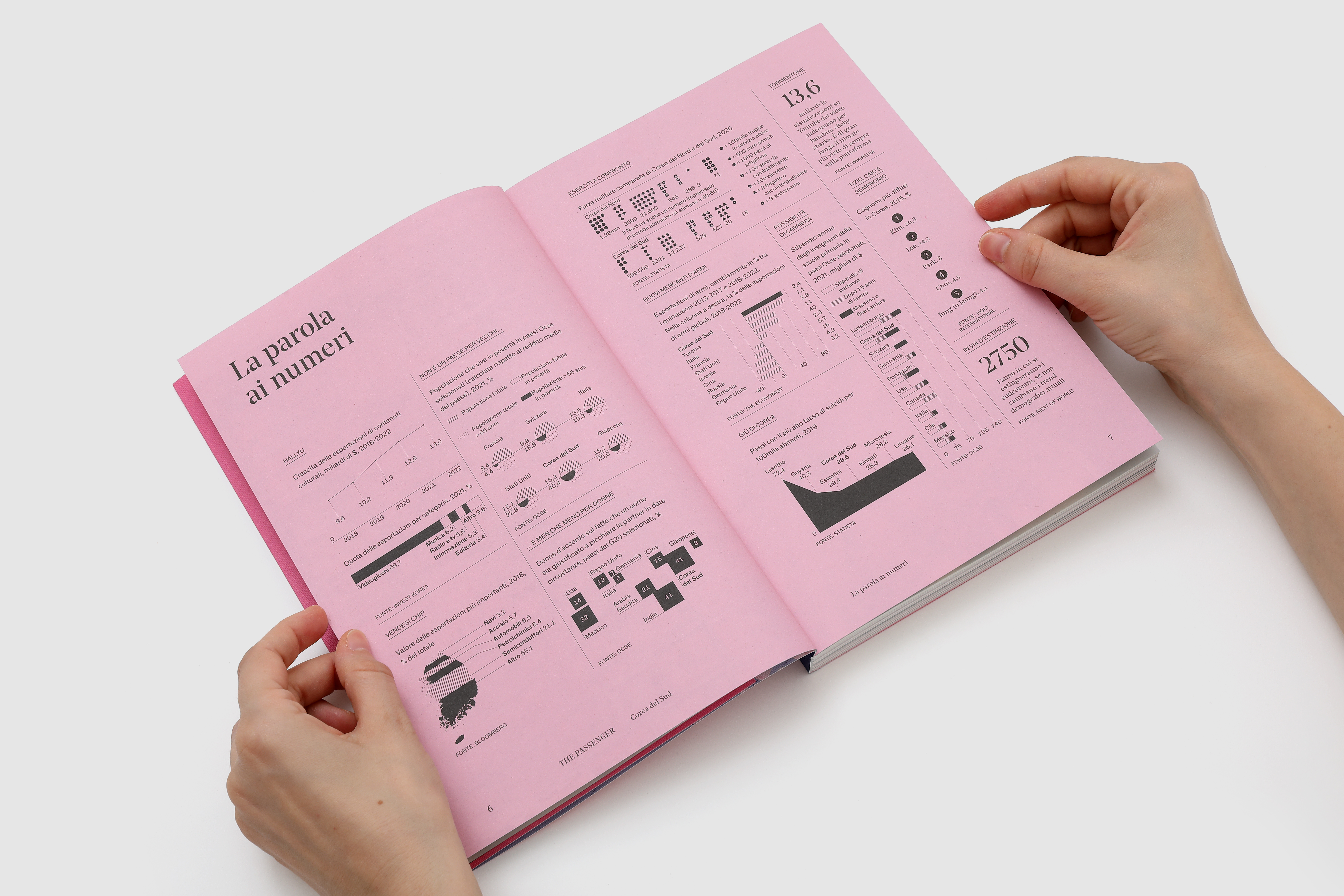
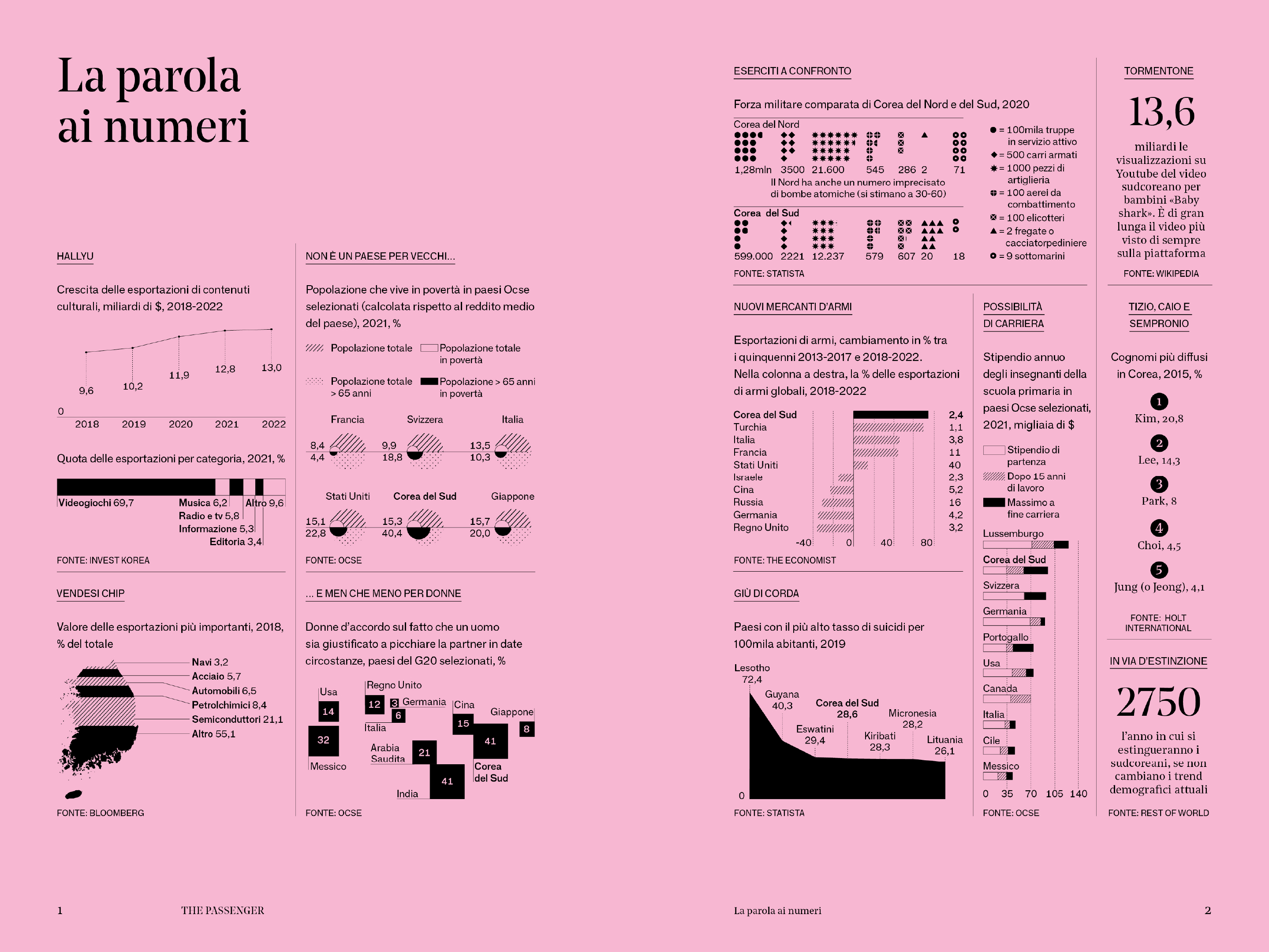
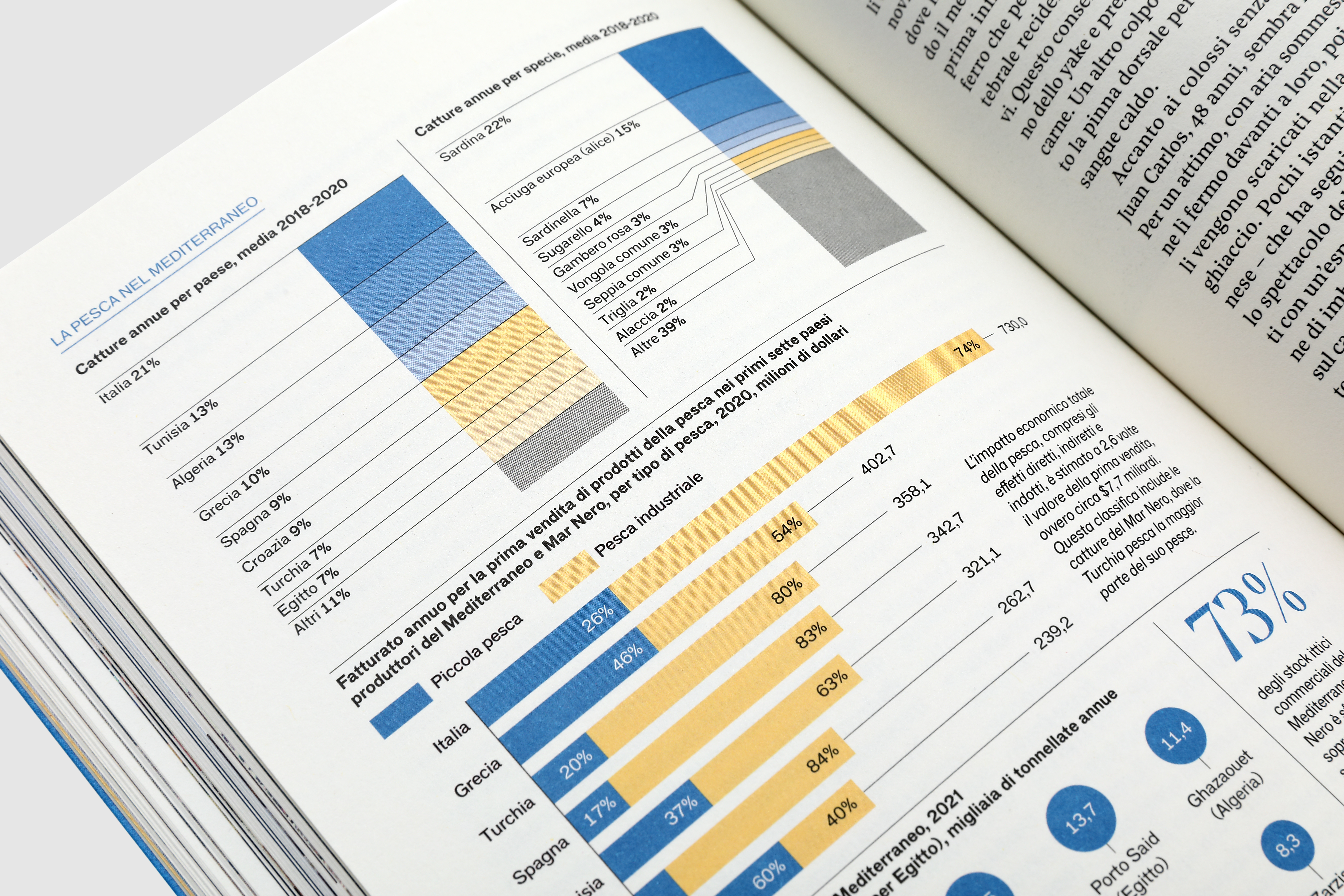
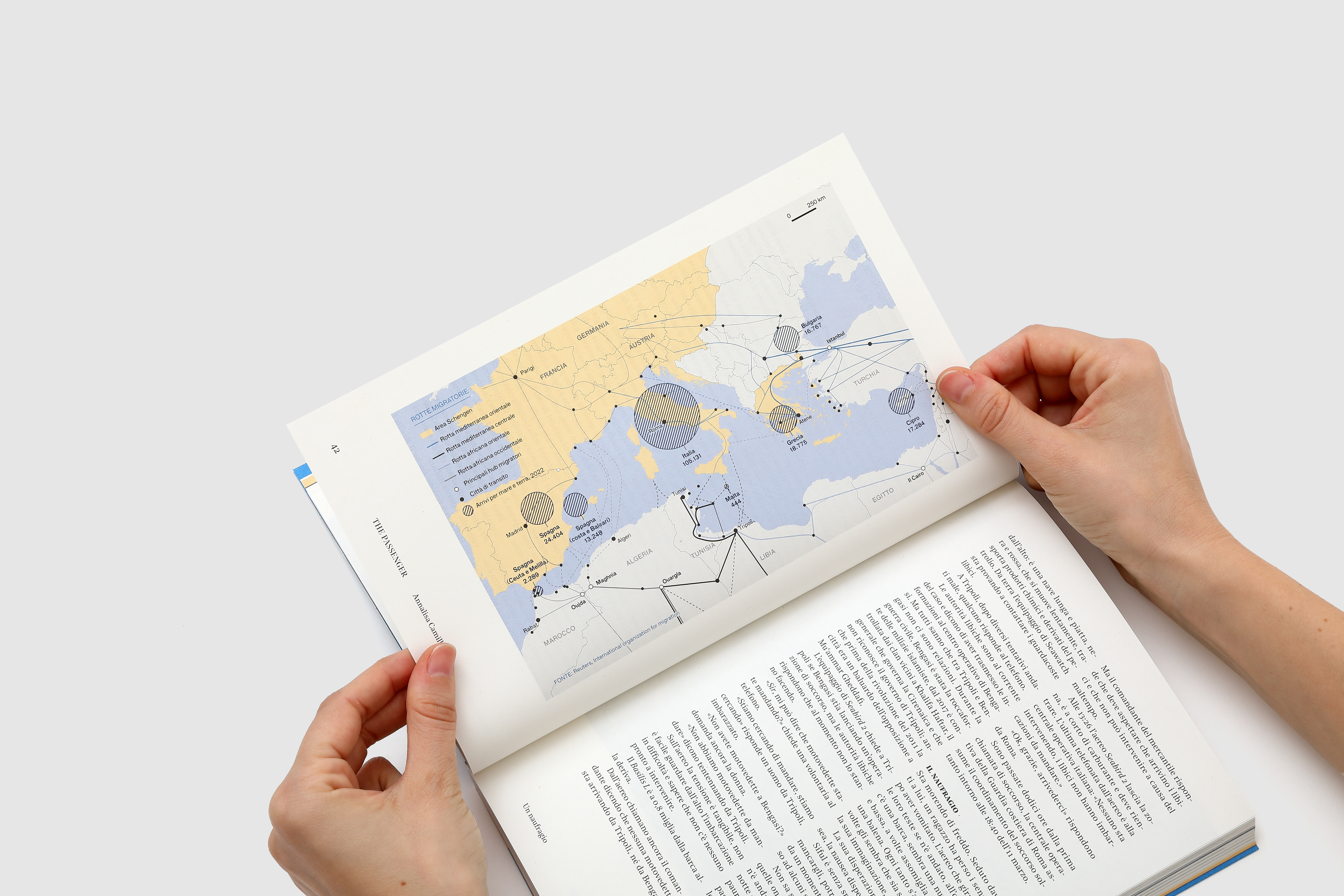
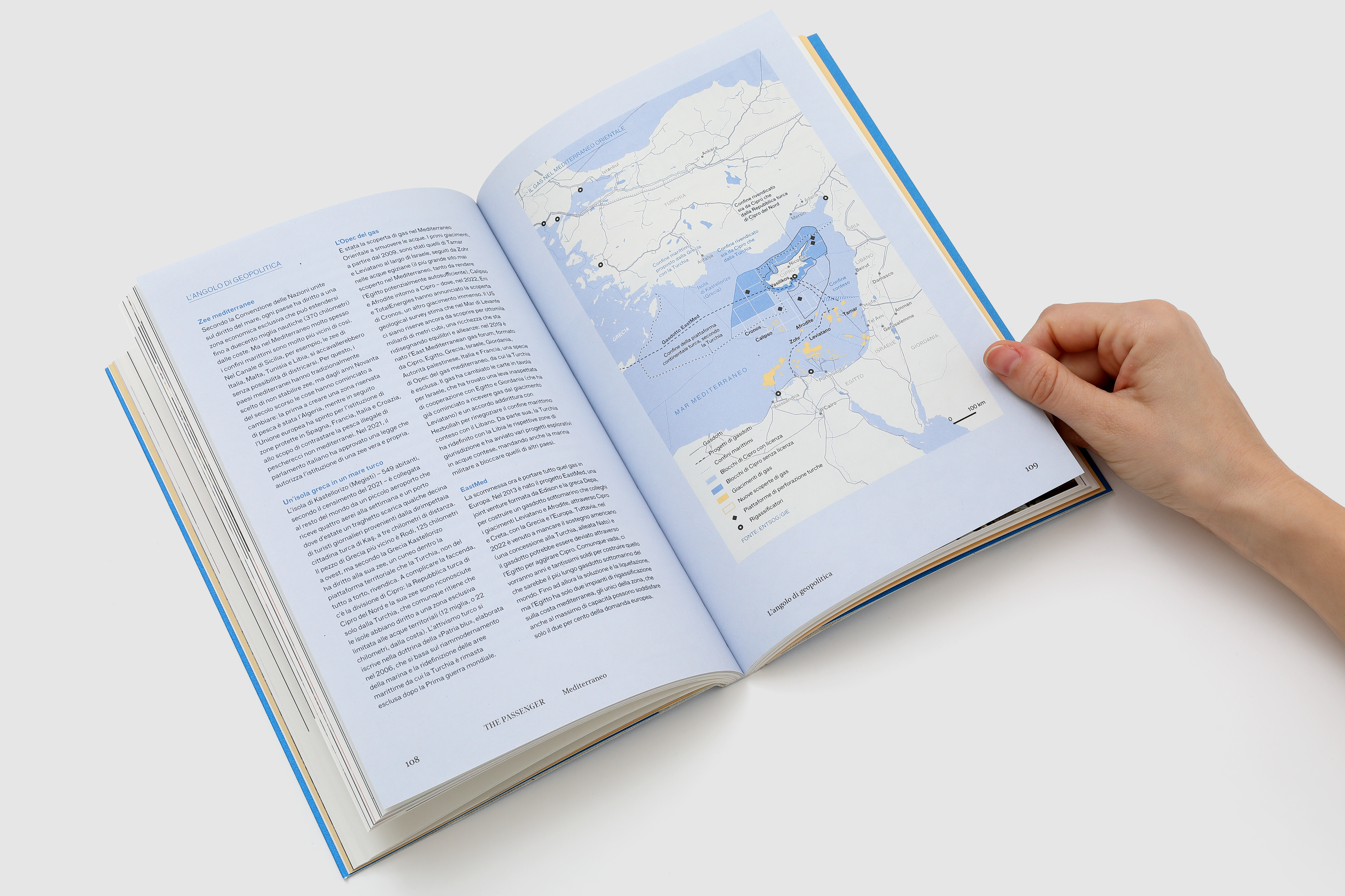
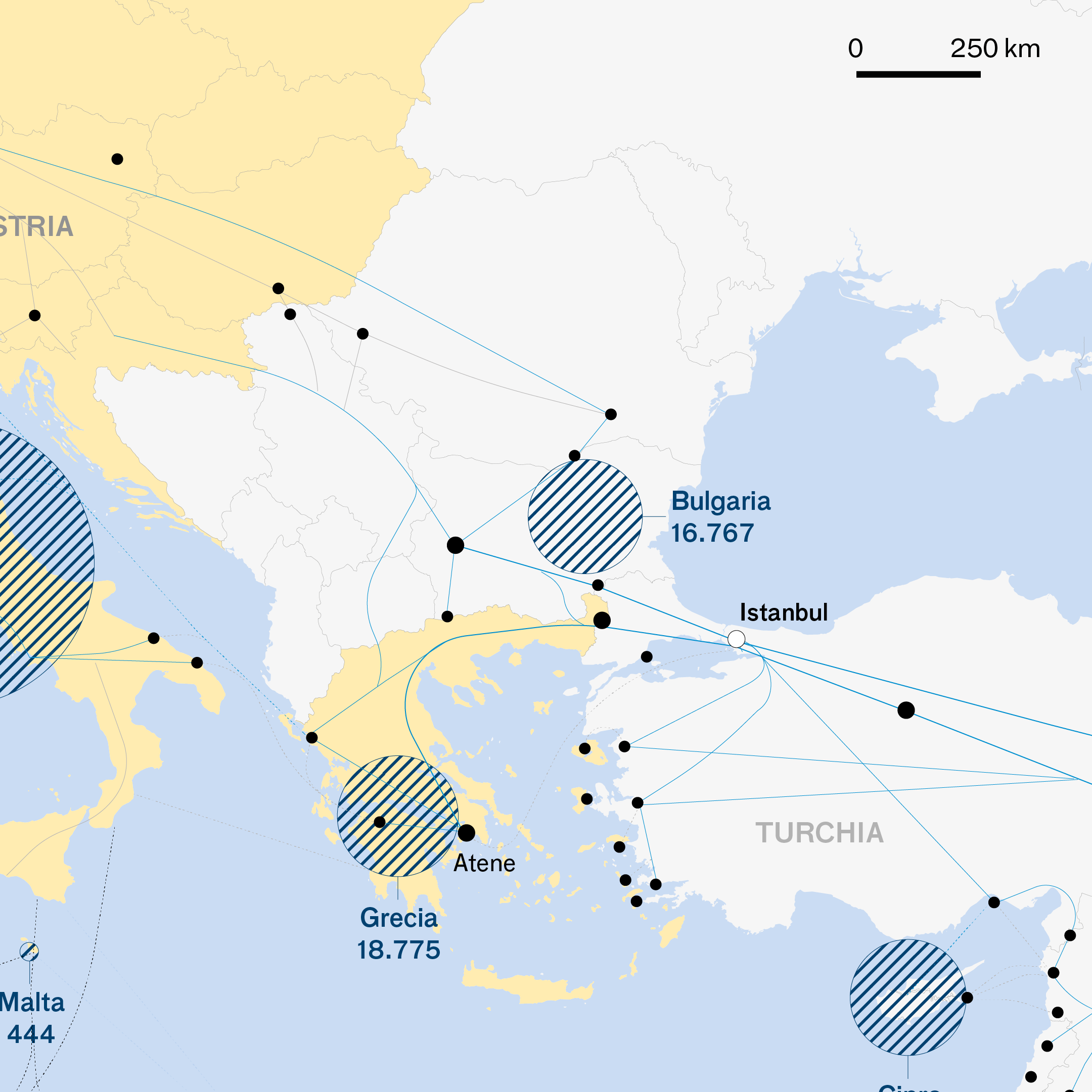
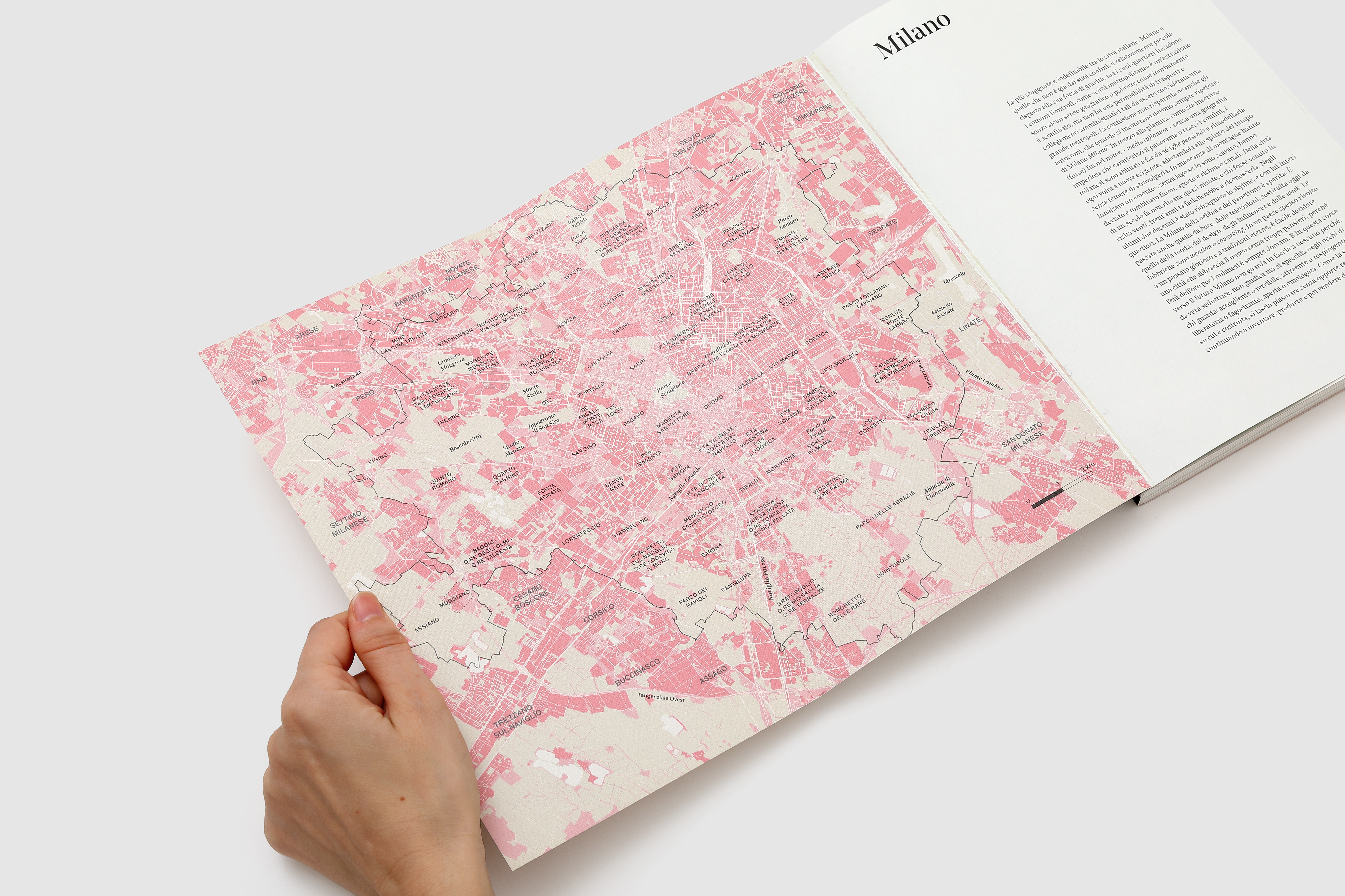
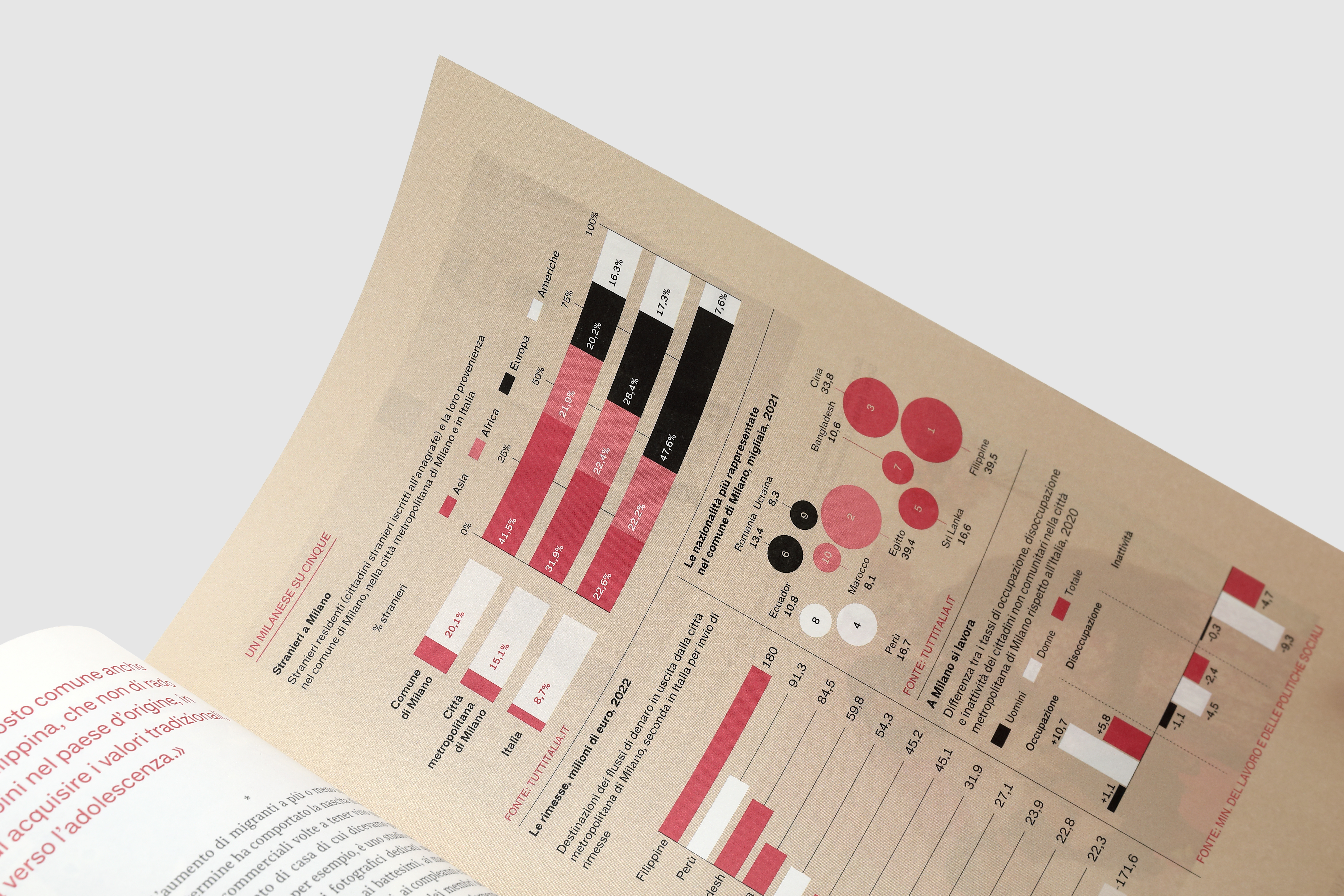
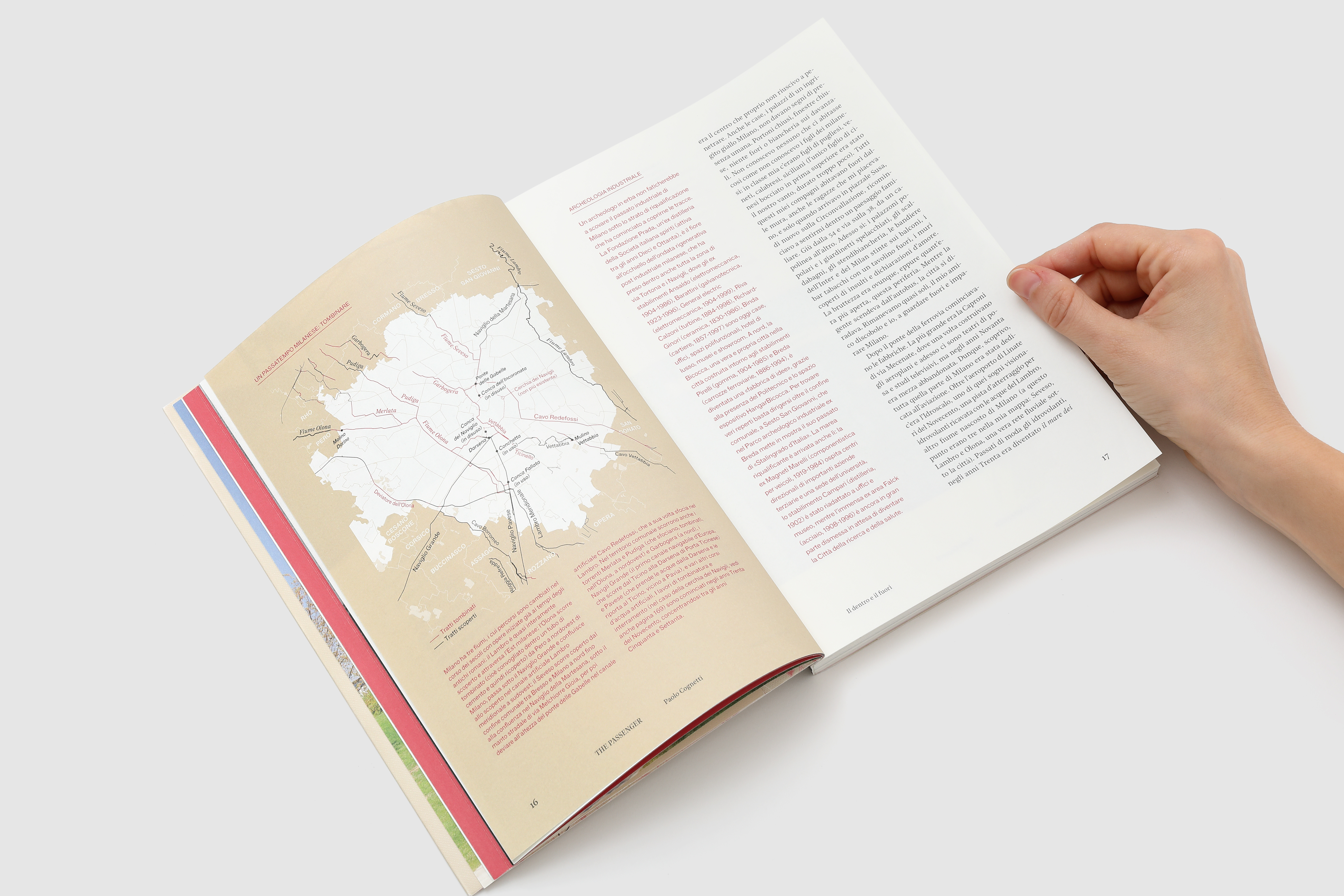
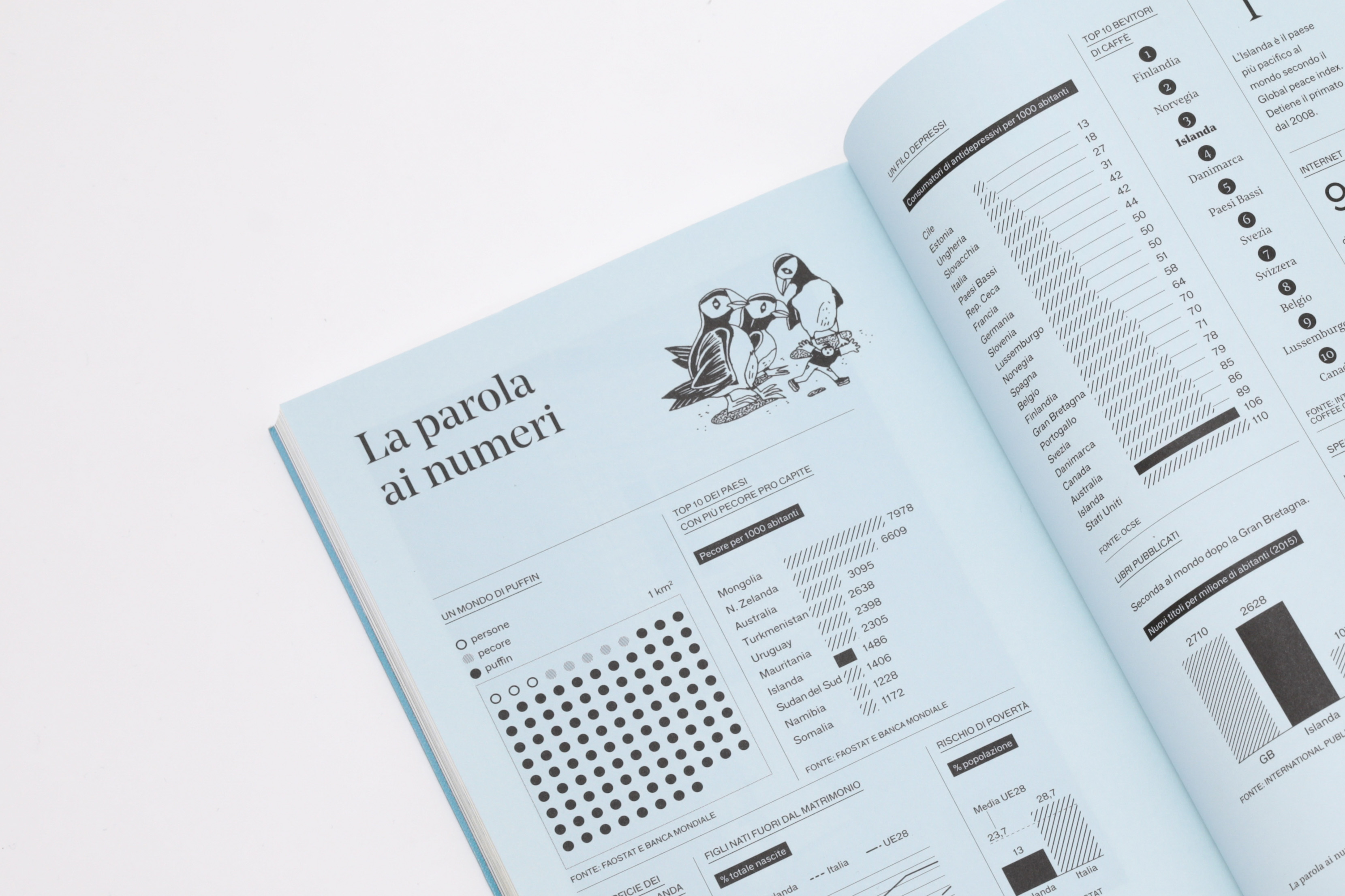
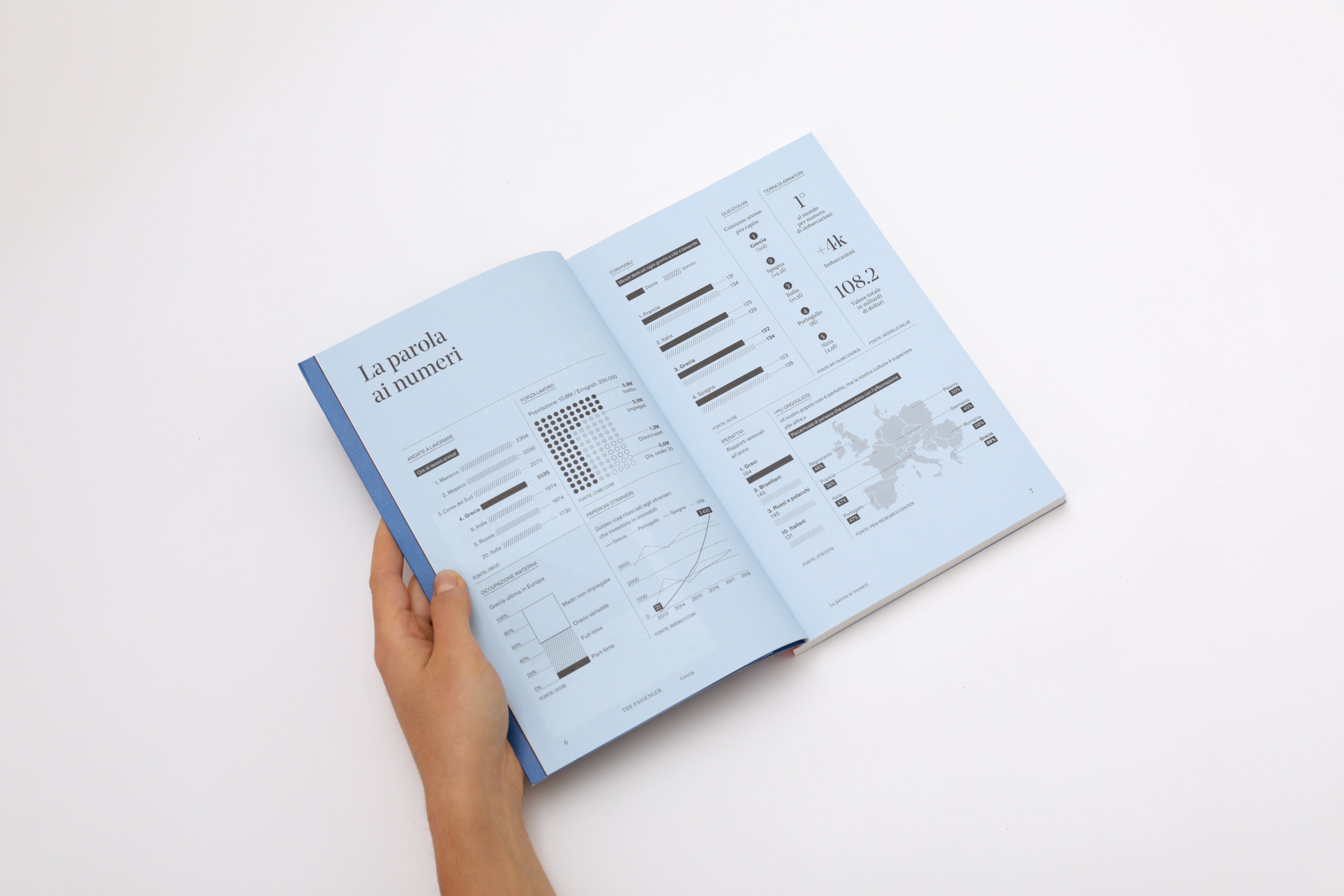
How does a carefully crafted map come to life—one built on precise, reliable information rather than approximation? For The Passenger, Iperborea’s book-magazine series, we have designed the entire system of infographics, data visualization, and cartography from the ground up. Each map starts with research: datasets, archives, and GIS tools are combined to build knowledge, not simply trace it. The result is rigorous yet readable, scientific in method and editorial in spirit. Pietro Buffa, now partner at Propp, previously helped shape the magazine’s graphic design with Tomo Tomo studio.
The Passenger Francia - November 2025
The Passenger Francia - November 2025
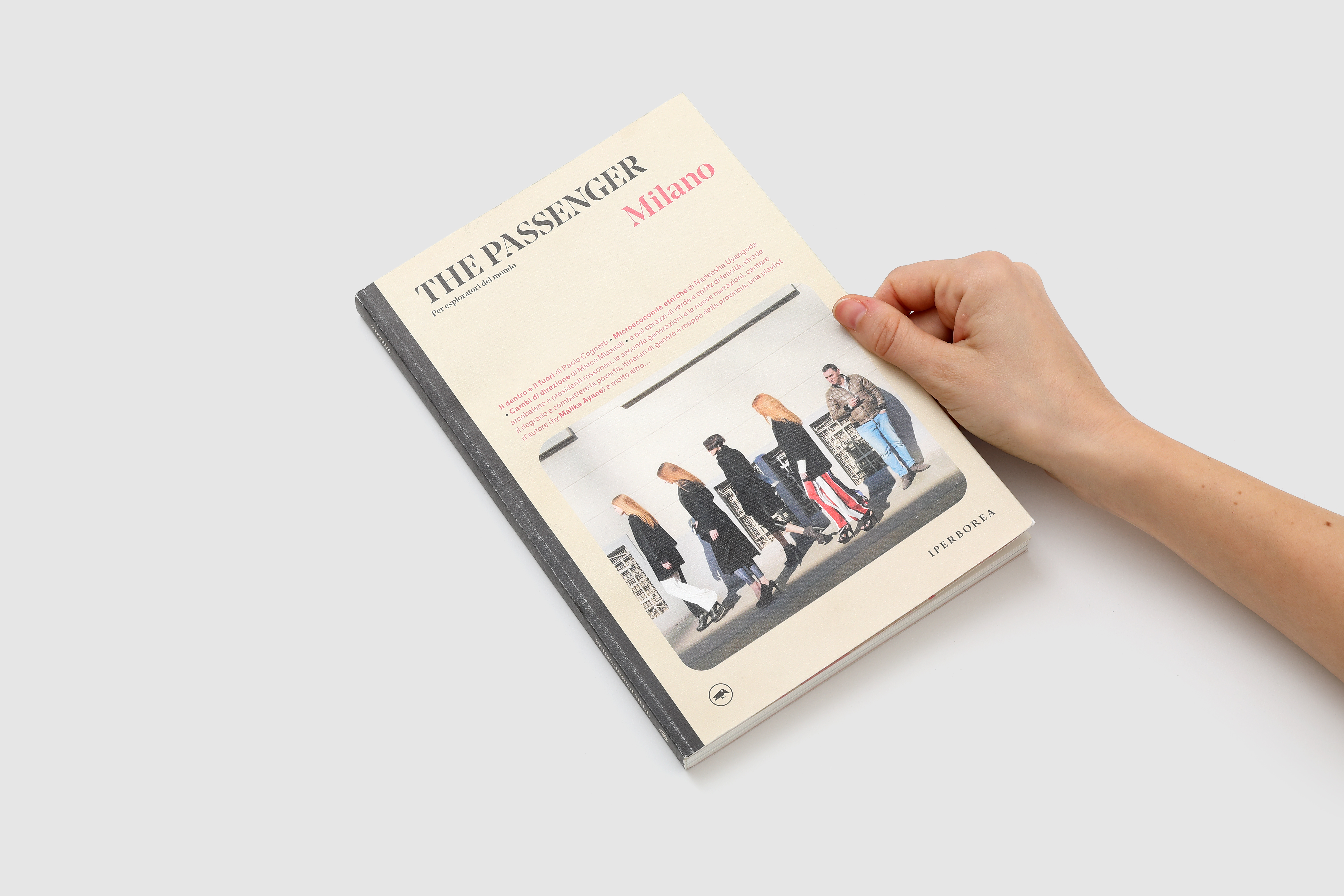
THE PASSENGER 2025
for: Iperborea
team: Pietro Buffa, Laura Bortolotti, Andrea Elena Febres Medina, Beatrice Savoldelli


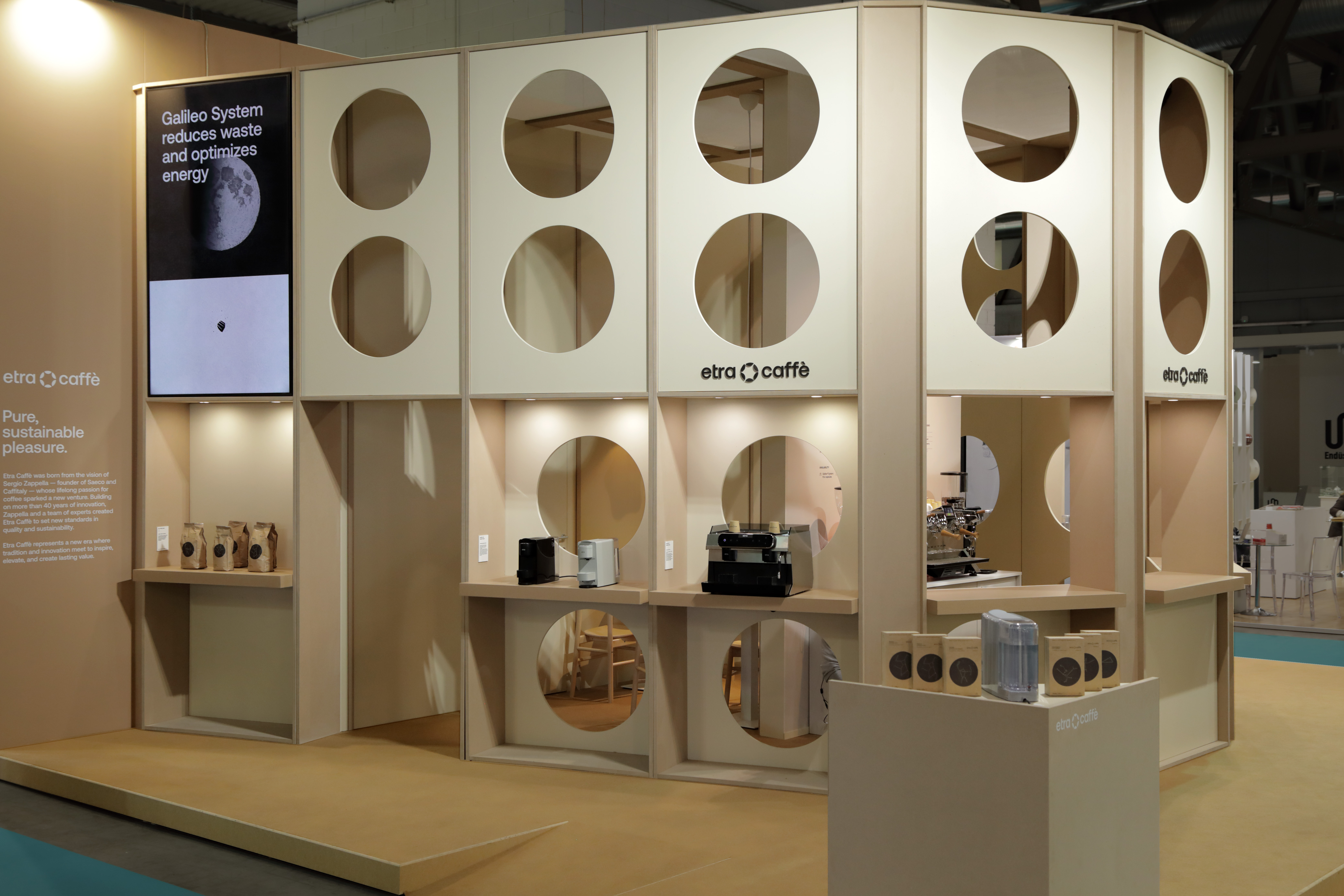
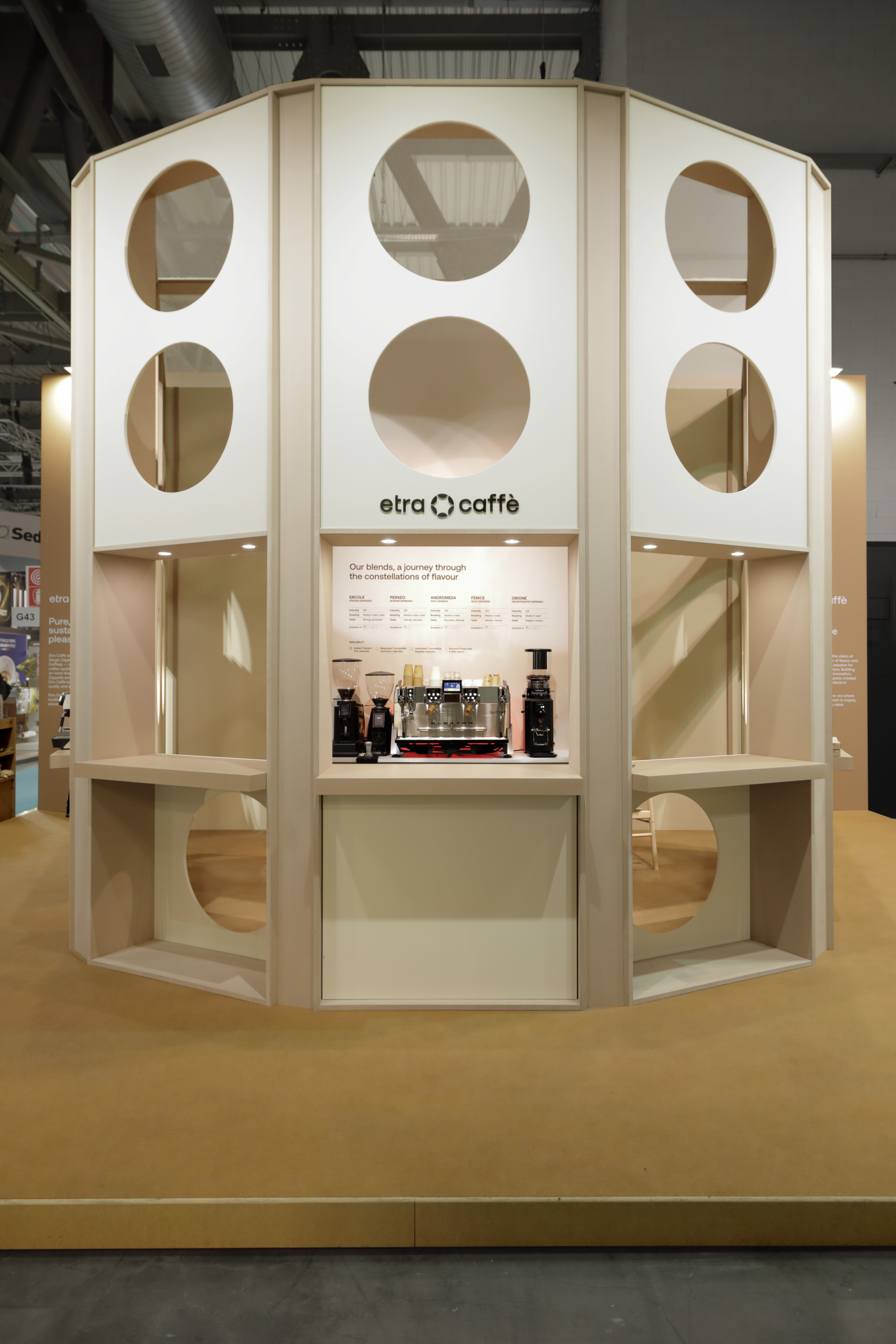
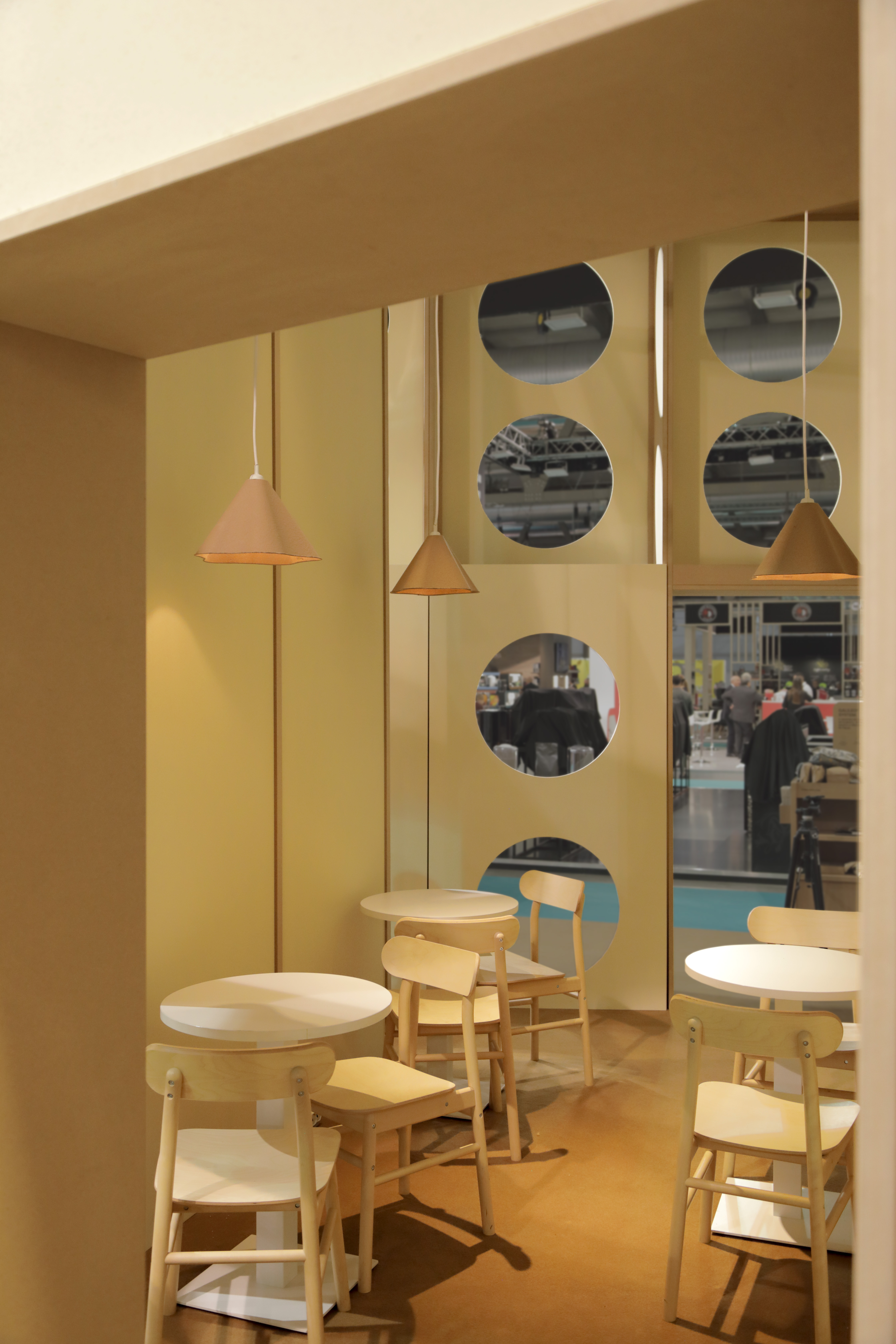
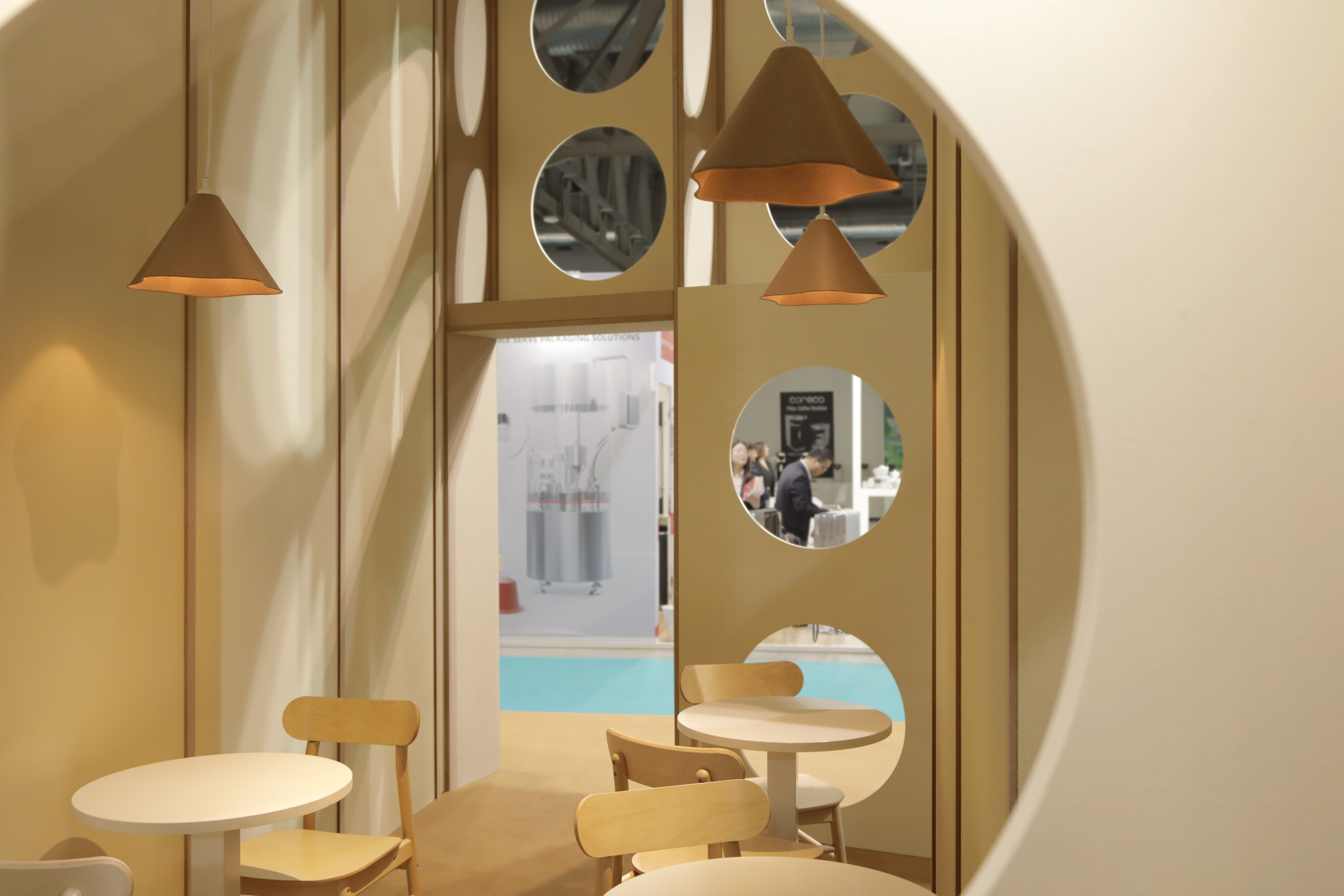
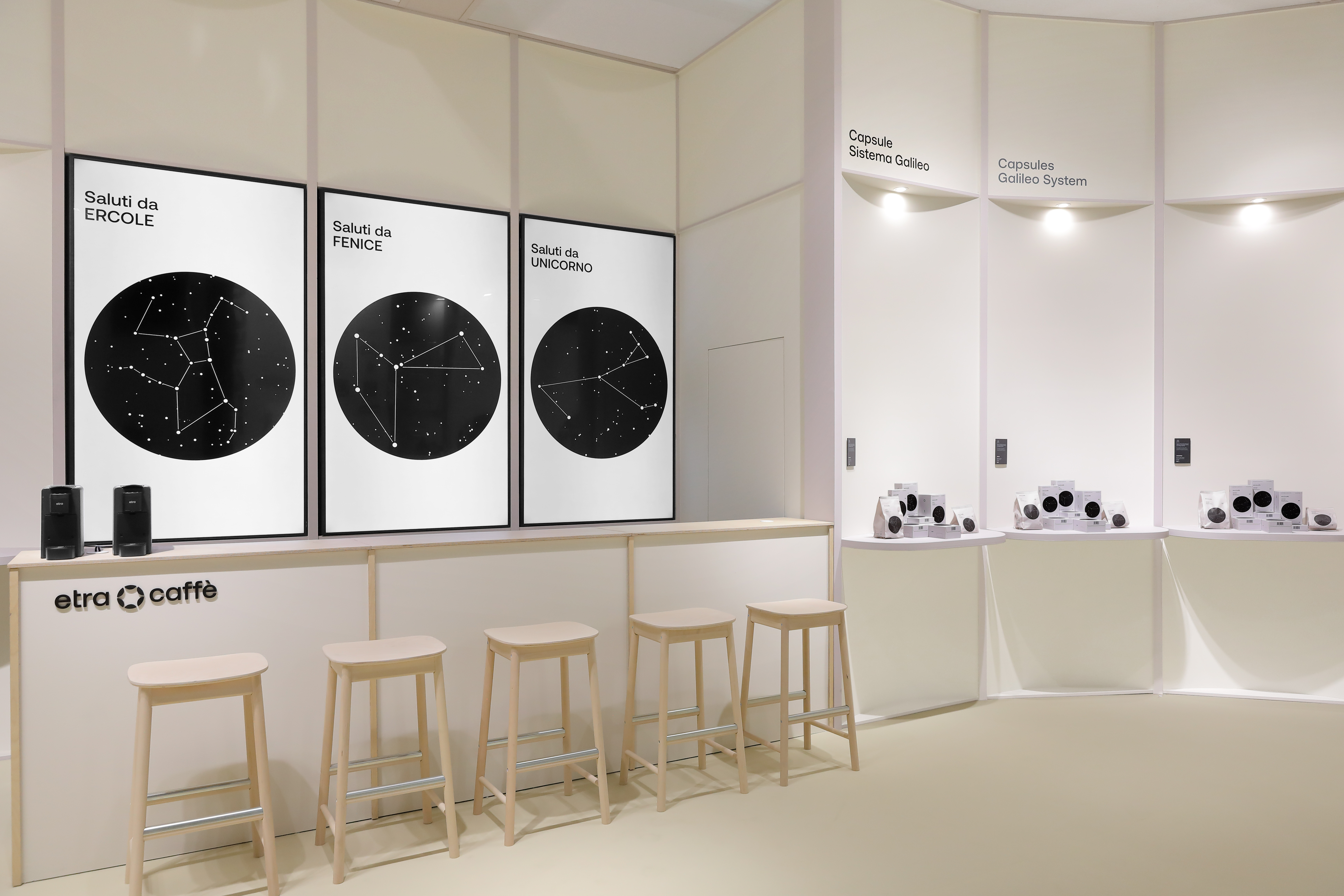
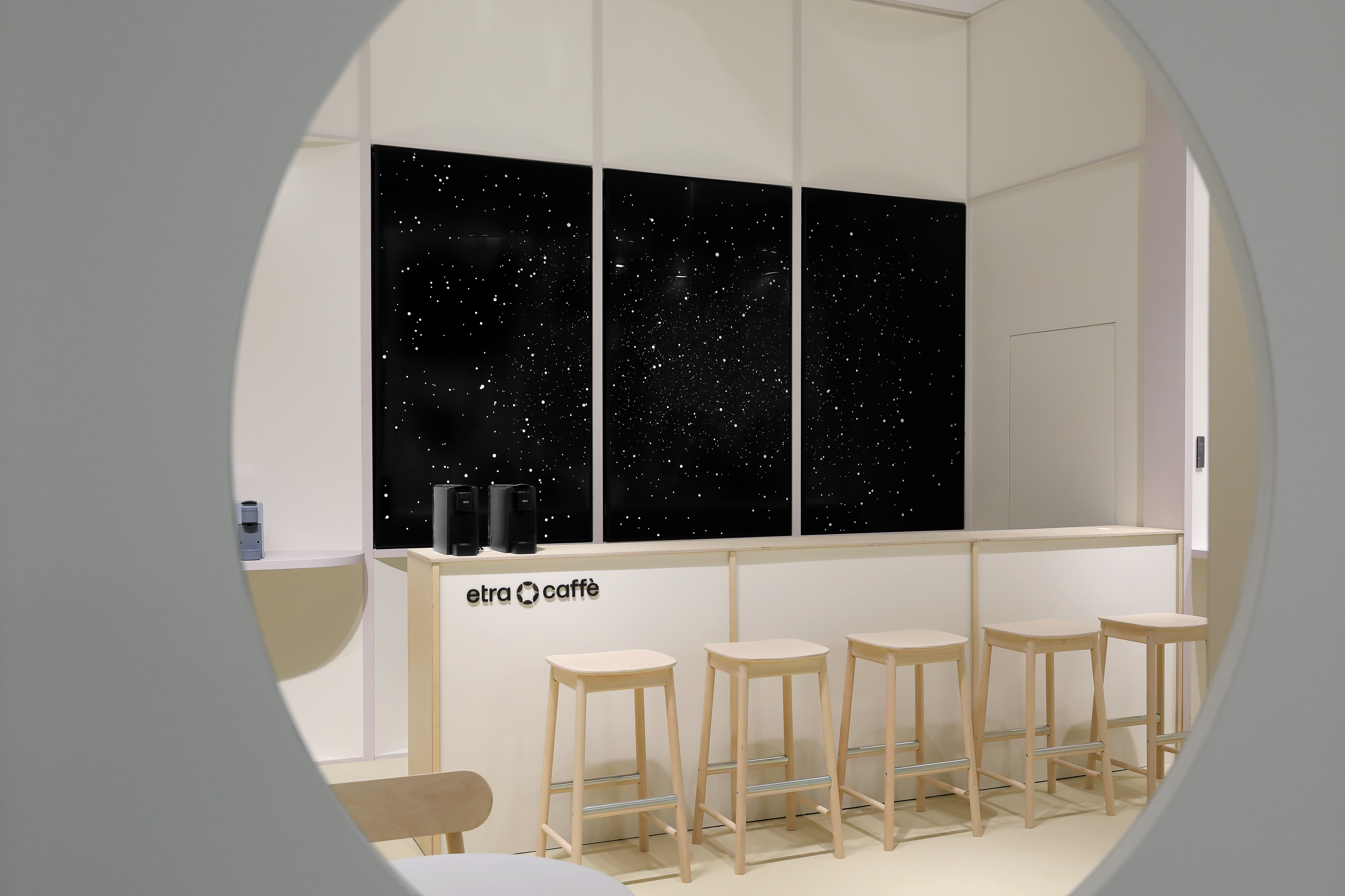
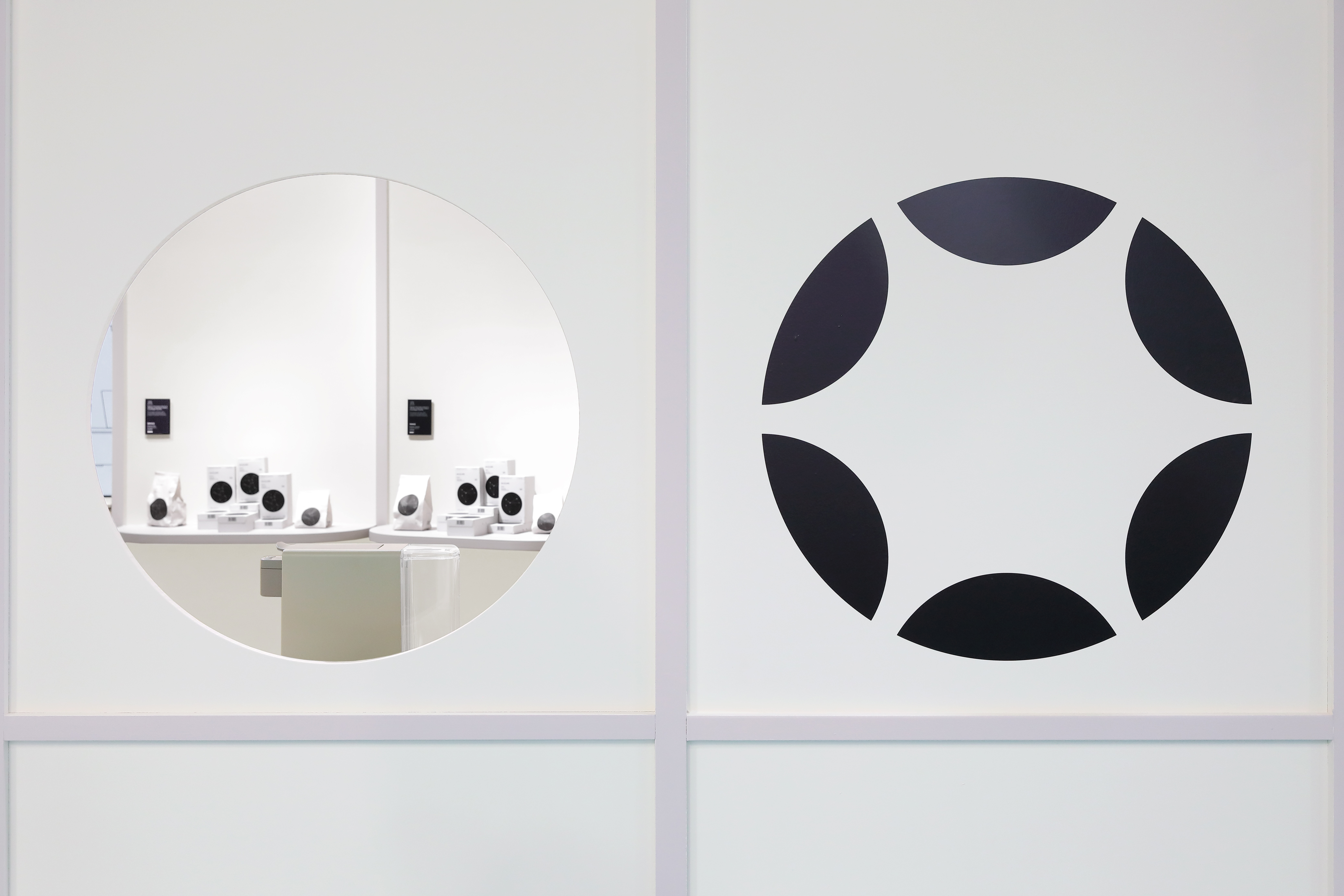
dives deep into the universe of hospitality — once again
Two years after its last appearance, Etra is back at Host Milano, showcasing the brand identity designed by Propp. The concept of pure and sustainable pleasure takes shape in a booth designed by Paolo Giacomazzi, inspired by the clean lines and welcoming atmosphere of a modern diner. Inside this small architectural space, static and animated content come together in a video installation centered on Etra’s eco-sustainable line of products.
ETRA HOST 2025
team: Pietro Buffa, Pierluigi Anselmi, Giada Fiorenza, Marco Gabriele

︎
The animation — a two-minute loop — stands out across the entire pavilion thanks to its strategic placement and its distinctive visual language, breaking away from the usual stylistic codes of the Horeca world. Through black-and-white visuals, minimalist shapes, fluid animation, and a narrative inspired by a journey through space, Etra brings a poetic and inspiring touch to an environment typically driven by business.
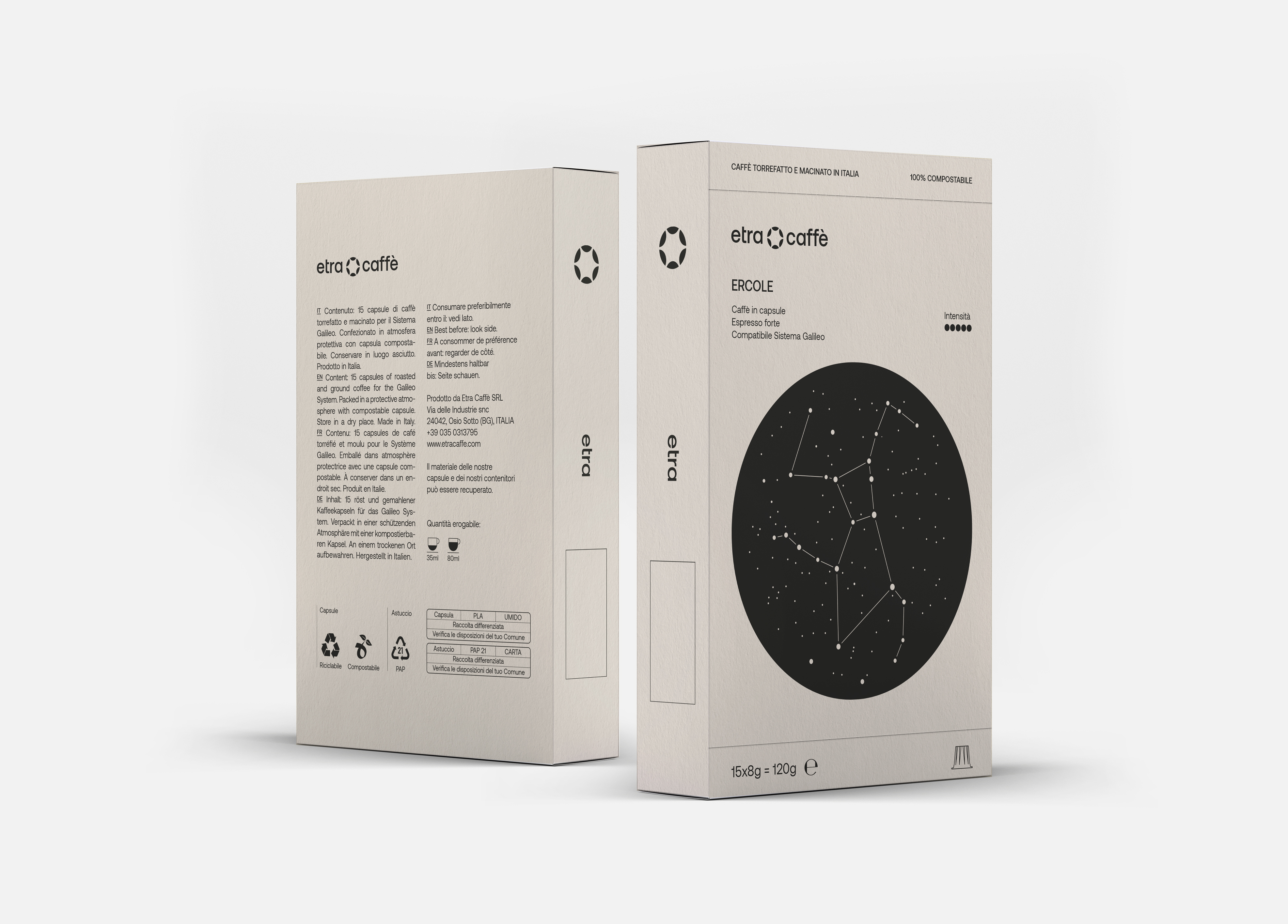
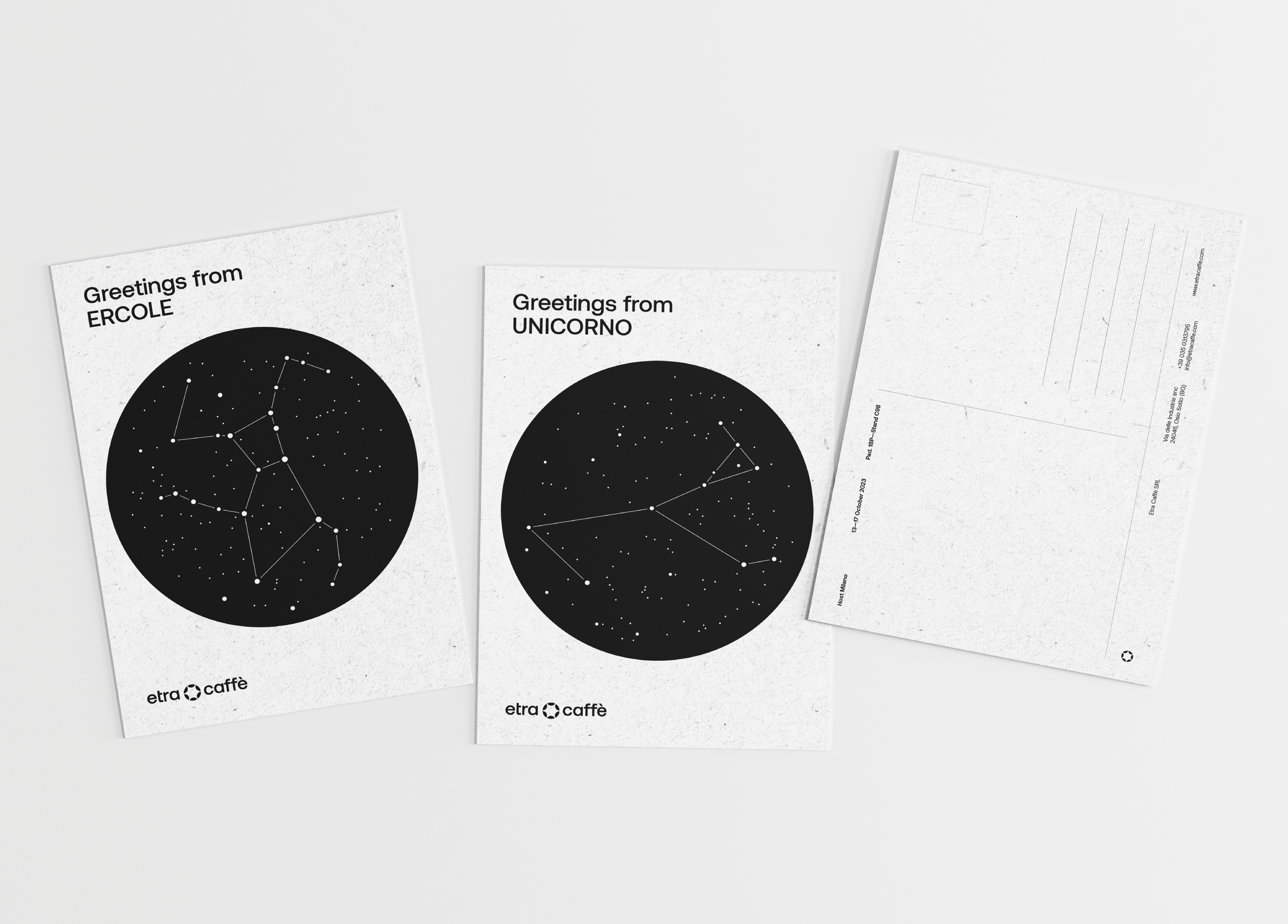
Completing the project are the packaging designs, originally developed during the branding phase and now produced on 100% recycled havana paper, marking a thoughtful evolution from two years ago.
Completing the project are the packaging designs, originally developed during the branding phase and now produced on 100% recycled havana paper, marking a thoughtful evolution from two years ago.


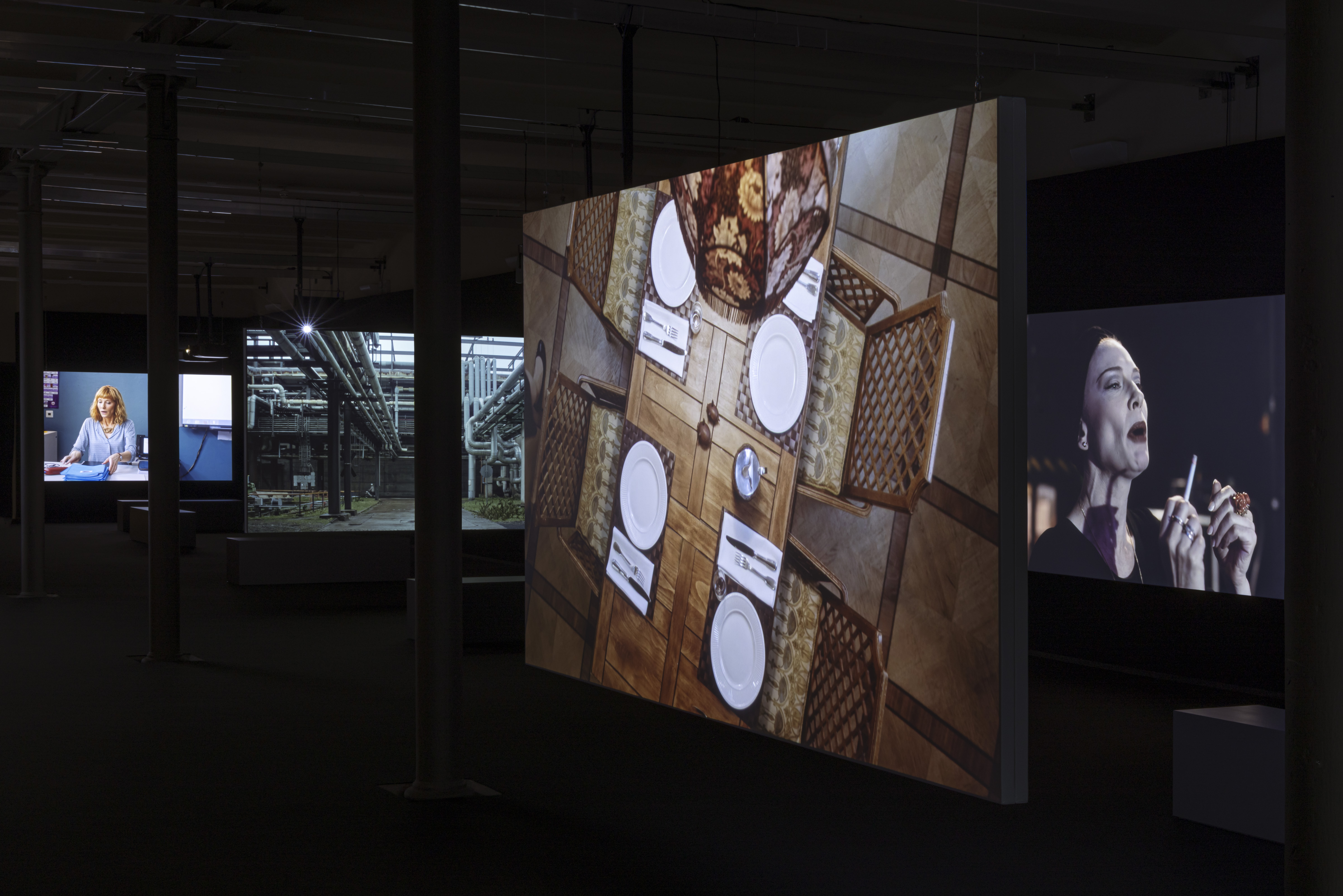
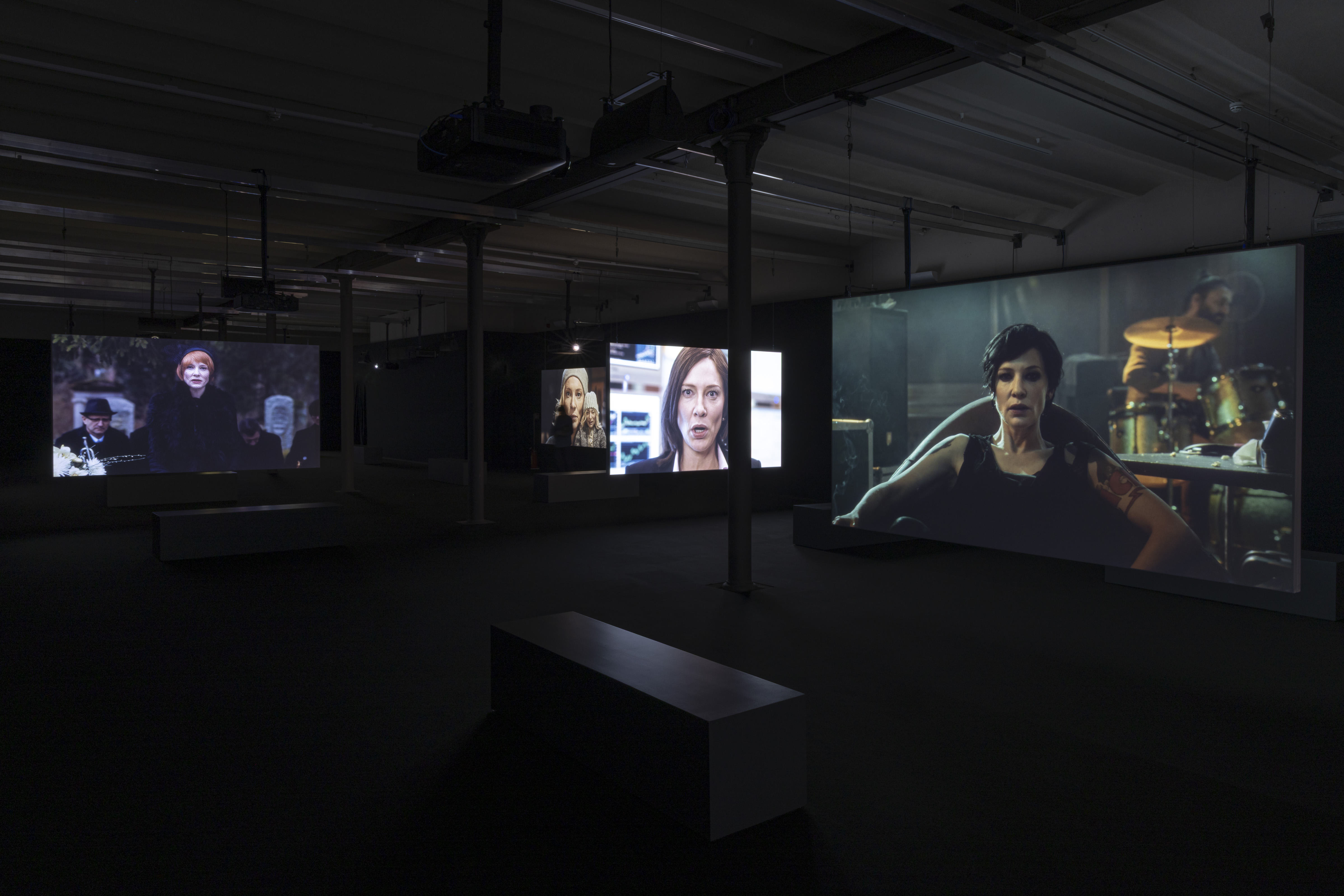
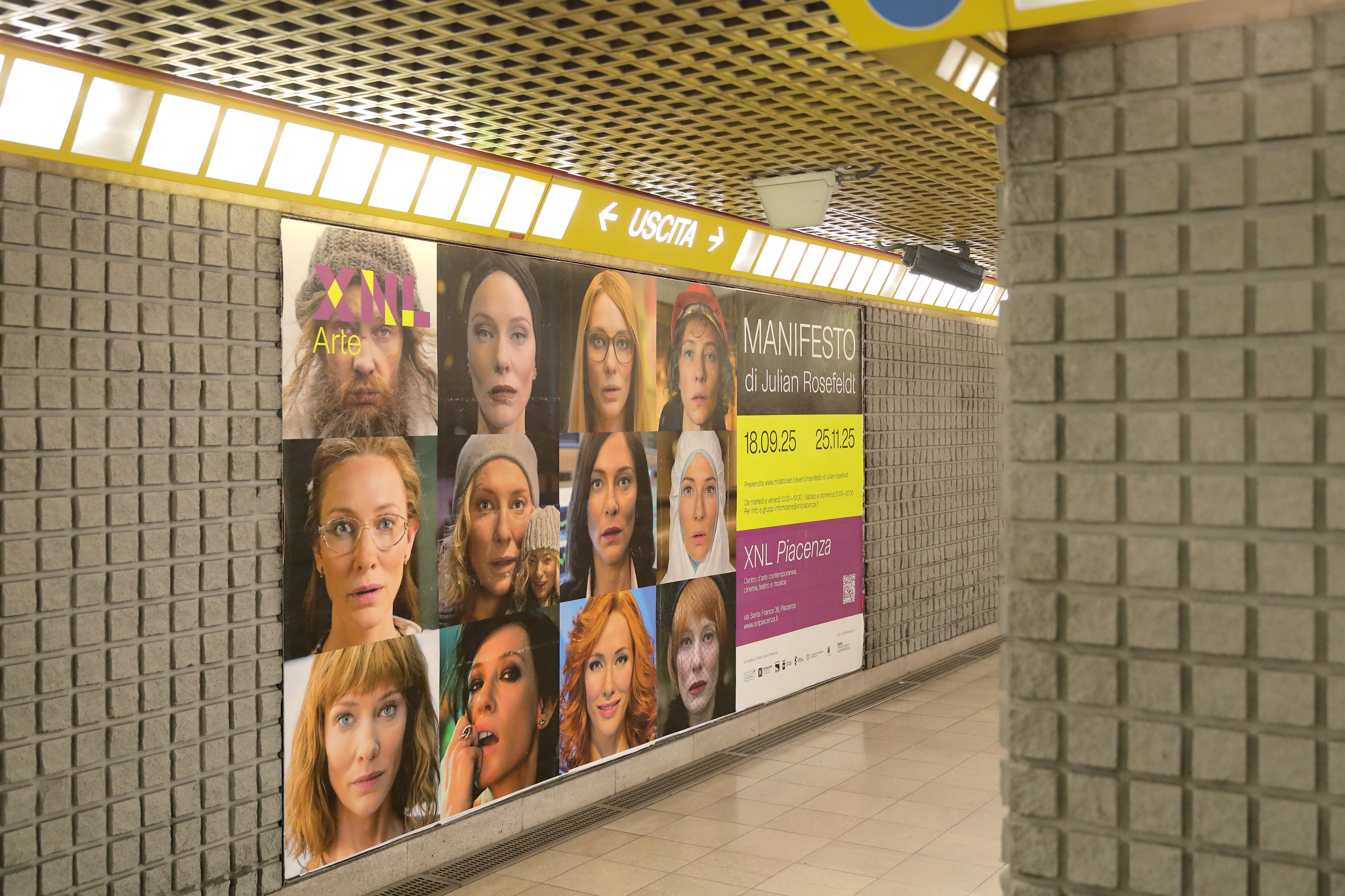
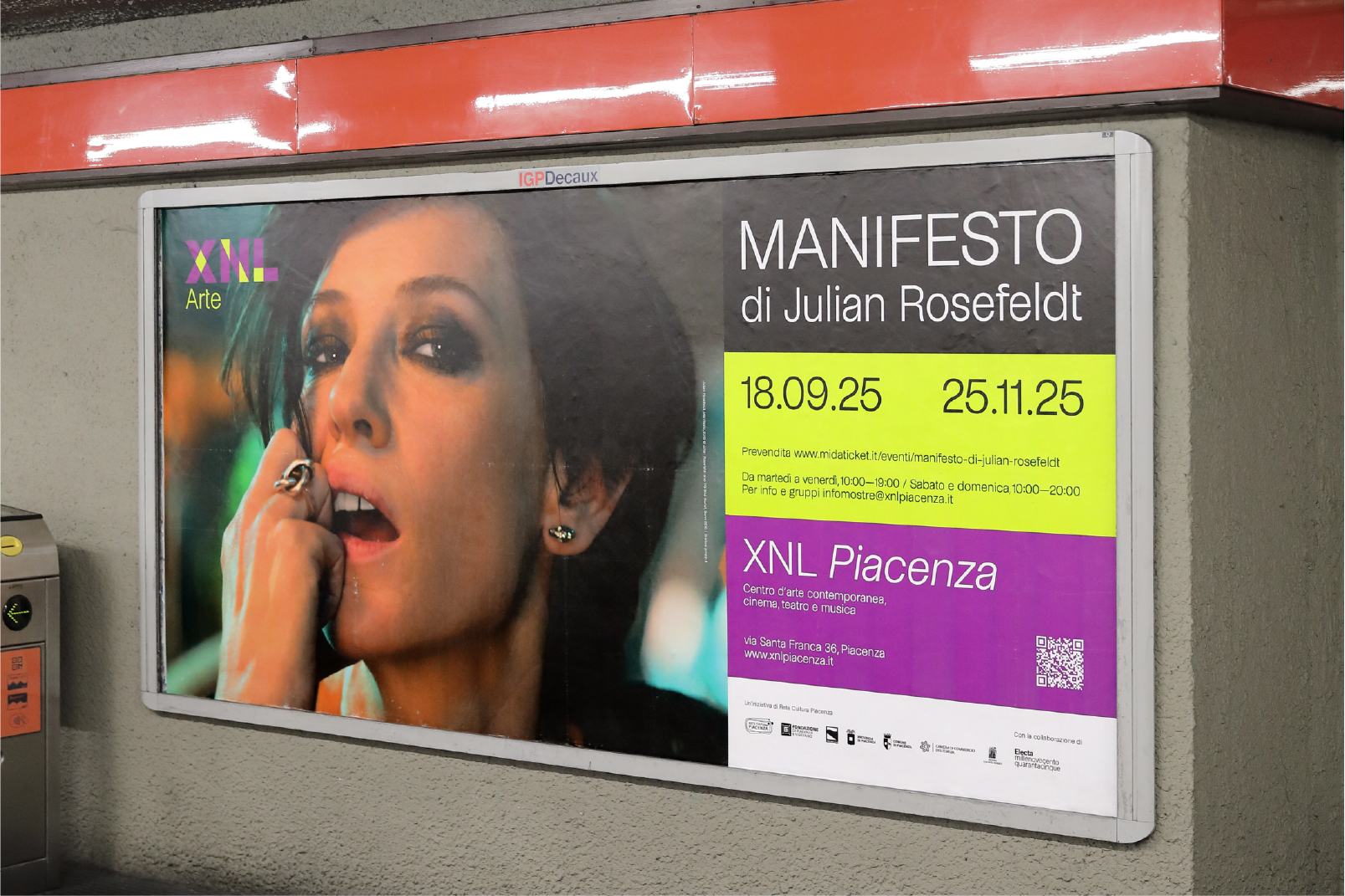
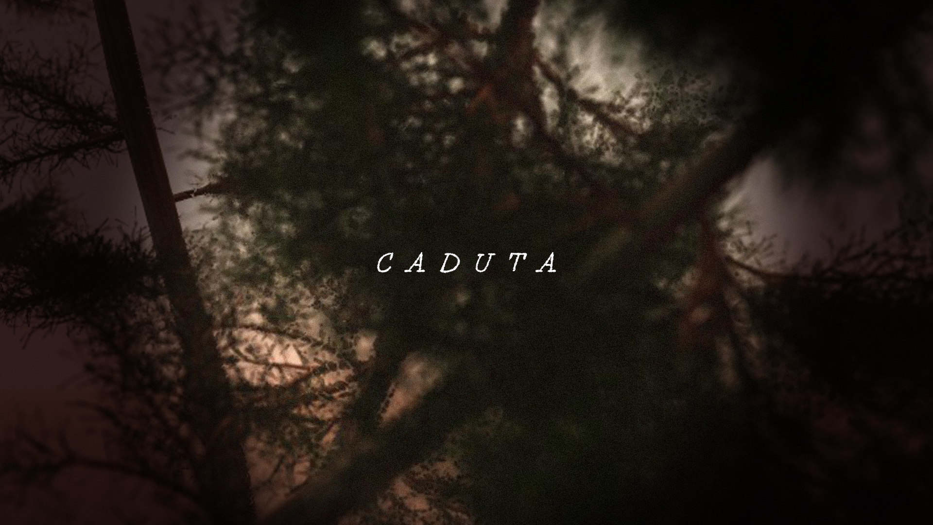
demonstrates in Piacenza
Manifesto by Julian Rosefeldt is a 13-channel film installation: a tribute to the history of artist manifestos from Futurism to Fluxus, Situationism and many more, quoting Kazimir Malevich, André Breton or Jim Jarmusch through the lens of director Julian Rosefeldt and performed by Academy Award winner Cate Blanchett. As part of XNL Arte’s agenda we designed the overall communication and graphics of the exhibit.
XNL ARTE — MANIFESTO
for: XNL Piacenza, Fondazione di Piacenza e Vigevano
team: Pierluigi Anselmi, Alessandro C. Busseni, Giada Fiorenza, Marco Gabriele
installation view by Daniele Signaroldi


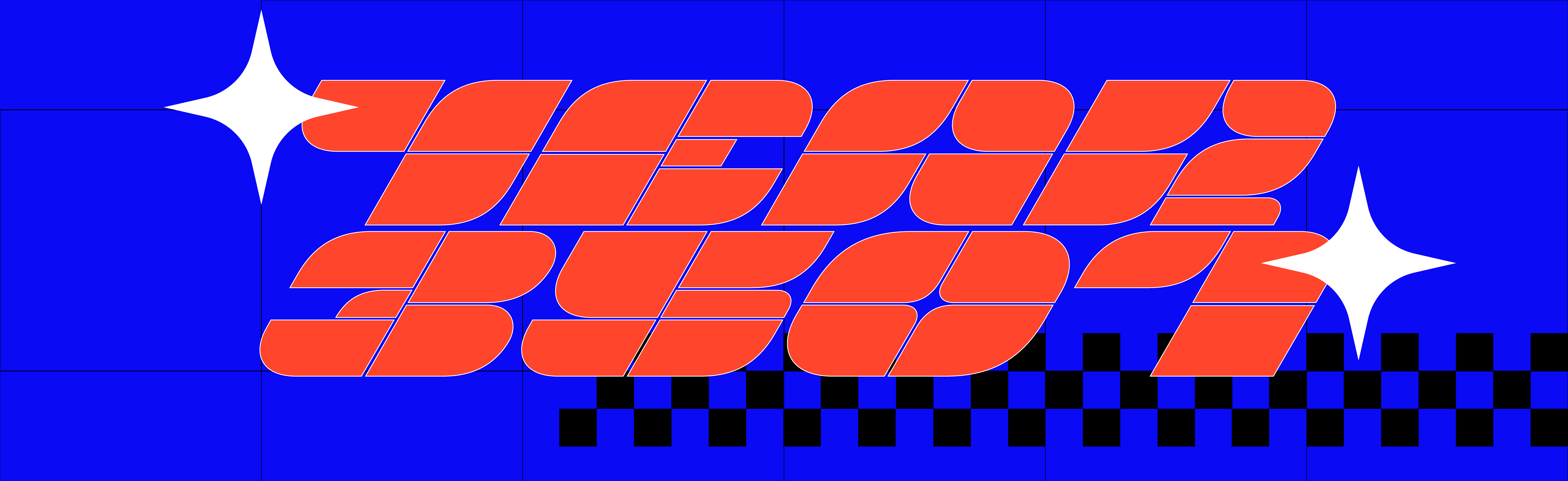
types back from the future
Future Forms is a display typeface inspired by a mix of early 2000s gaming culture, idolatry of constructivism and too much sci-fi adolescense’s readings. Rational, modular, geometric, squared and still rounded, it comes in the condensed, regular and expanded variants with their respective italic styles.
Future Forms is a ever evolving project ︎︎︎ contact us if you want to test it.
Future Forms is a ever evolving project ︎︎︎ contact us if you want to test it.
FUTURE FORMS DISPLAY
team: Alessandro C. Busseni, Beatrice Savoldelli


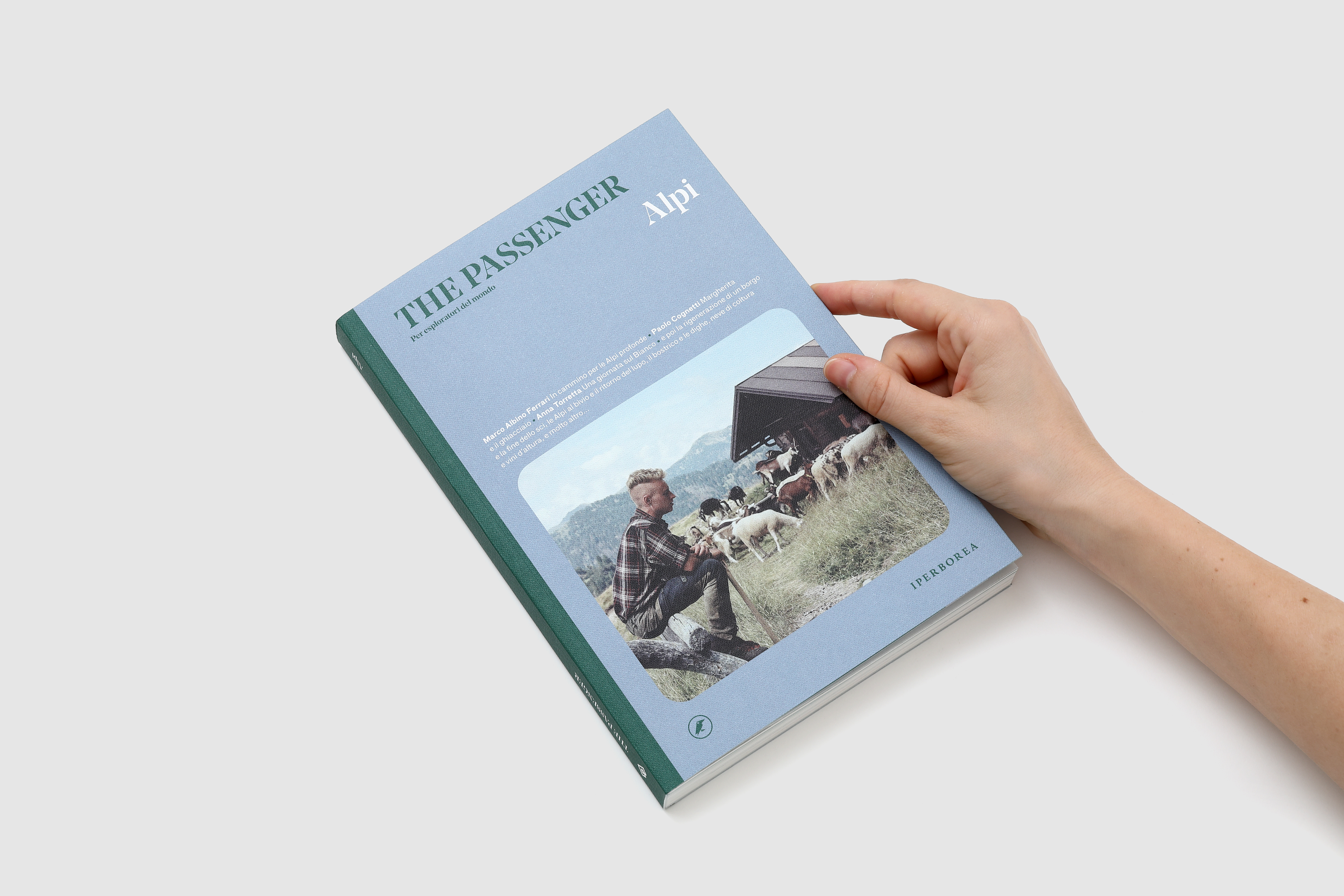
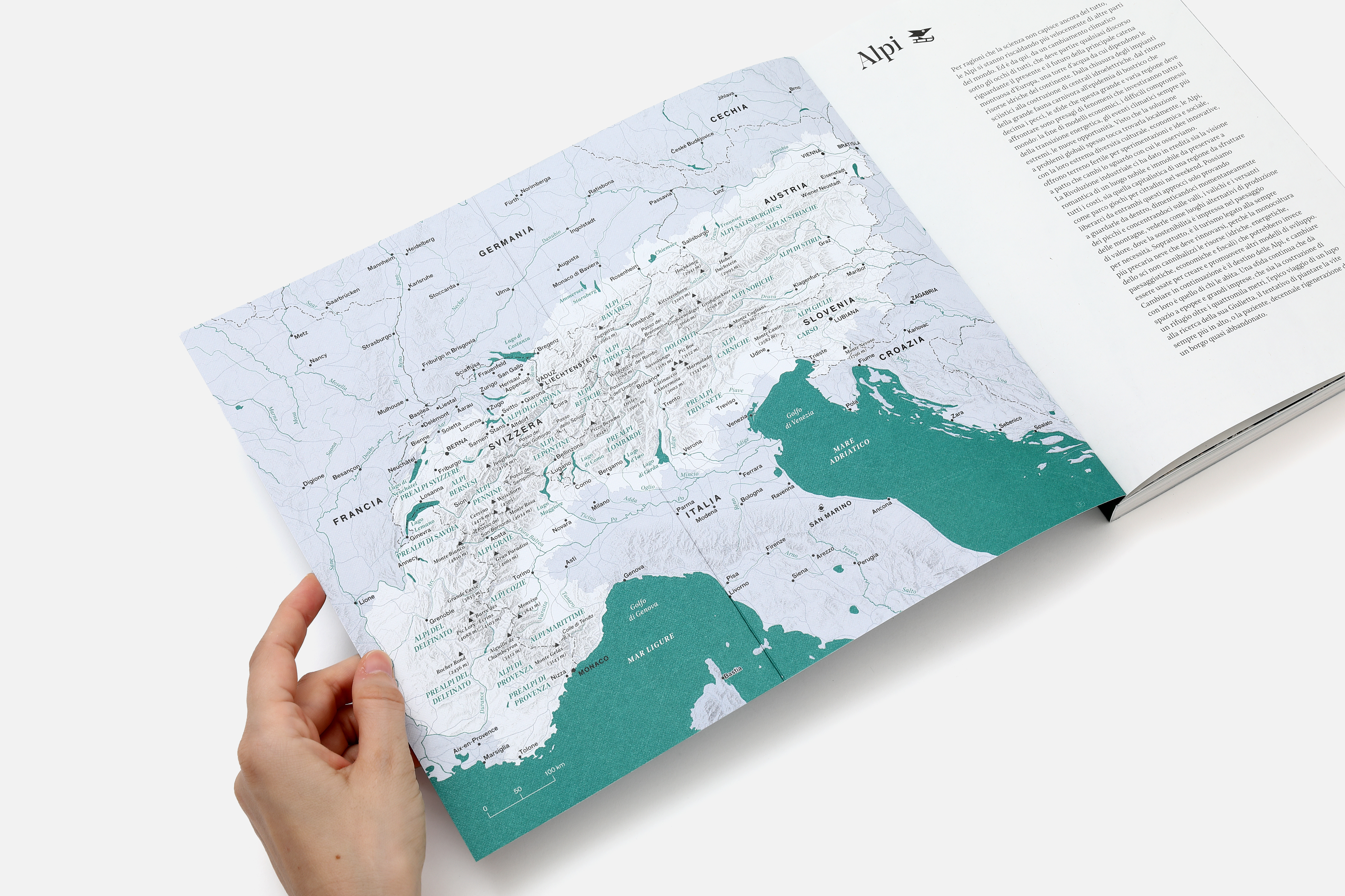
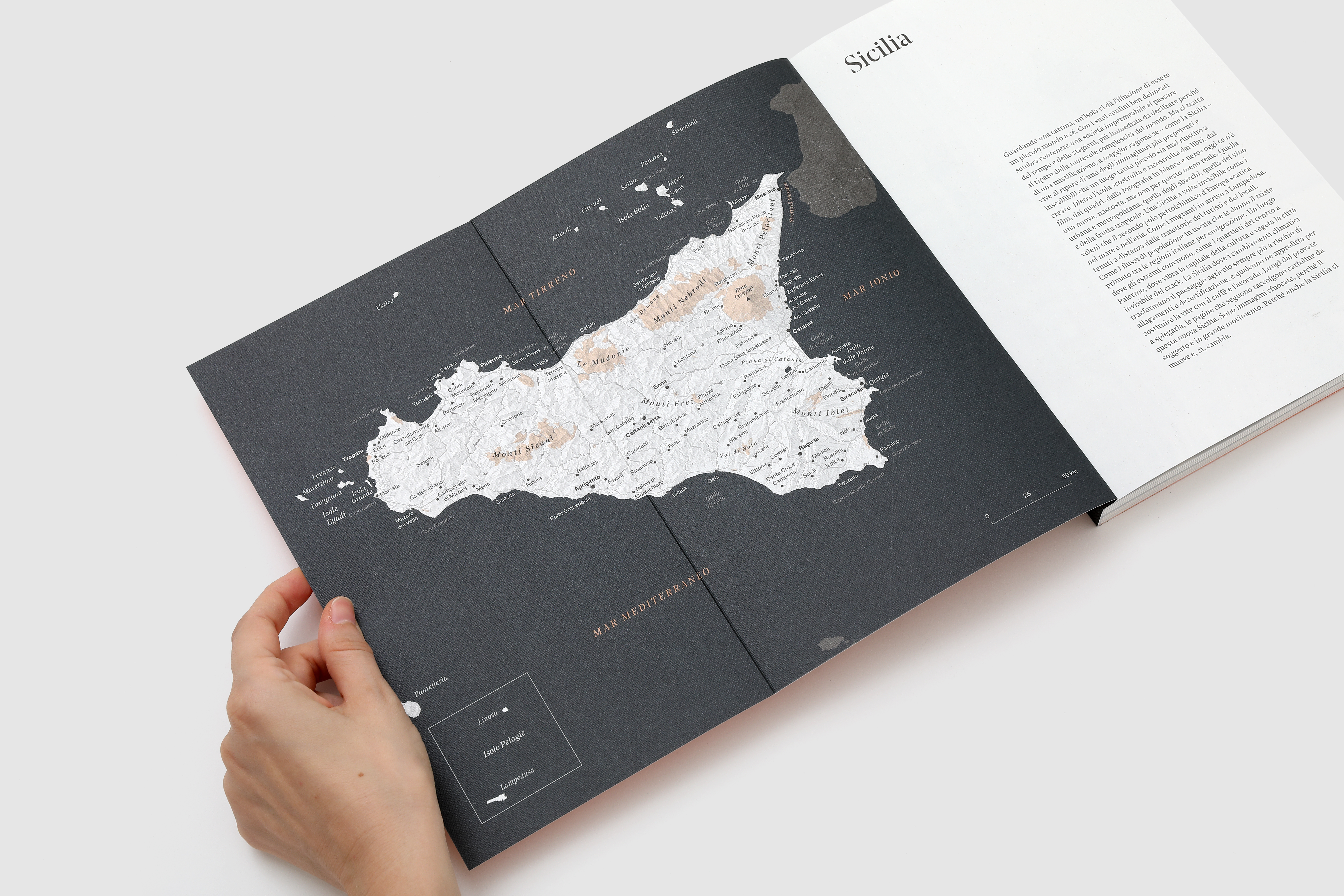
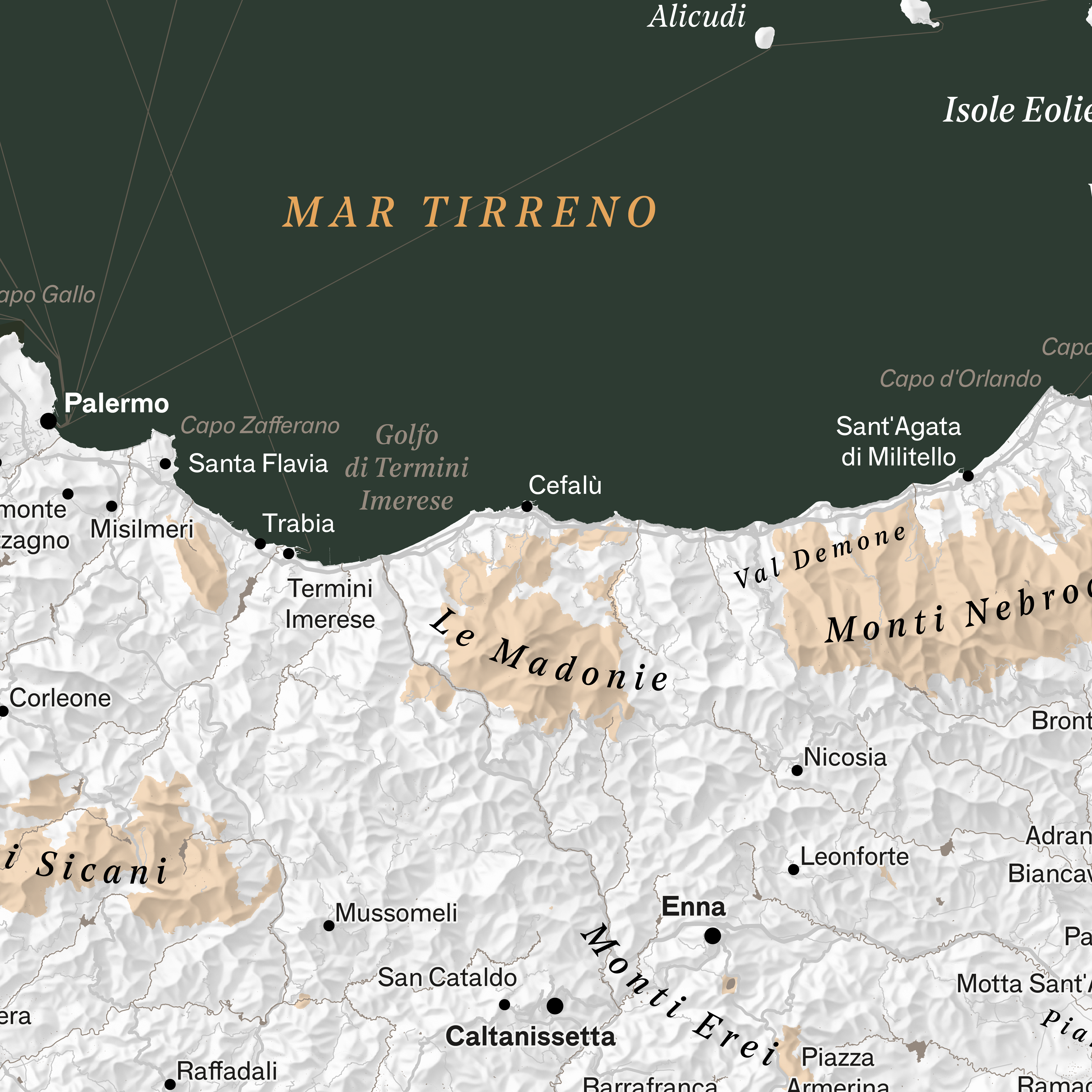
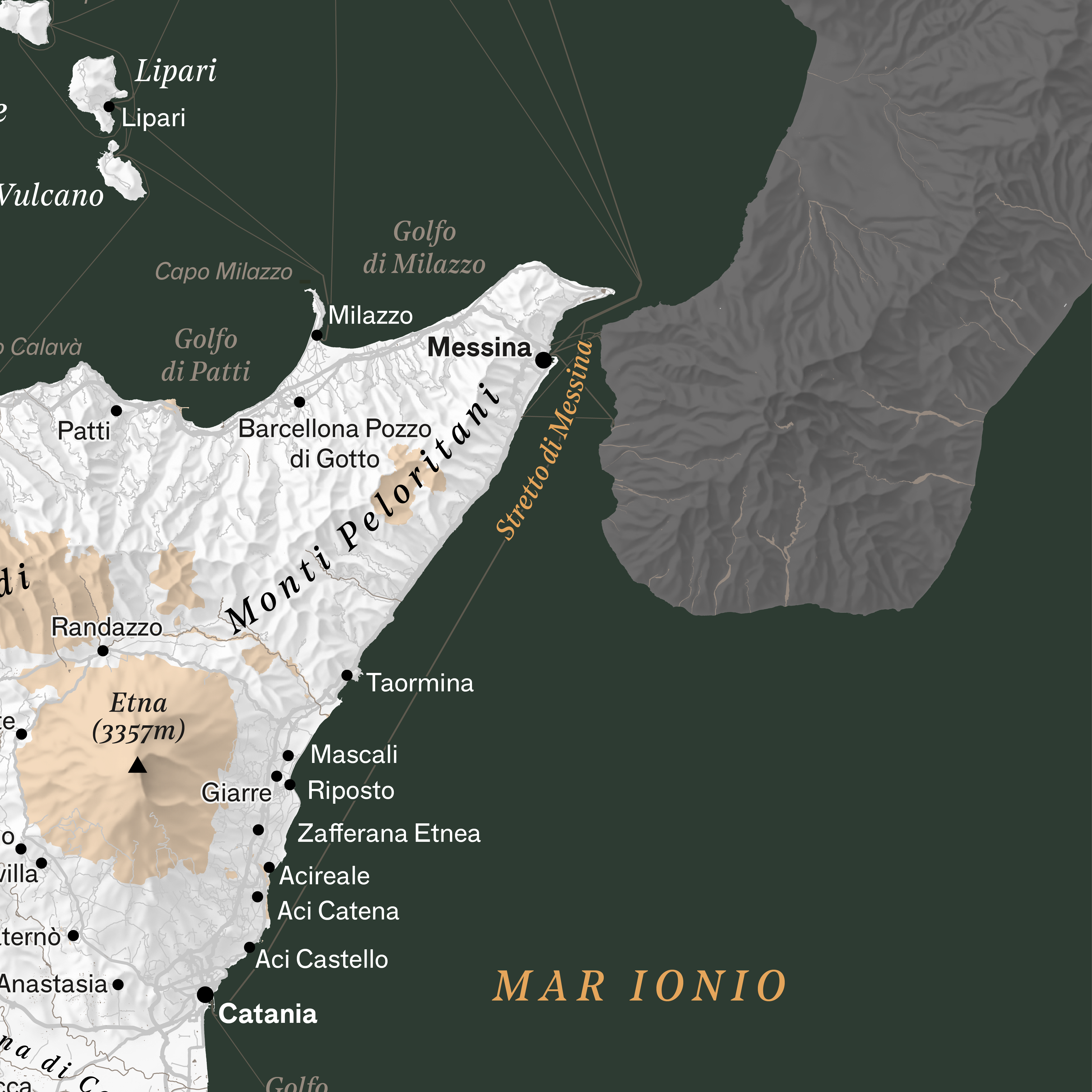
plans the hero’s journey
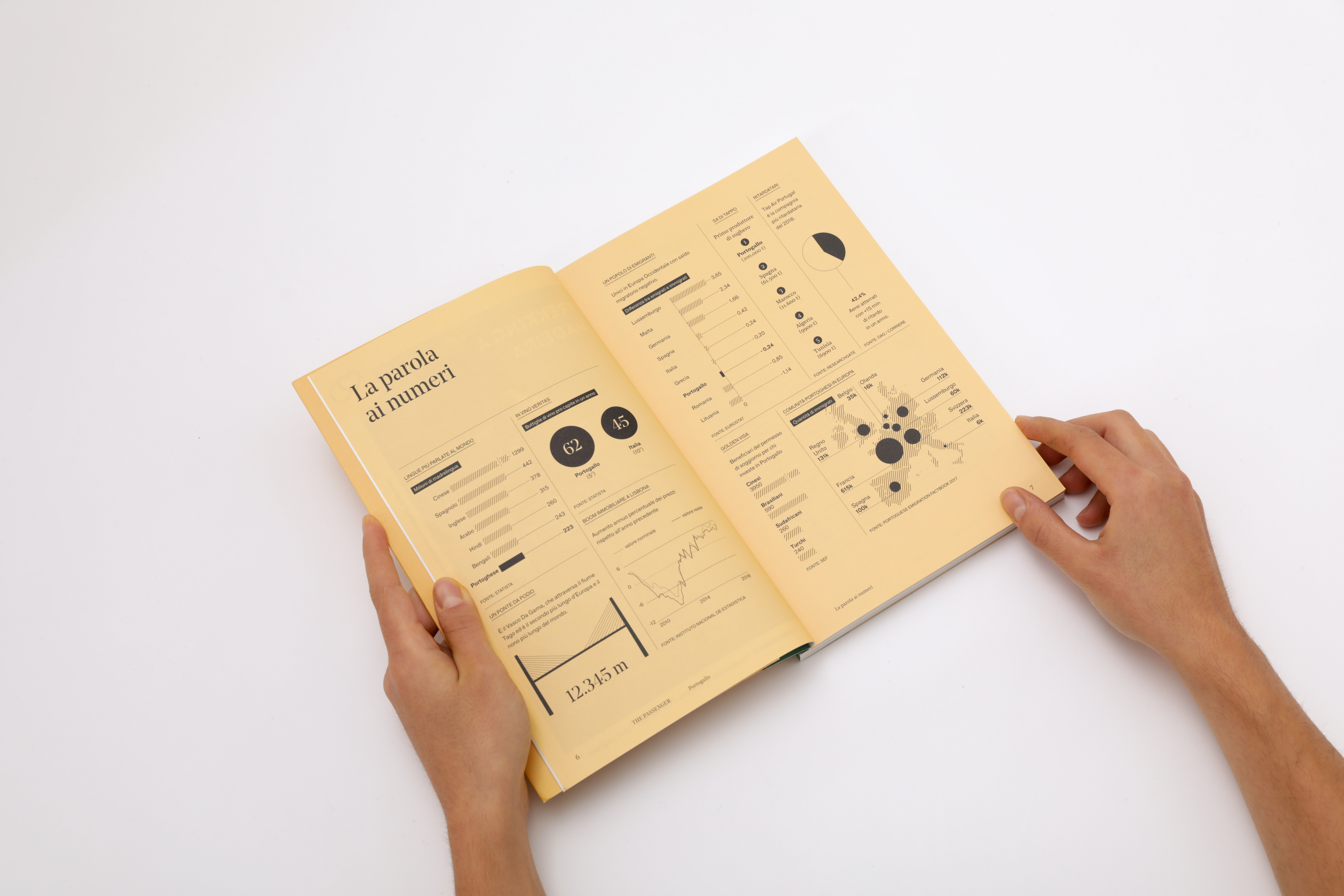
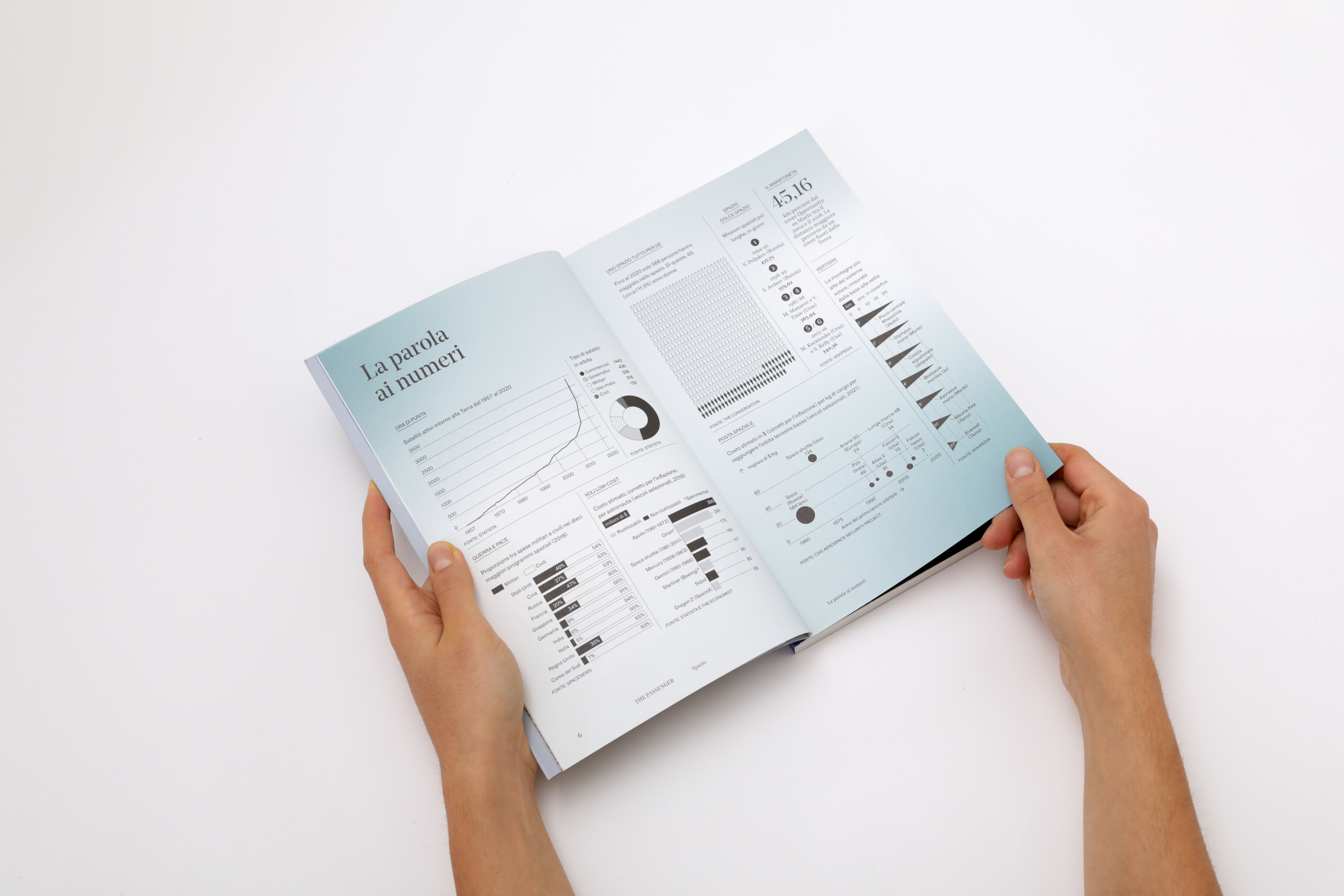
How does a carefully crafted map come to life—one built on precise, reliable information rather than approximation? For The Passenger, Iperborea’s book-magazine series, we have designed the entire system of infographics, data visualization, and cartography from the ground up. Each map starts with research: datasets, archives, and GIS tools are combined to build knowledge, not simply trace it. The result is rigorous yet readable, scientific in method and editorial in spirit. Pietro Buffa, now partner at Propp, previously helped shape the magazine’s graphic design with Tomo Tomo studio.
The Passenger Londra - February 2024
The Passenger Alpi - April 2024
The Passenger Sicilia - June 2024
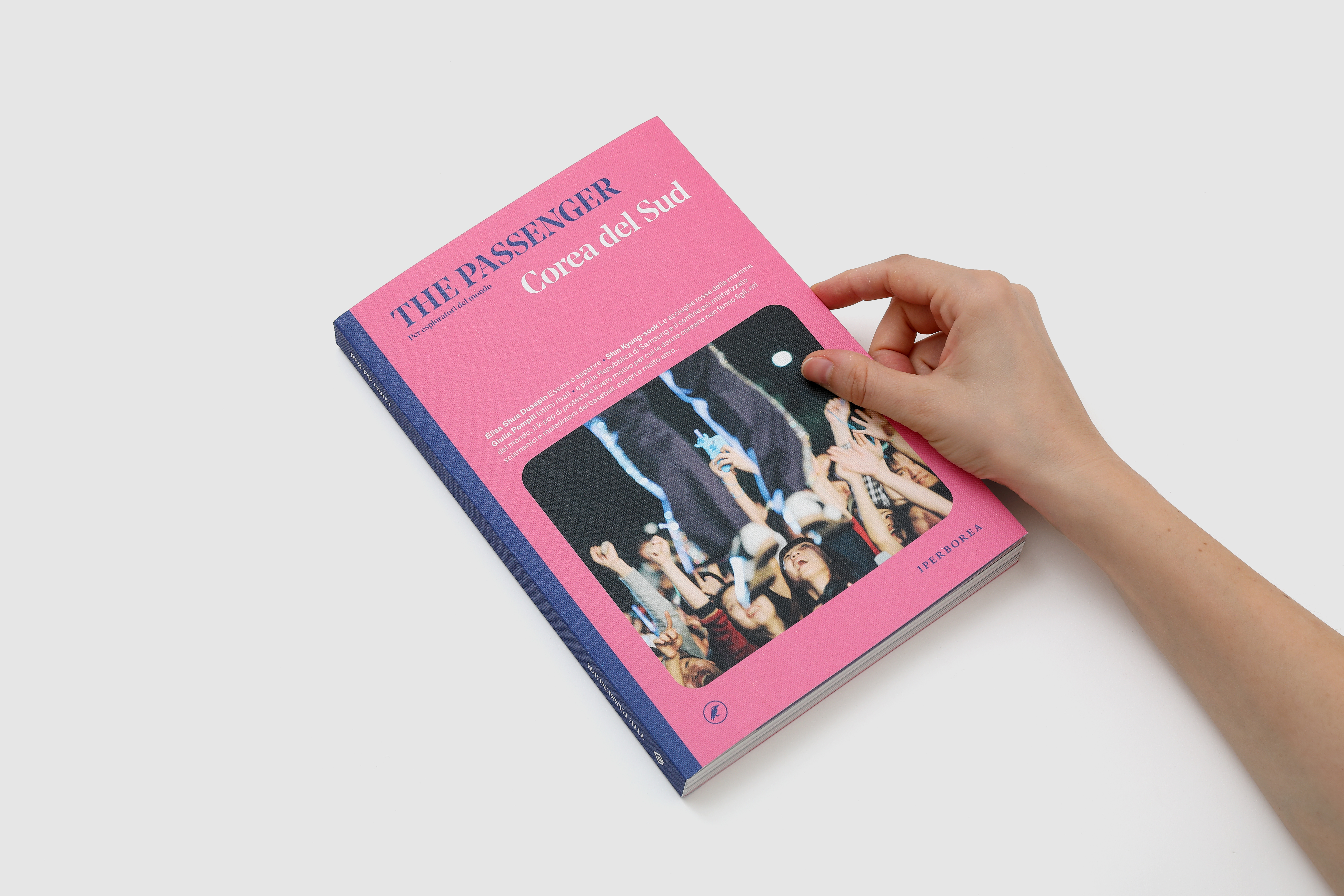
The Passenger Corea del Sud - November 2024
The Passenger Londra - February 2024
The Passenger Alpi - April 2024
The Passenger Sicilia - June 2024
The Passenger Corea del Sud - November 2024
THE PASSENGER 2024
for: Iperborea
team: Pietro Buffa, Marco Gabriele, Giada Fiorenza, Mara Castiglioni, Matteo Postinghel, Asia Capezzuoli, Giacomo Quinland, Beatrice Savoldelli


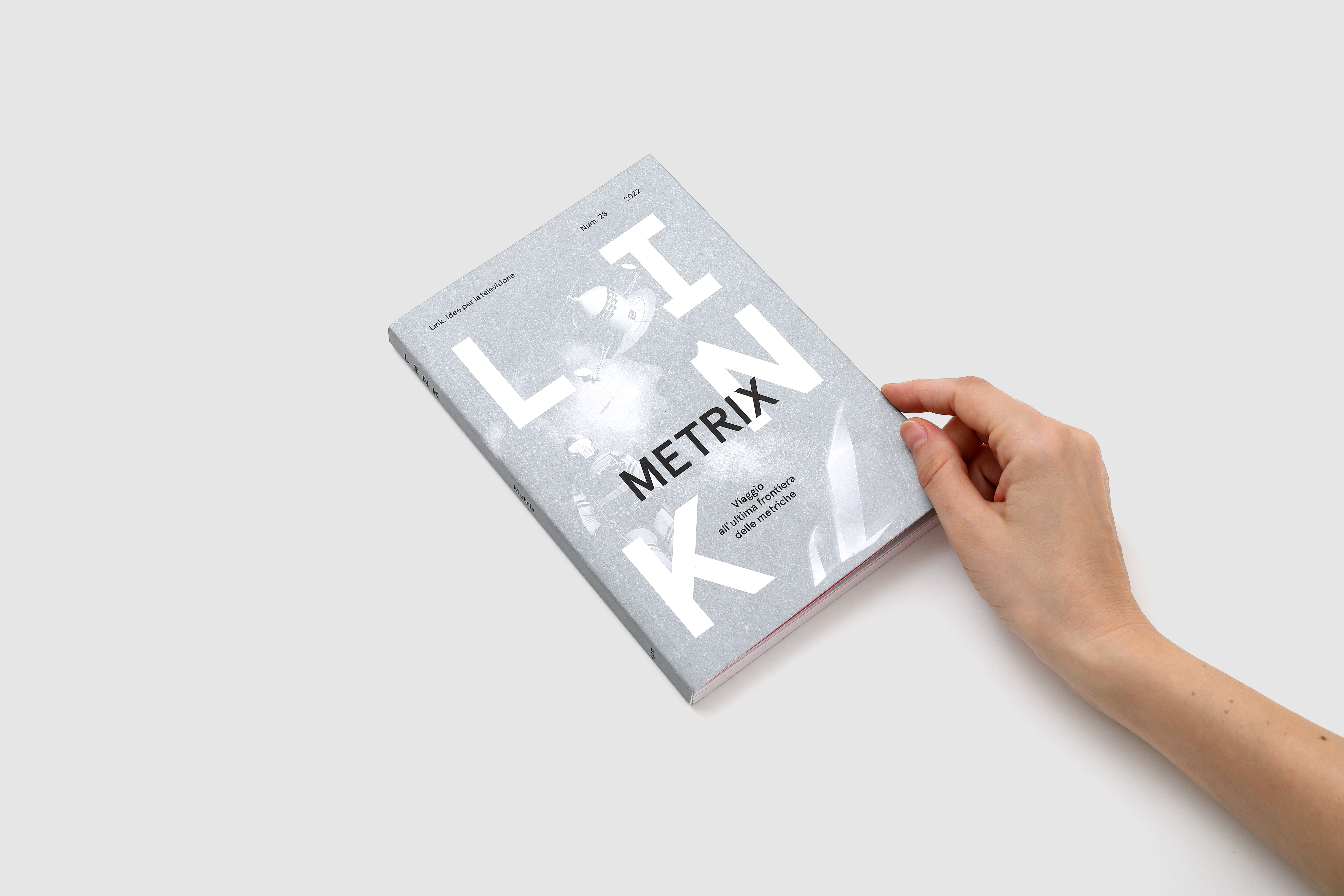
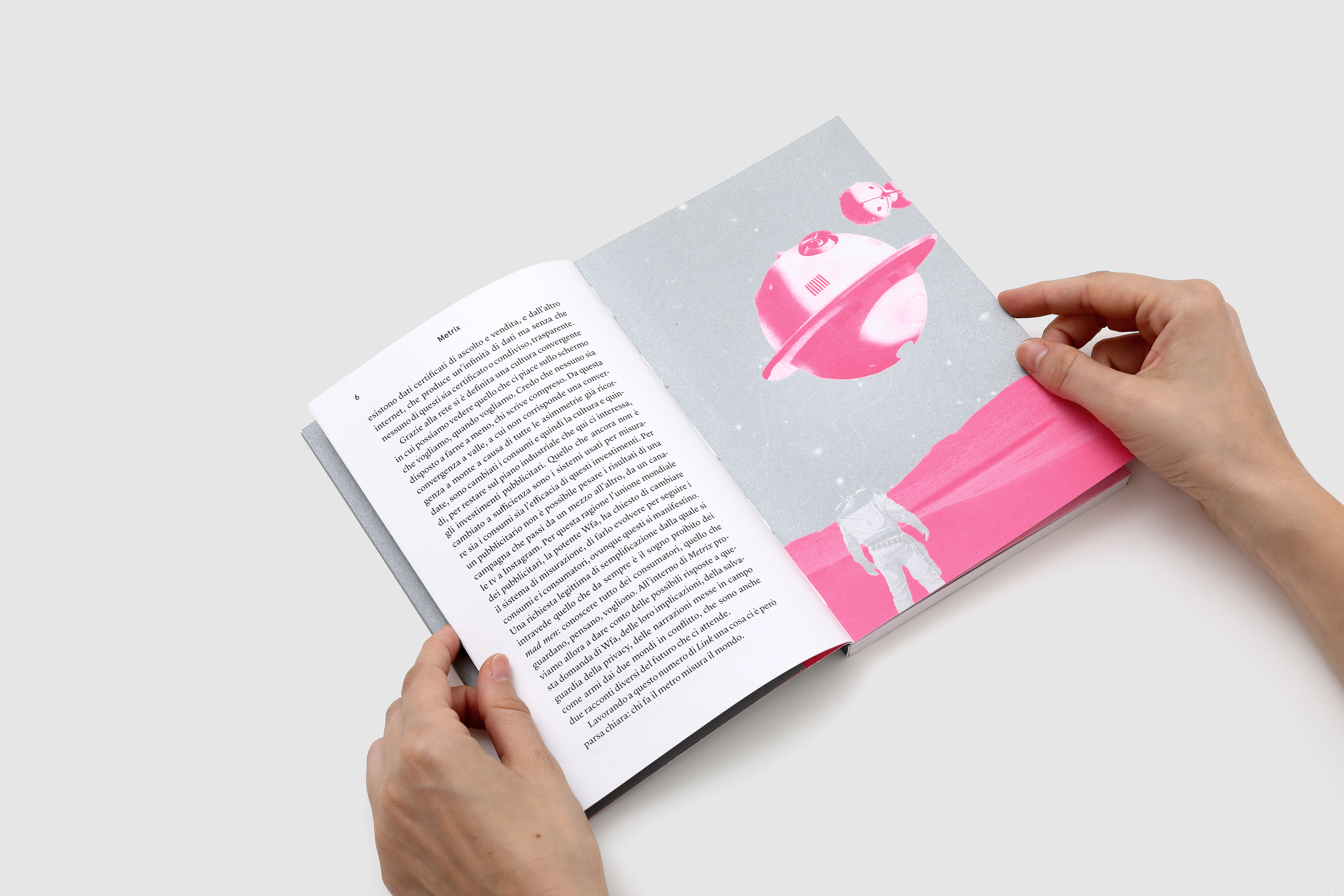
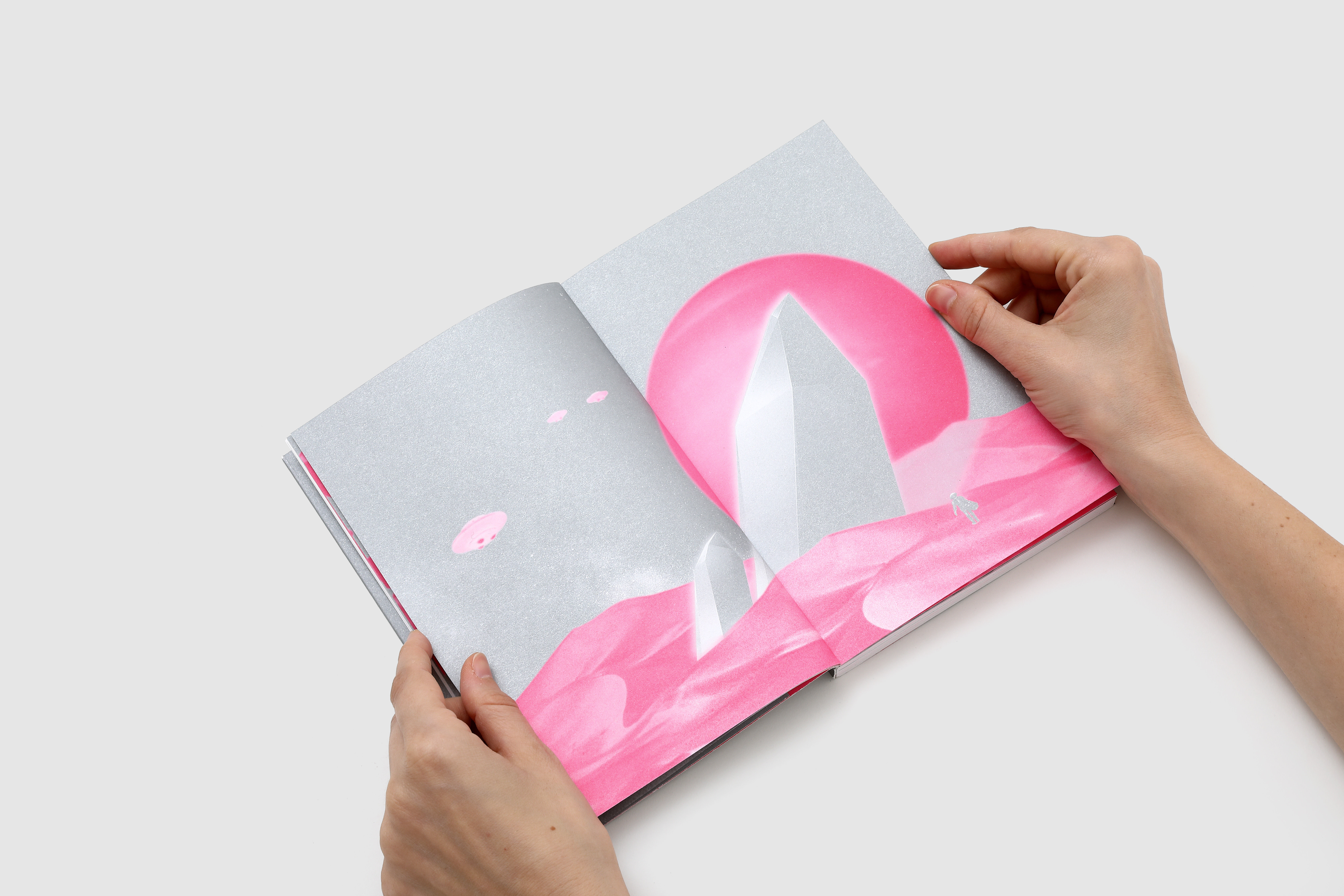
turns on the TV!
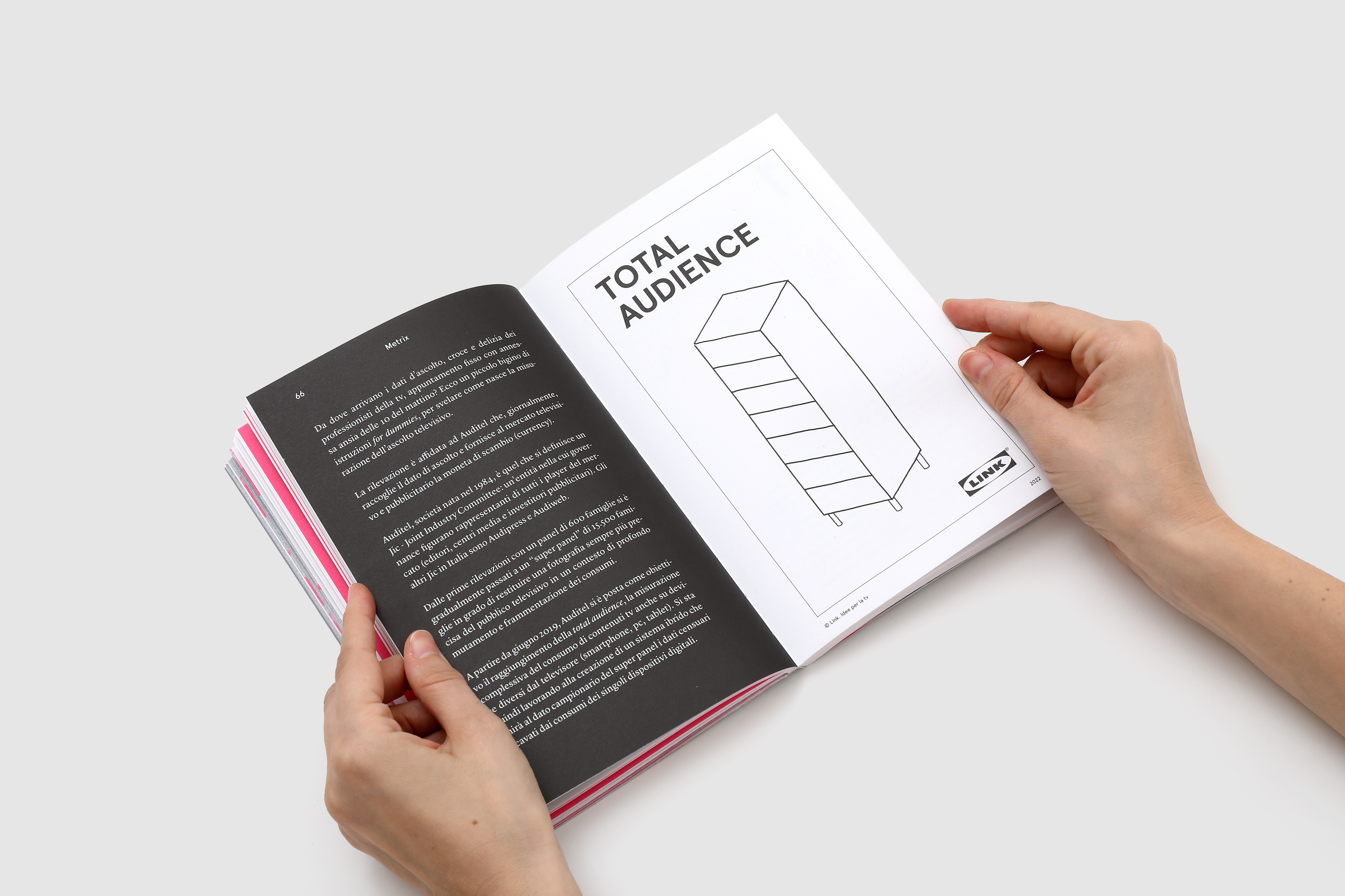
LINK. Idee per la TV is an editorial project dedicated to television and media curated by Mediaset – RTI strategic marketing team. LINK’s longform essays analyze the italian and international television industry with fresh persectives and valuable insights from the leading professionals.
Together with tomotomo we have designed the multi-format printed magazine and its ever-evolving digital version.
Visit ︎ LINK. Idee per la TV
Together with tomotomo we have designed the multi-format printed magazine and its ever-evolving digital version.
Visit ︎ LINK. Idee per la TV
LINK. IDEE PER LA TV
for: Mediaset – RTI
with: Tomo Tomo
team: Pierluigi Anselmi, Pietro Buffa, Letizia Tempesta Filisetti, Giacomo Quinland

︎
The website layout alternates text and strong visuals, op-ed commentaries and a complete archive to access all the articles from the print editions.
︎


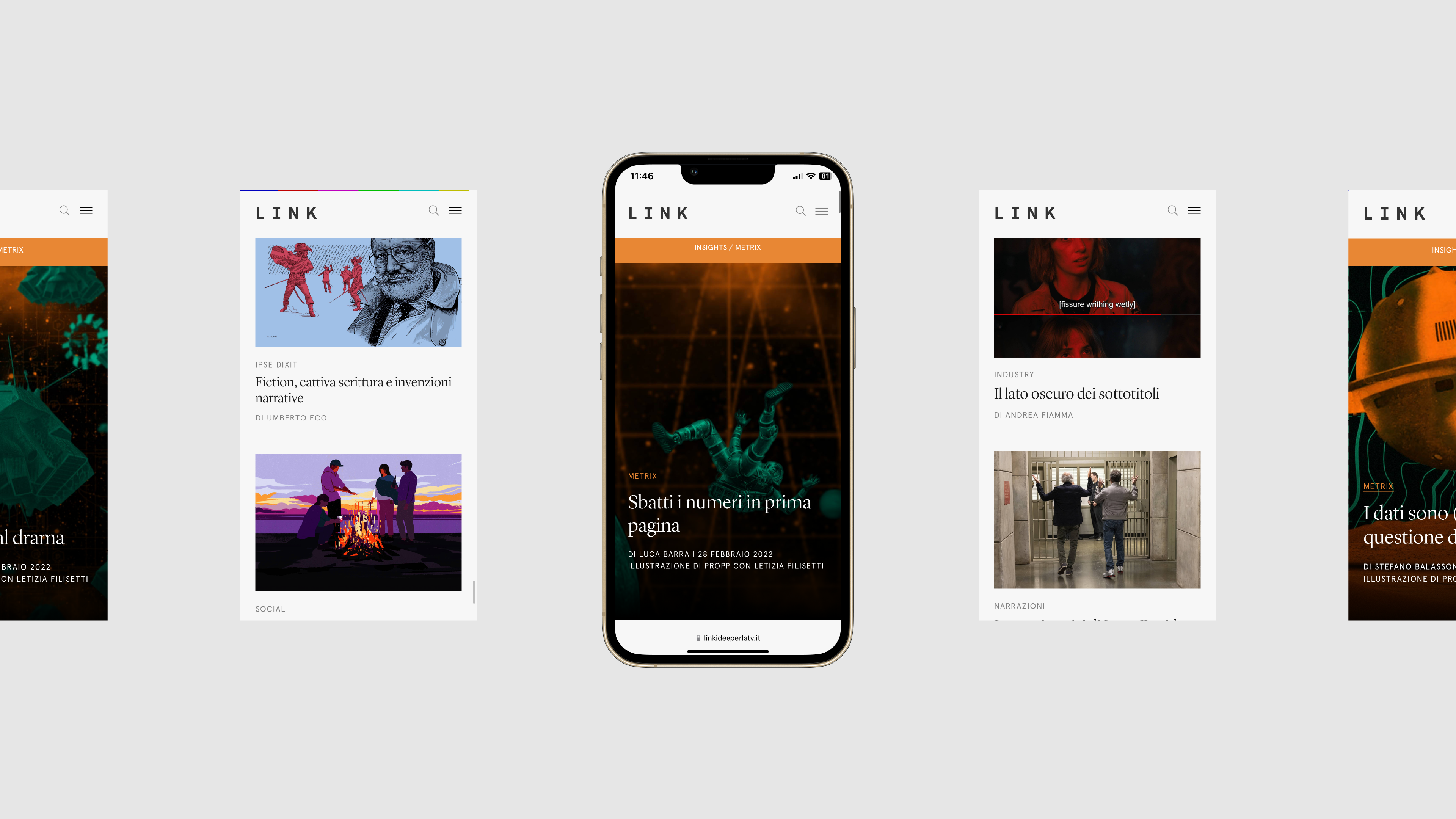
LINK 28. METRIX: we’ve made a series of silver and fluorescent pink collages taking cues from the bygone era of 50s/60s sci-fi to illustrate the main theme of this issue: the ongoing “war of the worlds” between the traditional media and the its digital rival.
︎


LINK 29. MEDIA-MORFOSI 3: experimenting with an early iteration of Midjourney’s AI text-to-image generation, we’ve fed the prompts with keywords from the issue and were met with fascinating, sometimes disturbing, outputs. What better way to illustrate the 2023 edition of Media-Morfosi, a long-sighted look at the present and future of the audio-visual market.
︎


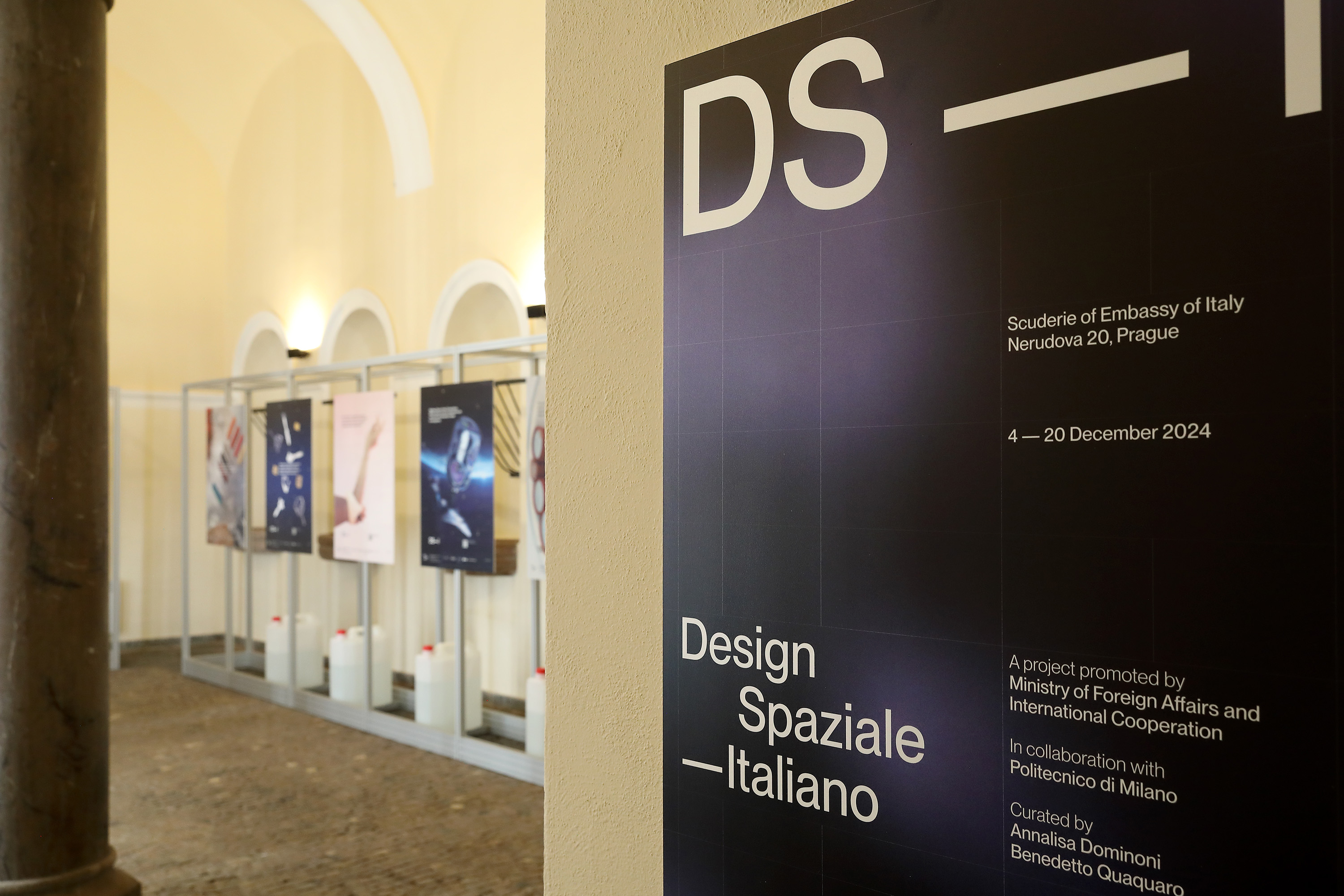
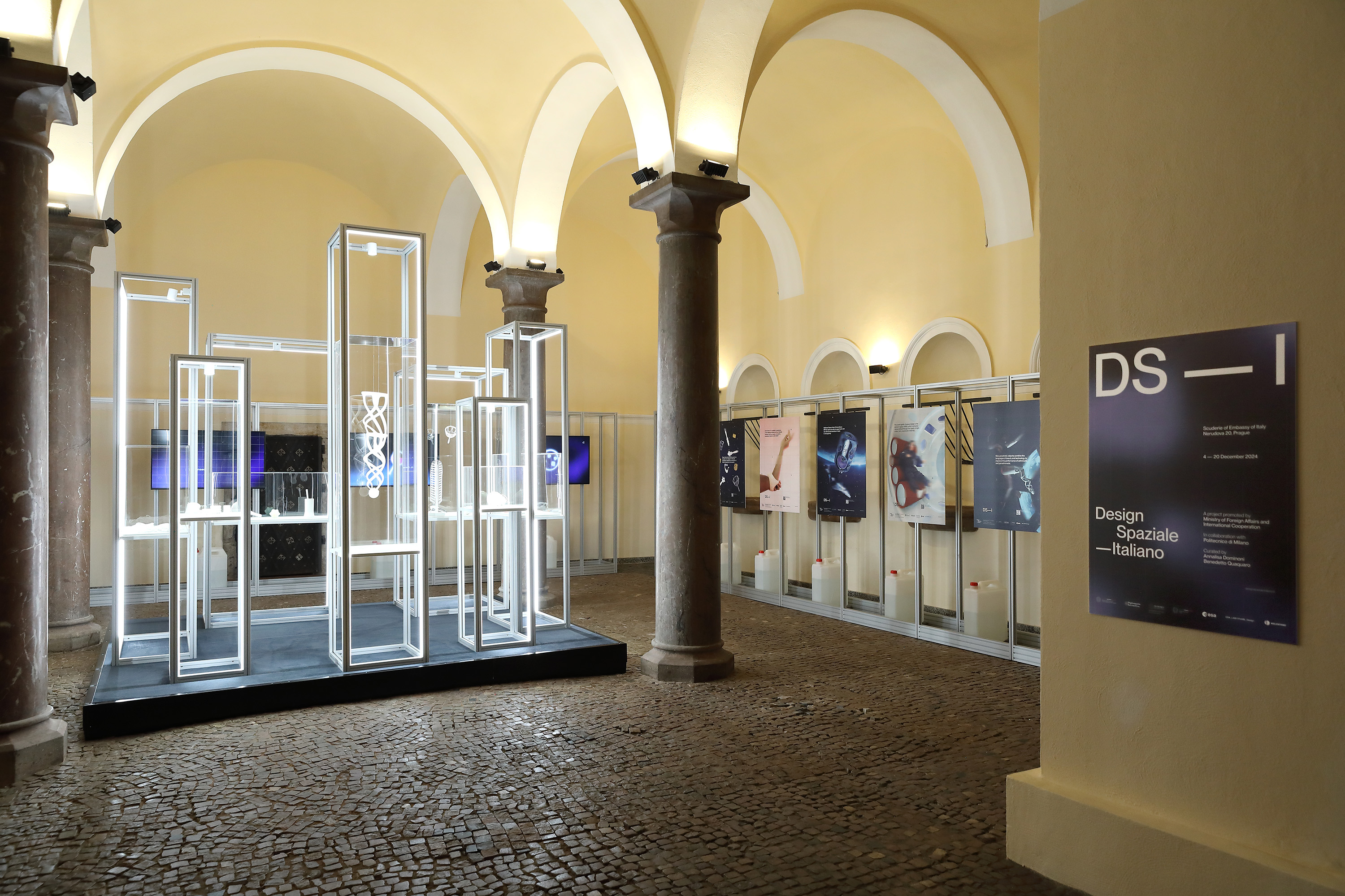
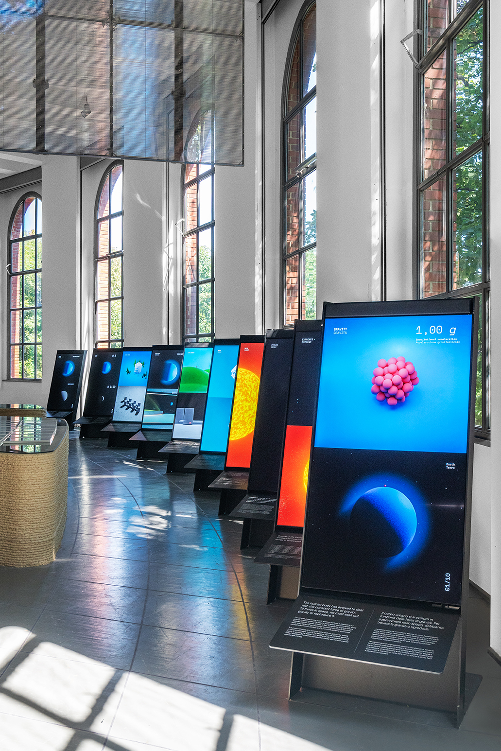
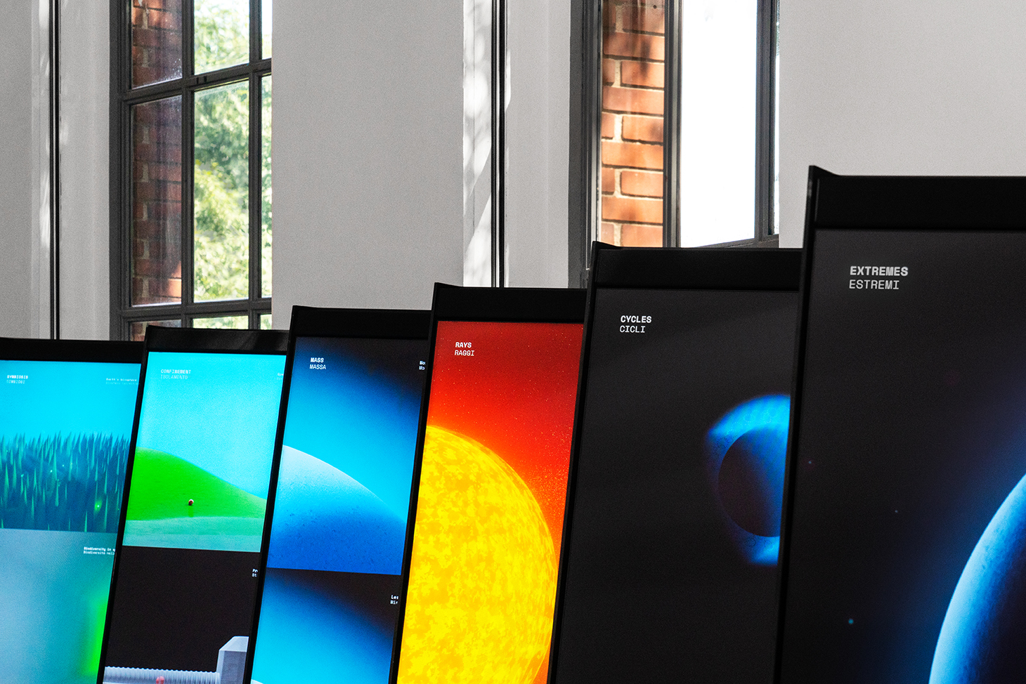
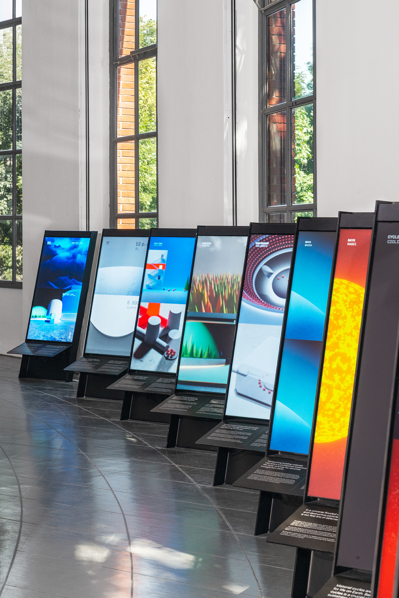
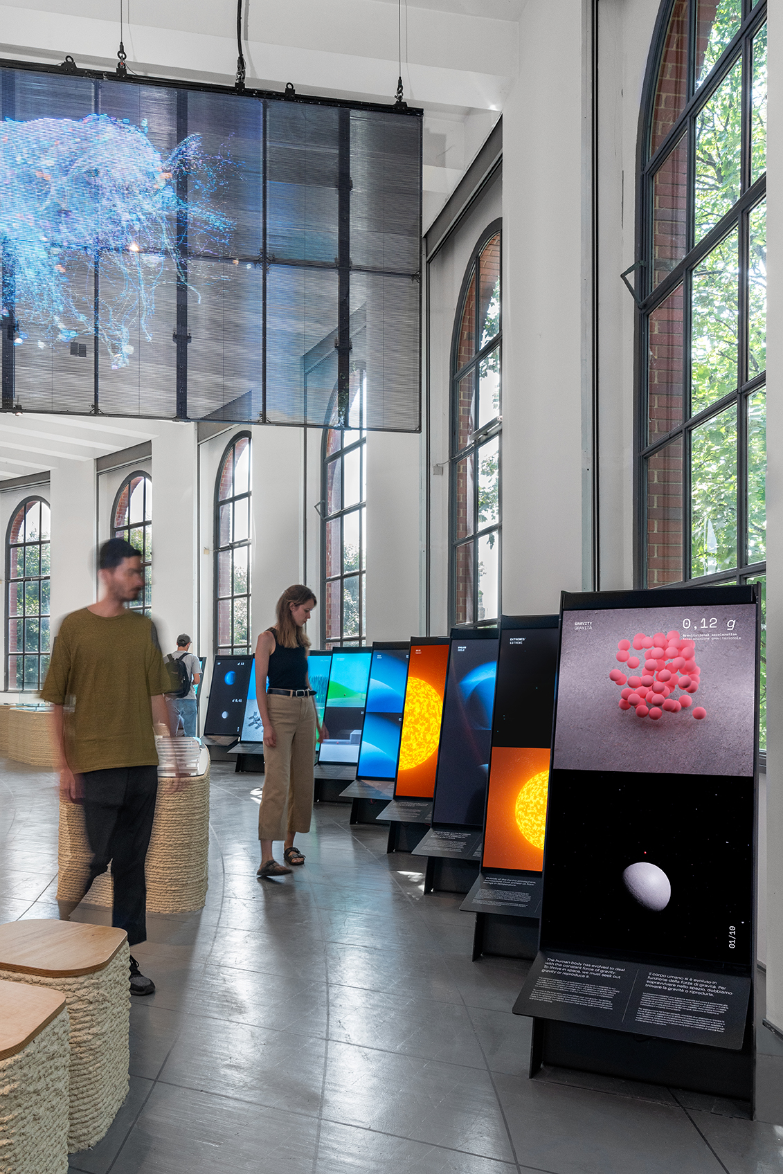
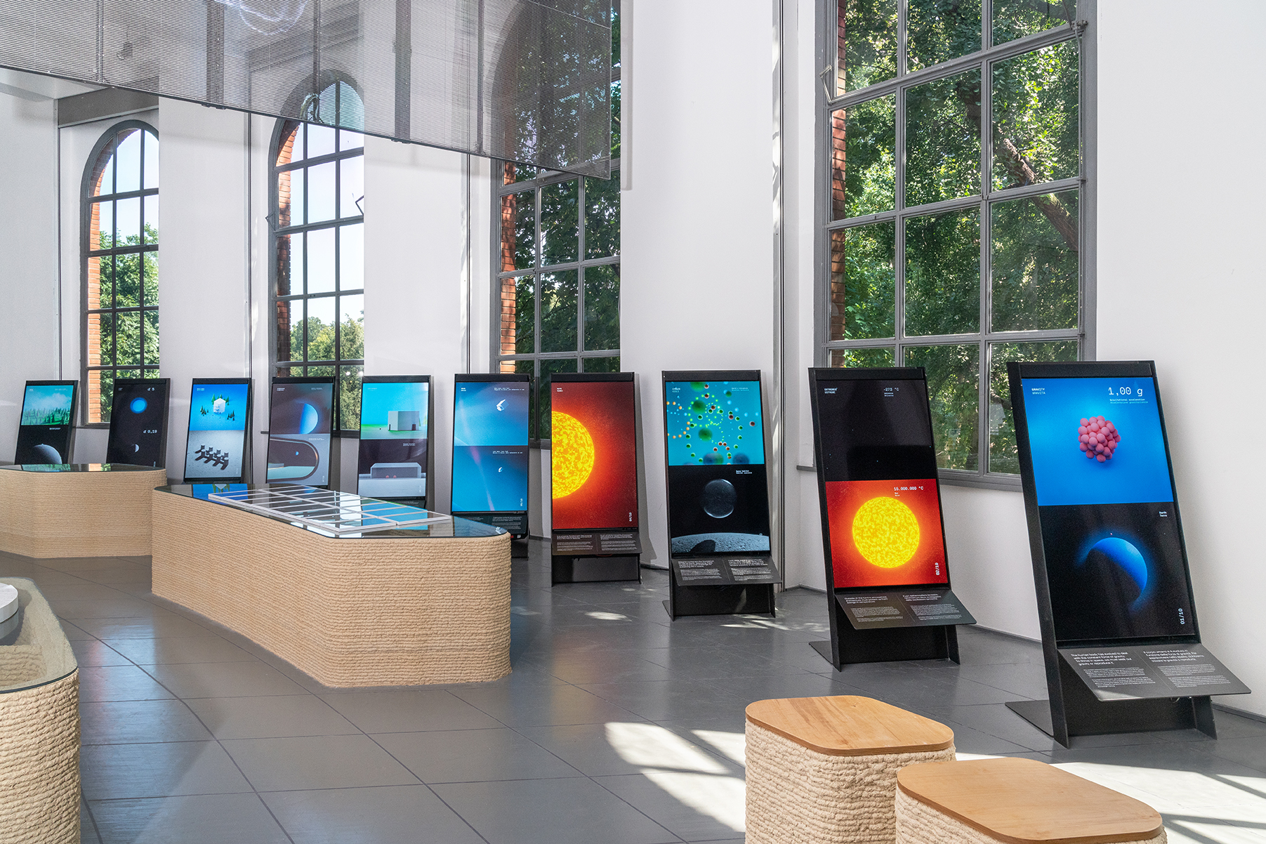
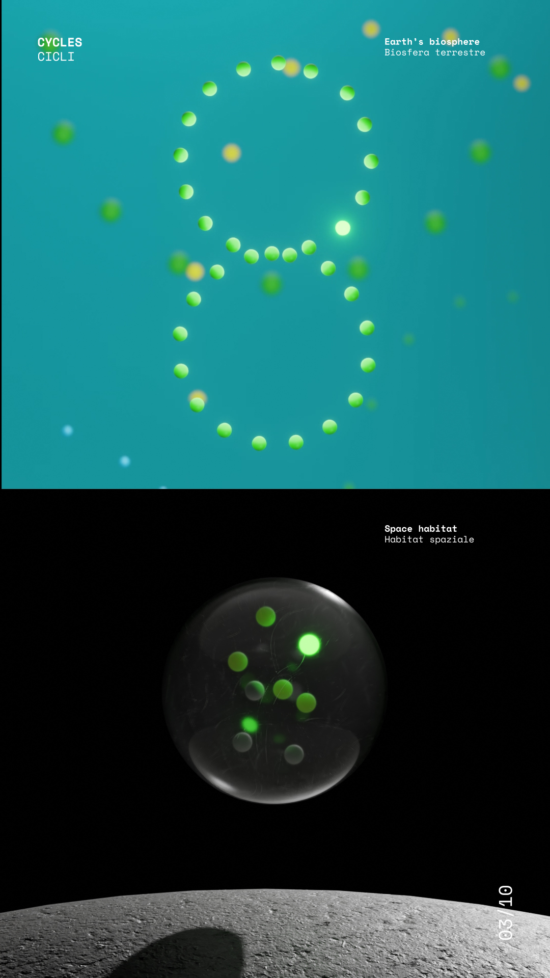
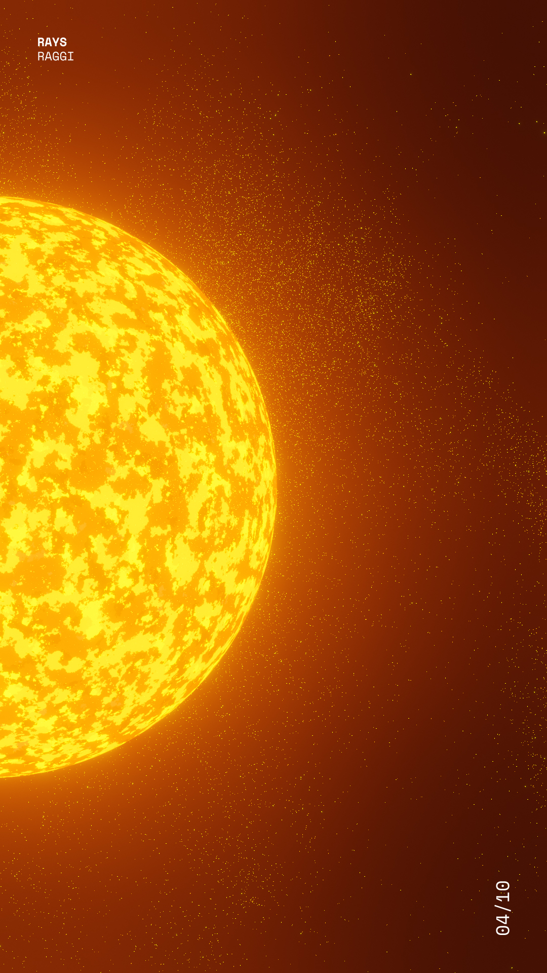
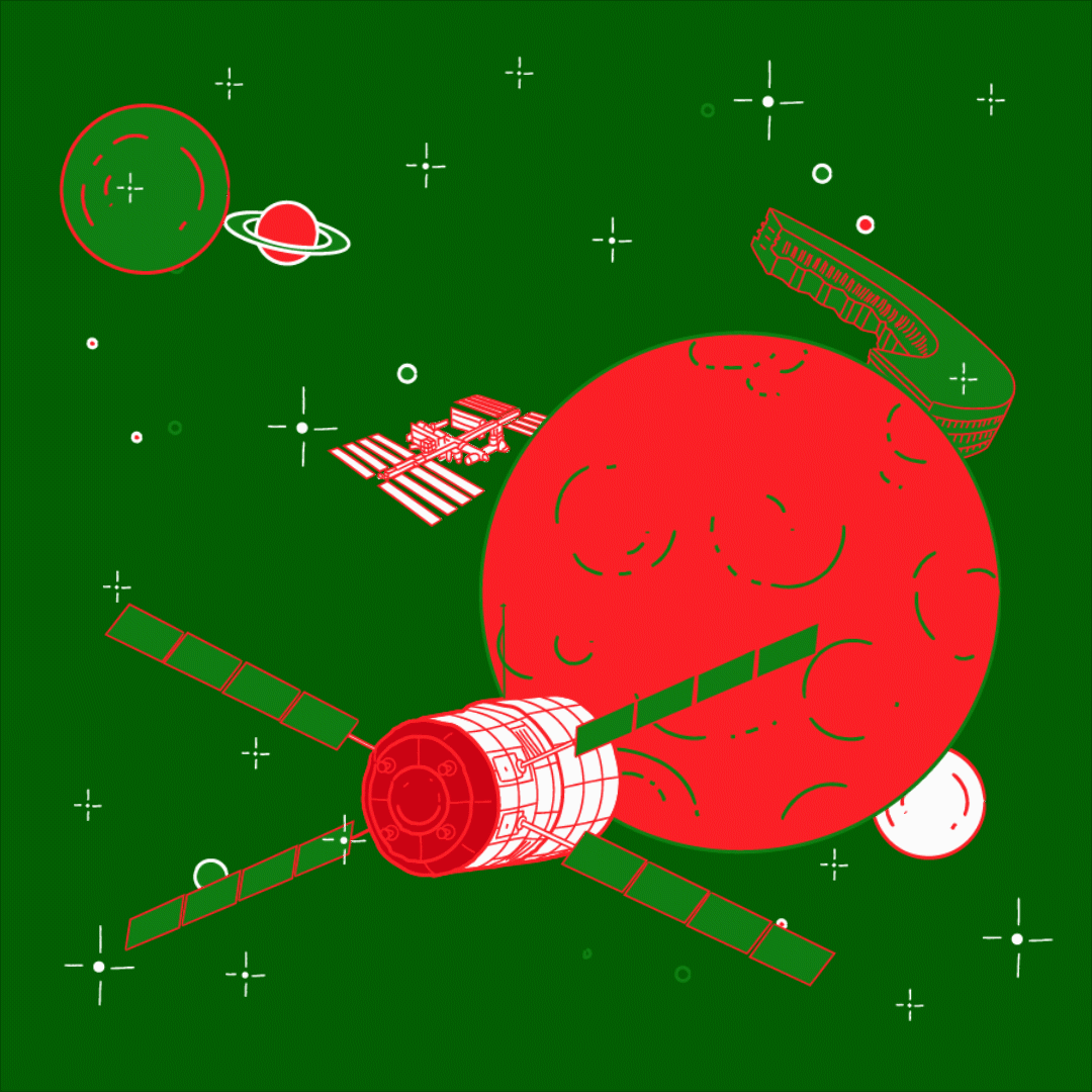
floats at zero gravity
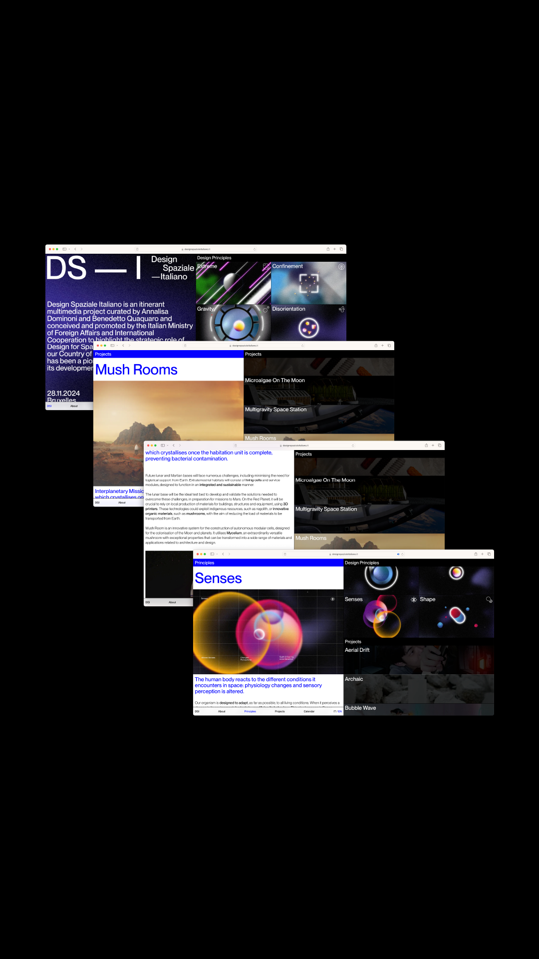
Design Spaziale — Italiano is an itinerant multimedia project with the mission to highlight the strategic role of Design for Space as an avant-garde domain for our country.
For months we have been synthesizing philosophical and perceptive design concepts in a series of videos and images representing the physical boundaries of moving through the extreme conditions of living outside planet Earth.
Visit ︎ designspazialeitaliano.it
For months we have been synthesizing philosophical and perceptive design concepts in a series of videos and images representing the physical boundaries of moving through the extreme conditions of living outside planet Earth.
Visit ︎ designspazialeitaliano.it
DESIGN SPAZIALE — ITALIANO
promoted by: Ministero degli Affari Esteri e dalla Cooperazione Internazionale
in collaboration with: Politecnico di Milano - Design Dept
curatorship and exhibition by: a+b Annalisa Dominoni and Benedetto Quaquaro
scientific partner: ESA
team: Pierluigi Anselmi, Pietro Buffa, Alessandro C. Busseni, Elisa Cappelletto, Marco Gabriele, Giada Fiorenza, Matteo Postinghel, Giacomo Quinland


︎
The result is a grid-based visual identity with a sci-fi look, a series of vid eo with matte painted visions of the glowing space surrounding us, and website collecting concepts, projects and detailed studies on design for space.


︎
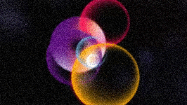
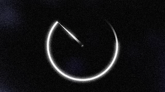
Confinement, disorientation, extreme, gravity, senses, shape, shell and time are the main conceptual design principles to consider when designing for space. We represent the laws and behaviours that rule and overturn how we perceive ourselves in a zero gravity context through a series of dreamy and fascinating videos, in cui macchie di colore in movimento, trasmesse da sonde lontane e cariche di rumore, si intrecciano al linguaggio puntale e minimale della visual identity.


︎
Noisy frames of colored nebulas and orbitanting planets are recorded by an old travelling space probe, in conversation with an accurate and minimal visual interface reporting soft data on space travelling, radioactive explosions, and extraterrestrial survival.
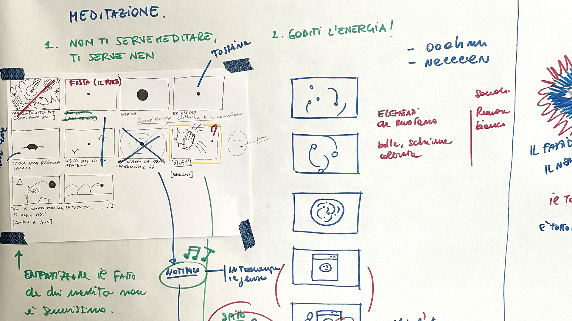
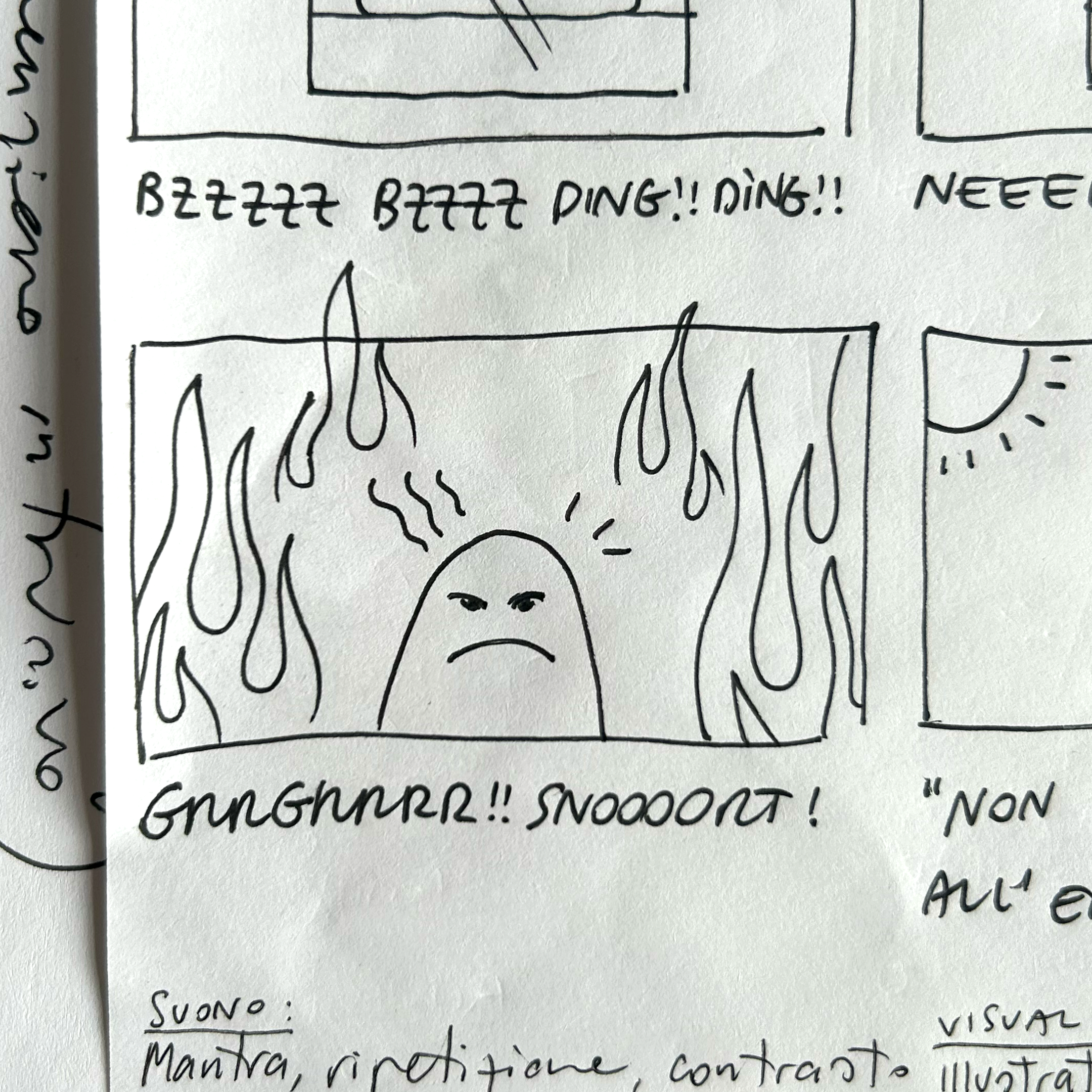
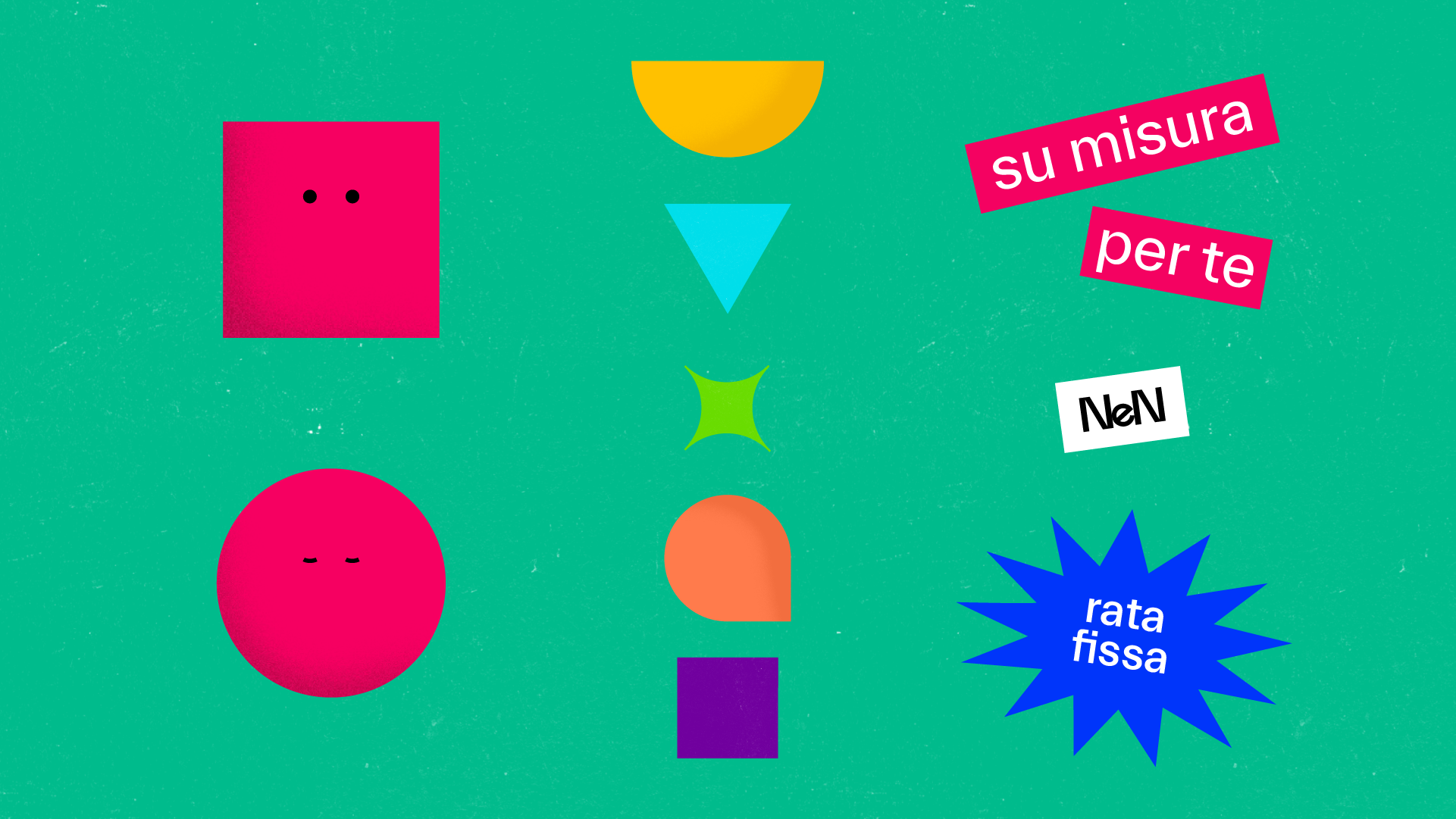
is levitating with NeN on TV
As simple as it might sounds, designing a campaign takes months in pitching, developing, fine-tuning, producing and detailing.
We took care of every stage of the project: brainstorming and delivering different proposals, pitching ideas for future scenarios, illustrating characters, defining styles, animating, writing, recording and post producing to go live.
See you on TV!
We took care of every stage of the project: brainstorming and delivering different proposals, pitching ideas for future scenarios, illustrating characters, defining styles, animating, writing, recording and post producing to go live.
See you on TV!
NeN TV ADVERTISING CAMPAIGN 2024
for: NeN Gruppo a2a
with: NOISE HEROES
team: Pierluigi Anselmi, Pietro Buffa, Alessandro C. Busseni, Marco Gabriele, Giacomo Quinland, Ciccio Rigoli


explores contemporary ways of seeing
Sul Guardare is a series of exhibitions, curated by Paola Nicolin, dedicated to little-known works that are part of collections of Piacenza museums, placed in dialogue with contemporary artist inspired by John Berger's book Ways of Seeing, which is still enlightening today for understanding works of art in a sociocultural key and a point of reference for the relationship between art and dissemination that is both complex and accessible.
XNL ARTE — SUL GUARDARE
for: XNL Piacenza, Fondazione di Piacenza e Vigevano
team: Alessandro C. Busseni, Giada Fiorenza
photos: Daniele Signaroldi

︎
Act 1 — Massimo Grimaldi in dialogue with Galleria d’Arte Moderna Ricci Oddi
Act 2 — Berlinde de Bruyckere, Carol Rama, Giovanni in dialogue with Angelo del Maino, in collaboration with Ufficio Beni Culturali Ecclesiastici della Diocesi di Piacenza-Bobbio and Centro Conservazione e Restauro La Venaria Reale
Act 3 — Andrea Sala in dialogue with Ufficio Beni Culturali Ecclesiastici della Diocesi di Piacenza-Bobbio
Act 4 — Valentina Furian / Notti bianche in dialogue with Musei Civici di Palazzo Farnese
︎


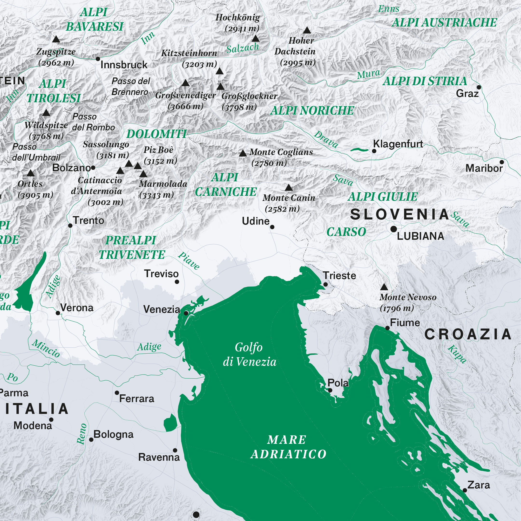
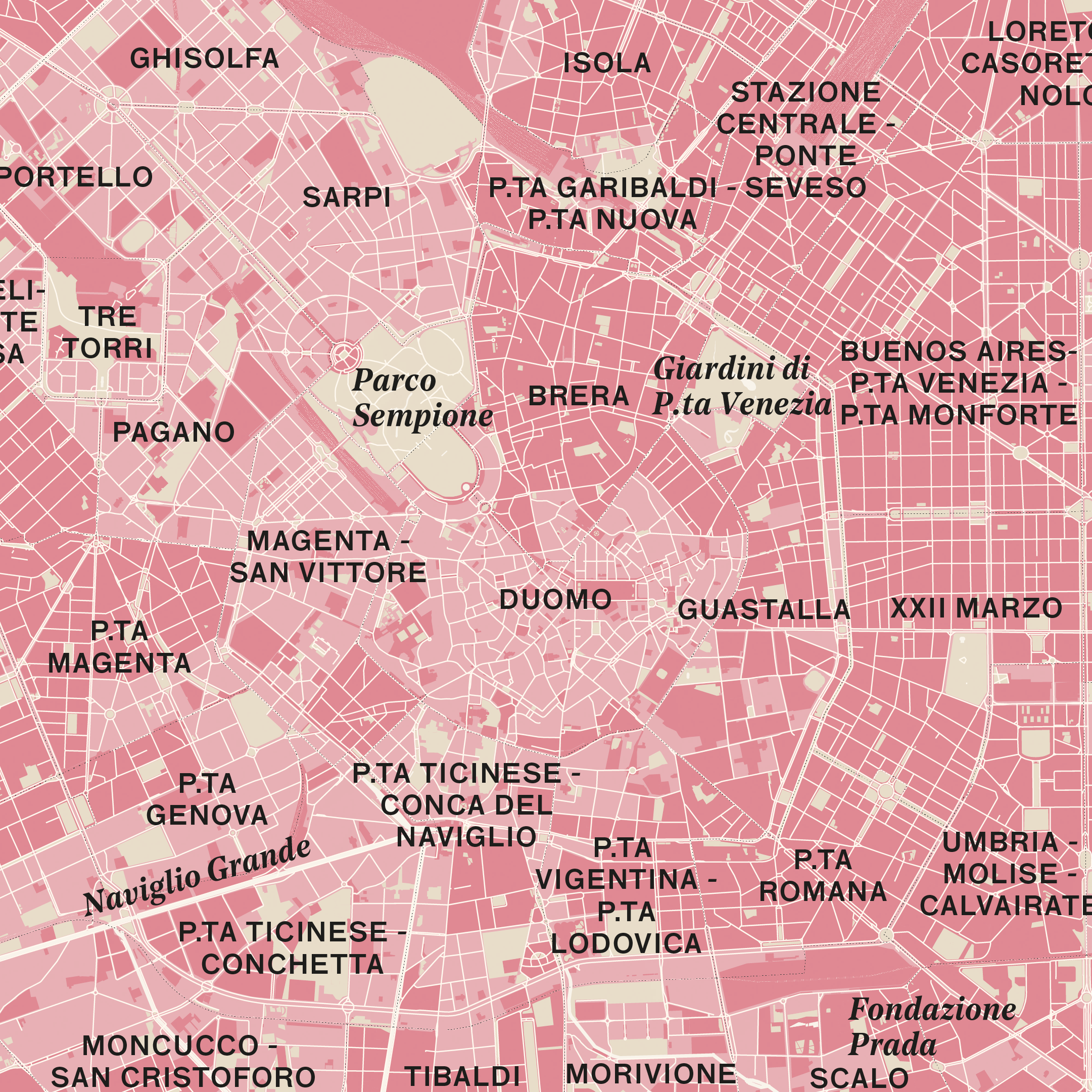
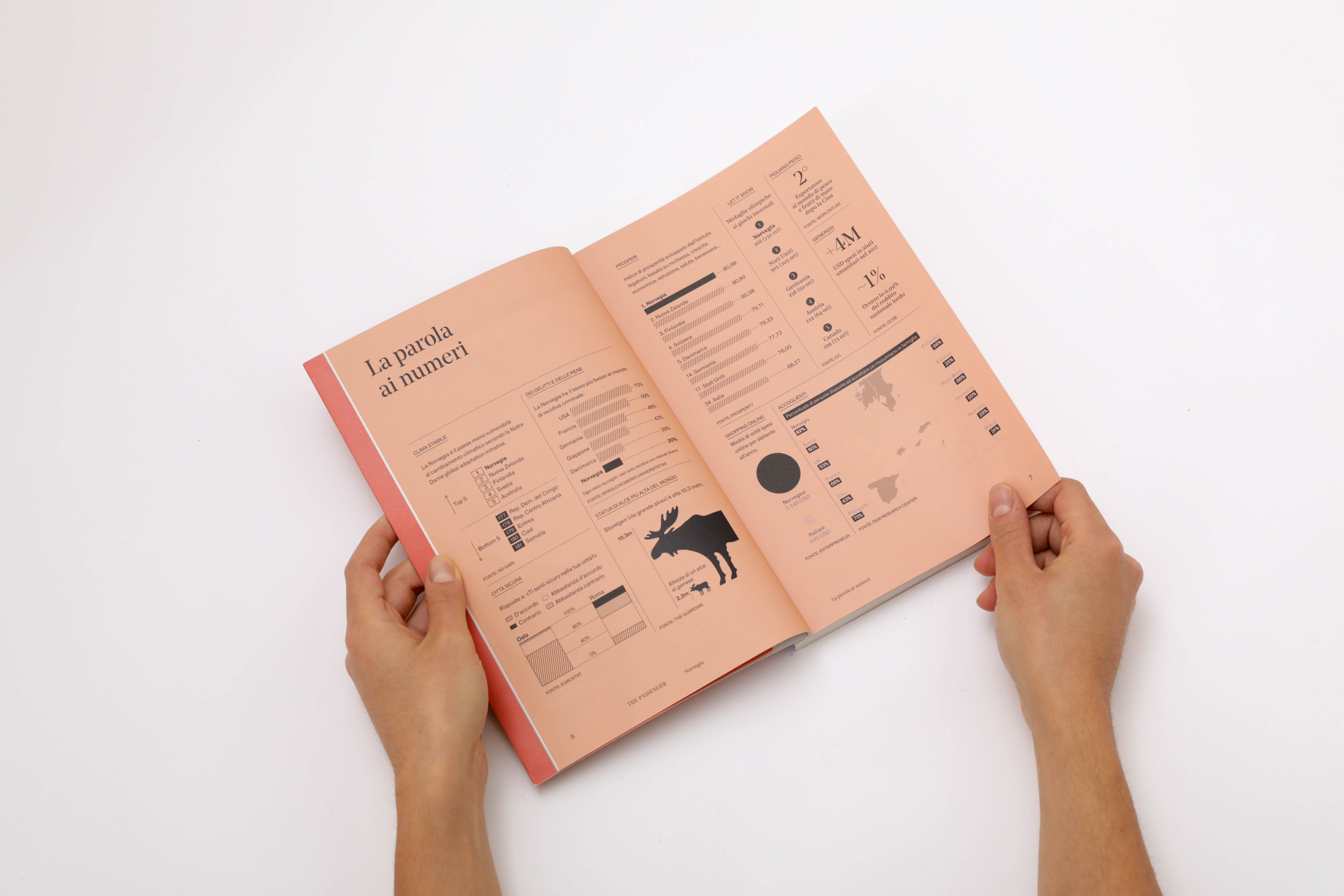
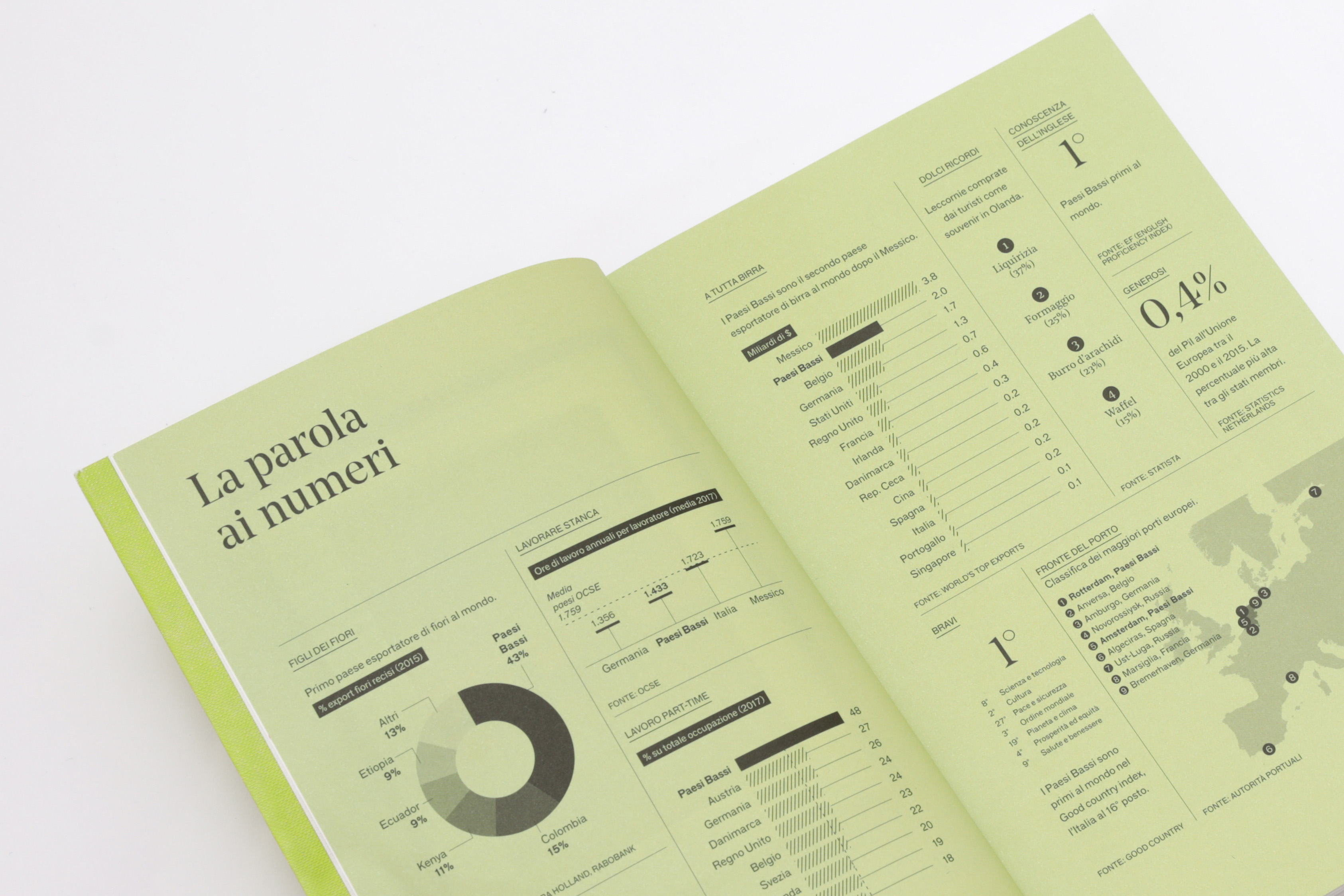
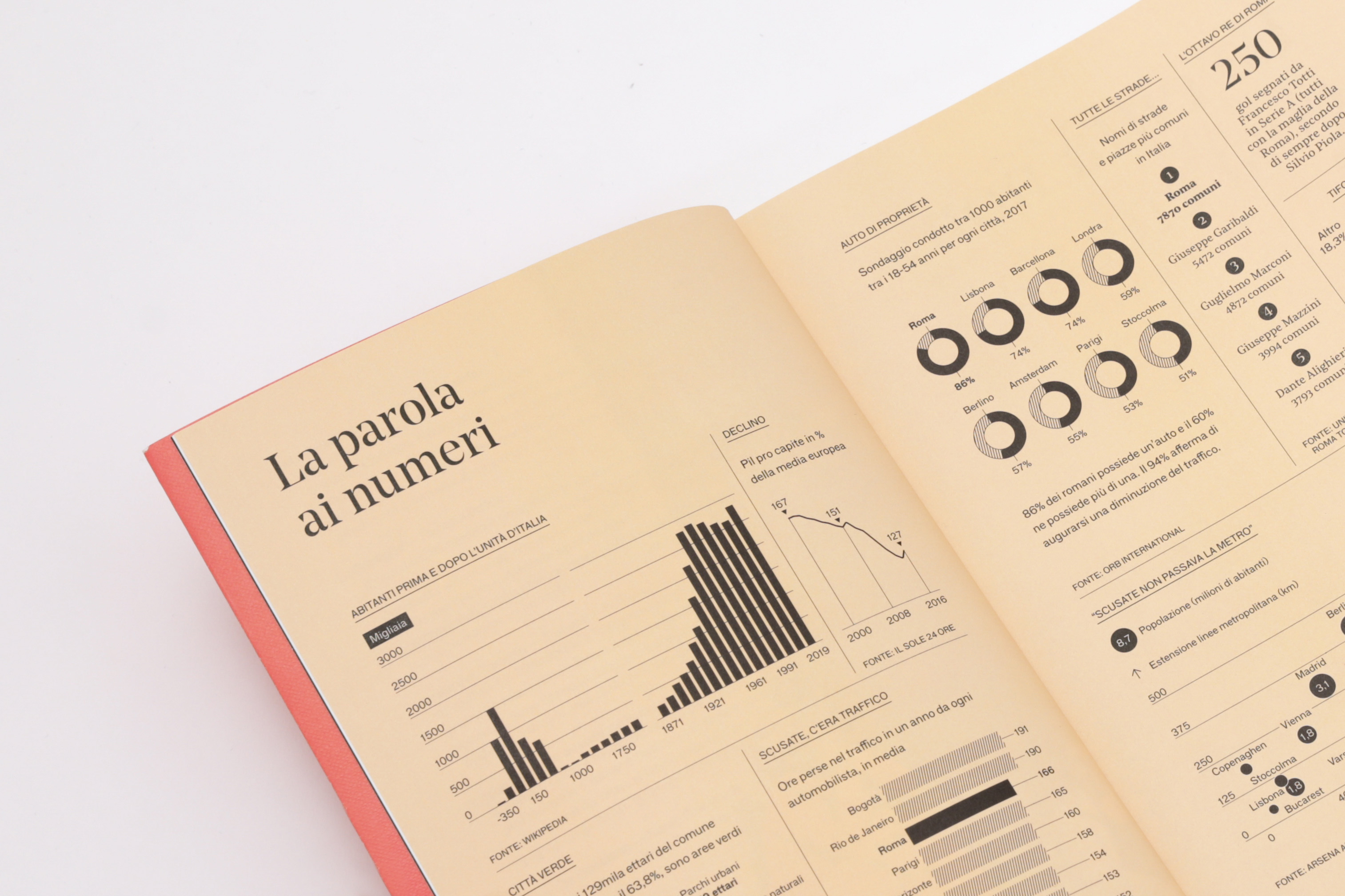
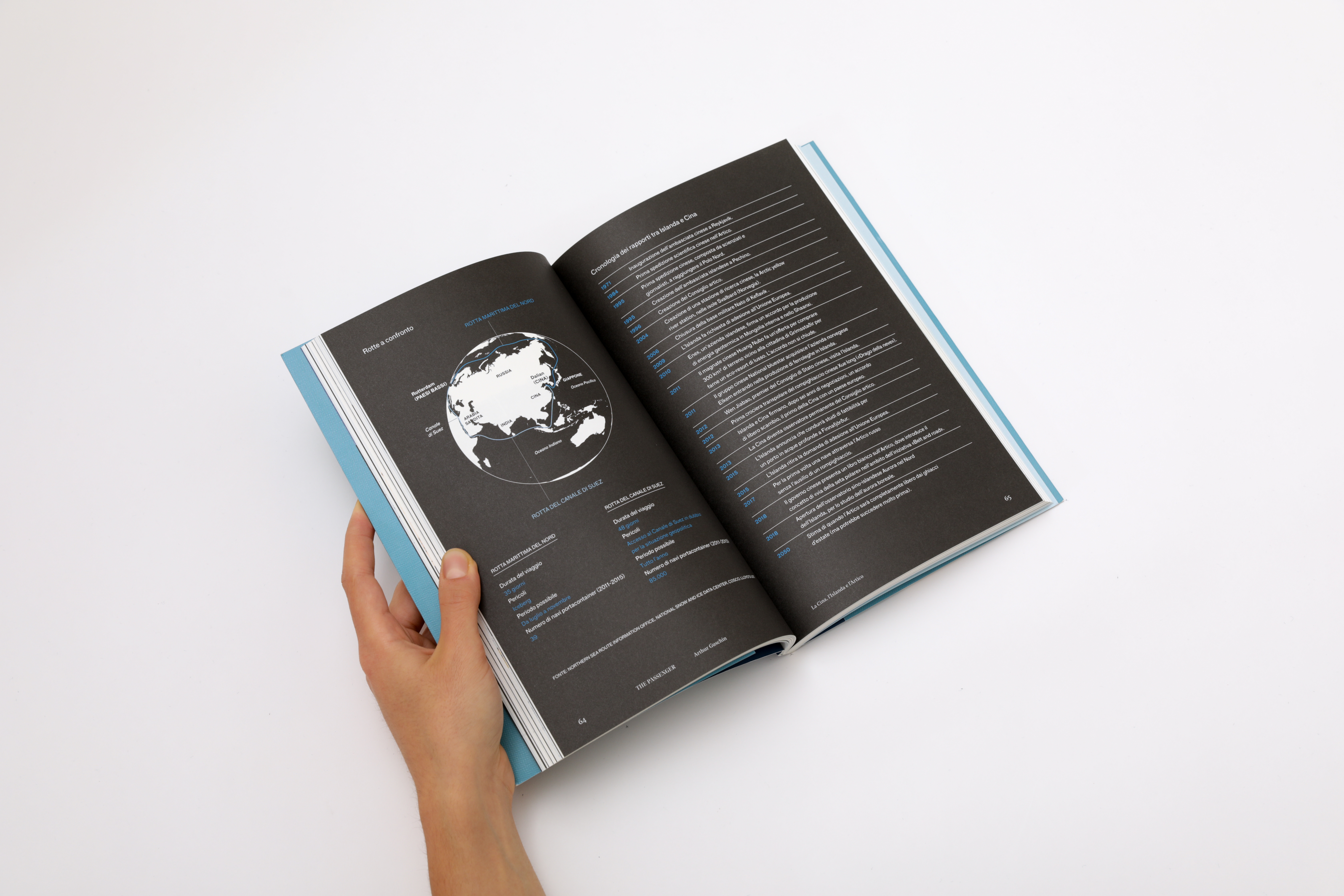
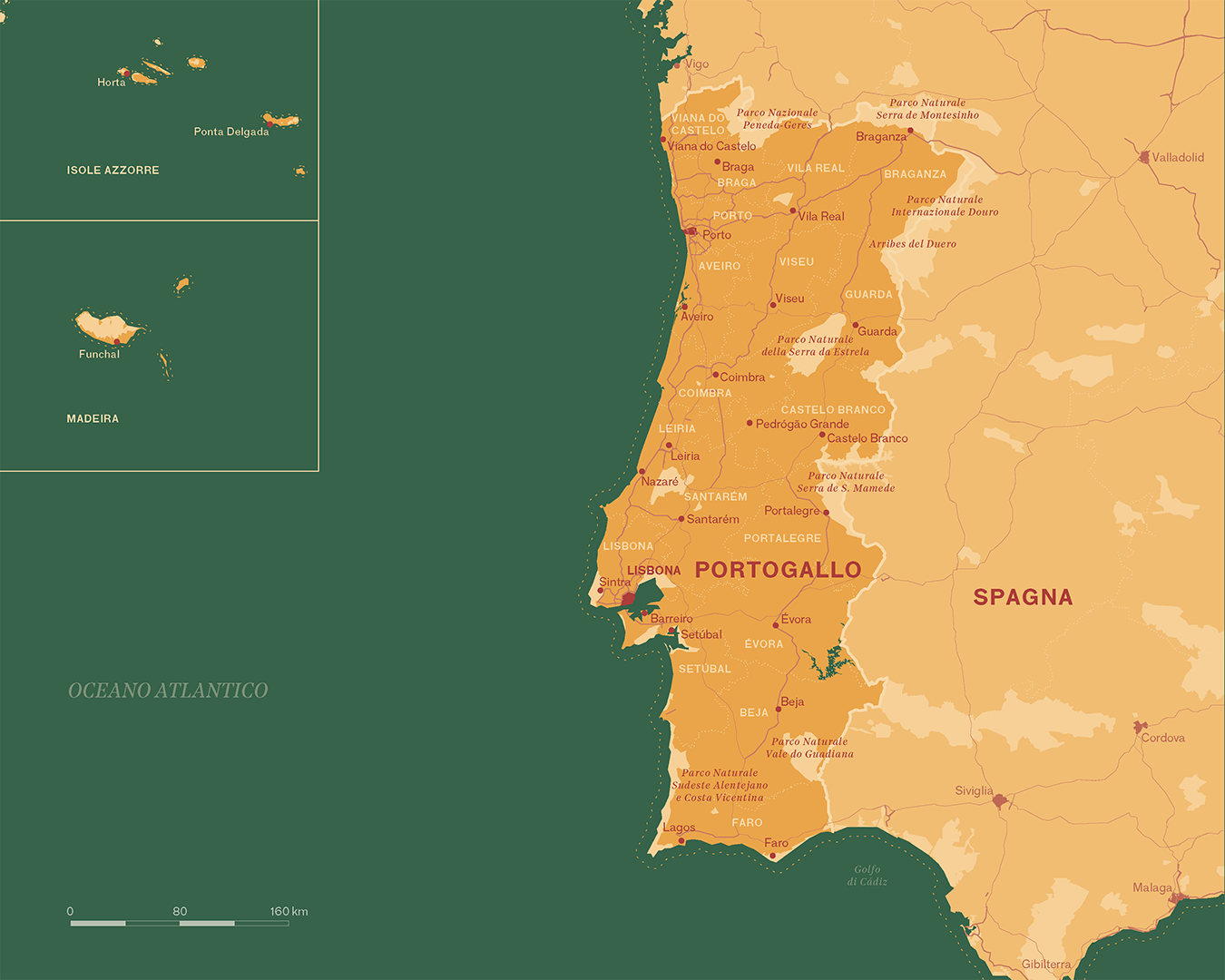
plans the hero’s journey
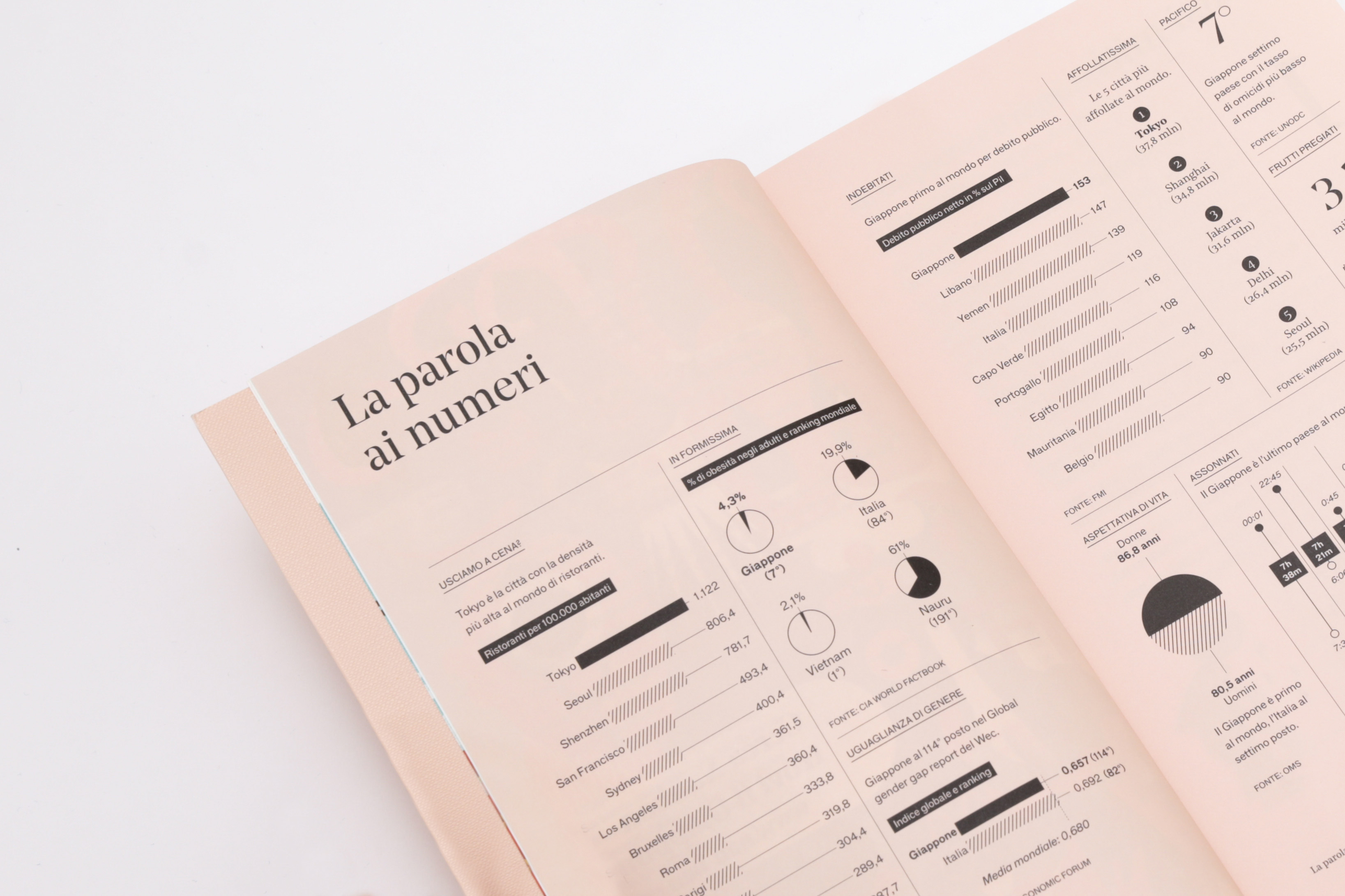
How does a carefully crafted map come to life—one built on precise, reliable information rather than approximation? For The Passenger, Iperborea’s book-magazine series, we have designed the entire system of infographics, data visualization, and cartography from the ground up. Each map starts with research: datasets, archives, and GIS tools are combined to build knowledge, not simply trace it. The result is rigorous yet readable, scientific in method and editorial in spirit. Pietro Buffa, now partner at Propp, previously helped shape the magazine’s graphic design with Tomo Tomo studio.
The Passenger Venezia - November 2023
The Passenger Palestina - September 2023
The Passenger Mediterraneo - June 2023
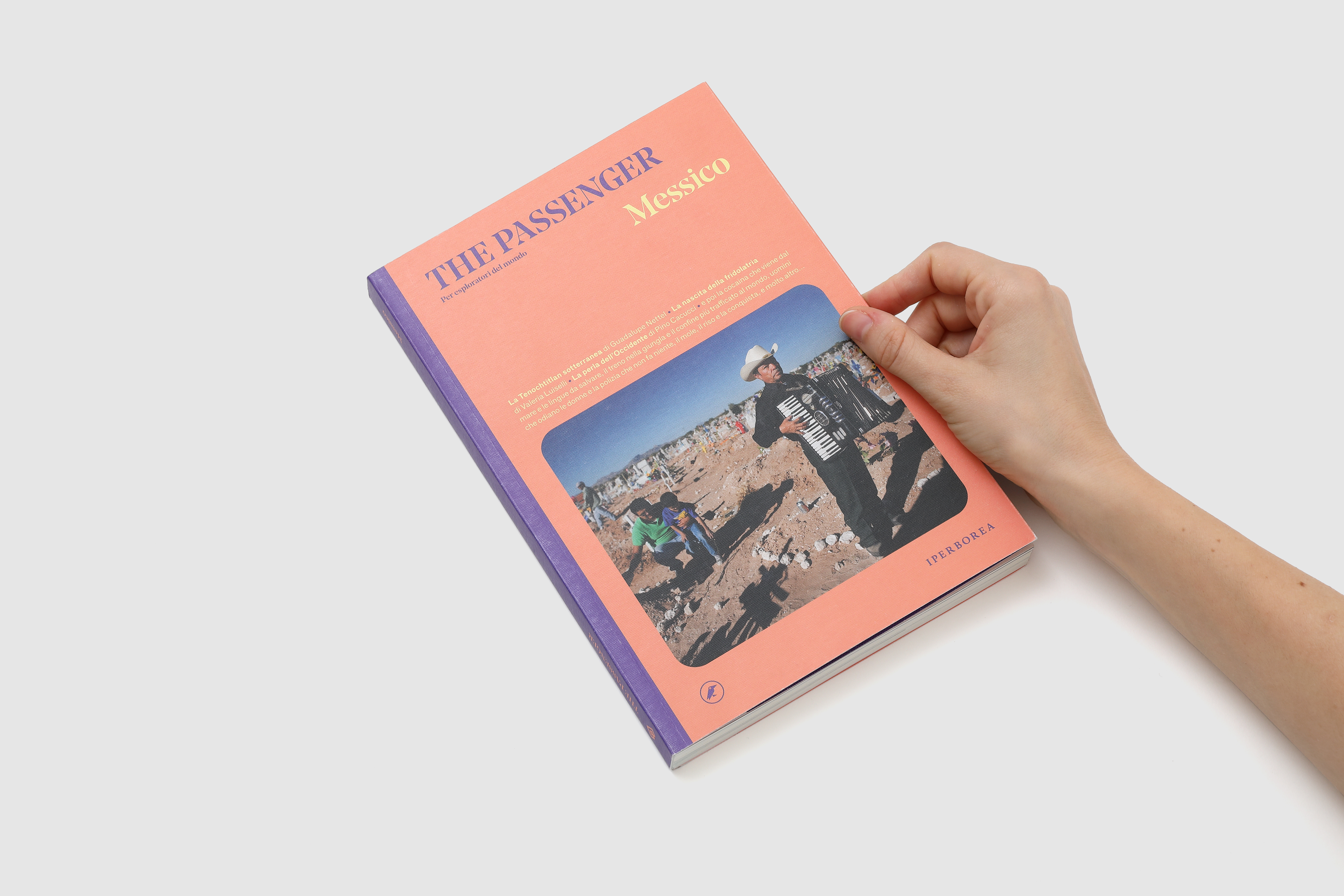
The Passenger Messico - April 2023
The Passenger Paesi Baltici - February 2023
The Passenger Milano - November 2022
The Passenger Venezia - November 2023
The Passenger Palestina - September 2023
The Passenger Mediterraneo - June 2023
The Passenger Messico - April 2023
The Passenger Paesi Baltici - February 2023
The Passenger Milano - November 2022


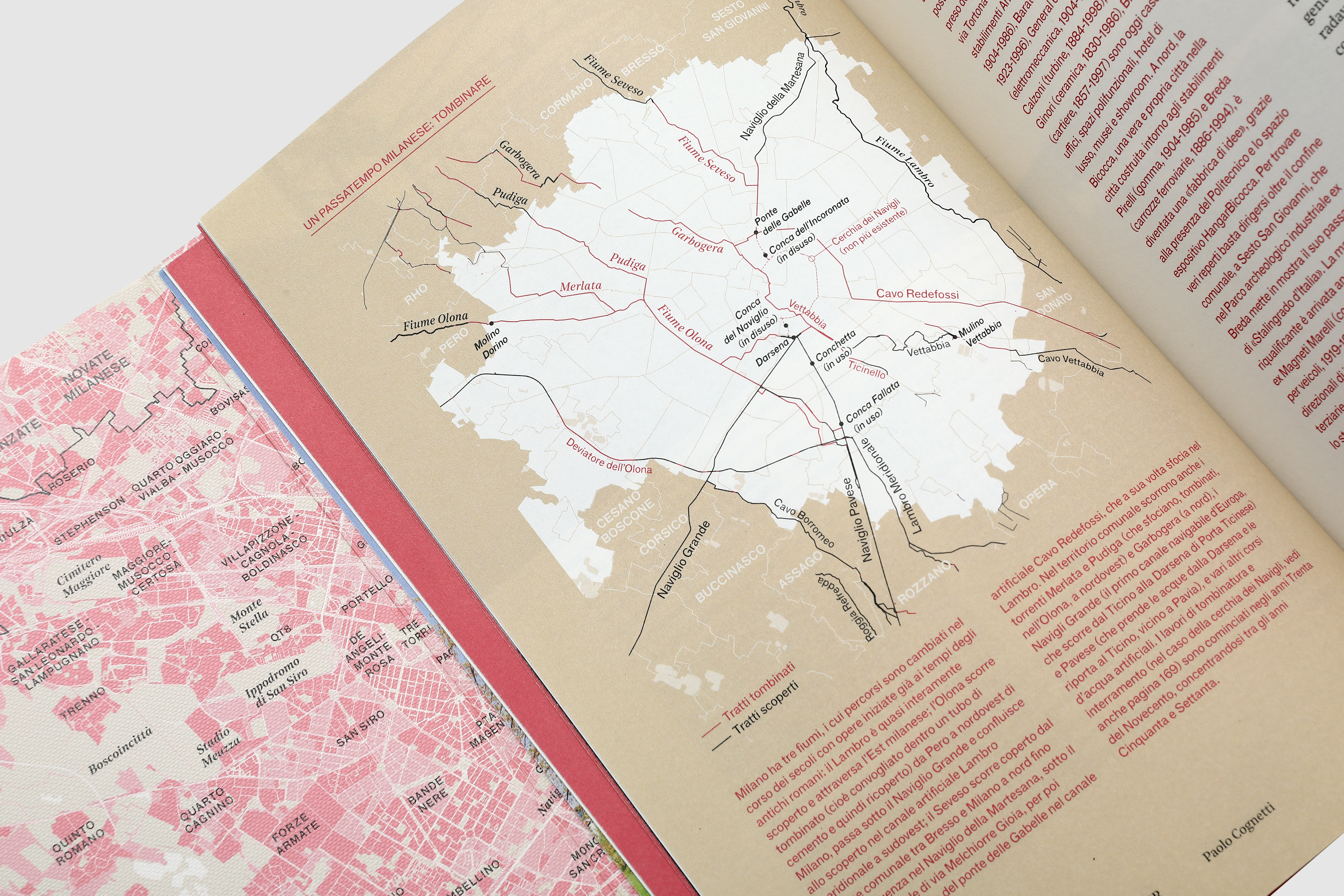
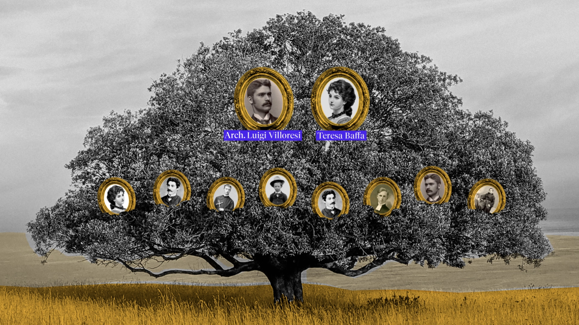
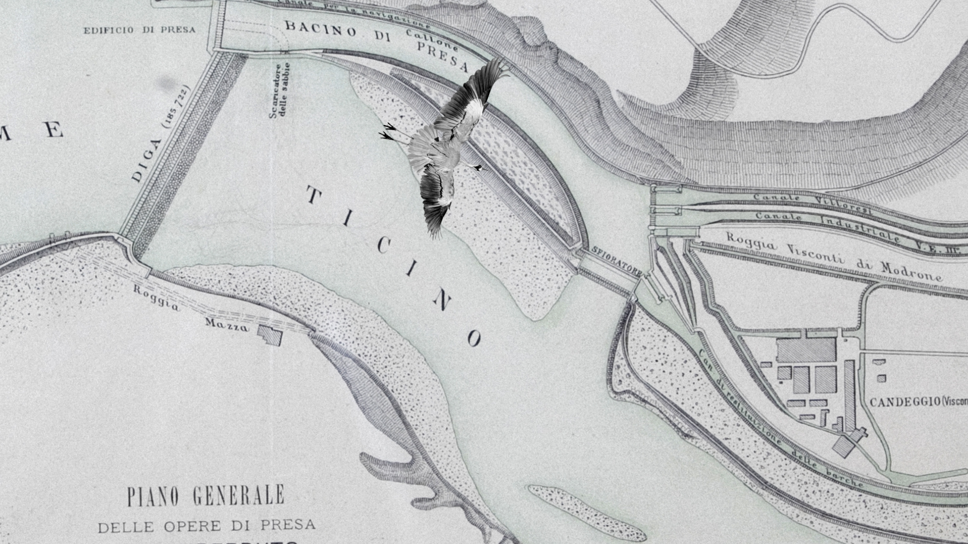
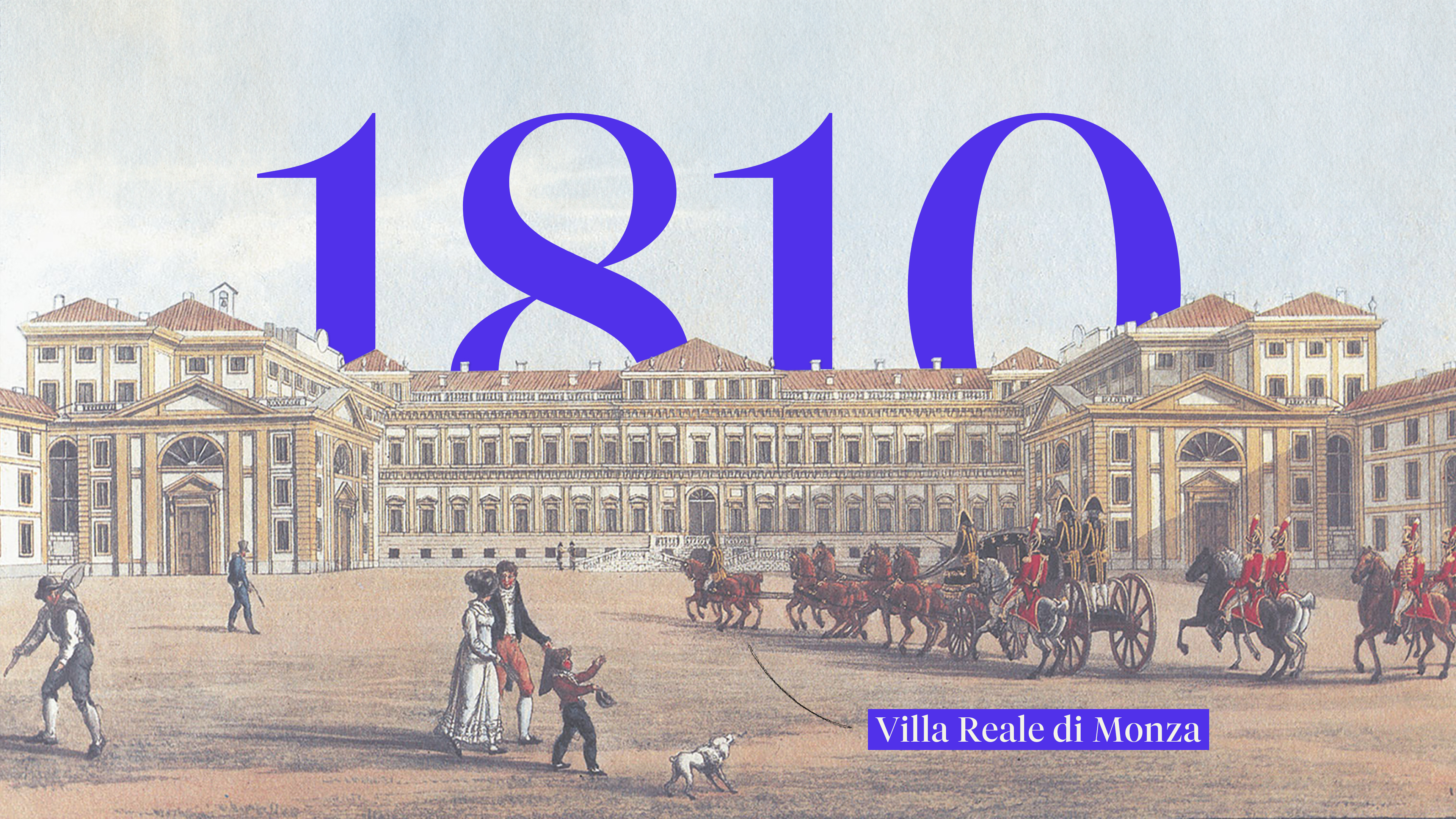
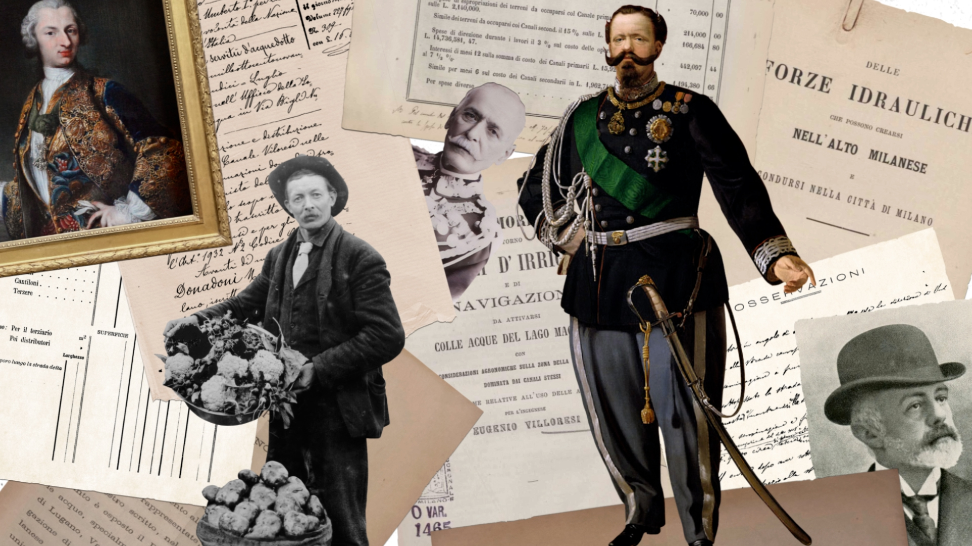
cruises through the waterways
Il Panperduto e la Regione del Villoresi is an animated documentary, a short film that weaves together documents, vintage photos, archival materials, and illustrations to create a captivating journey through time and space in the Villoresi’s Region.
IL PANPERDUTO E LA REGIONE DEL VILLORESI
for: Consorzio di Bonifica Est Ticino Villoresi
team: Pierluigi Anselmi, Pietro Buffa, Alessandro C. Busseni, Mara Castiglioni, Giada Fiorenza, Marco Gabriele, Martina Gommellini, Francesco Nozza, Andrea Quartarone, Giacomo Quinland, Beatrice Savoldelli, Duccio Servi
︎
We wrote a narrative that unfolds around Eugenio Villoresi, a visionary engineer from Monza who, some 200 years ago, brought to life a crucial project for Lombardy's economic growth: the Villoresi Canal. This 86km waterway horizontally slices through the northern territory of Milan irrigating fields and distributign water to thousands of people.
We wrote a narrative that unfolds around Eugenio Villoresi, a visionary engineer from Monza who, some 200 years ago, brought to life a crucial project for Lombardy's economic growth: the Villoresi Canal. This 86km waterway horizontally slices through the northern territory of Milan irrigating fields and distributign water to thousands of people.

wanders through the sands of knowledge
Vous/Nous is a metaphorical journey lived through the eyes of a falcon, a snake and an errant scientist: a four walls’ projection, designed by dotdotdot, surrounds the viewers and takes them across 3D environments and generative art landscapes to introduce the scintific reasearches of the CENTAI’s team to their main stakeholders.
Vοῦς/Nous
hosted by: CENTAI
exhibited in: Gallerie d’Italia, Torino
for: dotdotdot
team: Pierluigi Anselmi, Pietro Buffa, Alessandro C. Busseni, Lorenzo Baraldi, Giovanni Cola, Marco Gabriele, Giacomo Quinland


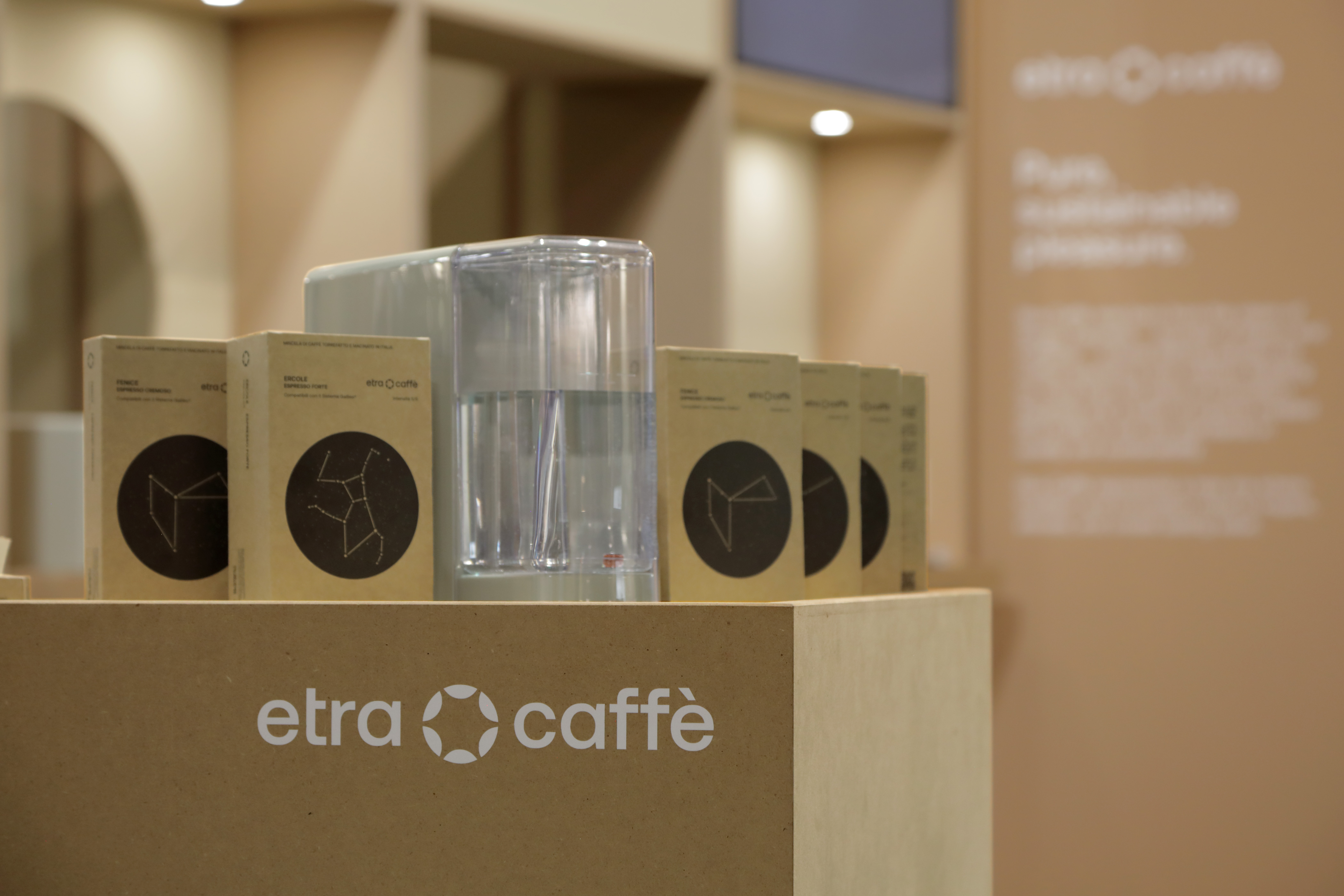
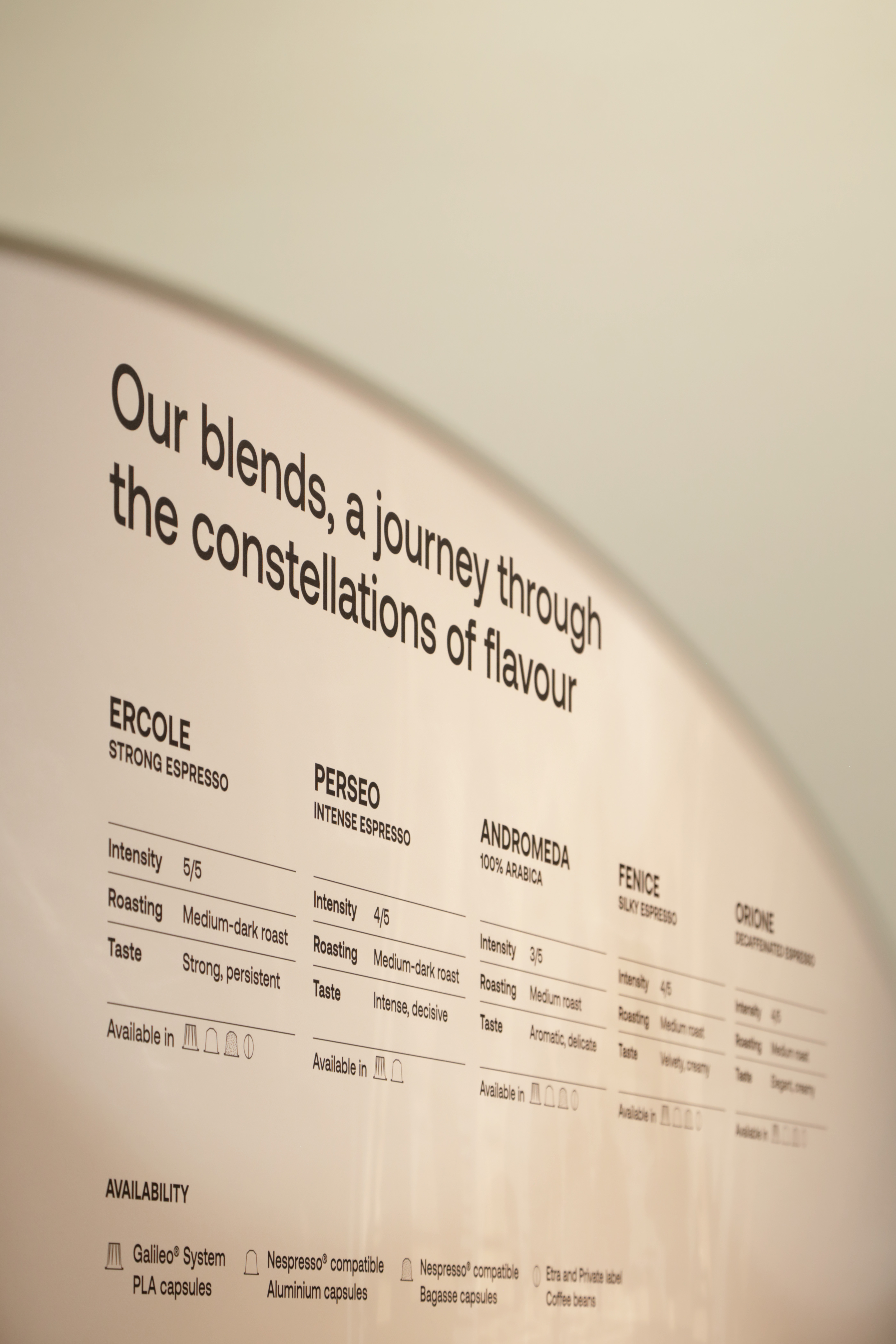
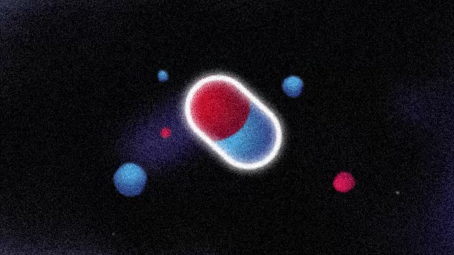
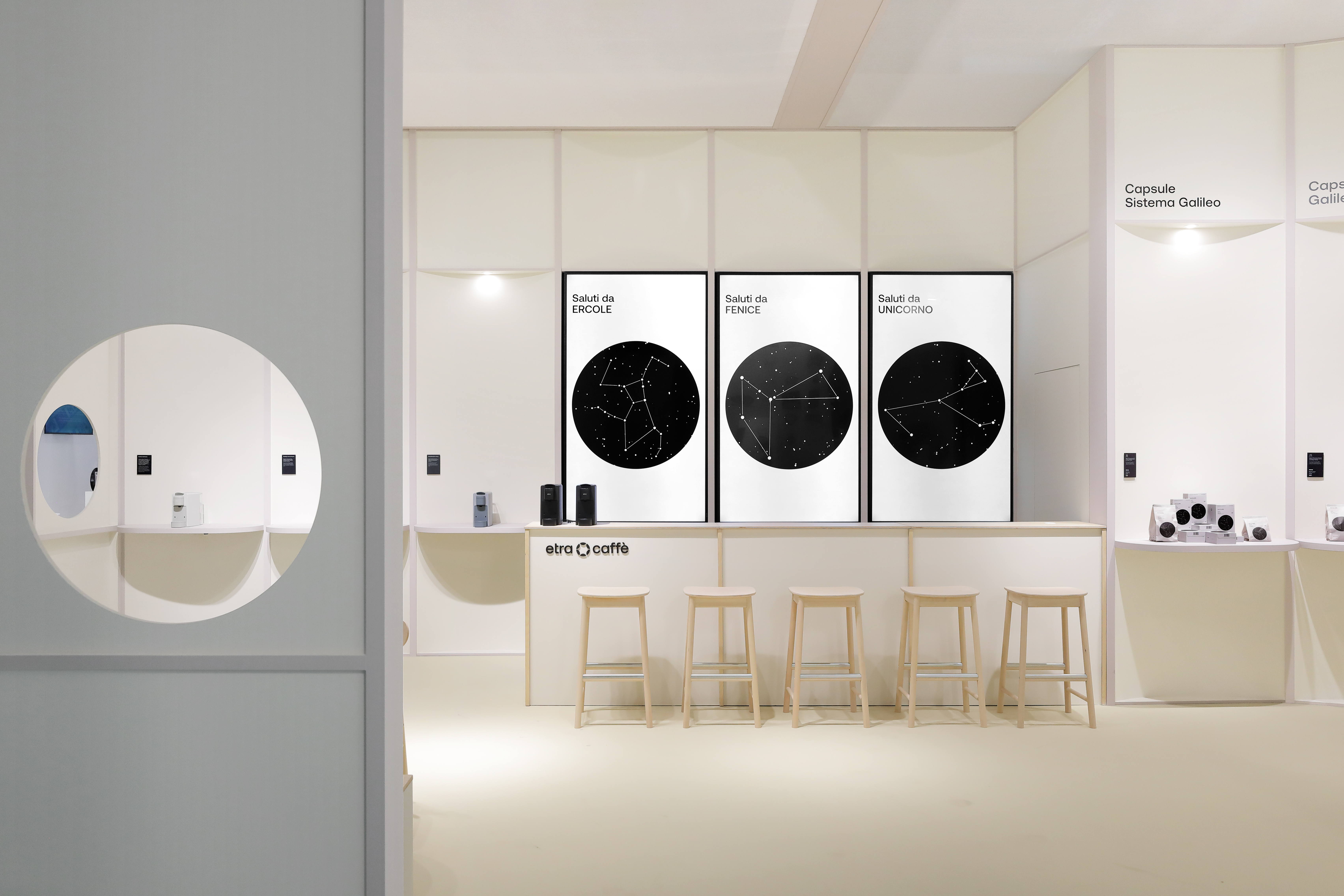
goes on an insterstellar journey
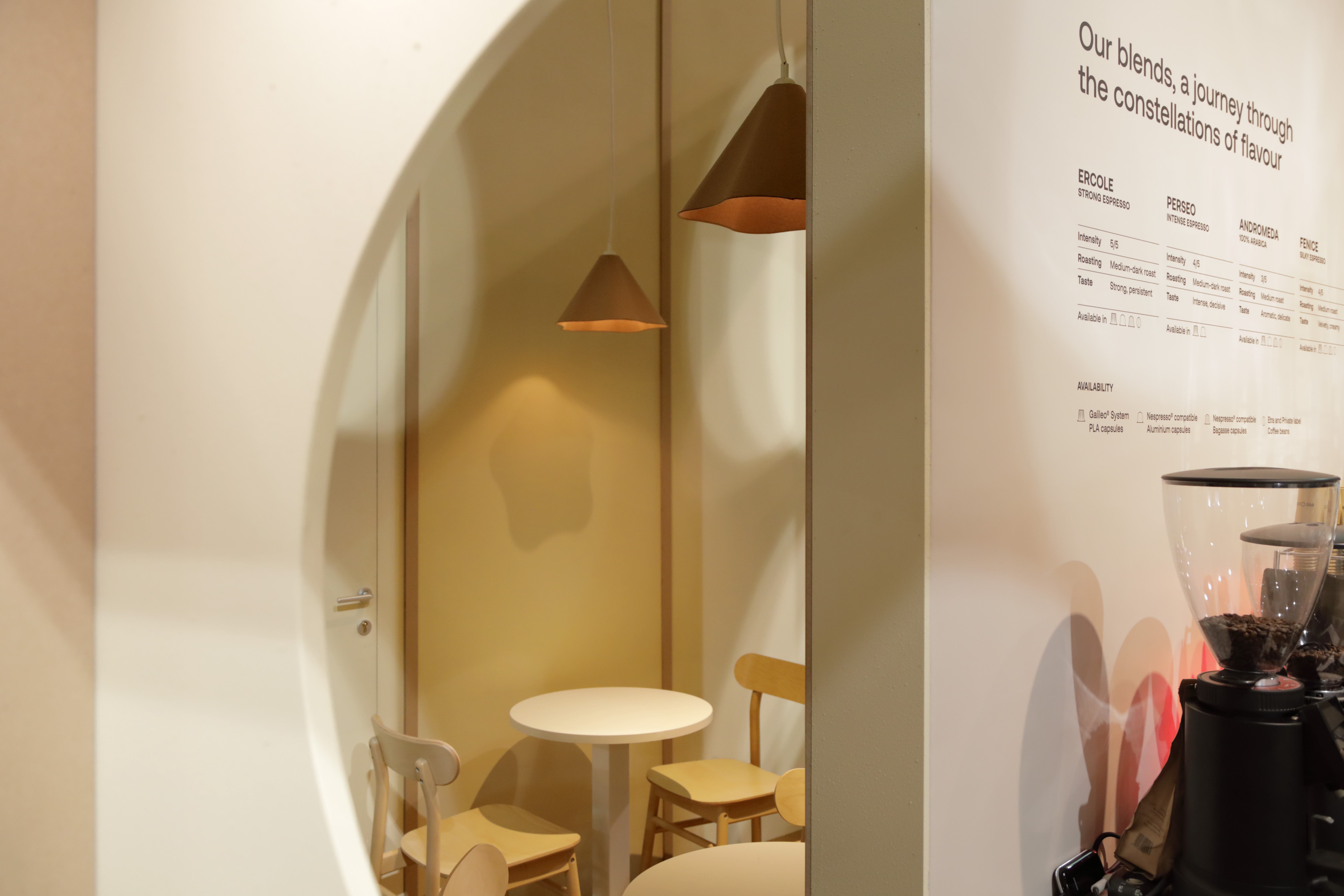
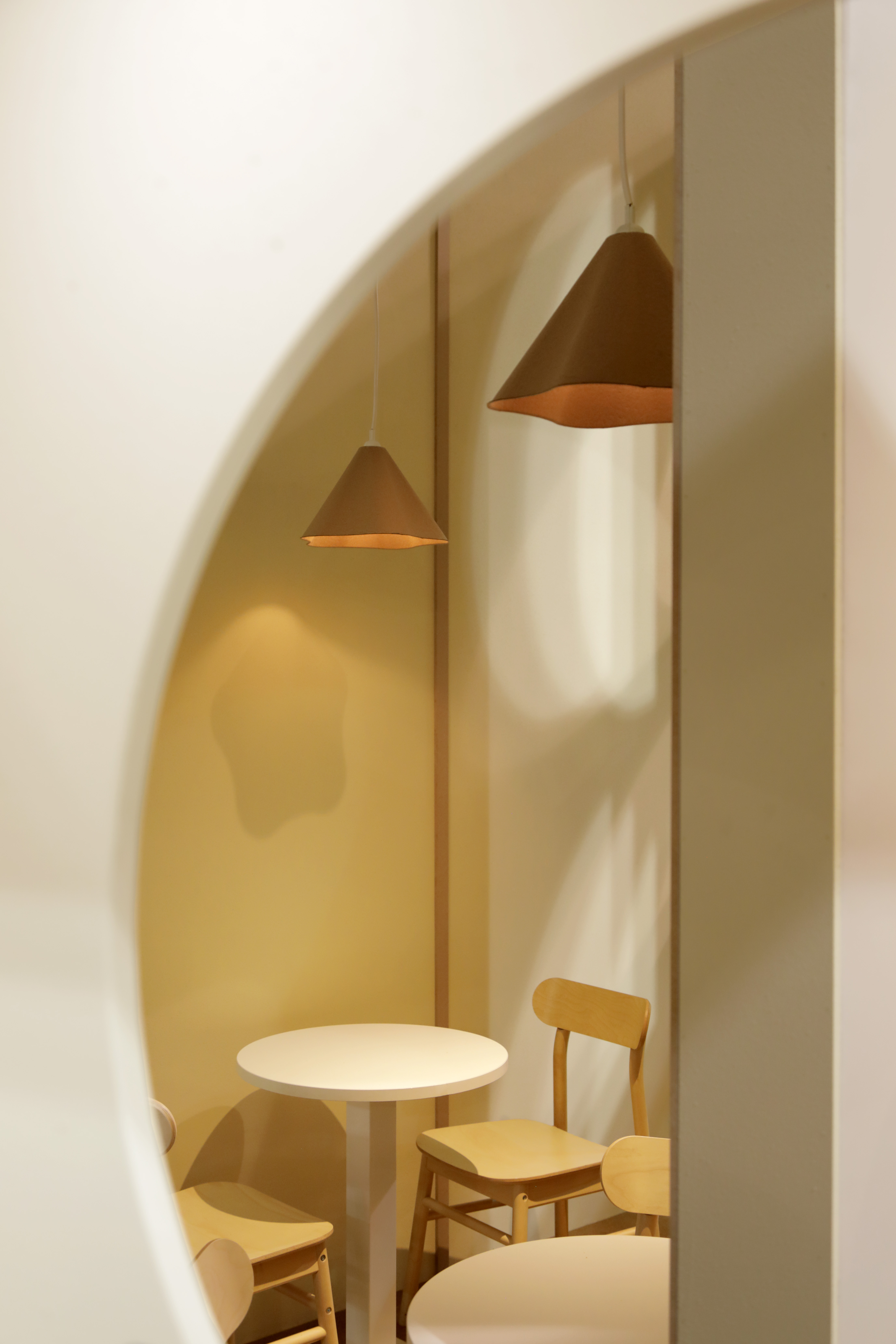
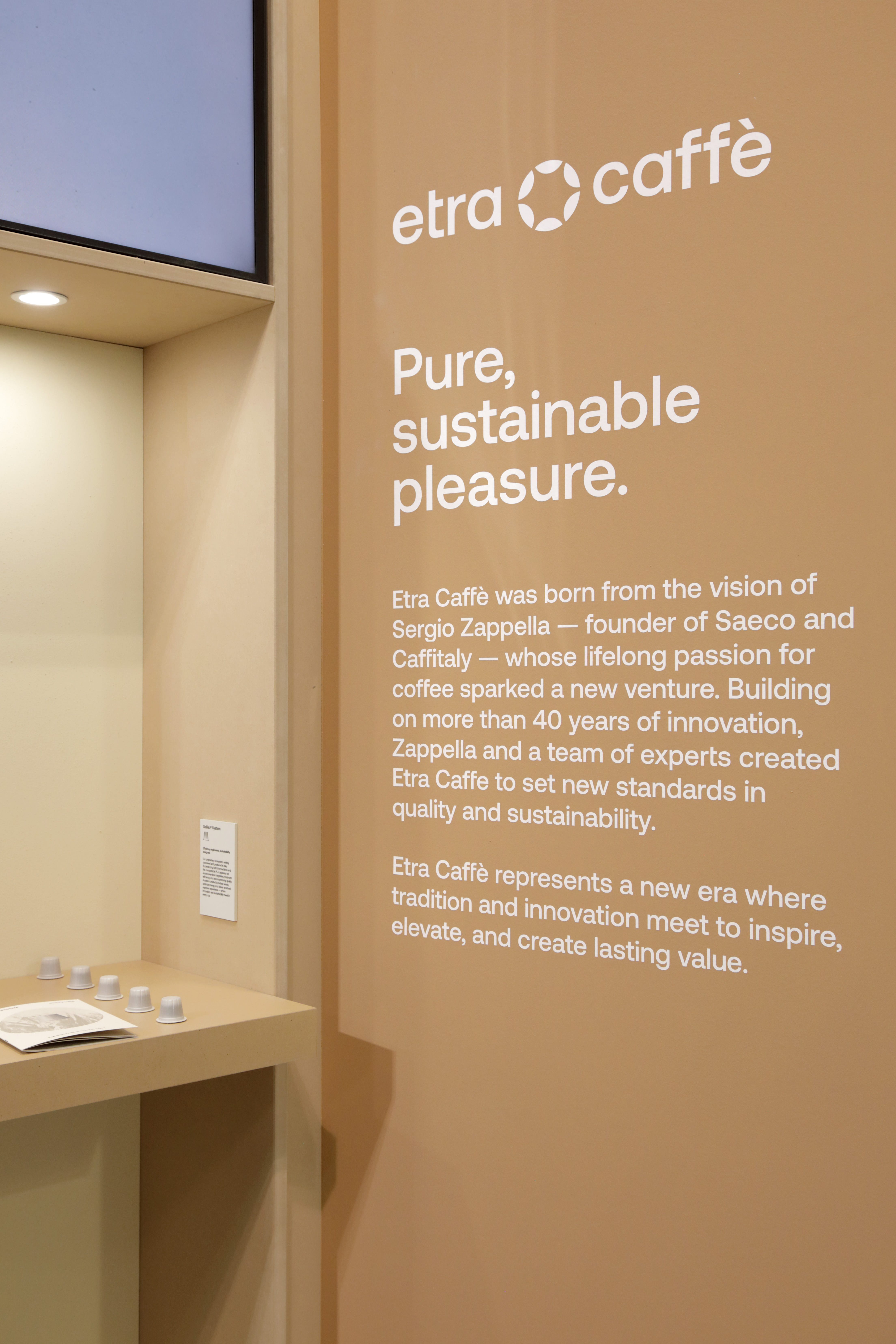
According to ancient Greek cosmologists, the aether is the highest, purest and brightest part of the sky. Etra is the set of shining stars that guides us on a path made of pure raw materials, a path in search of simplicity. Etra Caffè is born to offer everyone a moment of pleasure through pure and sustainable coffee.
We have been working on the entire design system, defining the brand strategy and developing all visual assets, both physical and digital.
Visit ︎︎︎ etracaffe.com
We have been working on the entire design system, defining the brand strategy and developing all visual assets, both physical and digital.
Visit ︎︎︎ etracaffe.com
ETRA CAFFÈ
for: Etra Caffè
team: Pierluigi Anselmi, Pietro Buffa, Alessandro C. Busseni, Mara Castiglioni, Marco Gabriele, Martina Gommellini, Giacomo Quinland


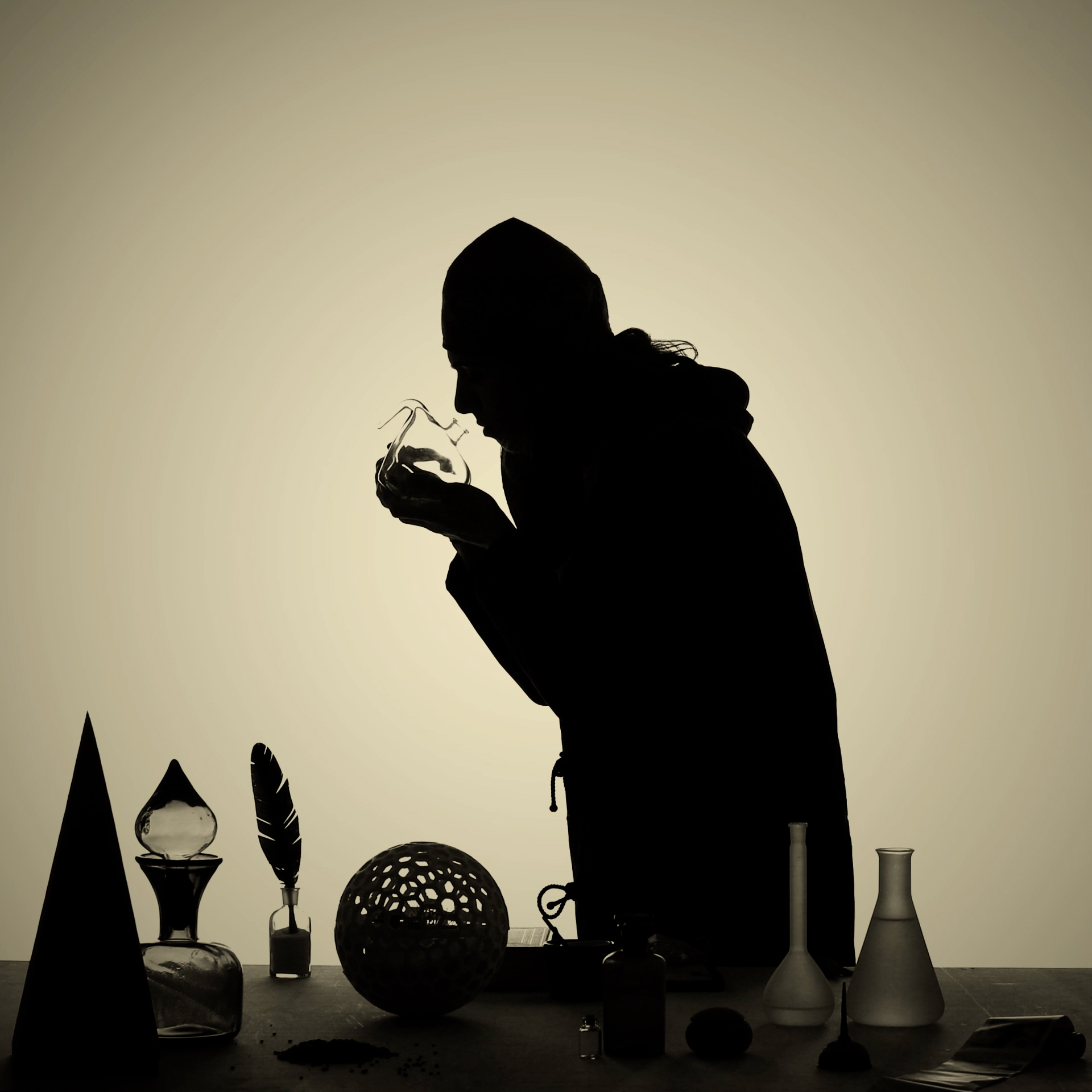
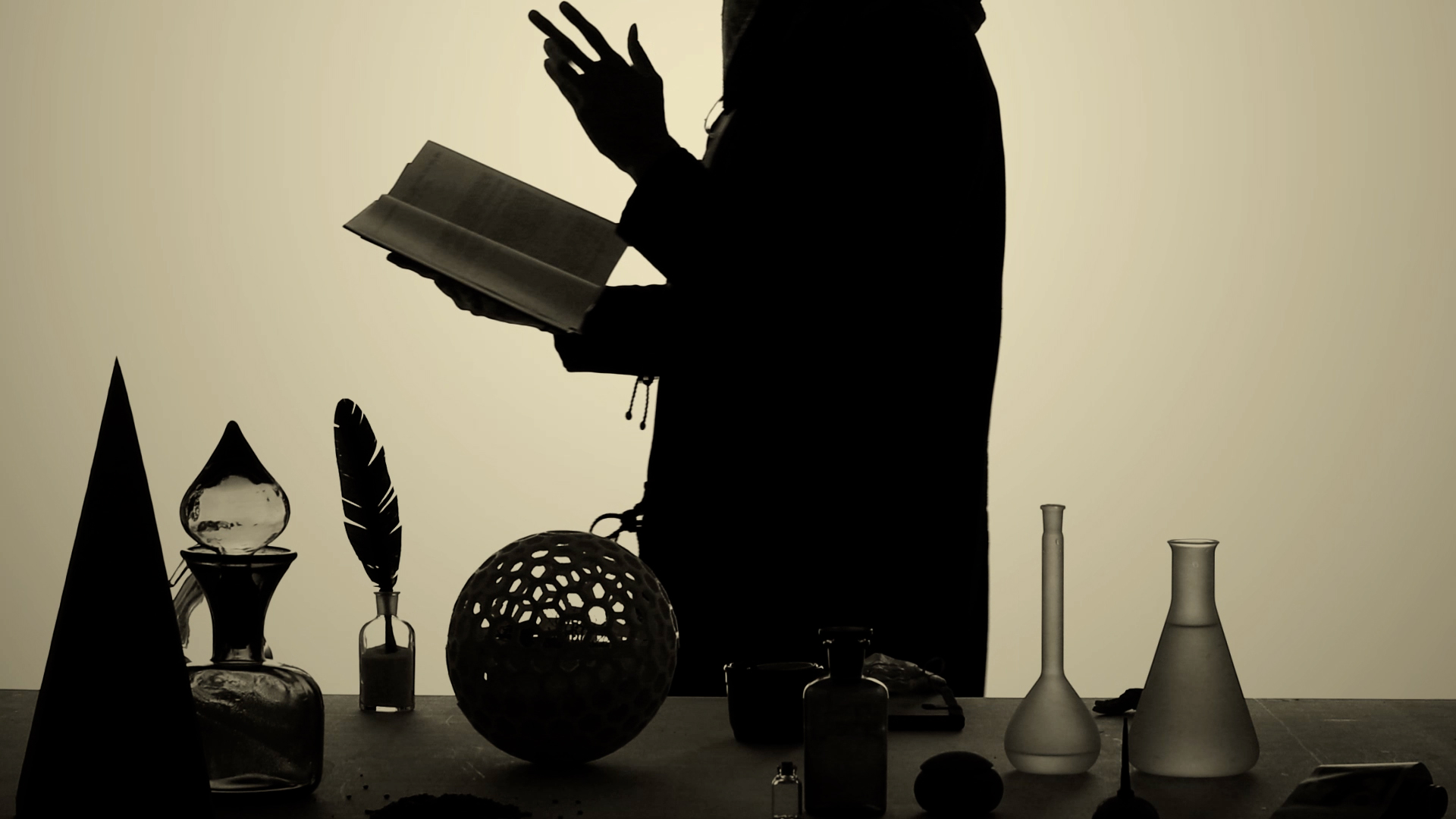
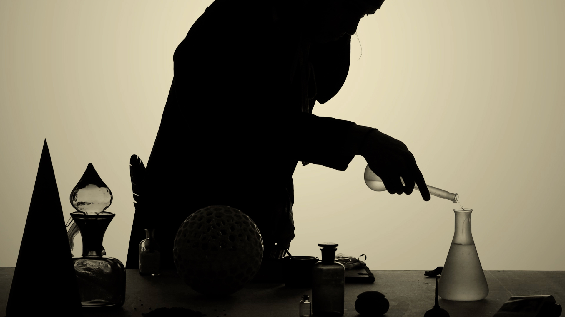
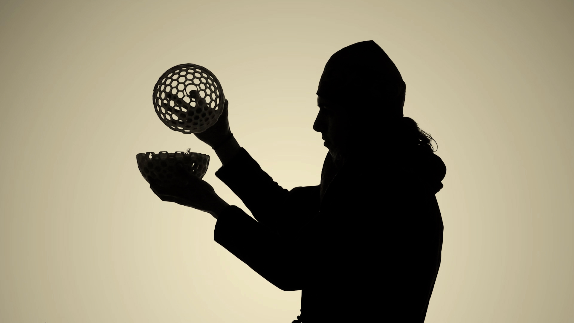
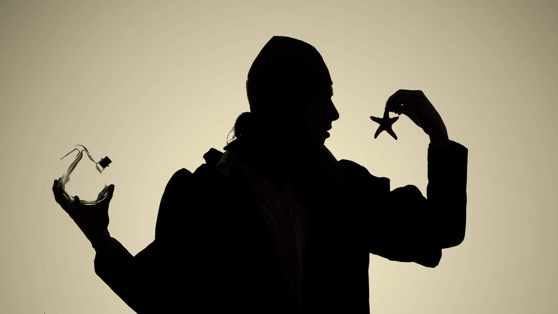
is the alchemist’s apprentice
Lo Speziale is a journey to discover the story of a master alchemist, keeper of a bizarre knowledge. Between lights and shadows you will discover mystical secrets, wondrous potions and strange exotic words in a short theatrical action we shot for dotdotdot’s exhibition design.
LO SPEZIALE
exhibited in: Orto botanico dell'Università di Padova
with: dotdotdot
team: Pierluigi Anselmi, Giovanni Cola, Marco Gabriele, Giacomo Quinland, Duccio Zanone

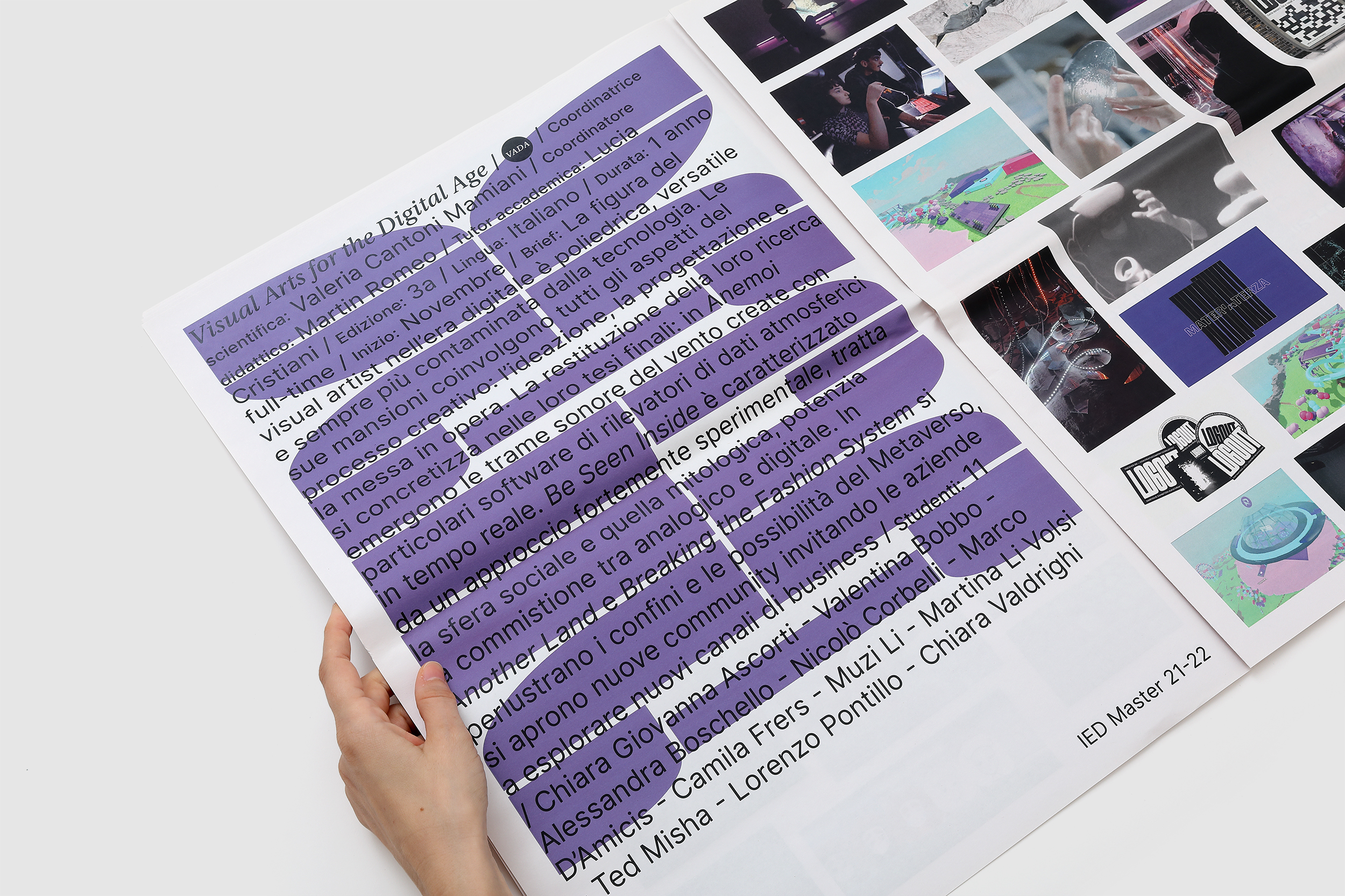
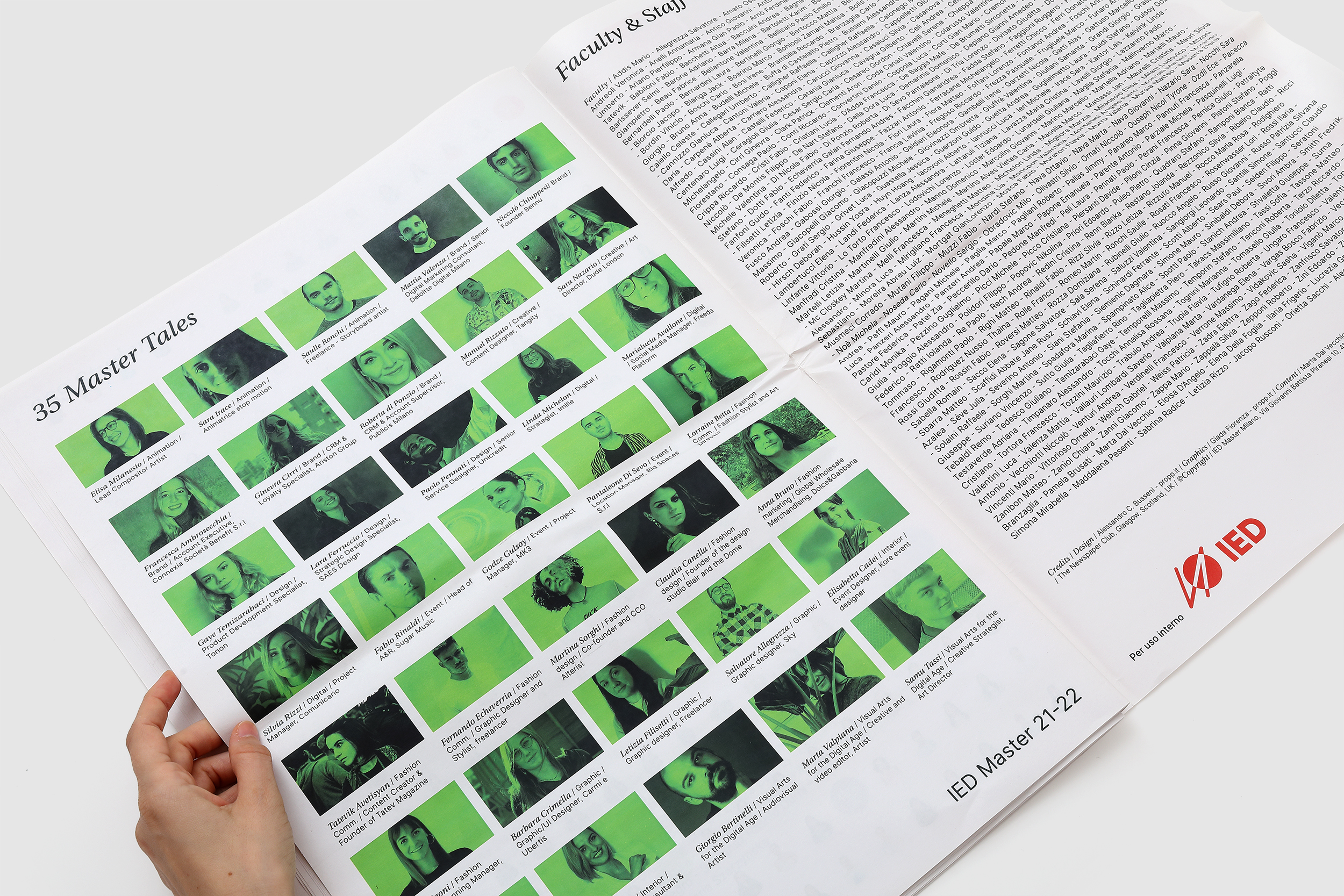
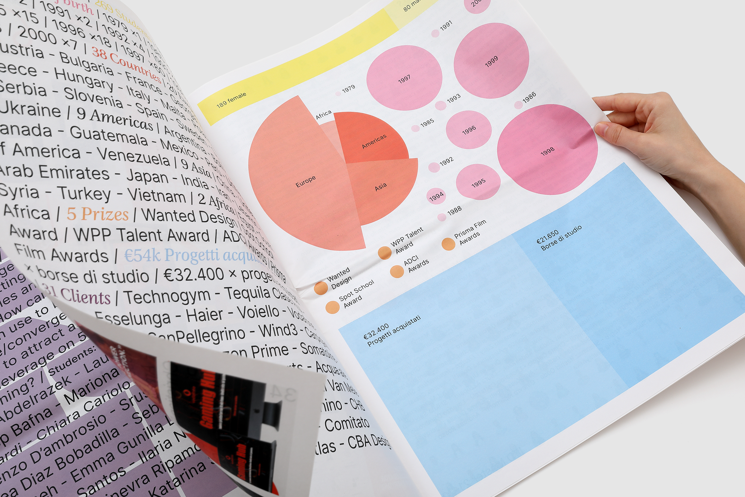
trespass in the 3rd dimension
IED Master Journal is a journey through a year of struggles, wonders, failures, achievements and above all projects designed by IED Milan Master courses’ students: from fashion to digital, graphics, interior and much more.
This special edition is printed in tabloid size, 55gsm paper, full color, with a custom geometric typeface and a special AR twist to entertain the readers, playing with the school’s theme of the year: Find your Difference.
This special edition is printed in tabloid size, 55gsm paper, full color, with a custom geometric typeface and a special AR twist to entertain the readers, playing with the school’s theme of the year: Find your Difference.
IED MASTER JOURNAL 21/22
for: IED Master Milano
with: Michele Giacopuzzi
team: Alessandro C. Busseni, Giada Fiorenza


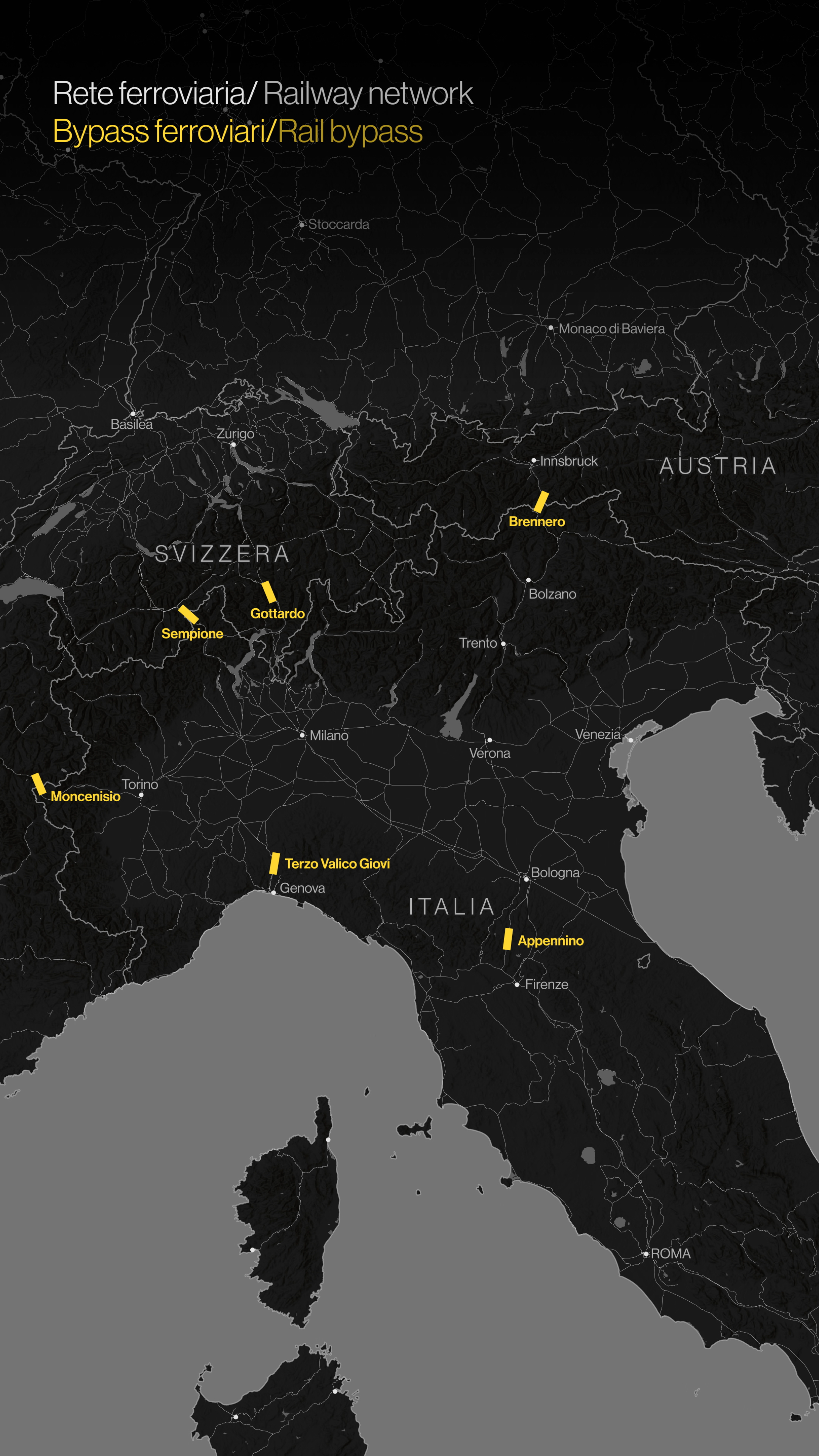
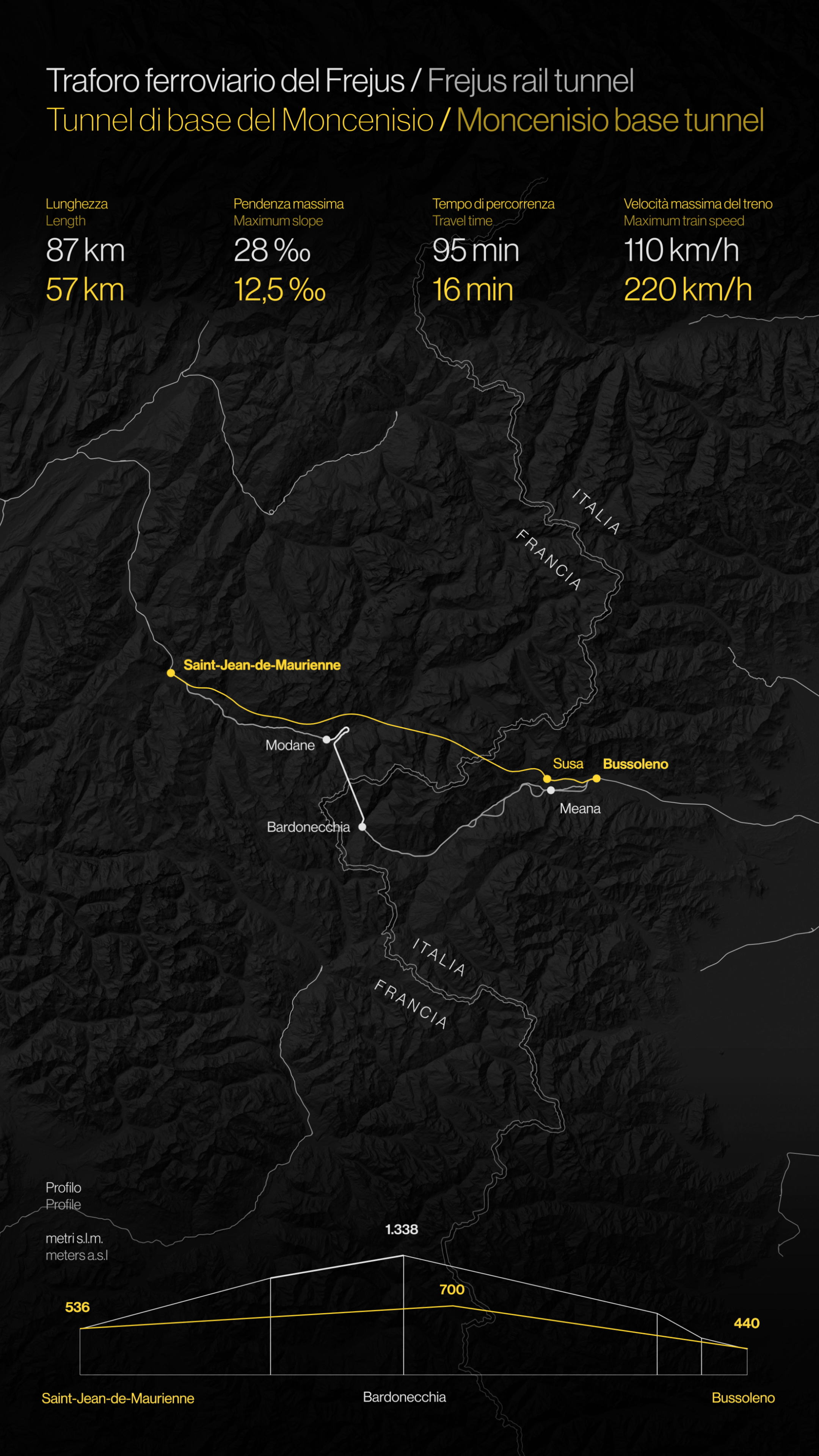
goes beyond
mountains
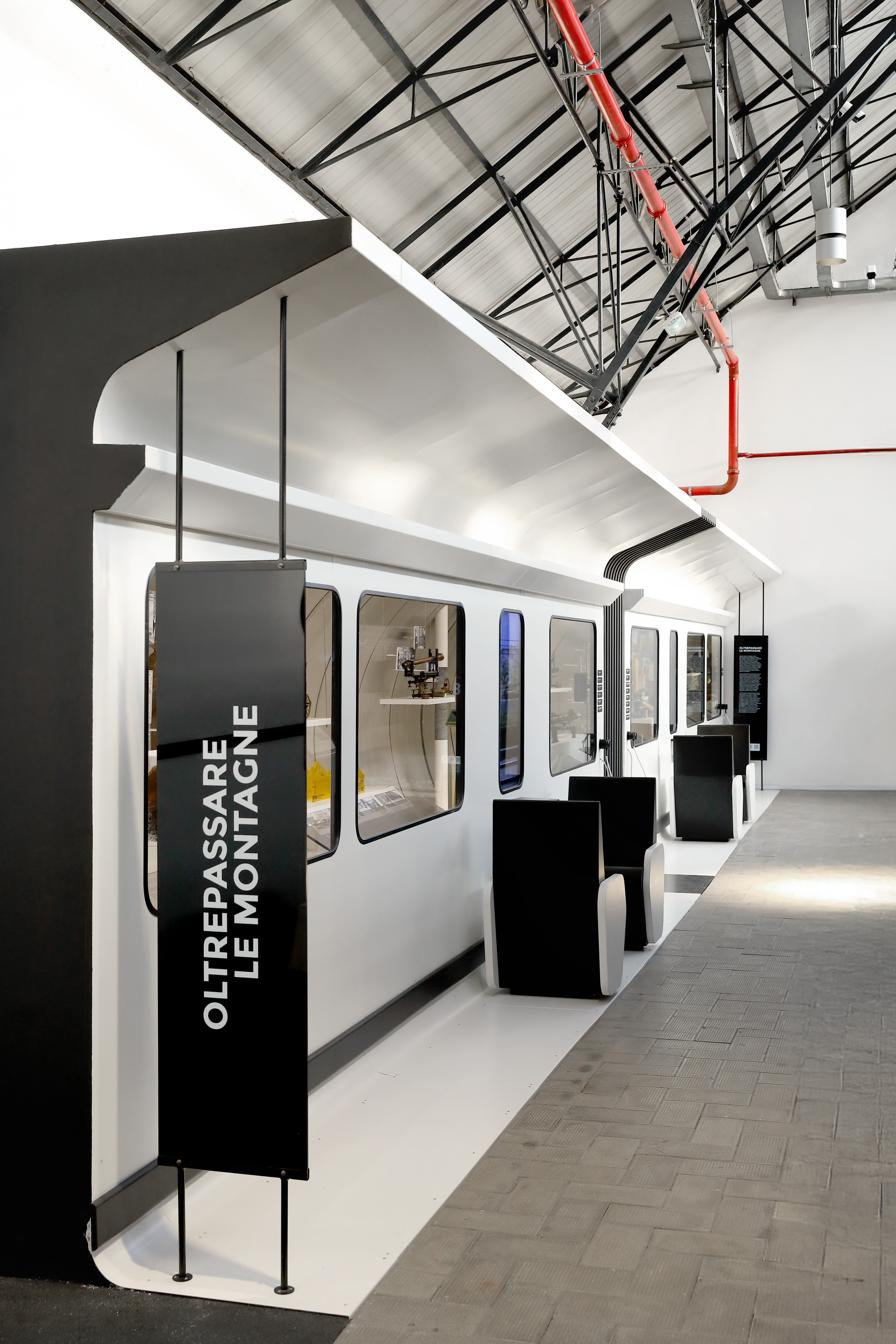
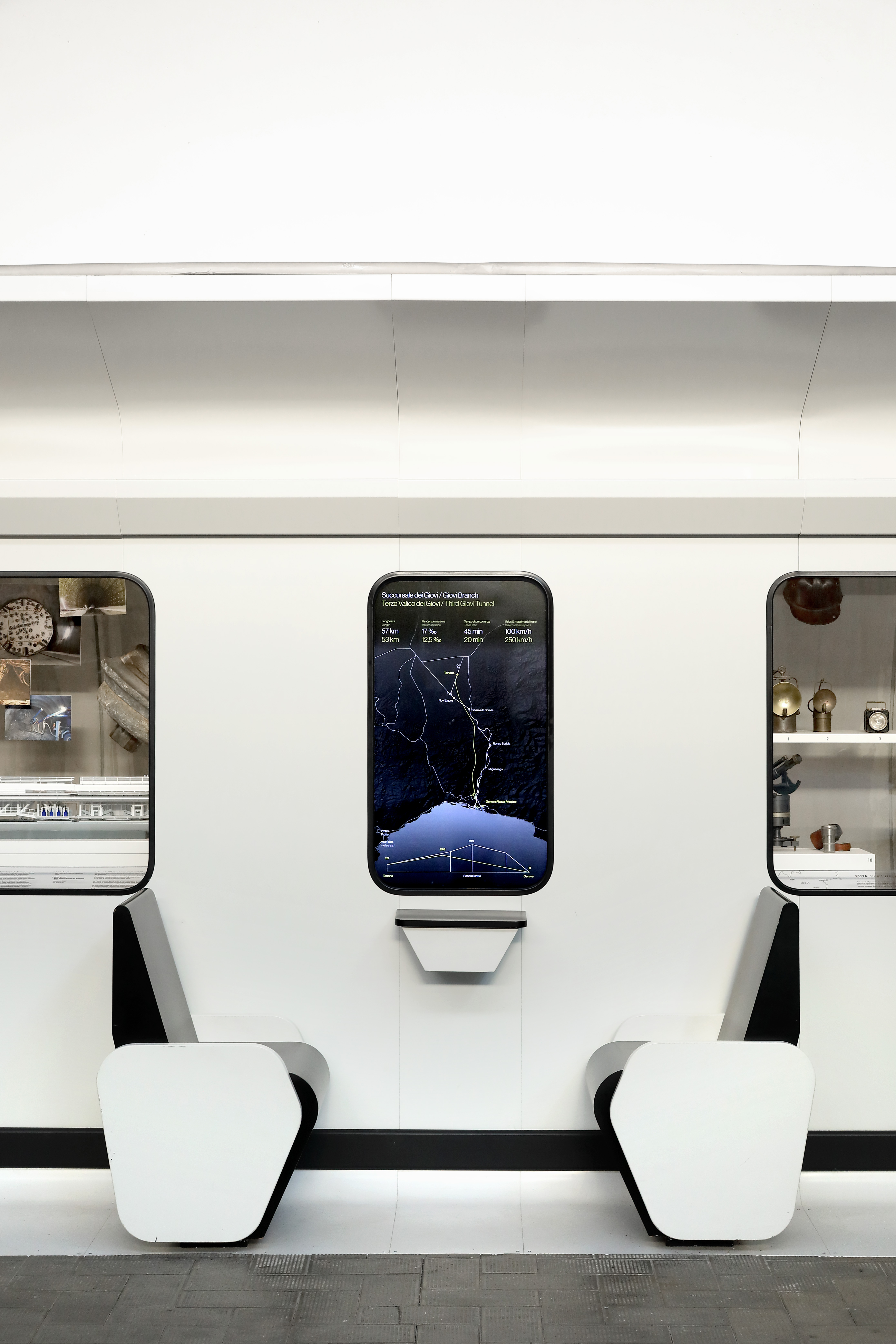
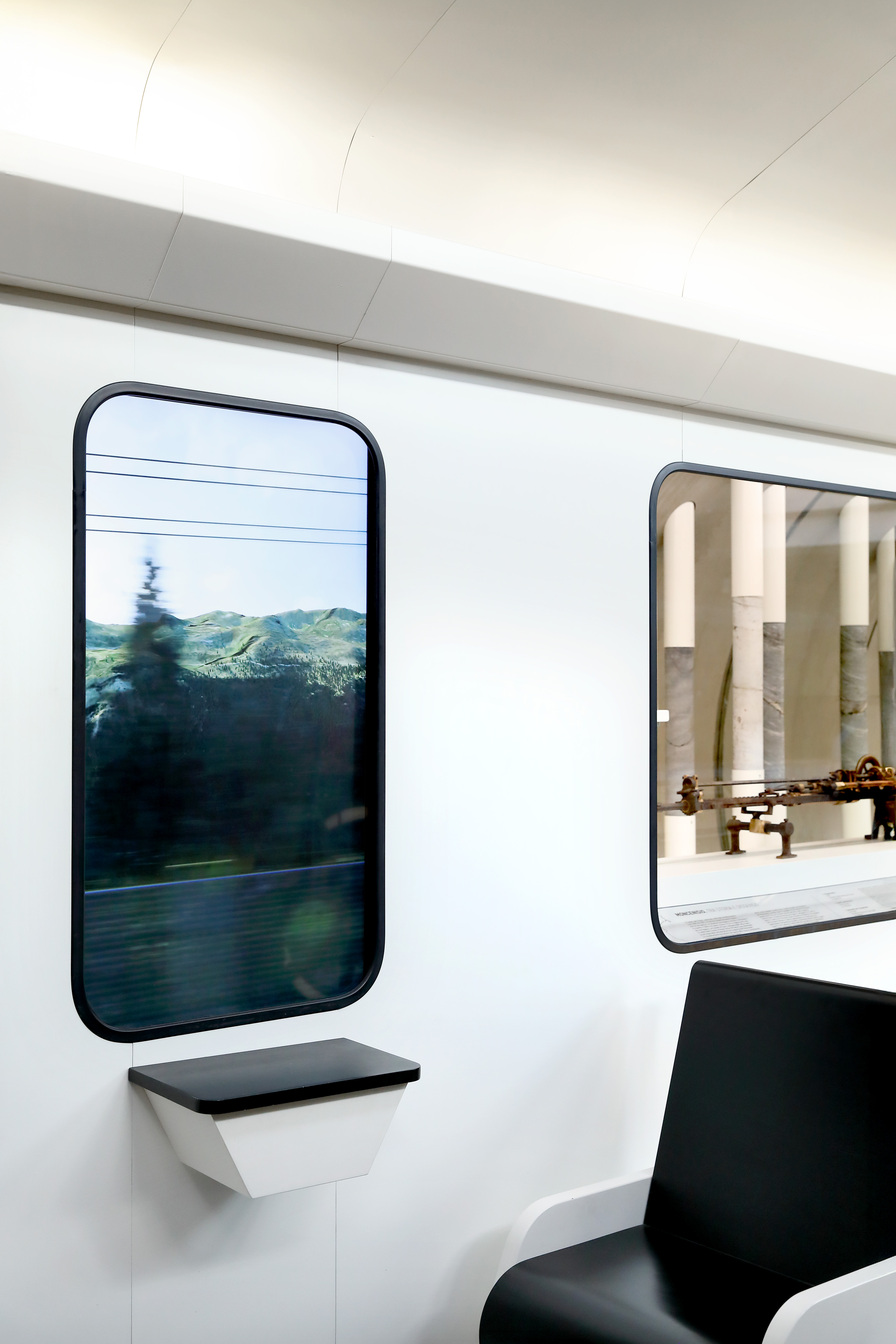
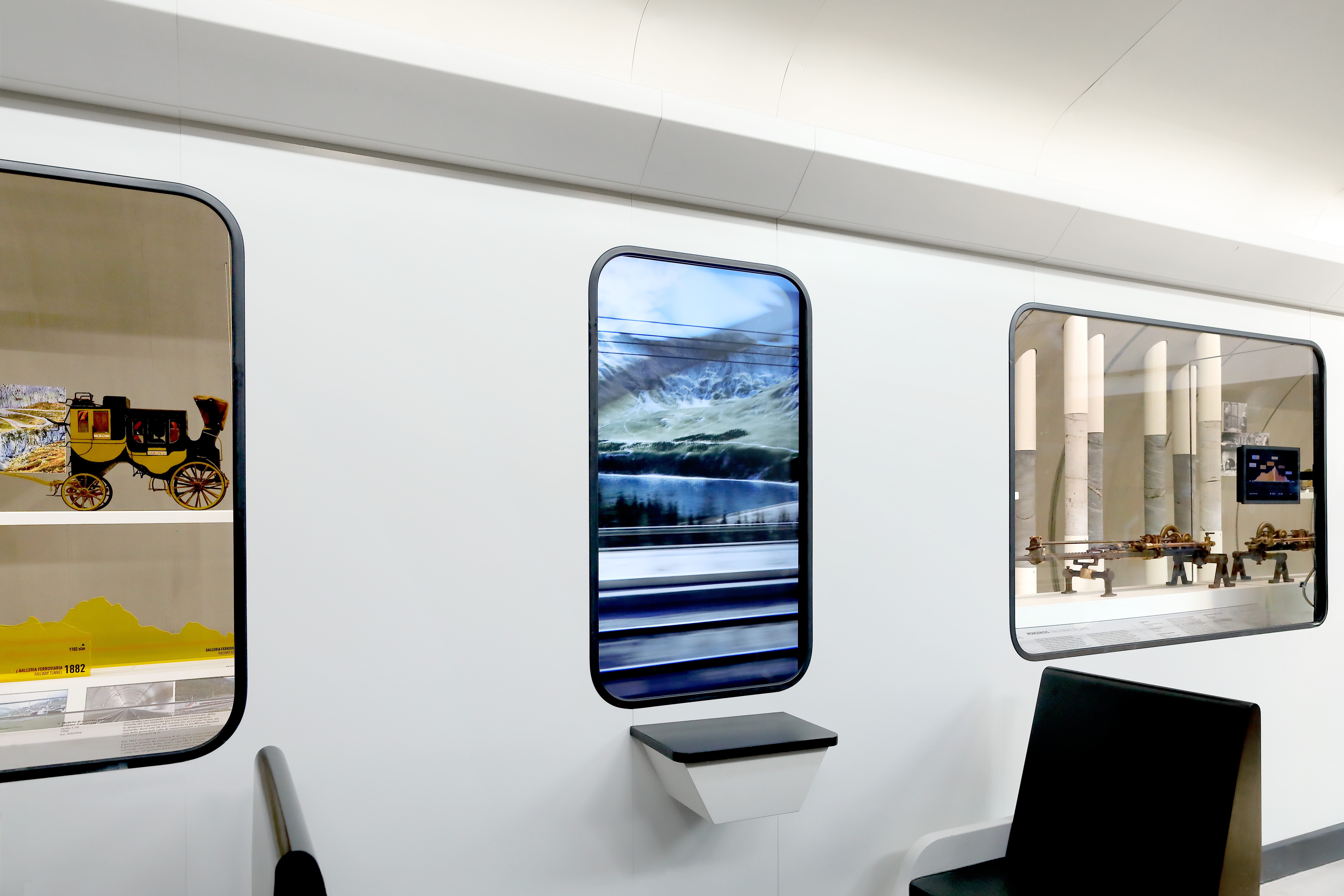
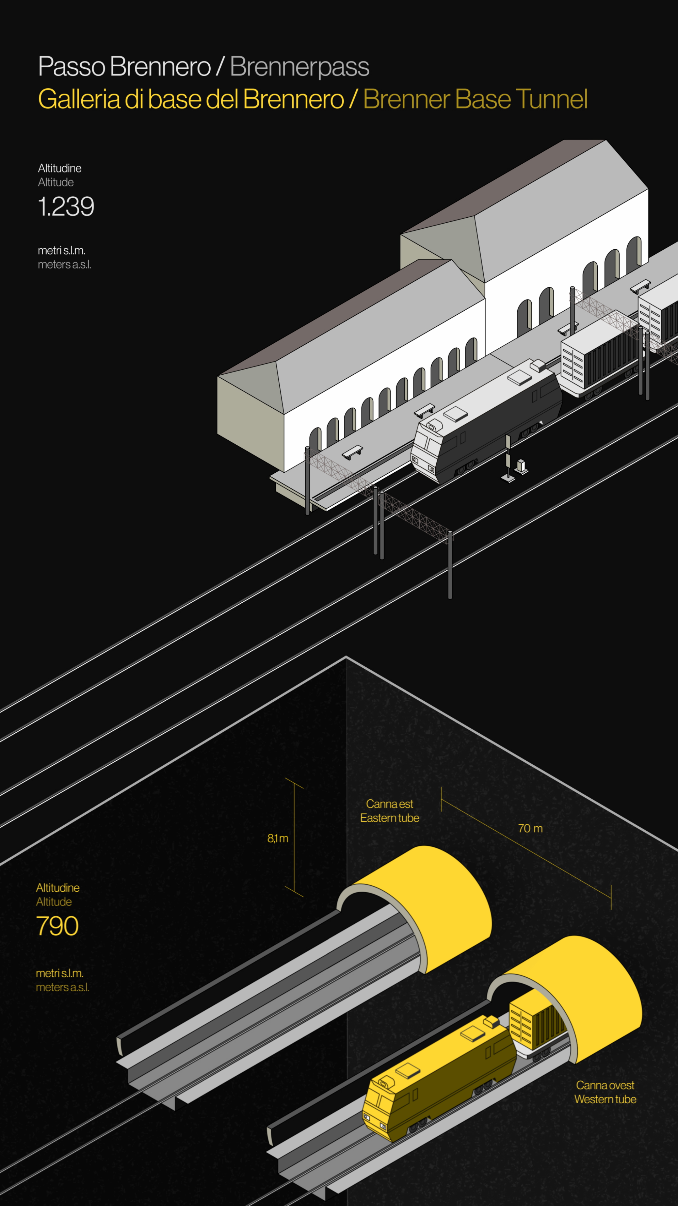
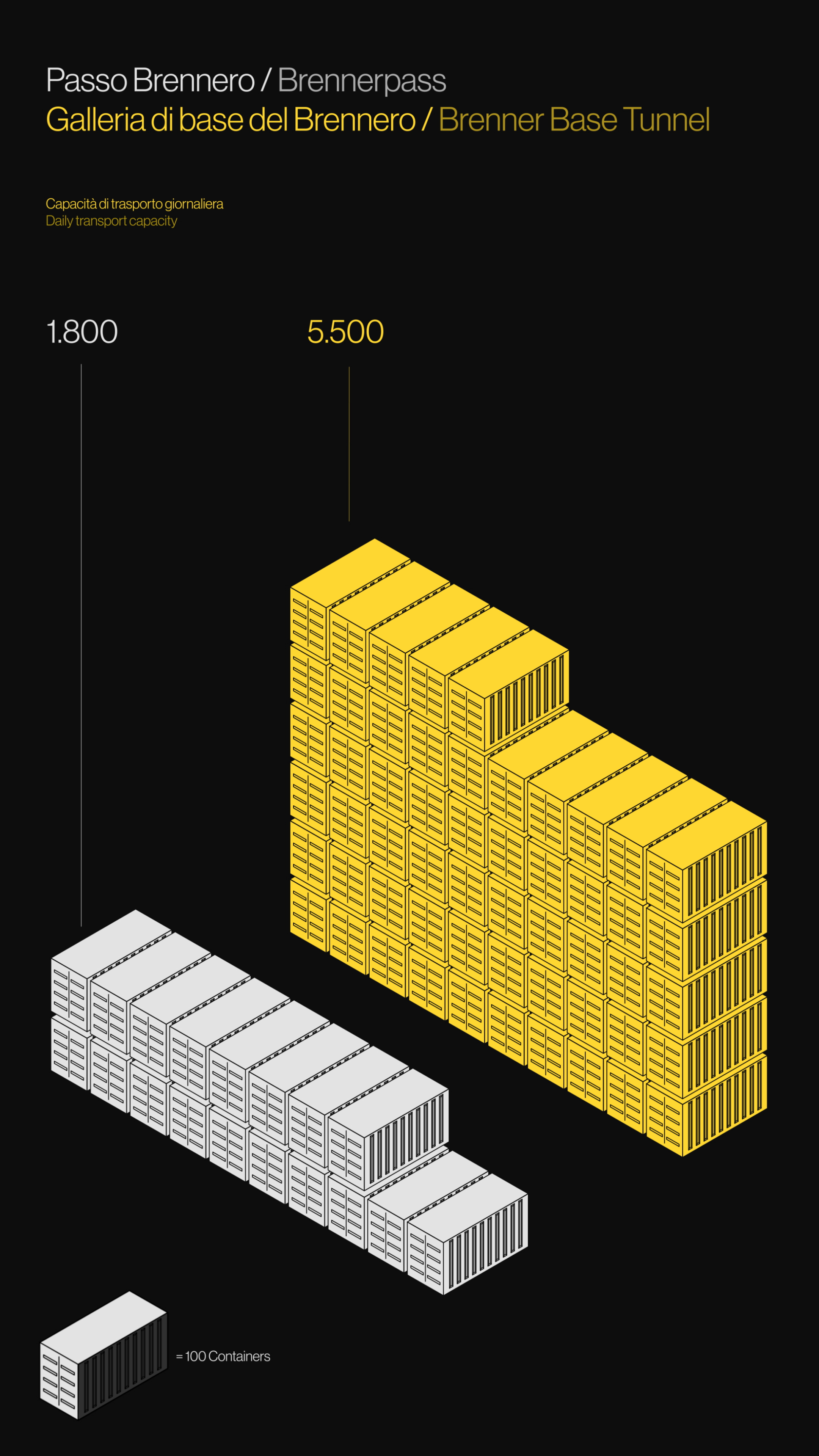
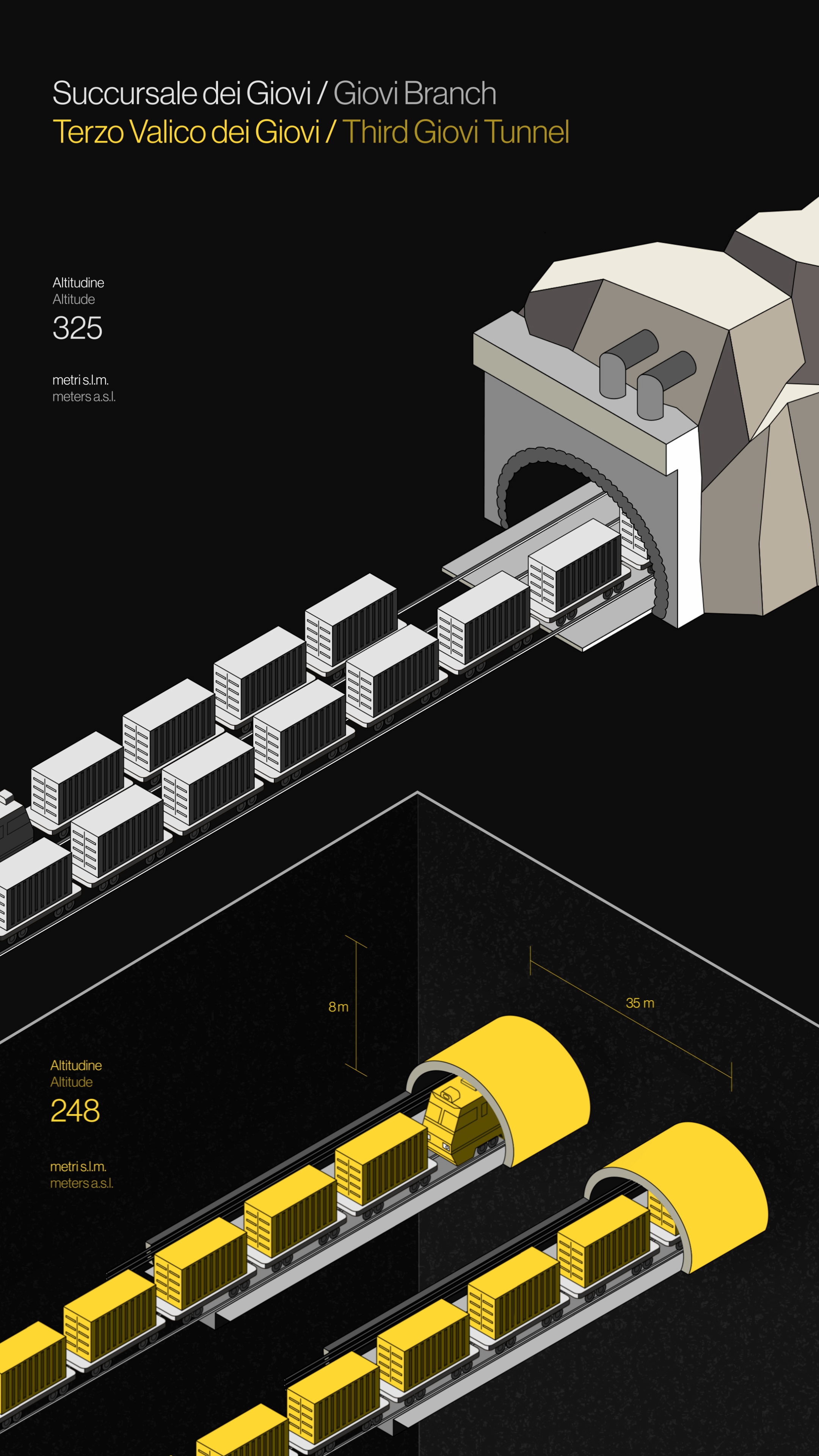
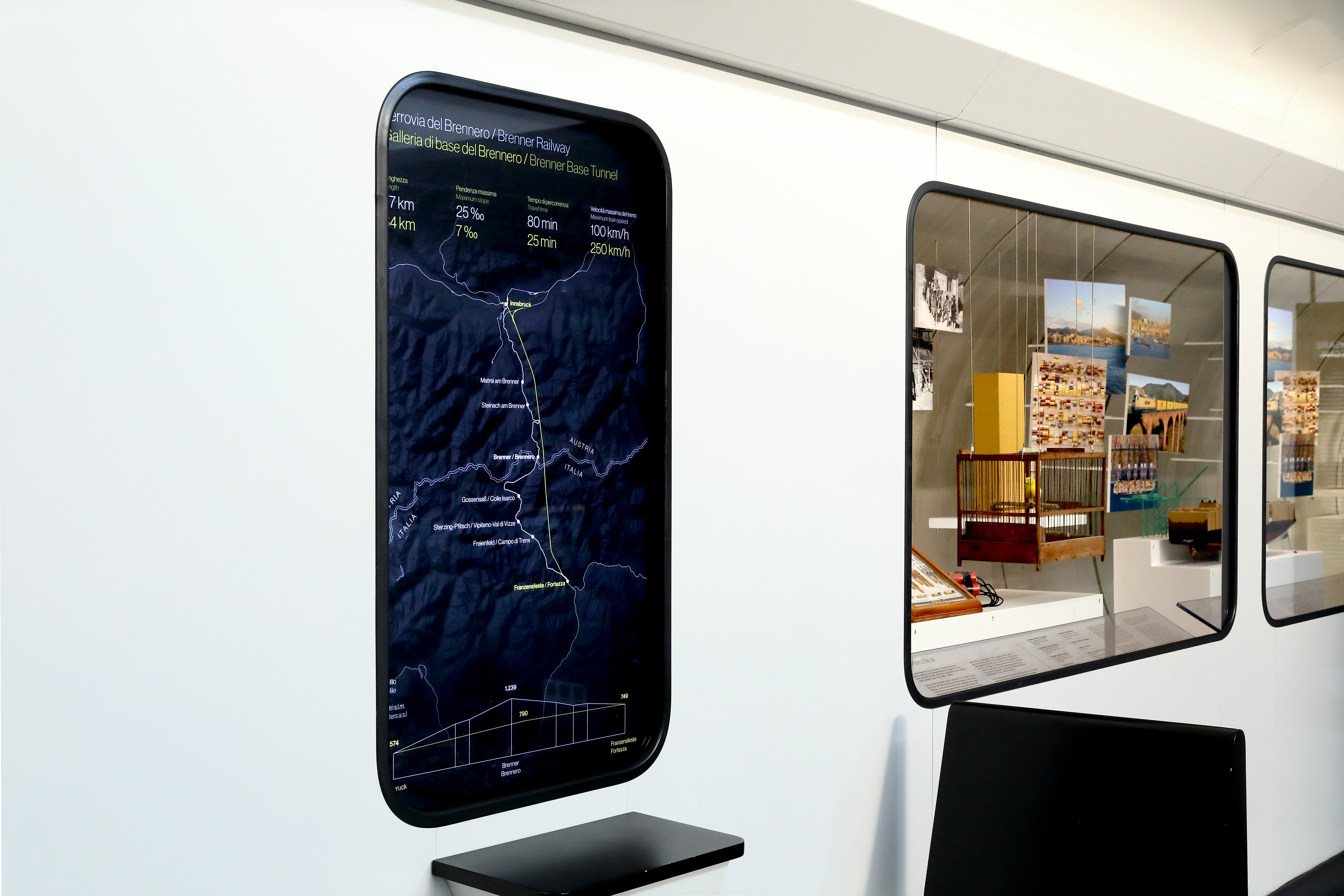
Oltrepassare le montagne is the first of three new multimedia installations featured in the railway pavilion at the Leonardo da Vinci Museum of Science and Technology in Milan. The installation explores the concept of railway bypasses—deep tunnels designed to boost freight transport capacity and reduce travel times.
BYPASS FERROVIARI
for: Museo Nazionale della Scienza e della Tecnologia Leonardo da Vinci
team: Pierluigi Anselmi, Pietro Buffa, Marco Gabriele, Lorenzo Baraldi, Giacomo Quinland


︎
Created by MUST, the installation recreates the interior of a train carriage. We developed the animated content for the monitors, which serve as windows, presenting two key moments: one more narrative, with four mountain landscapes flowing past, and one more analytical, using maps and infographics to present data curated by the exhibition’s scientific team in an engaging and accessible way for a broad audience.
Created by MUST, the installation recreates the interior of a train carriage. We developed the animated content for the monitors, which serve as windows, presenting two key moments: one more narrative, with four mountain landscapes flowing past, and one more analytical, using maps and infographics to present data curated by the exhibition’s scientific team in an engaging and accessible way for a broad audience.


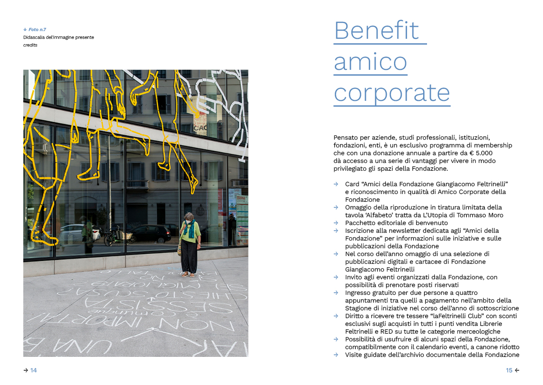
contributes to the daily debat on socio-cultural diversities
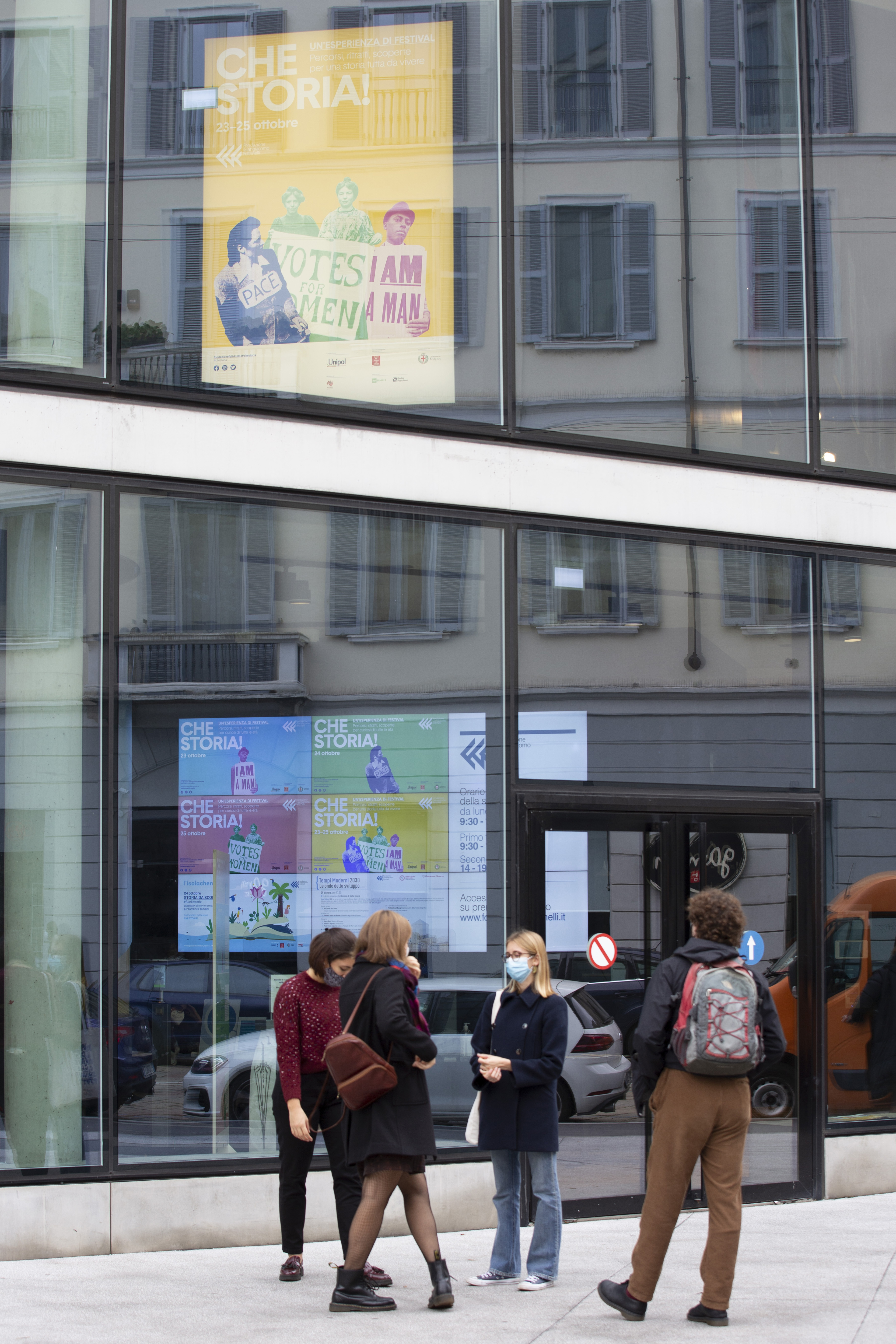
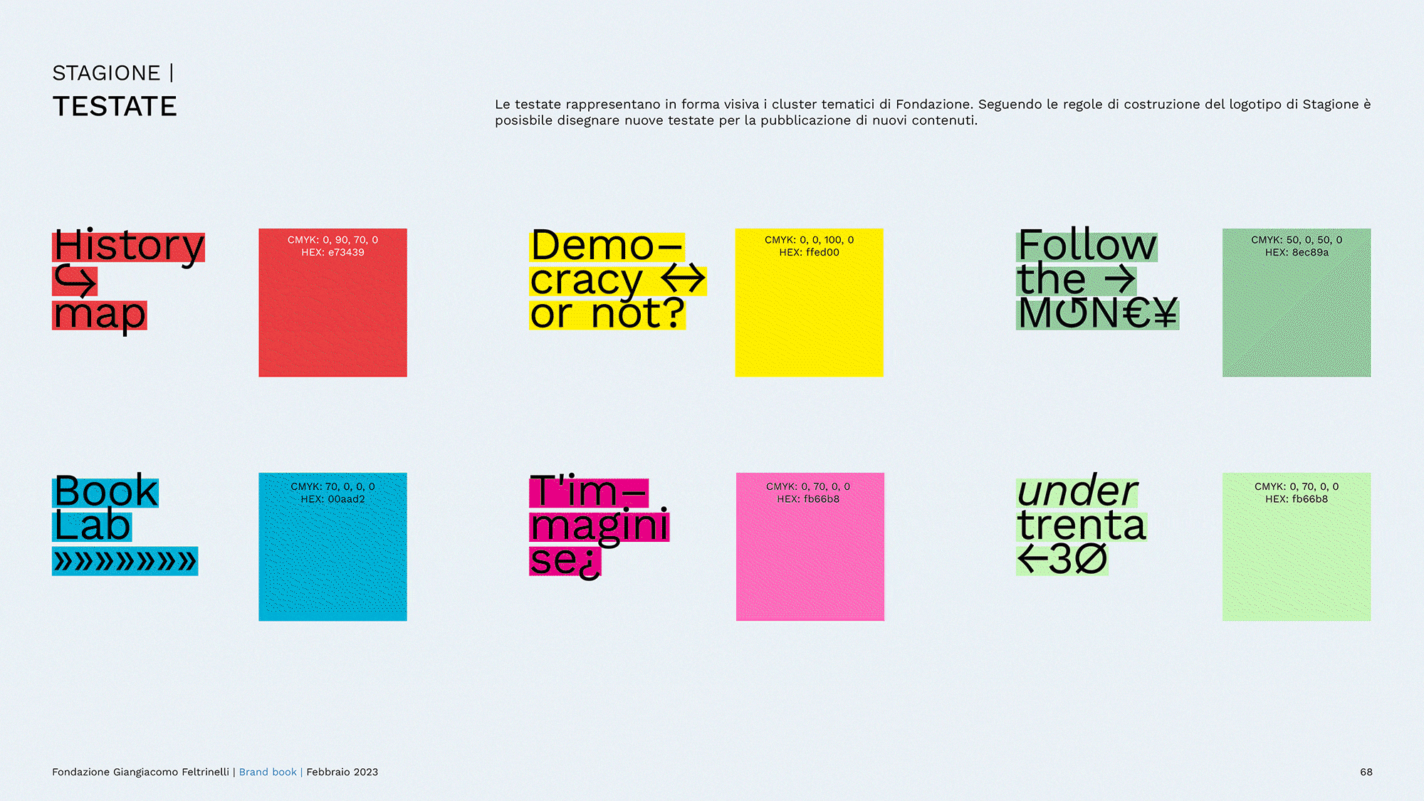
Fondazione Giangiacomo Feltrinelli is an inclusive cultural space accessible to all: a public library, an archive of sources, research activities on citizenship issues, of work, contemporary history and the globalized economy and a space where contemporary themes meet the arts.
We have followed Fondazione on a 3 years journey through their public program, to collect all needs and redesign their design system defining the rules to creates any formats needed for their never ending production of activities: events, exhibitions, shows, books or research projects.
Visits fondazionefeltrinelli.it
FONDAZIONE GIANGIACOMO FELTRINELLI
for: Fondazione Giangiacomo Feltrinelli
team: Pierluigi Anselmi, Alessandro C. Busseni, Giovanni Cola, Giada Fiorenza, Letizia Tempesta Filisetti, Beatrice Mucci, Alessia Sparacino


take off to colonize the universe: how will we bring colours to the Moon ?
Twenty short 3D animations visualize the conceptual Decalogue for Space Architecture developed by SOM hosted by an installation designed by dotdotdot: ten-monitors-long split screen installation, explaining to the XXIII Triennale’s audience the prerequisites for living outside our atmosphere.
DECALOGUE FOR SPACE ARCHITECTURE
hosted by: Triennale Milano
exhibited in: Unknown Unknowns
for: dotdotdot, SOM
team: Pierluigi Anselmi, Lorenzo Baraldi, Alessio Brioschi, Pietro Buffa, Alessandro C. Busseni, Guido Dallago, Elena Iankov, Giacomo Quinland


breaks the 17K wall!
We illustrated and animated a handmade story gives life and color to the Portal Of Mysteries, the video-installation imagined by philosopher Emanuele Coccia, designed and developed by dotdotdot to introduce the public to the mysteries of the XXIII Triennale – Unknown Unknowns.
PORTAL OF MYSTERIES
hosted by: Triennale Milano
exhibited in: Unknown Unknowns
for: dotdotdot
written by: Emanuele Coccia
team: Pierluigi Anselmi, Lorenzo Baraldi, Alessio Brioschi, Alessandro C. Busseni, Guido Dallago, Elena Iankov, Giacomo Quinland, Wei-Hsin Shih
photos: DSL studio


︎
16 monitors x 4’ 25” of video x 12 animated illustrations depict the highlights of the exhibition through an interpretation of the works and the creation of an immersive narration, sanely out of this world, but most importantly colorful.
16 monitors x 4’ 25” of video x 12 animated illustrations depict the highlights of the exhibition through an interpretation of the works and the creation of an immersive narration, sanely out of this world, but most importantly colorful.


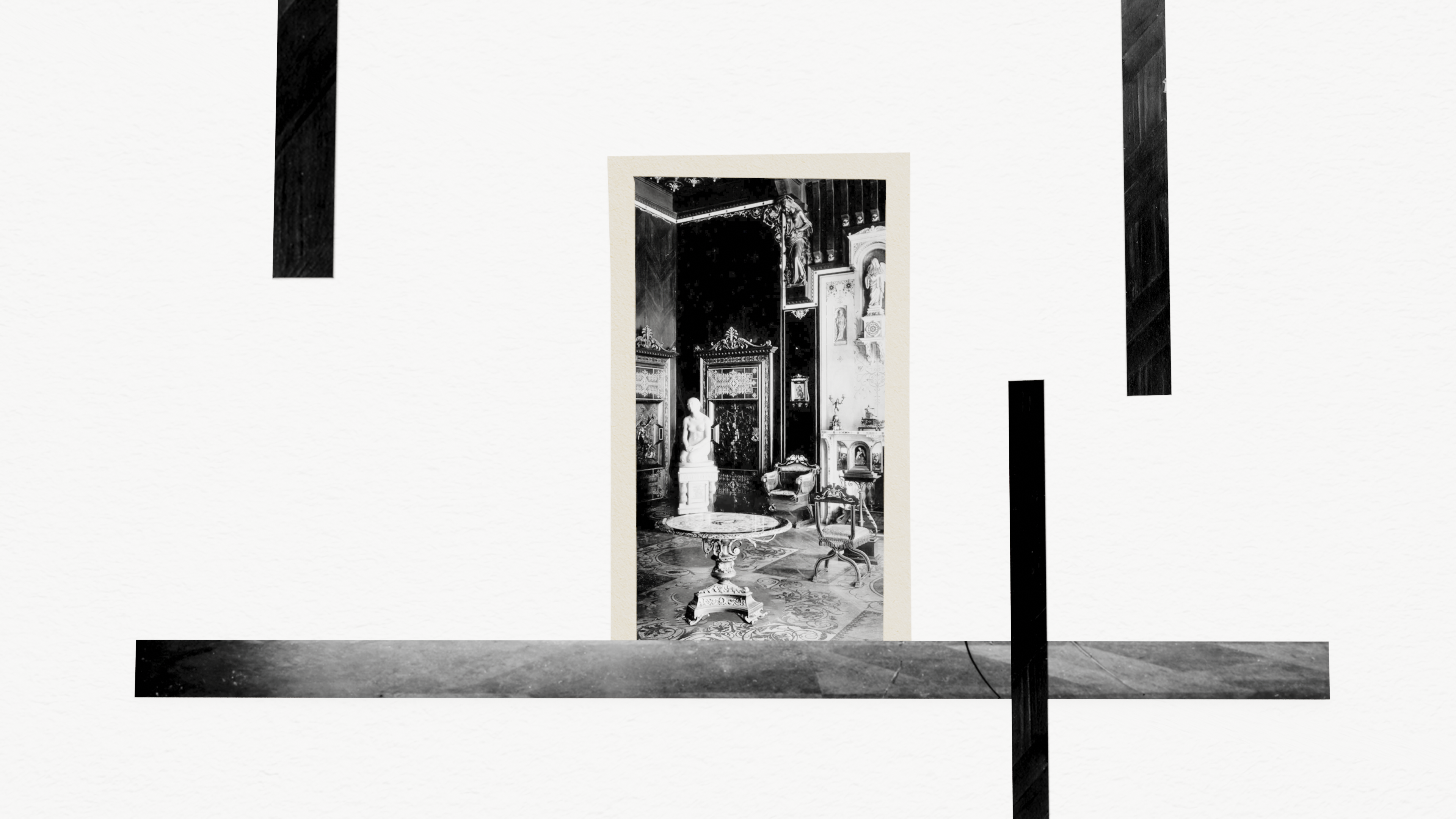
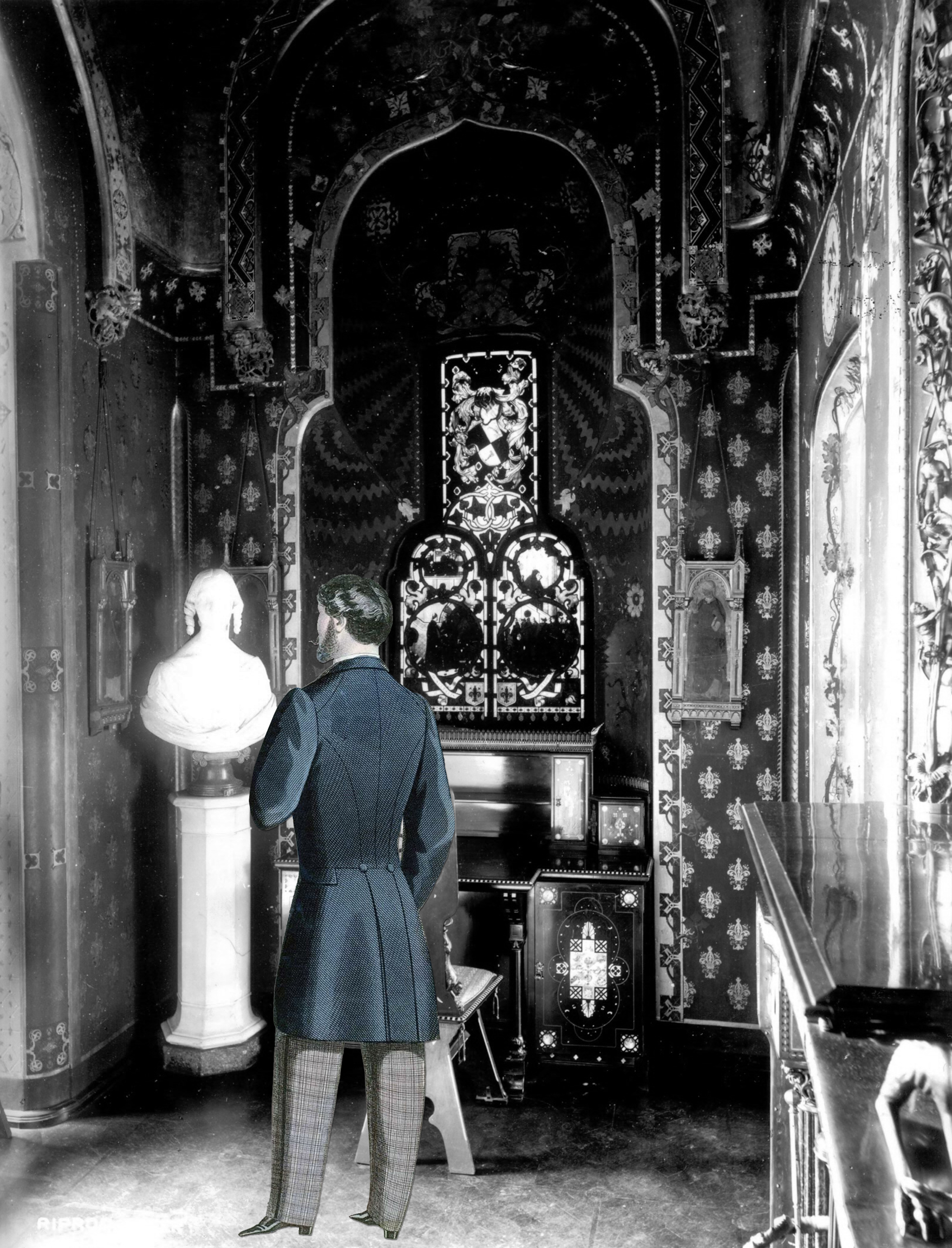
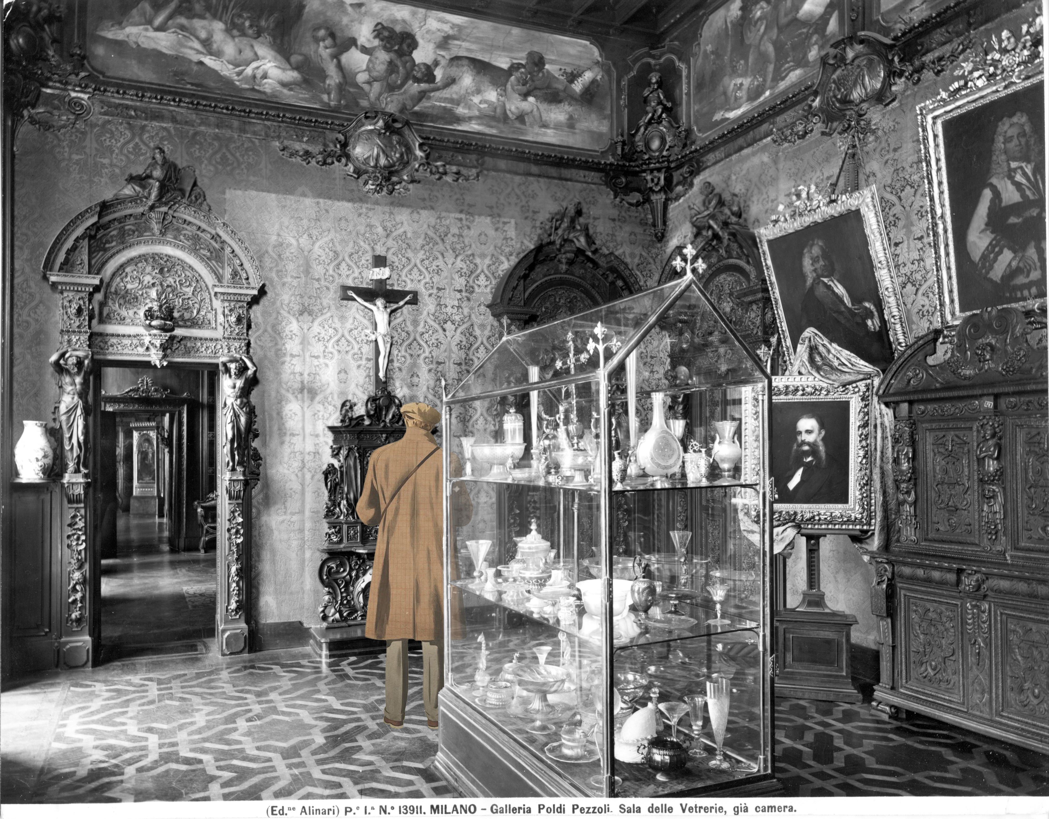
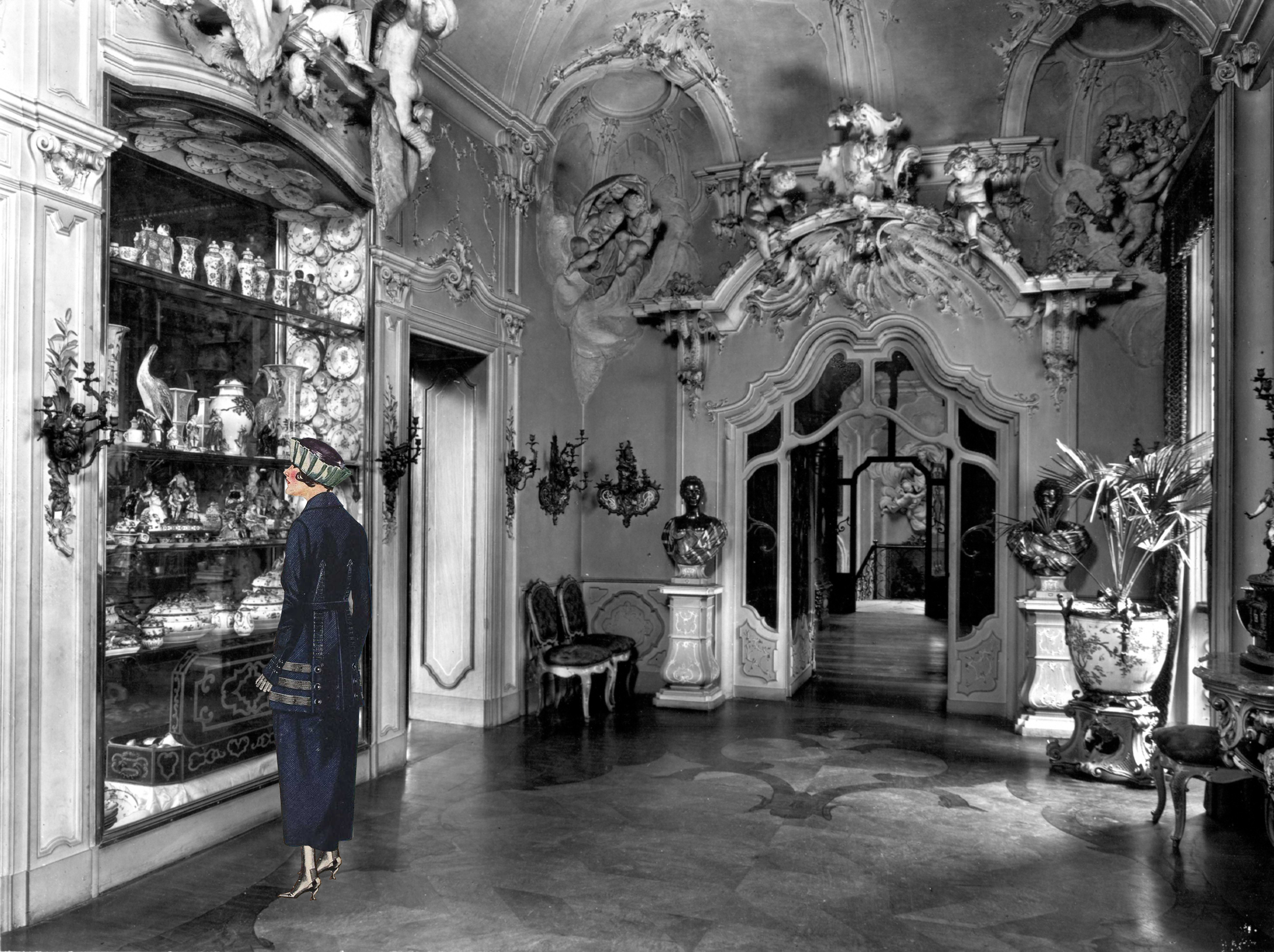
meets Gian Giacomo Poldi Pezzoli
Memo takes you to a walk inside the Poldi Pezzoli museum. Discover Gian Giacomo Poldi Pezzoli’s house and its manifold collection made of paintings, sculptures, clocks, jewels, armory, swords, axes, guns, rifles, shields, spears, daggers, tapestries, doors, locks, keys, crucifixes, tables, chairs and much more.
MEMO
for: Museo Poldi Pezzoli
with: Duccio Servi, Valentina Rodolfi
team: Pierluigi Anselmi, Lorenzo Baraldi, Pietro Buffa, Alessandro C. Busseni, Giovanni Cola, Marco Gabriele, Elena Iankov, Giacomo Quinland


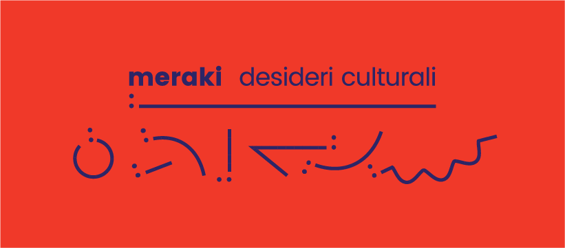
helps you express your cultural dreams
Meraki is a greek word that means “to take care of what you love the most”. Cultura Meraki works with people, communities and institutions. We helped them define the basics for their identity: an empty field to be fullfilled with their clients dreams and objectives.
Visit culturameraki.com
Visit culturameraki.com


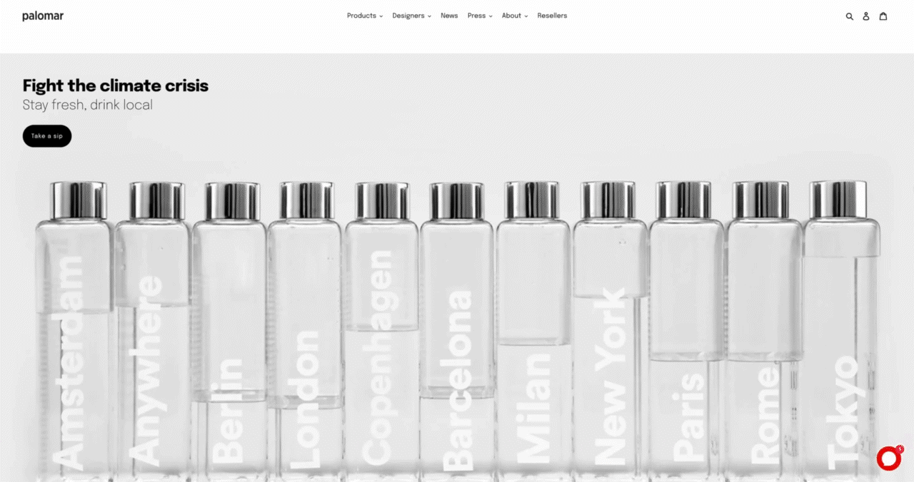
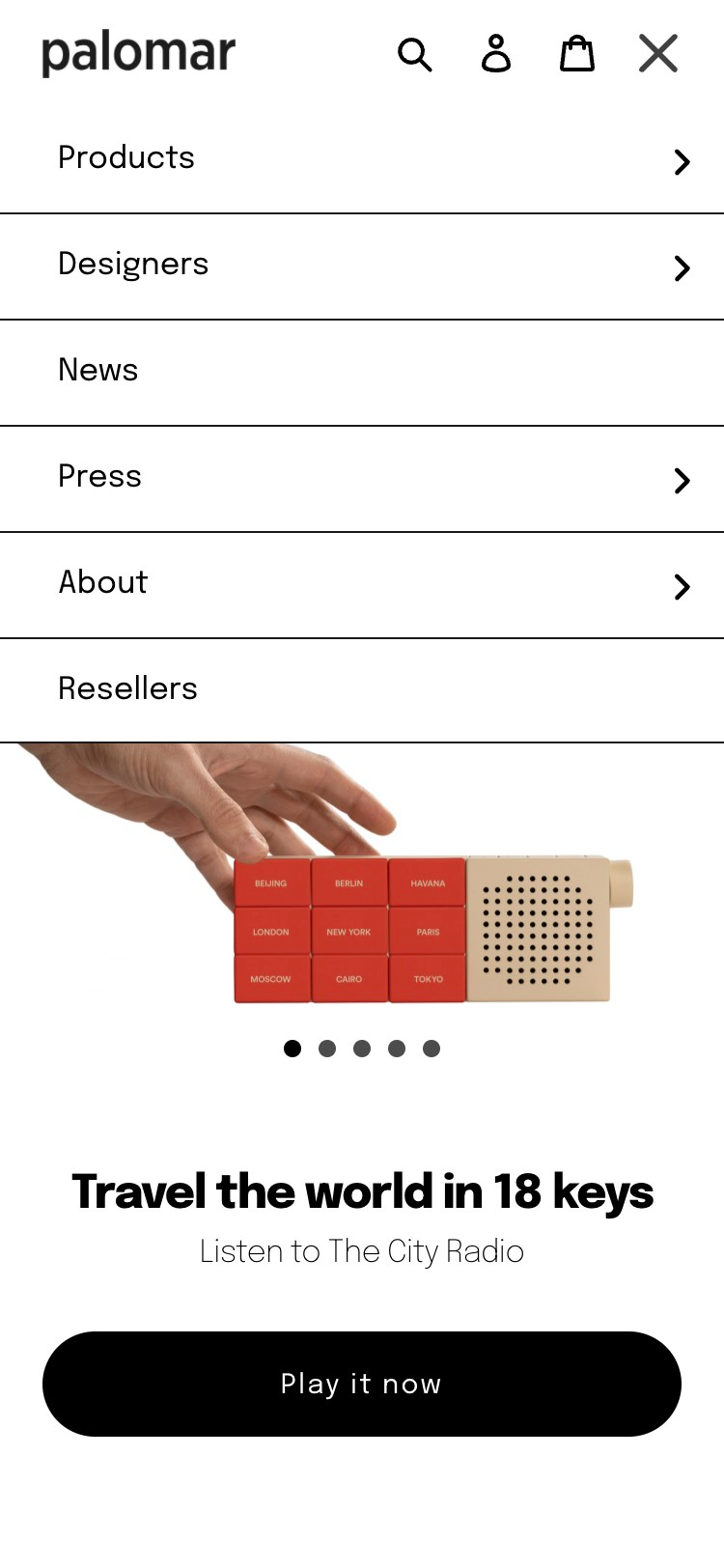
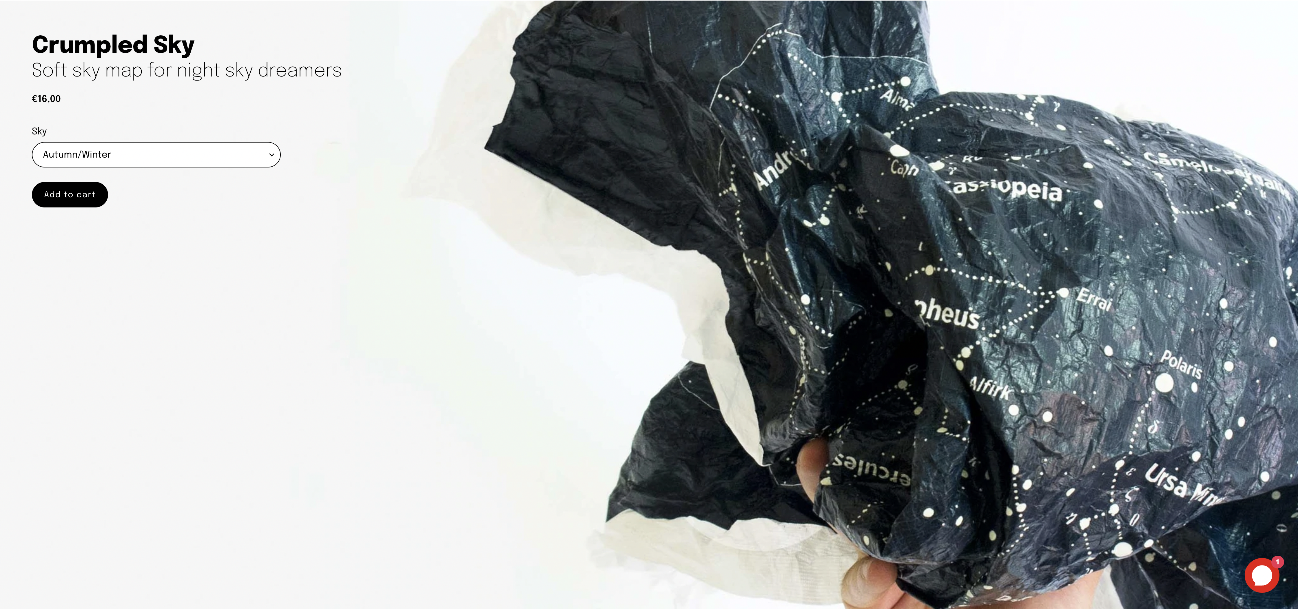
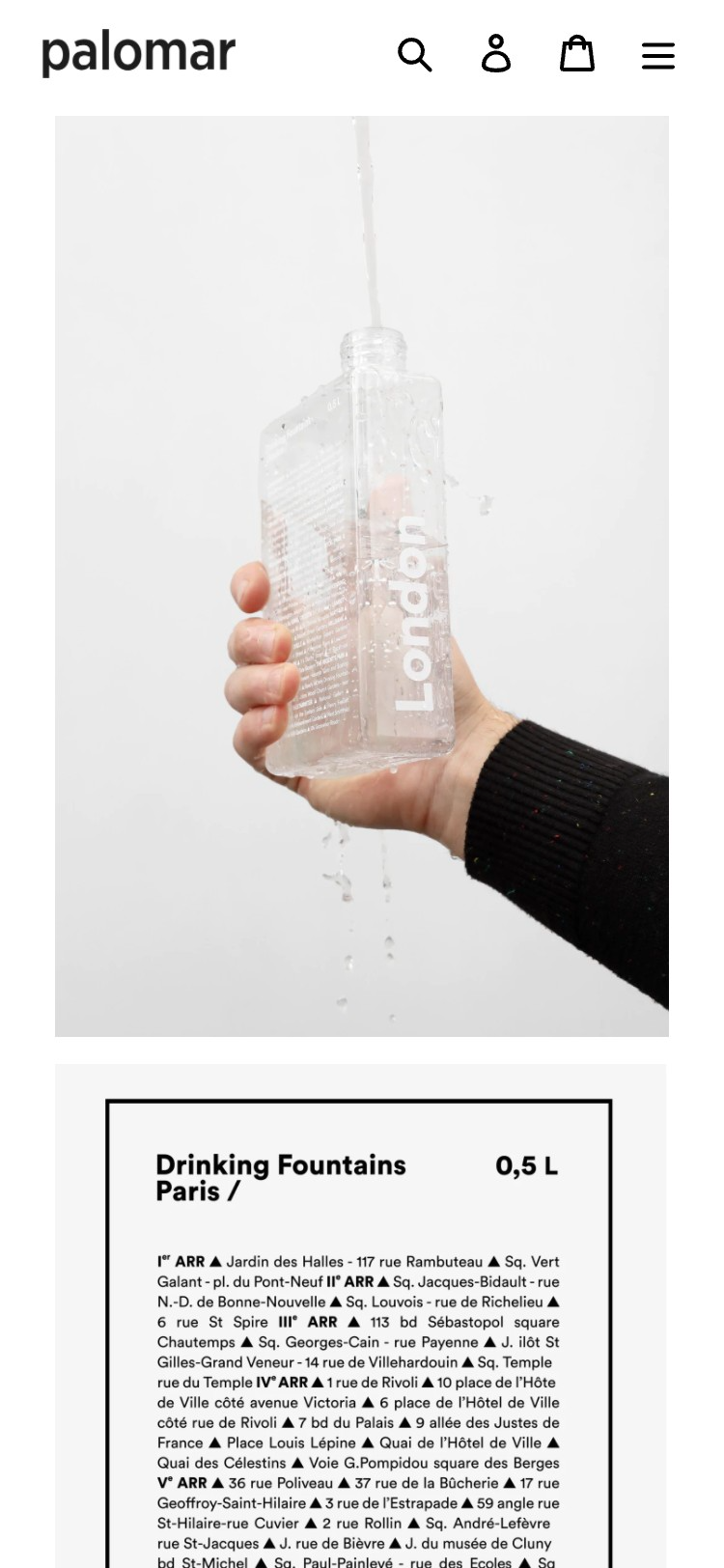
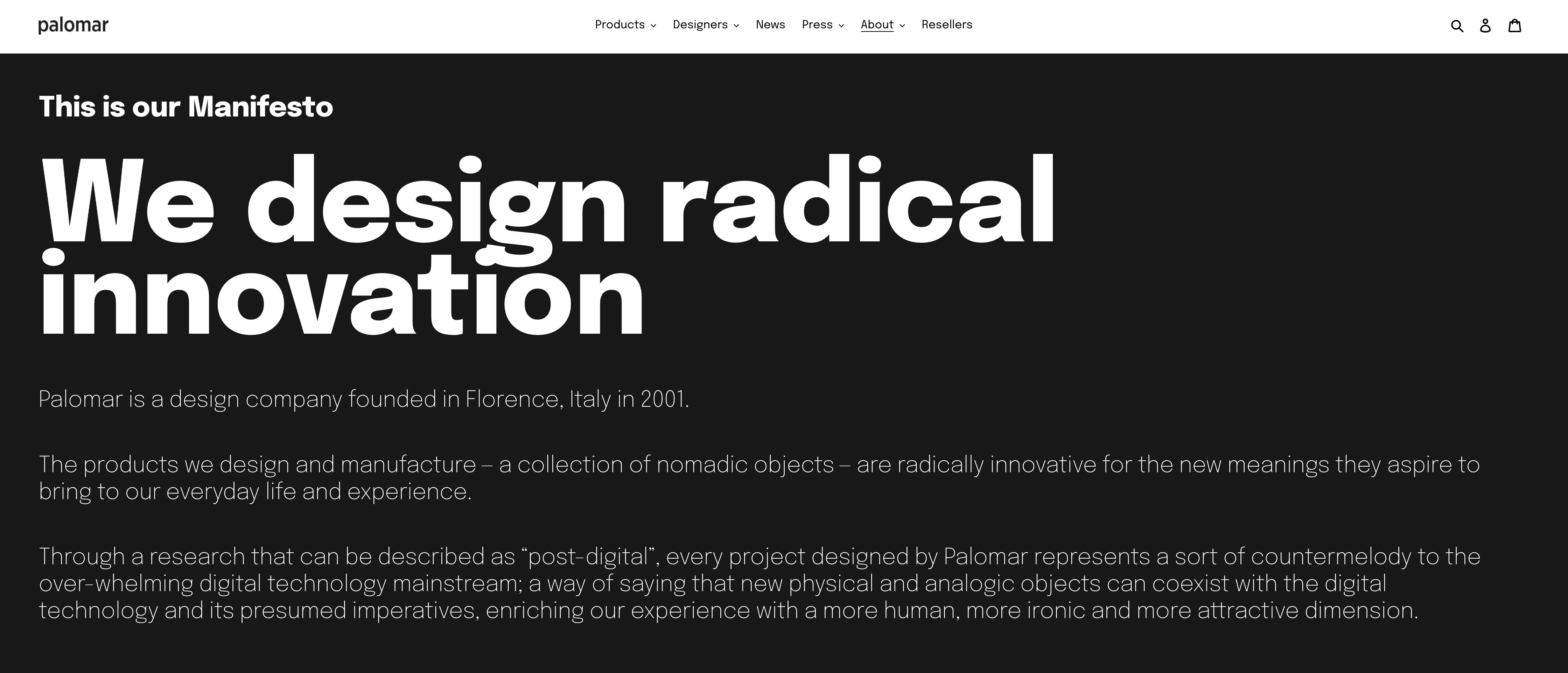
collects meaningful iconic design objects
Palomar produces smart object to inject creativity and innovation in our daily life. We developed a new ecommerce experience for the company, moving the old e-commerce on a tailor made Shopify platform and curated the art direction and production for all the shooting and video presenting and explaining the products in their catalogue.
Visit palomarweb.com
Visit palomarweb.com


has the attitude for the impossible
CREATED IN ITALY is an exploration of the Italian industry and its aim is to present a vivid picture of the Italian expertise. We designed and developed the site for the project, we did and animated its illustrations thus creating a digital summary of all the 31 stories behind and beyond the case histories collected for the exhibition curated by Giulio Iacchetti, Odo Fioravanti and Francesca Picchi within the framework of the Cultural and Economic Promotion and Innovation. The exhibition will tour the World visiting different Italian Cultural Institutes during 2022.
CREATED IN ITALY
for: Ministero degli Affari Esteri e della cooperazione internazionale
with: Odo Fioravanti, Giulio Iacchetti e Francesca Picchi
team: Pierluigi Anselmi, Alessandro C. Busseni, Pietro Buffa, Giovanni Cola, Elena Iankov, Alessia Sparacino


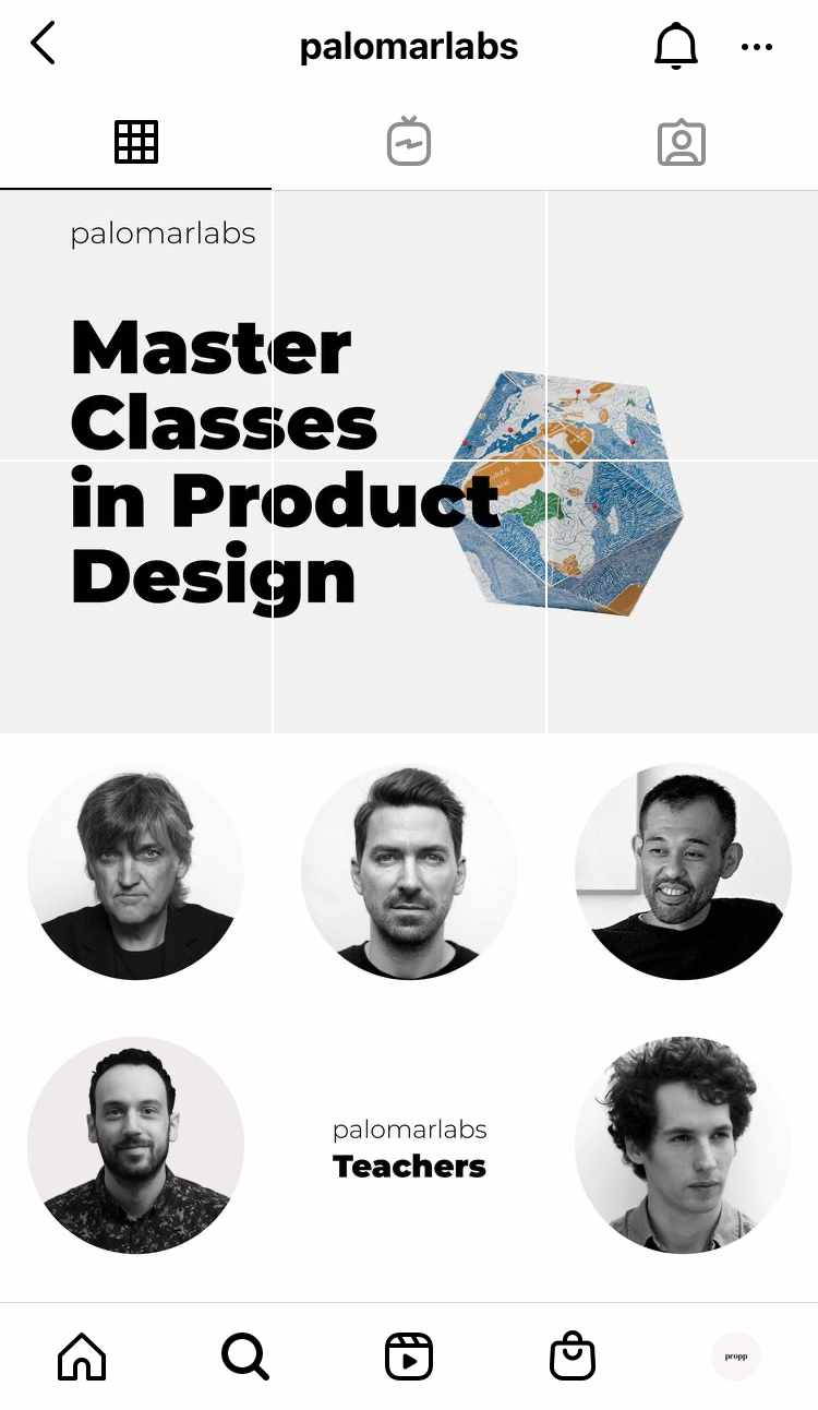
takes on a new discipline with a series of design masterclasses
Propp updated Palomarlabs’ website, also curated and directed its social presence on Instagram.
Visit palomarlabs.com
Visit palomarlabs.com
PALOMARLABS
for: Palomar
team: Pierluigi Anselmi, Pietro Buffa, Giovanni Cola, Letizia Filisetti


learns how to design with Enzo Mari
To celebrate the work of Enzo Mari we did a few animated trailers based on some of the illustrations that he made during his career.
at the Grand Tour across Italy
Viaggio in Italia takes you on a road trip around Italy discovering its villages, castles, houses, their stories and the secrets of their inhabitants.
VIAGGIO IN ITALIA
for: Mibac
with: Rosanna Pavoni, Francesco Librizzi
team: Pierluigi Anselmi, Pietro Buffa, Alessandro C. Busseni, Giovanni Cola
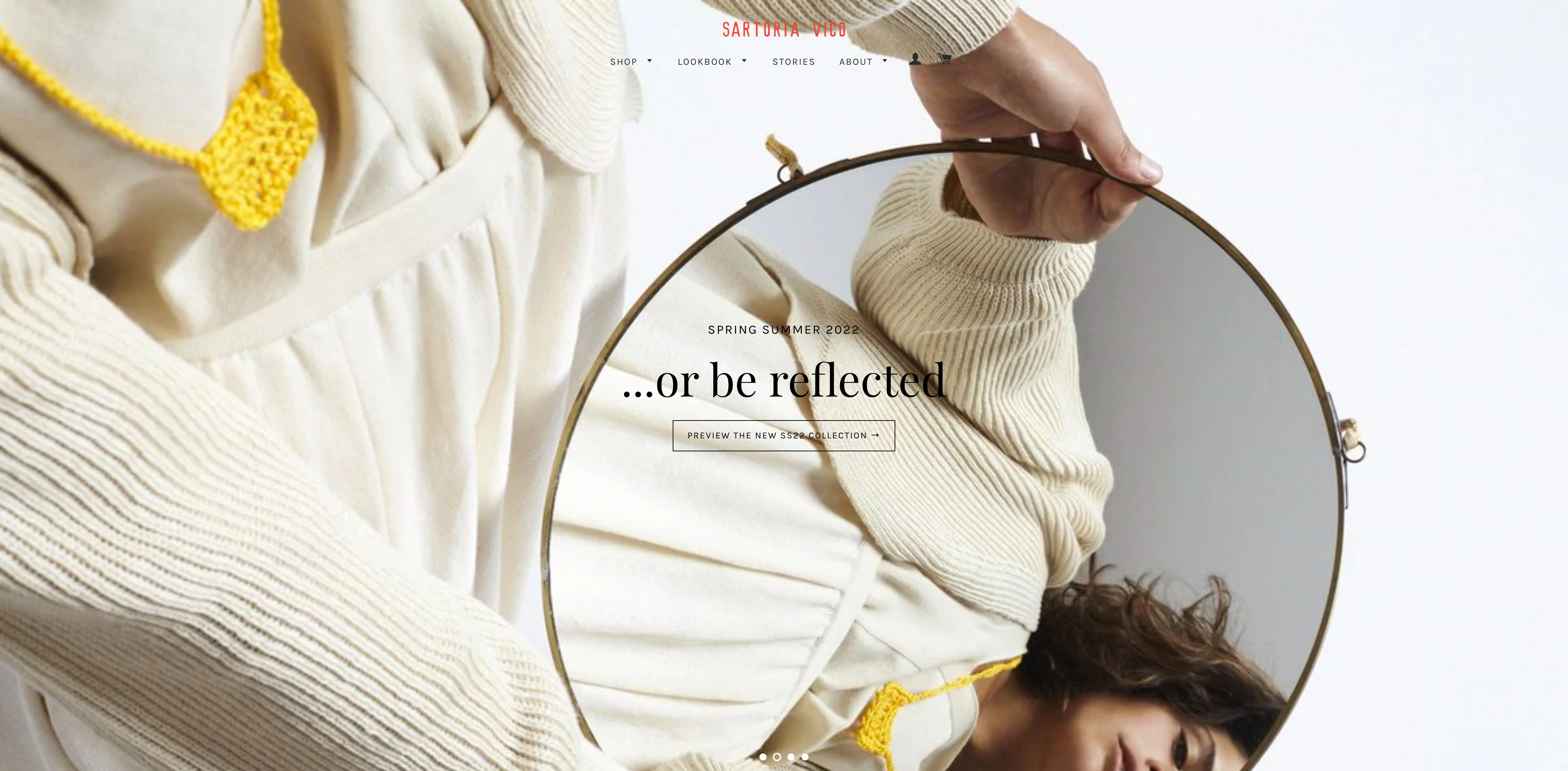
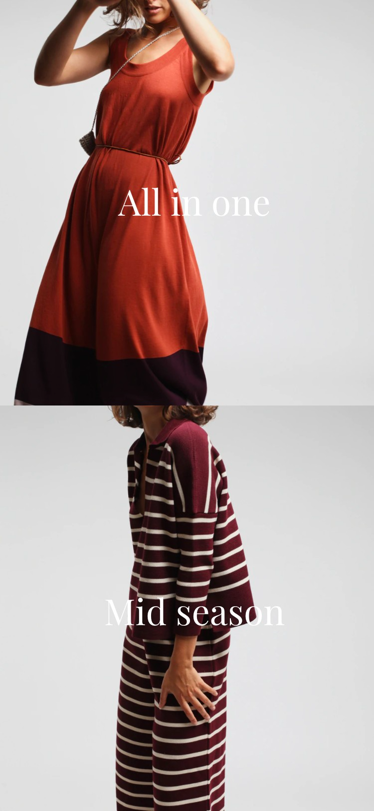
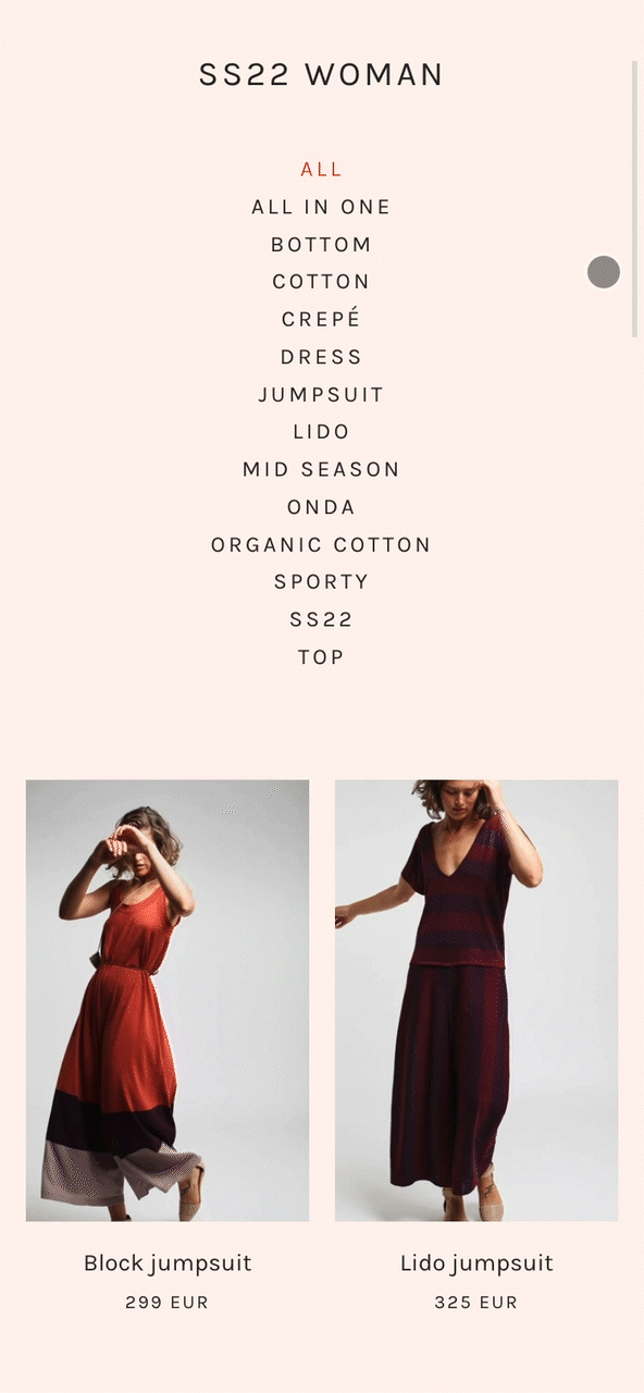
feels warm
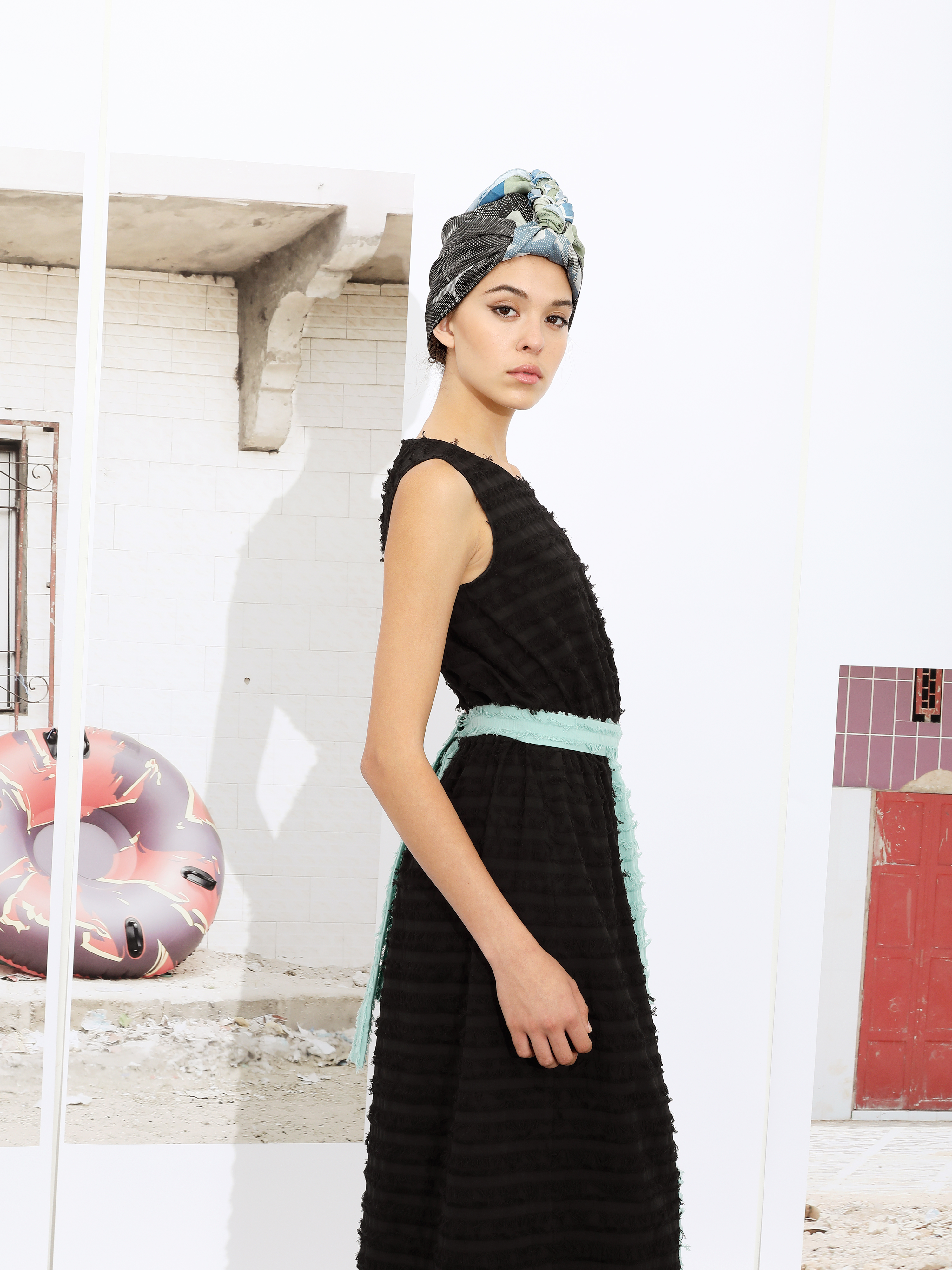
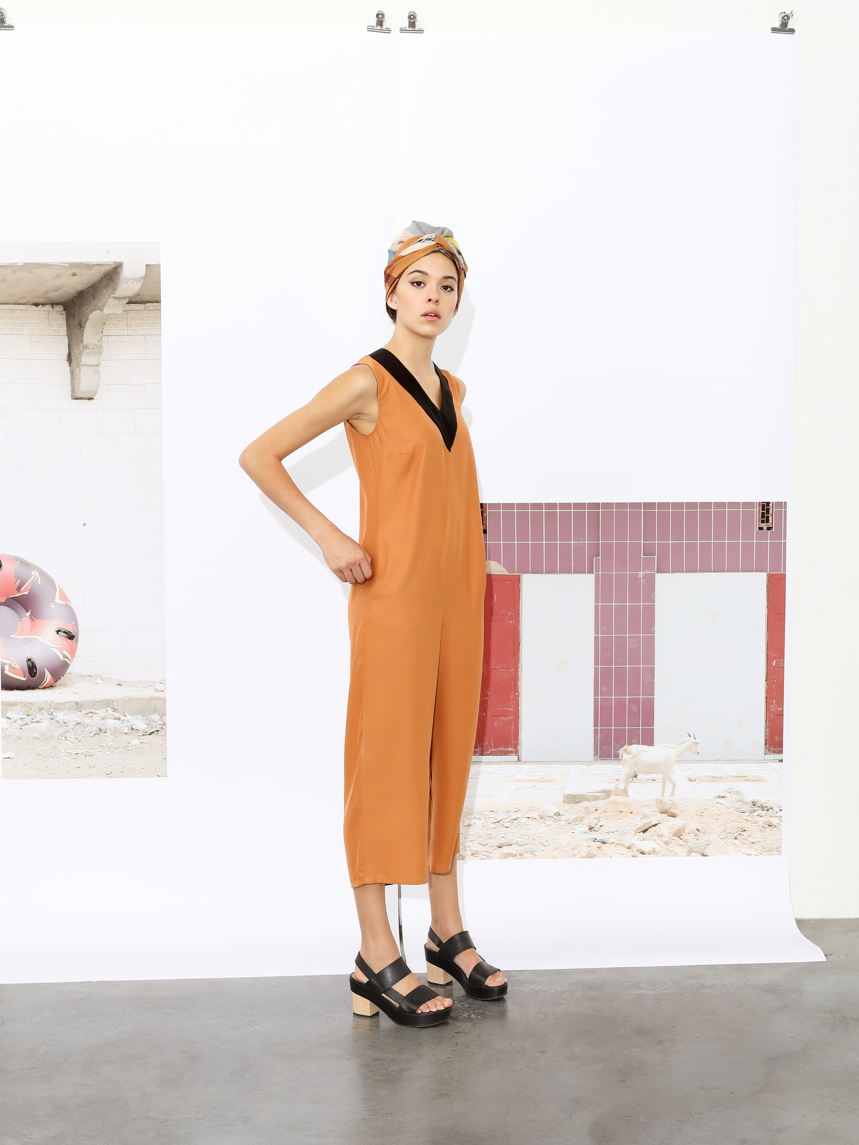
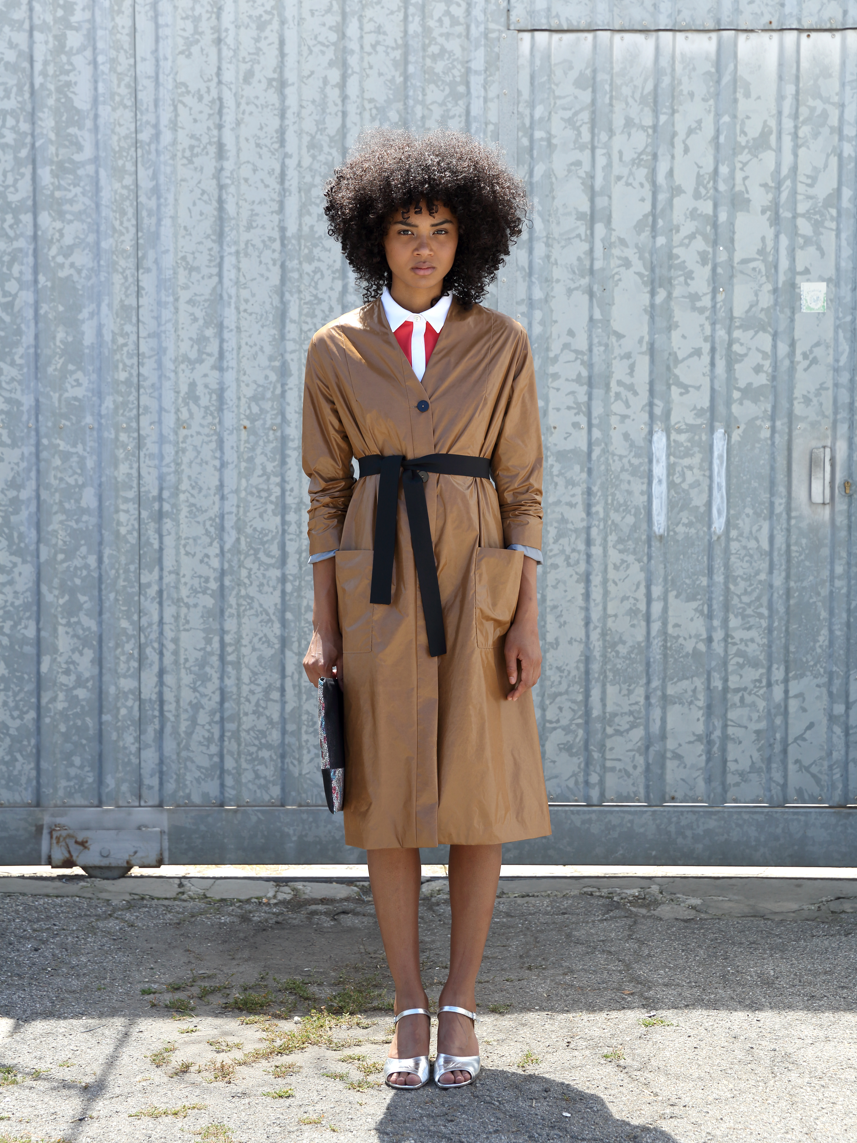
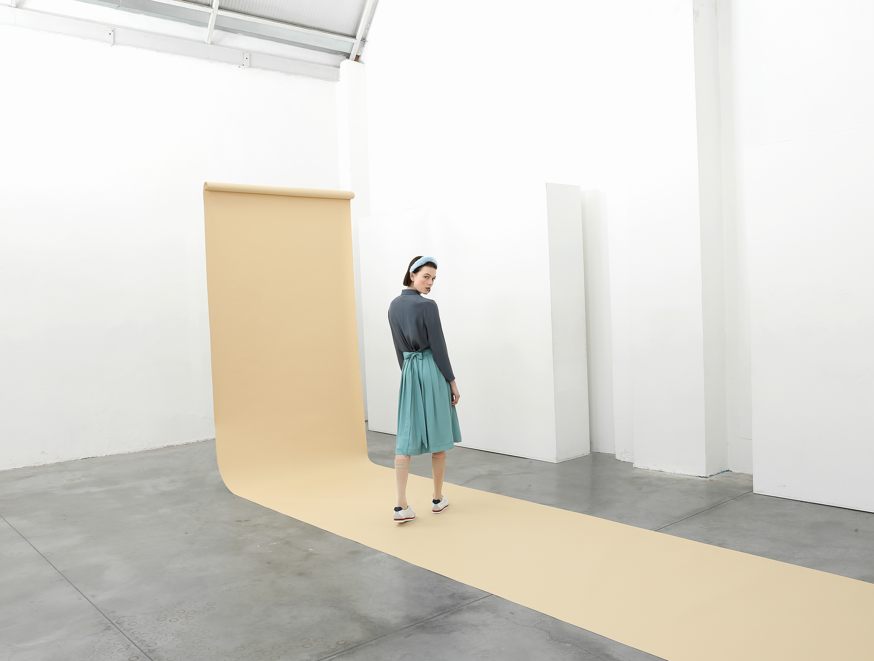
Sartoria Vico is a knitwear brand, inspired by self confident, creative and free spirited women. We designed the overall ecommerce and email marketing platform.


plans the hero’s journey
Check out the maps and infographics we have designed, and wander through the data about these amazing places.


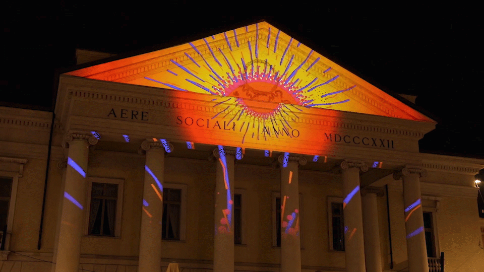
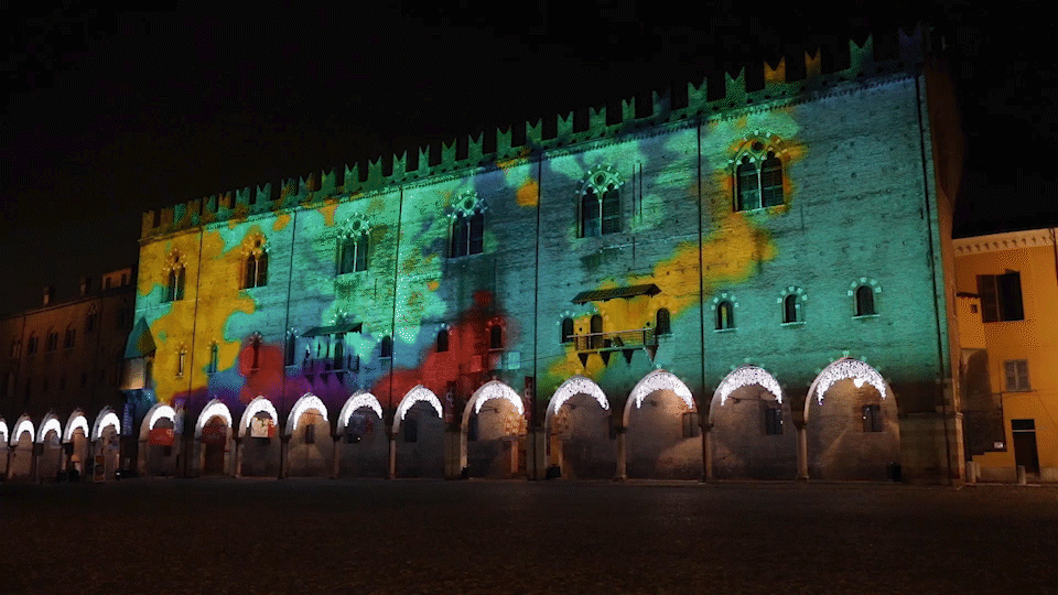
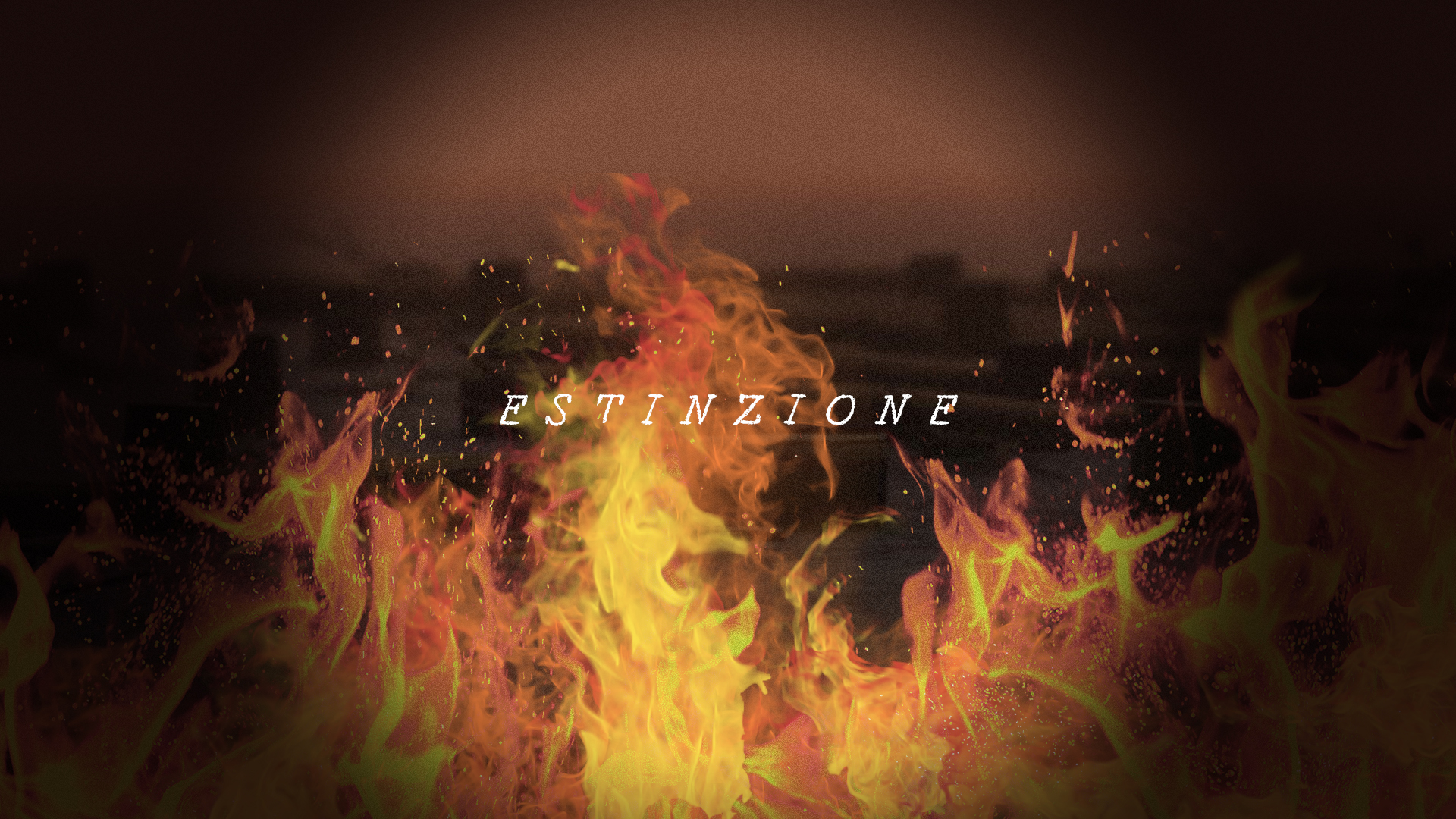
explores the four elements to celebrate Christmas
Three audiovisual installations over three historycal buildings in the city of Mantua: air and earth over Palazzo Ducale, fire over the Teatro Sociale and water over Palazzo ex-INPS.
ELEMENTI INSTALLATION FOR MANTUA
for: Comune di Mantova
team: Pierluigi Anselmi, Alessandro C. Busseni, Painé Cuadrelli, Giovanni Cola, Francesca Rodolfi


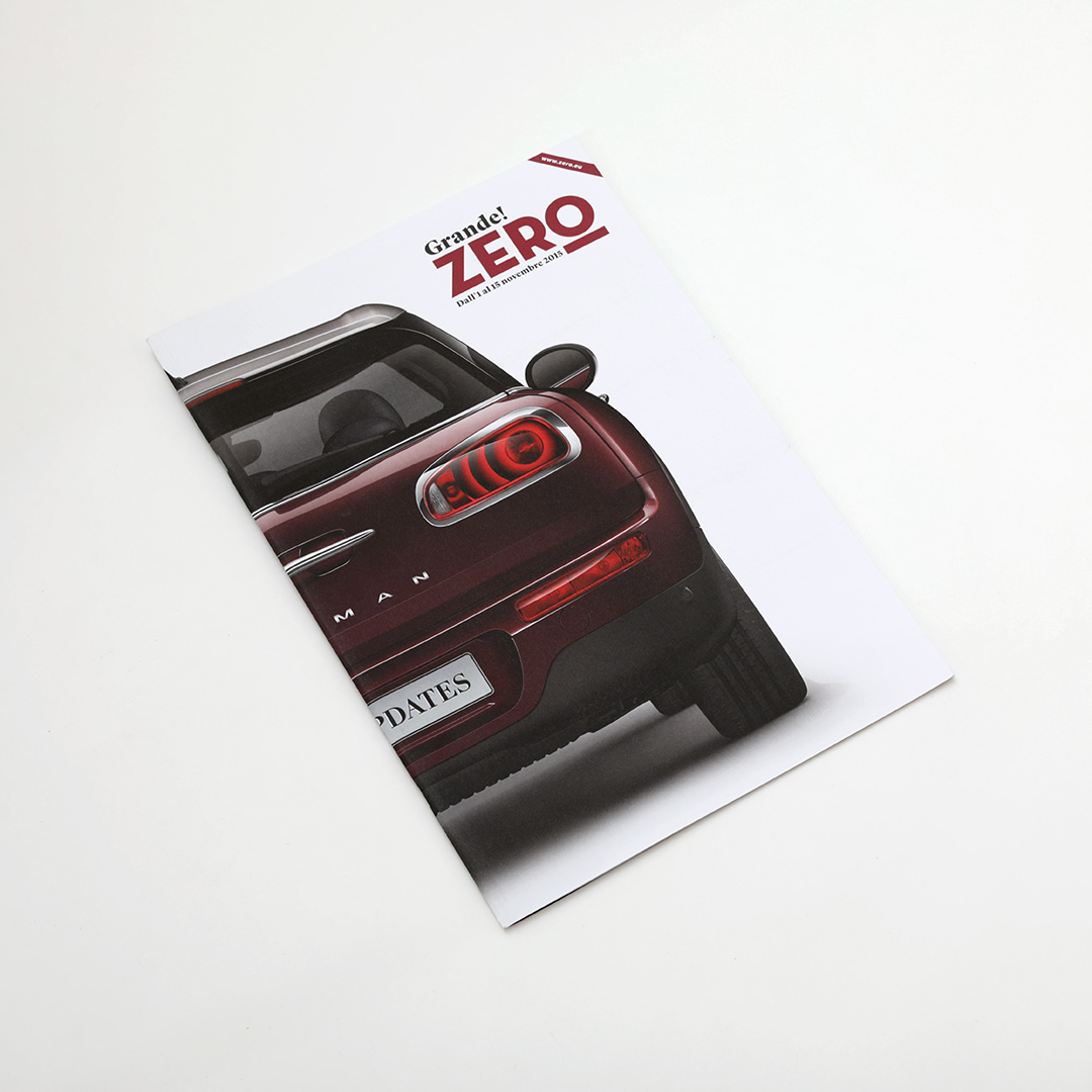
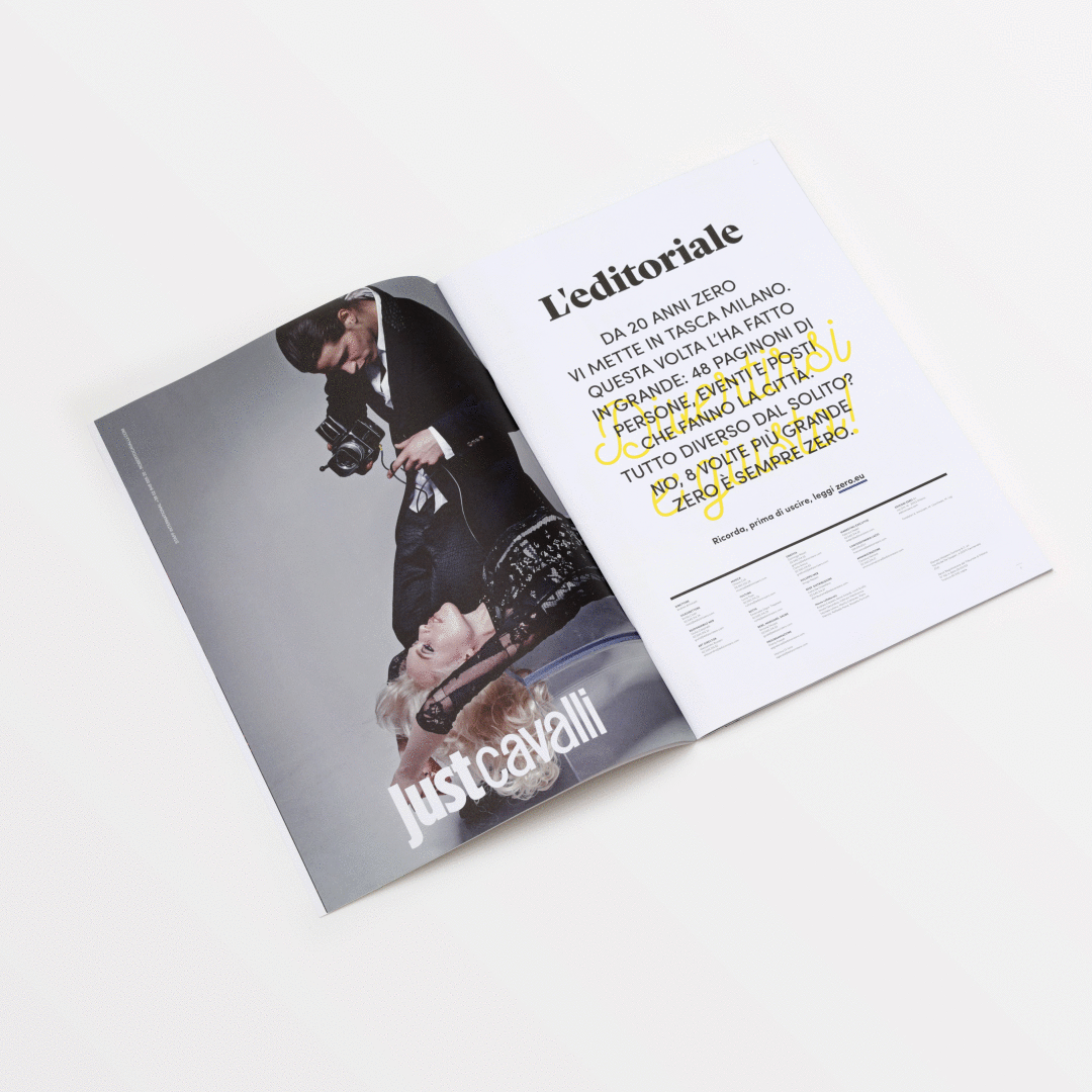
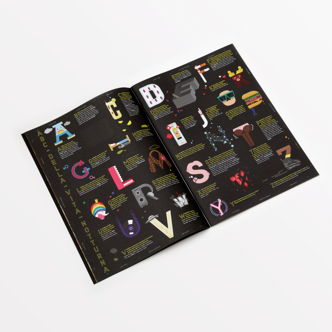
searches for new events
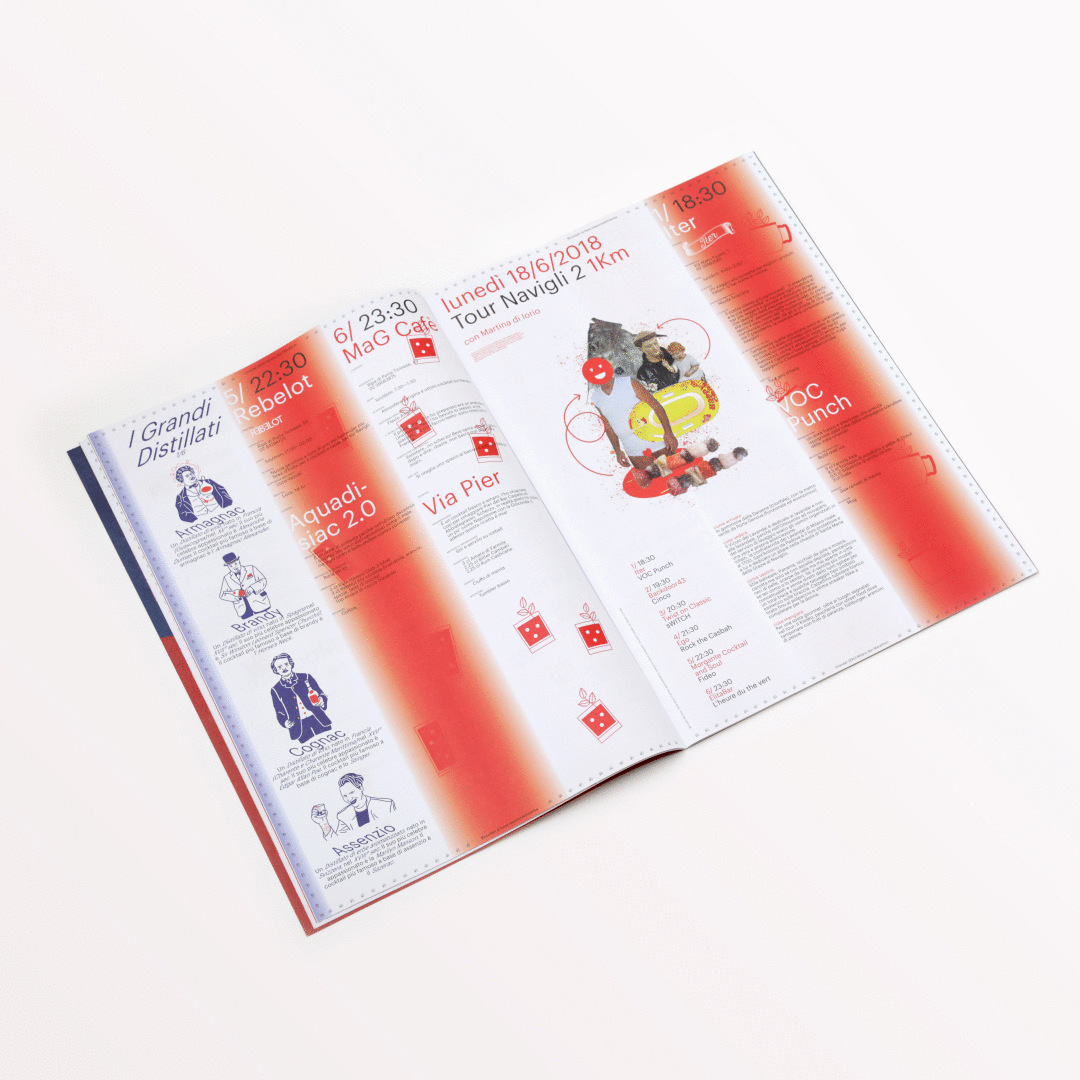
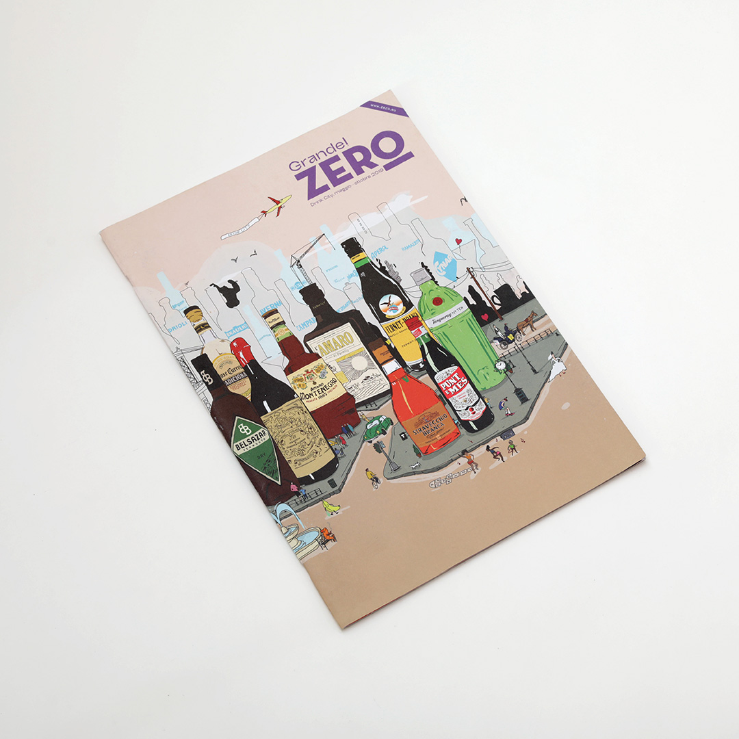
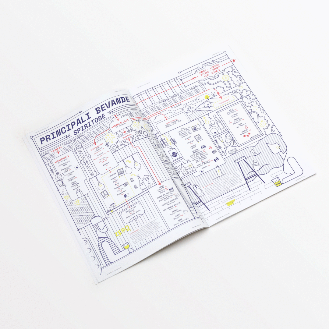
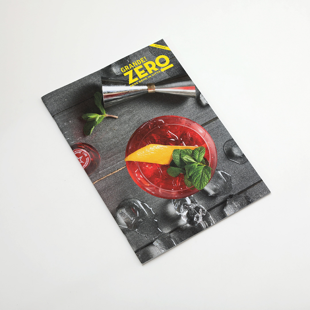
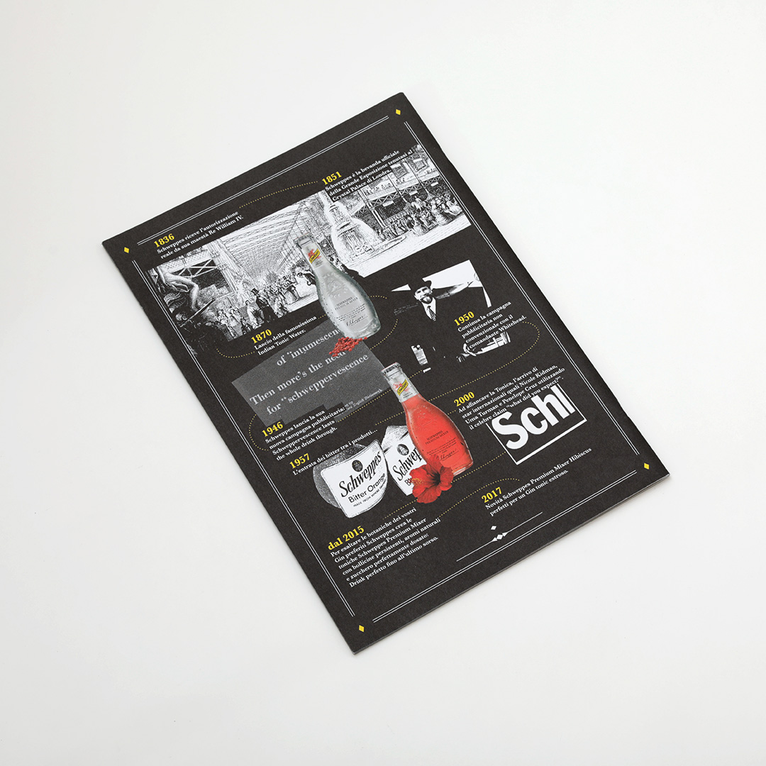
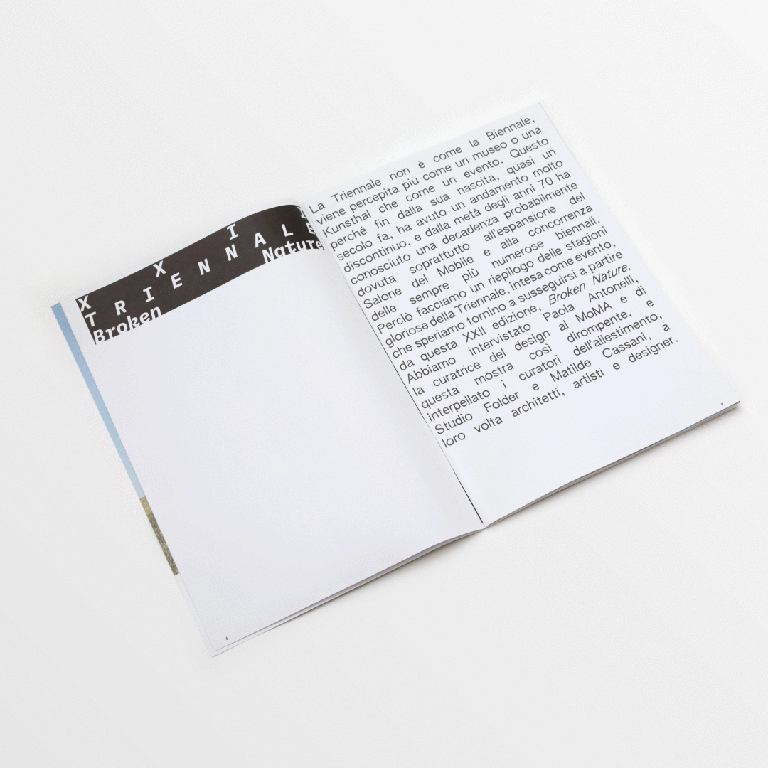
Since 2015 propp has been responsible for the creative direction of Grande! ZERO, the megasize edition of ZERO magazine. Each issue is custom designed based on the content. Thorugh the years we have talked about Milan Design Week, MiArt, the Design Triennale's Broken Nature, interviewed tons of creatives, entrpreneurs, artists and entarteiners to celebrate nightlife and bartending/drinking culture with best people and spot in town.


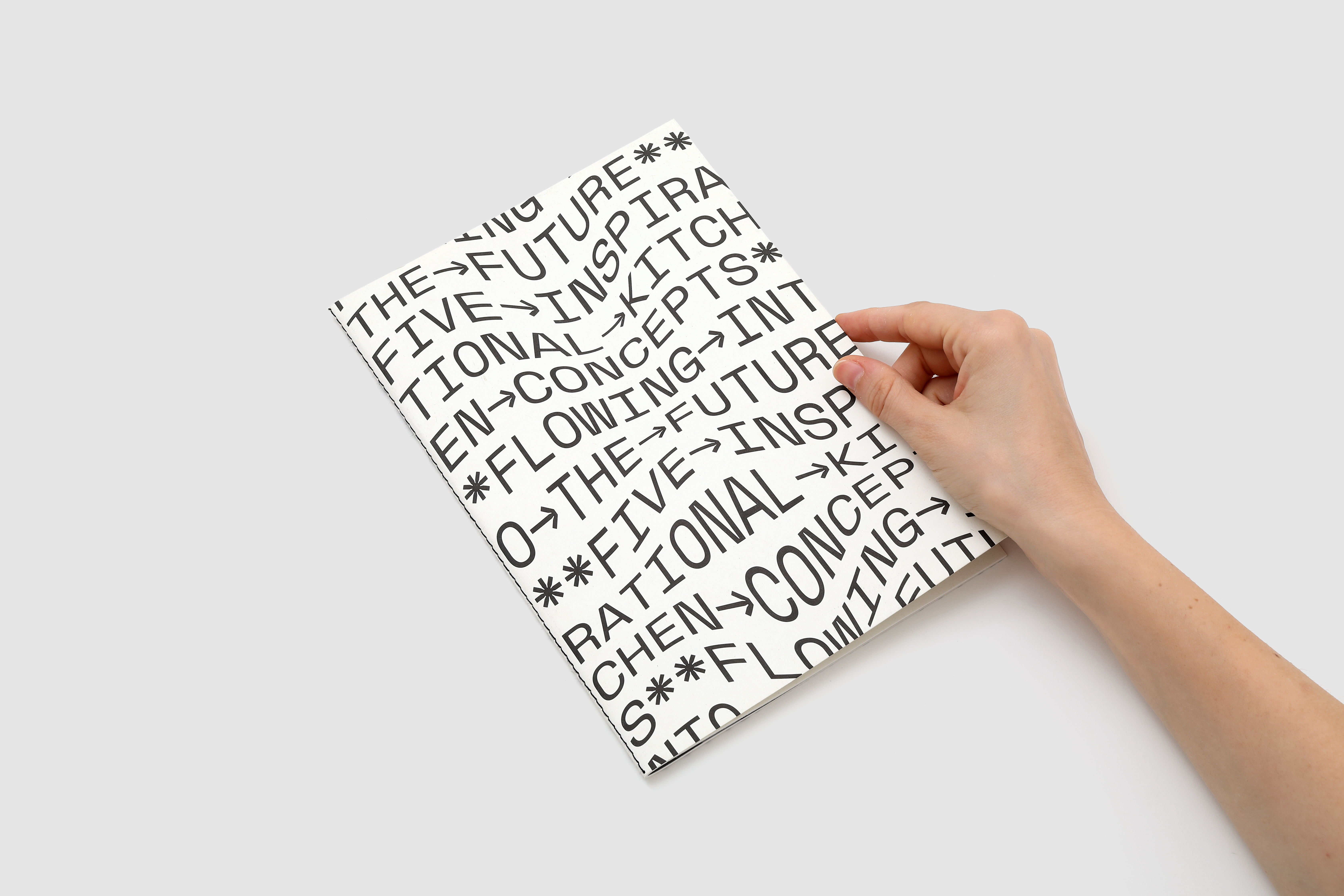
flows into the future
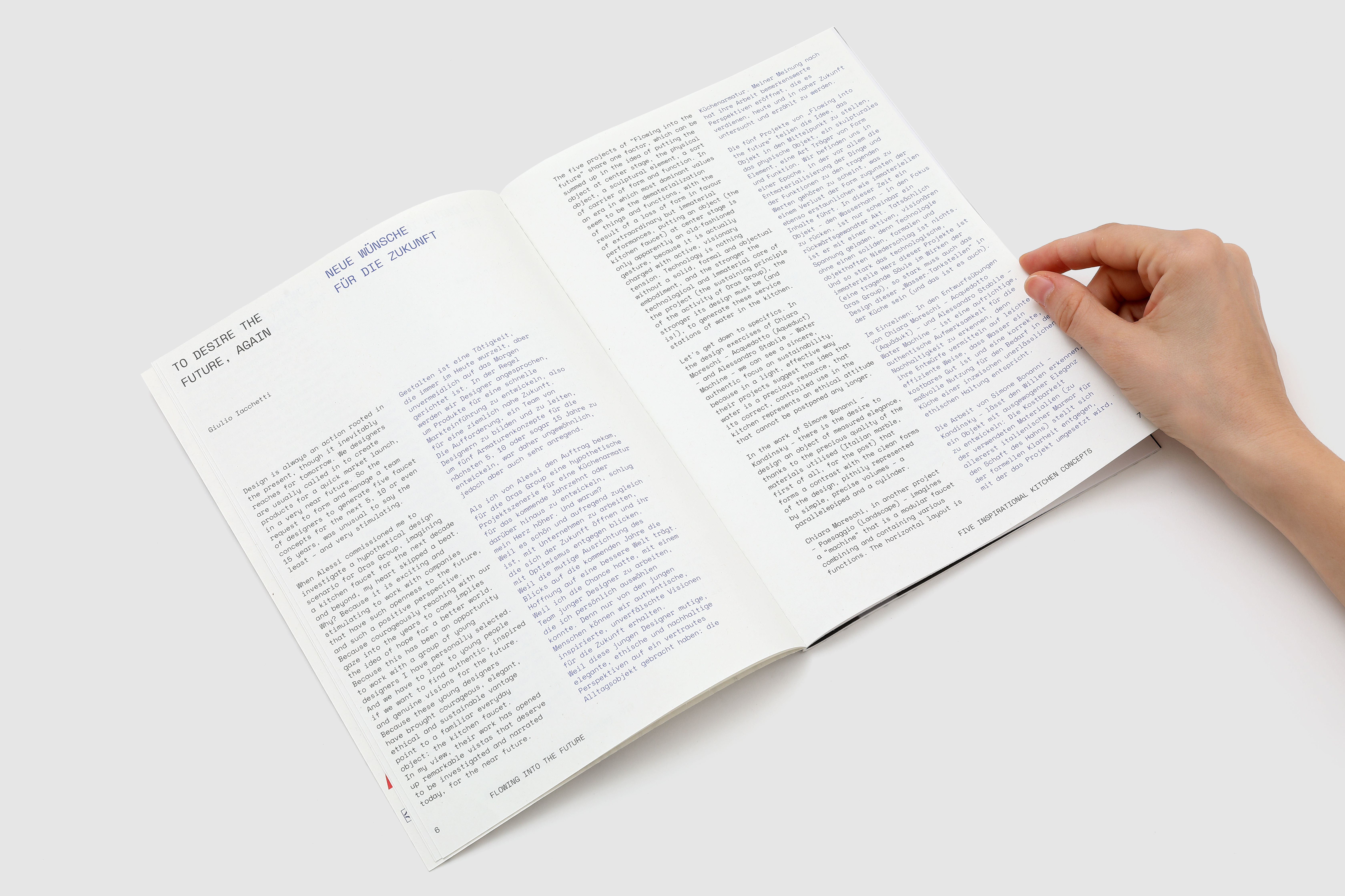
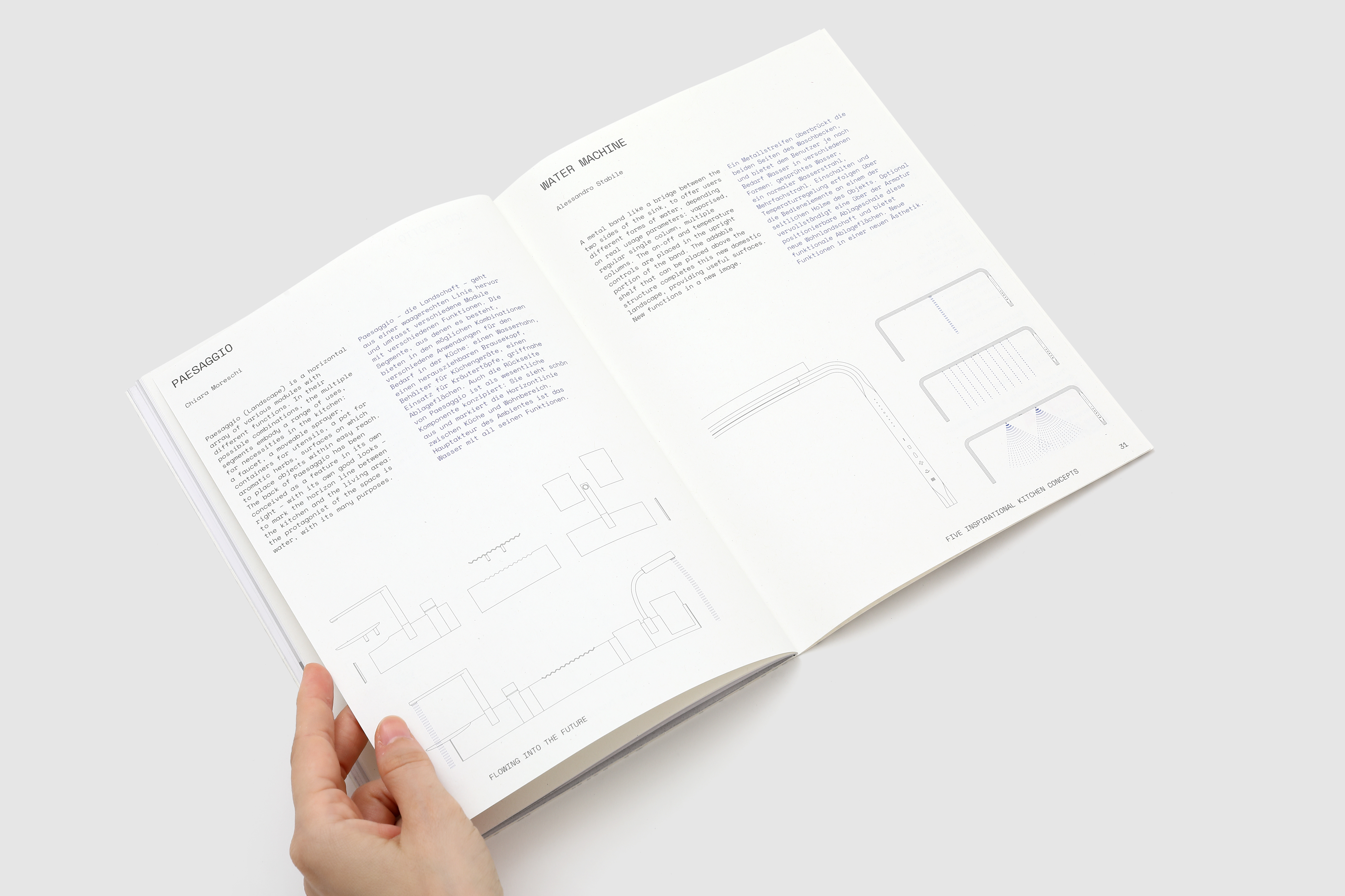
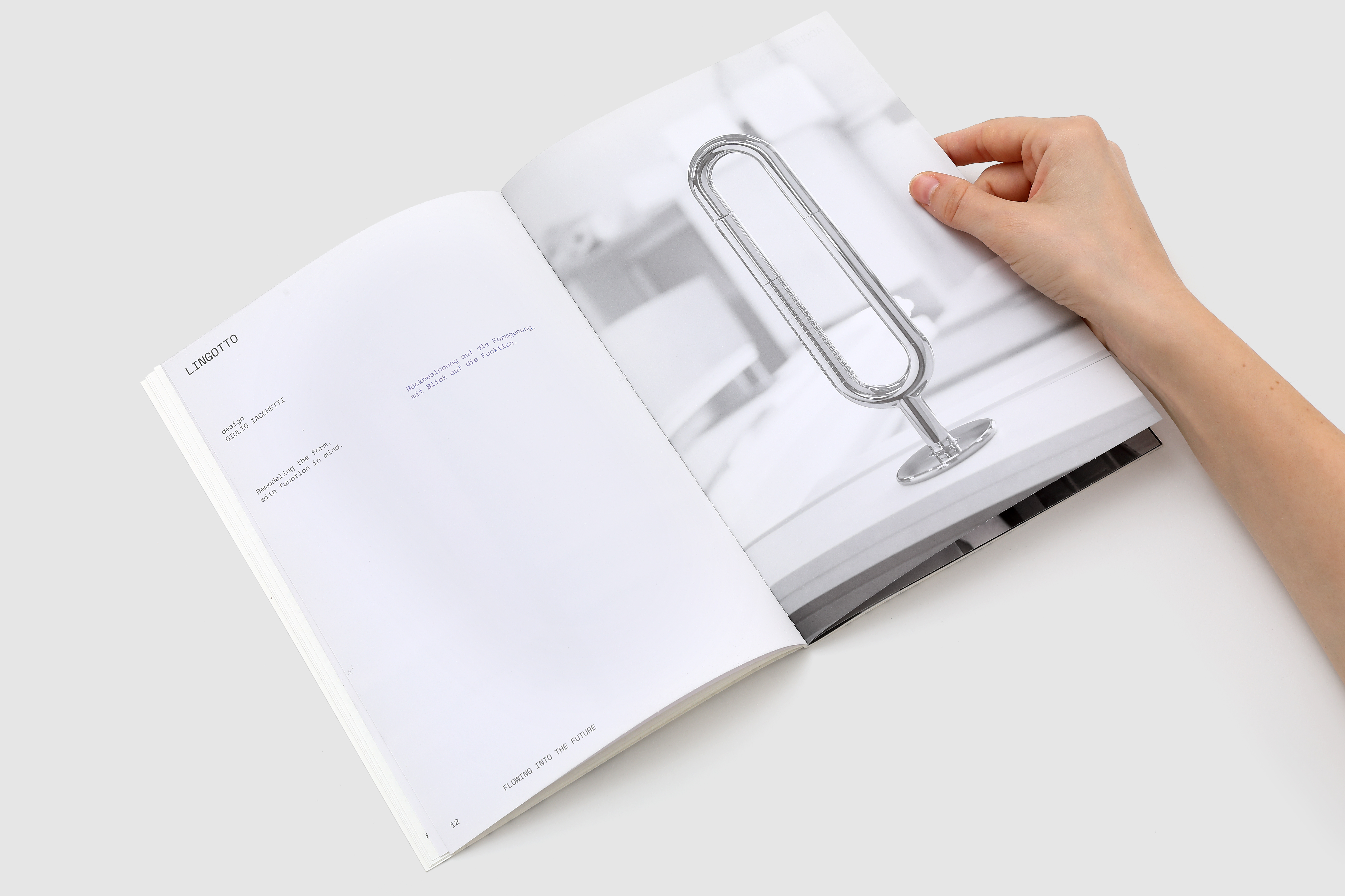
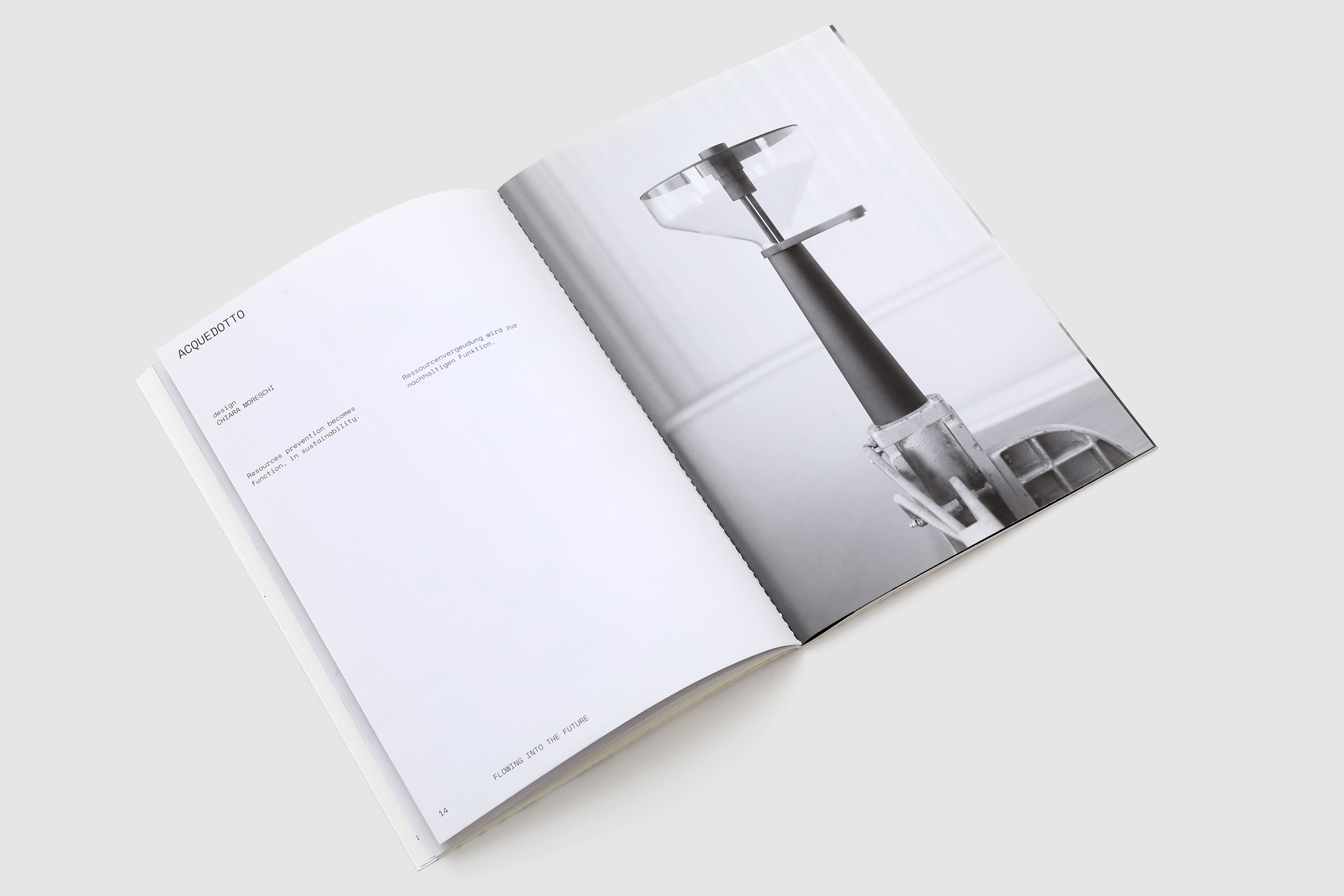
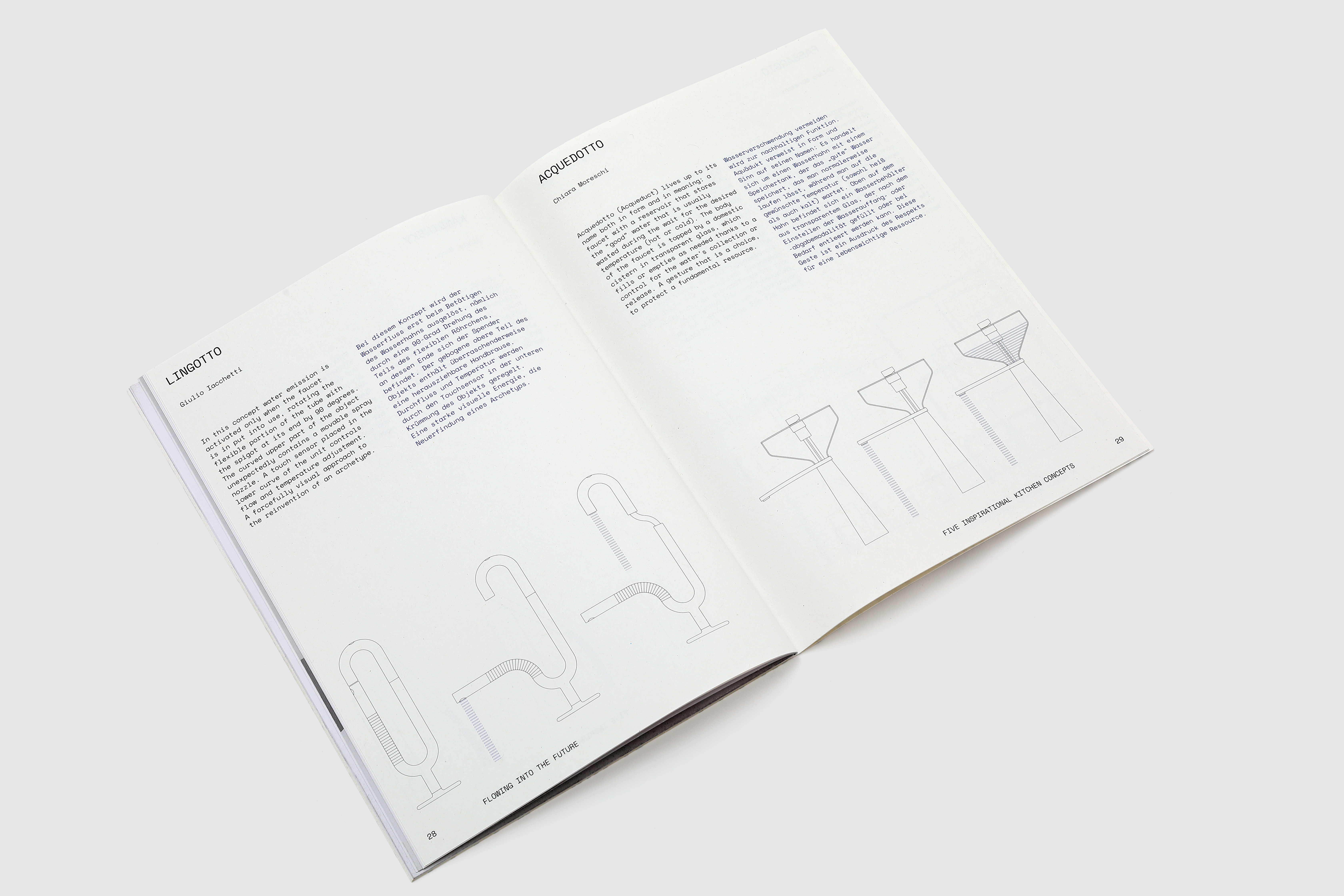
Five inspirational kitchen concepts is a reasearch project guided by Giulio Iacchetti with Simone Bonanni, Chiara Moreschi and Alessandro Stabile to investigate the role of the faucet in the kitchen of the future. Five concepts, five scenarios, a book and an exhibition hosted during ISH 2019 in Frankfurt.
FLOATING INTO THE FUTURE
for: Alessi, Oras, Hansa
with: Giulio Iacchetti, Painé Cuadrelli, Francesco Gini
team: Pierluigi Anselmi, Pietro Buffa, Alessandro C. Busseni, Giovanni Cola, Beatrice Mucci


is close to Switzerland
Like a Swiss is an ode to Swissness, presented as an animated collage and acted by an automatic reader, the story starts with a blow that makes the Swiss flag’s cross turn, like a wish wheel and continues with a celebration of the swiss way of life, seen from south of the Alps.
LIKE A SWISS
for: Emmentaler Swiss Original Handmade Creative Project
team: Pierluigi Anselmi, Pietro Buffa, Alessandro C. Busseni, Giovanni Cola, Beatrice Mucci, Mariacristina Tota


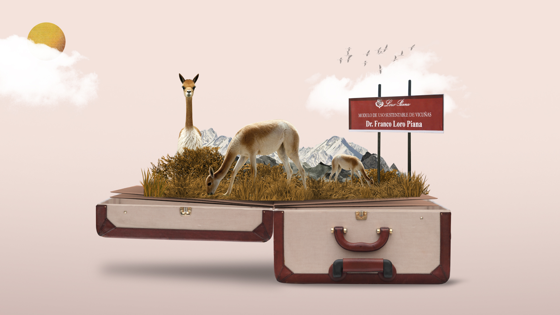
explores Loro Piana’s legacy
An animated collage where a suitcase full of history, values and people takes us into the world of Loro Piana, from the early beginnings, through the different travels seeking for textile perfection, to the future and it’s new horizons.
LORO PIANA’S HERITAGE
for: Loro Piana
with: YAM112003, Nazario Graziano
team: Pierluigi Anselmi, Giovanni Cola


visits Gae Aulenti’s home
A day spent talking together with FontanaArte in Gae Aulenti’s archive home, to retrace the history of the company and of the many figures that took, and will take part, in it.
takes you to the movies: let’s go to Nuovo Armenia
A journey through the rise and fall and rise again of the “Cascina Nuovo Armenia”. From the flames to a new multifunctional shared space, with cultural activities spread all over the building and it’s community built forest.
NUOVA ARMENIA
for: Nuovo Armenia
with: Hypereden
team: Pierluigi Anselmi, Alessandro C. Busseni, Giovanni Cola, Beatrice Mucci, Mariacristina Tota


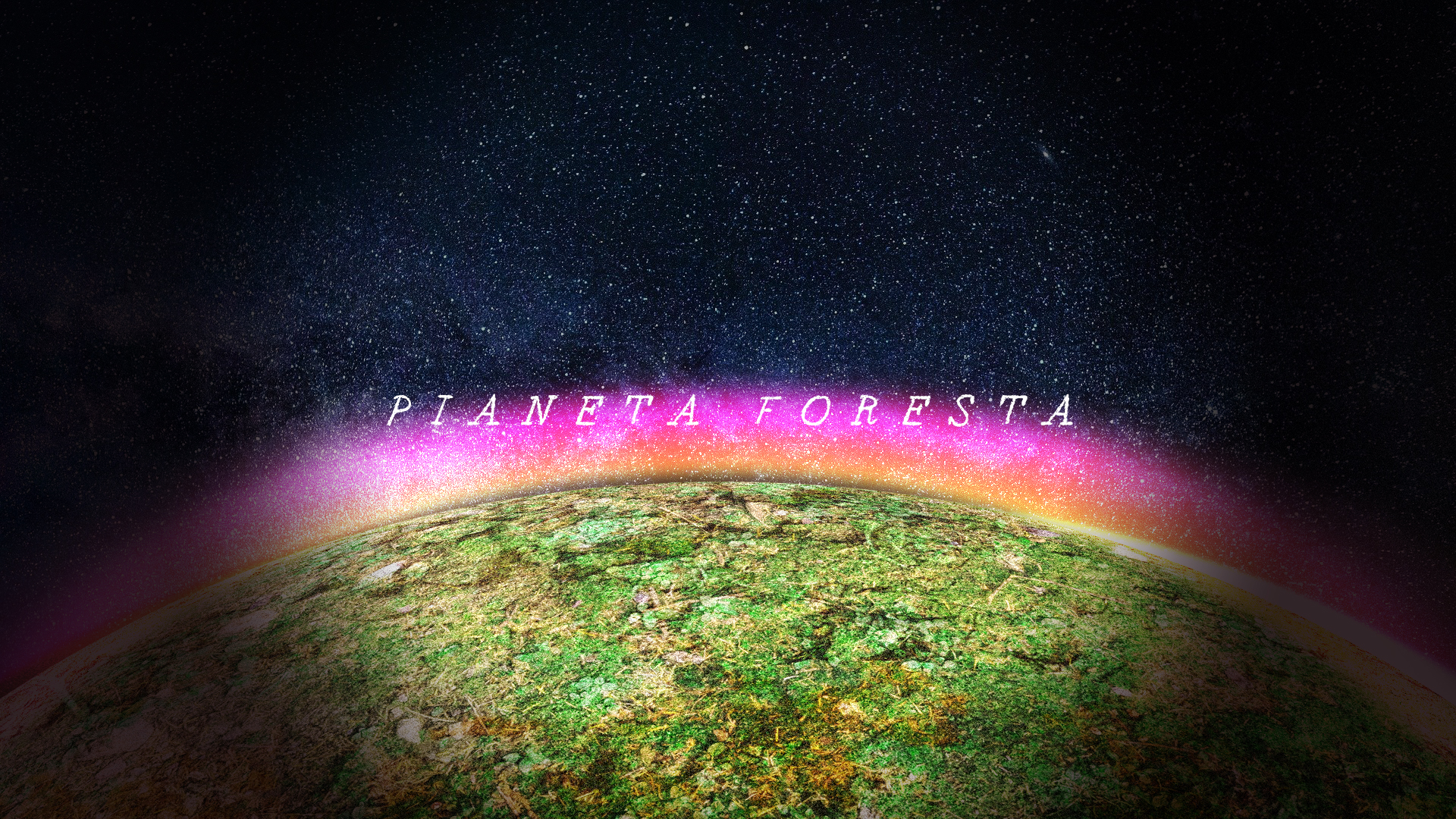
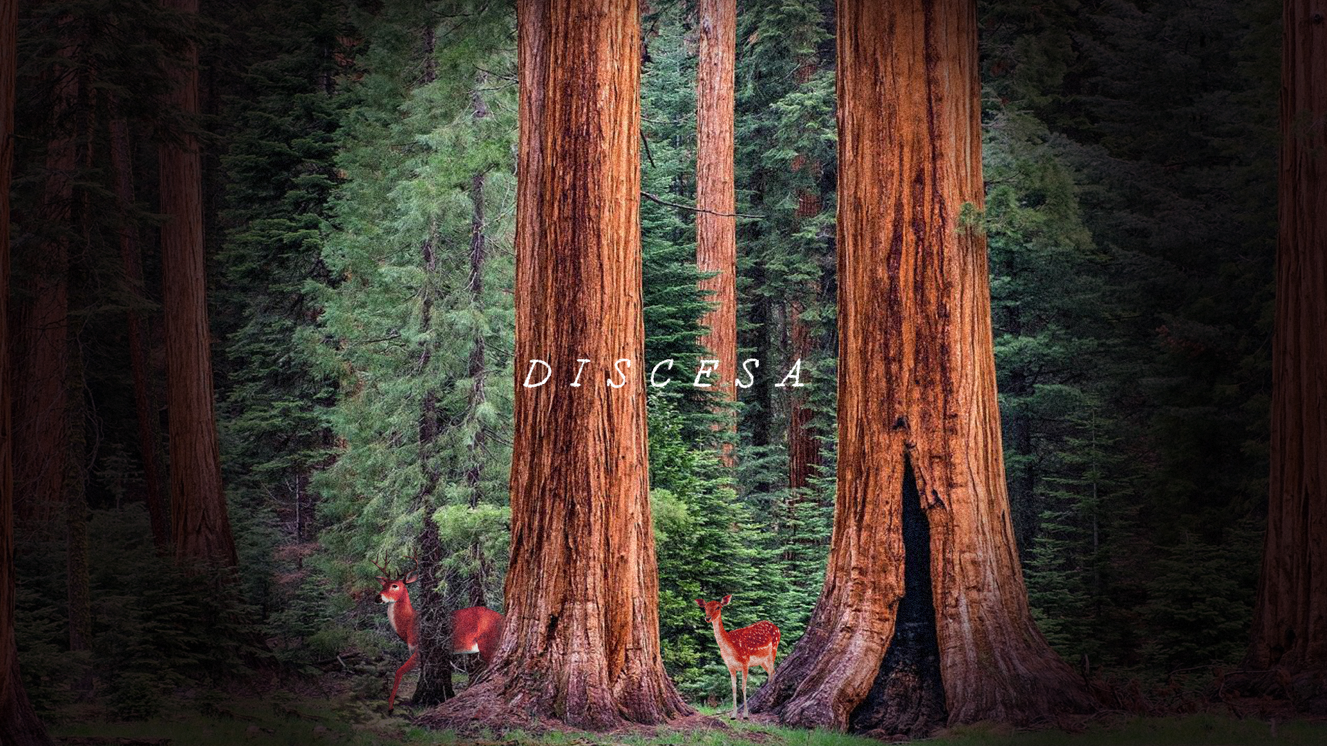
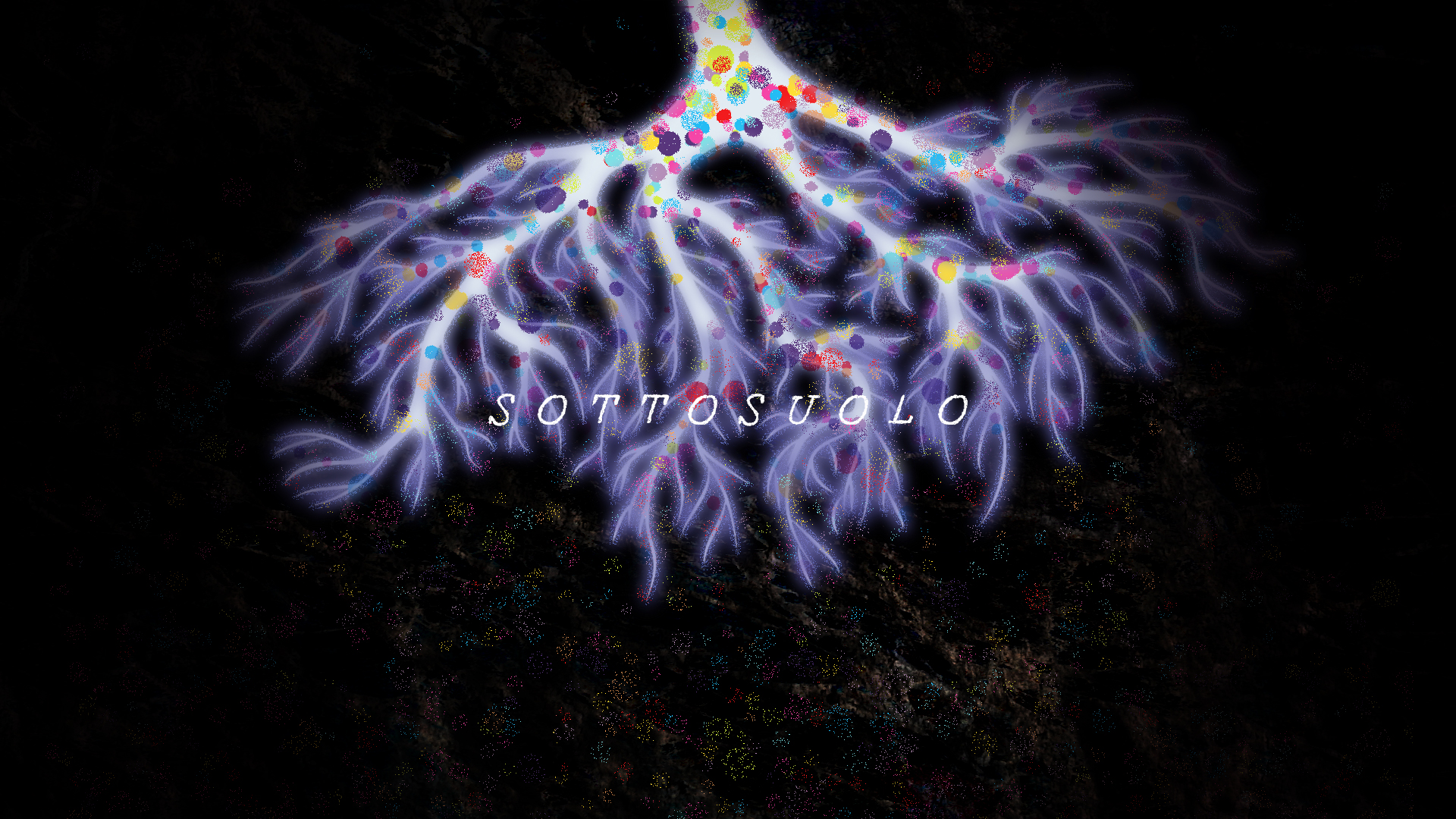
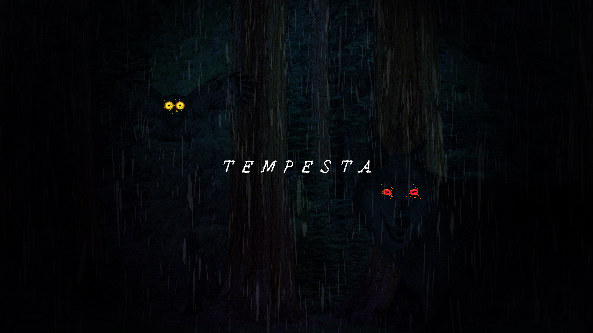
lands on Pianeta Foresta
Pianeta Foresta is a journey toward a green planet, from dusk till dawn and back again, exhibited in Mantua's Rotonda di San Lorenzo during the 2018 World Forum on Urban Forests.
PIANETA FORESTA FOR THE WORLD FORUM ON URBAN FORESTS
for: Mantova World Forum on Urban Forests
with: Painé Cuadrelli, Francesco Gini
team: Pierluigi Anselmi, Alessandro C. Busseni, Giovanni Cola

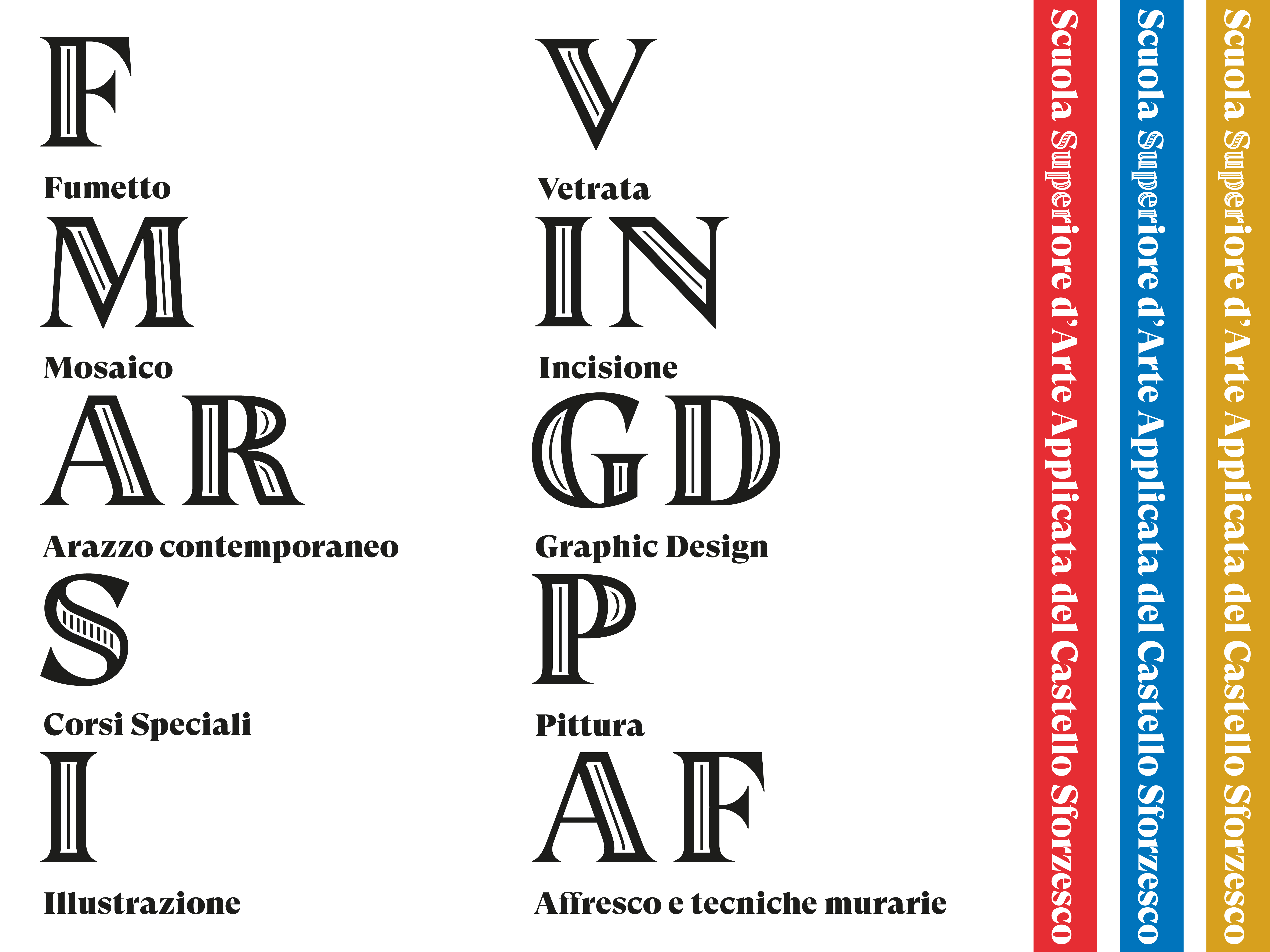
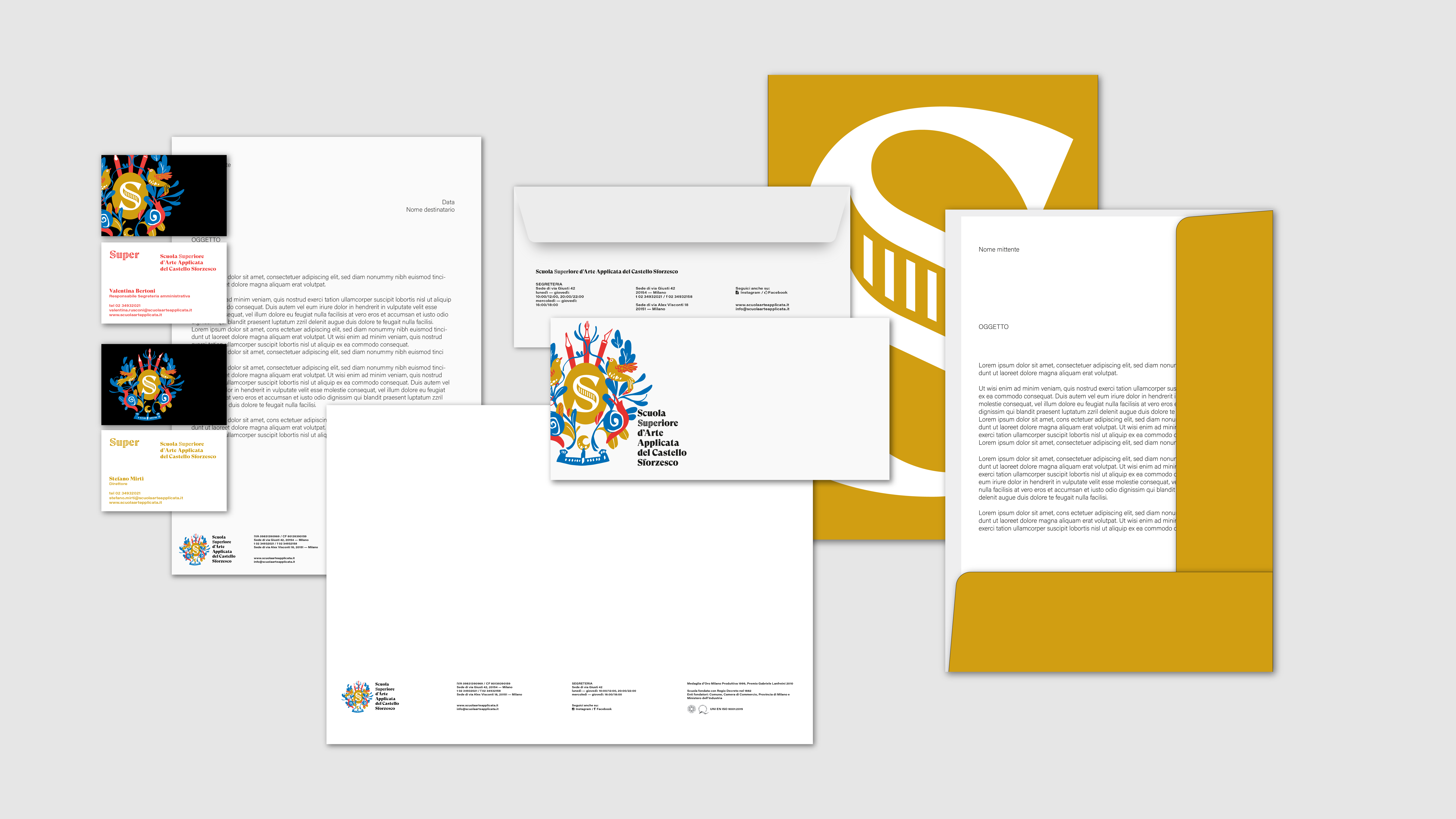
giudes a centenary school towards its future
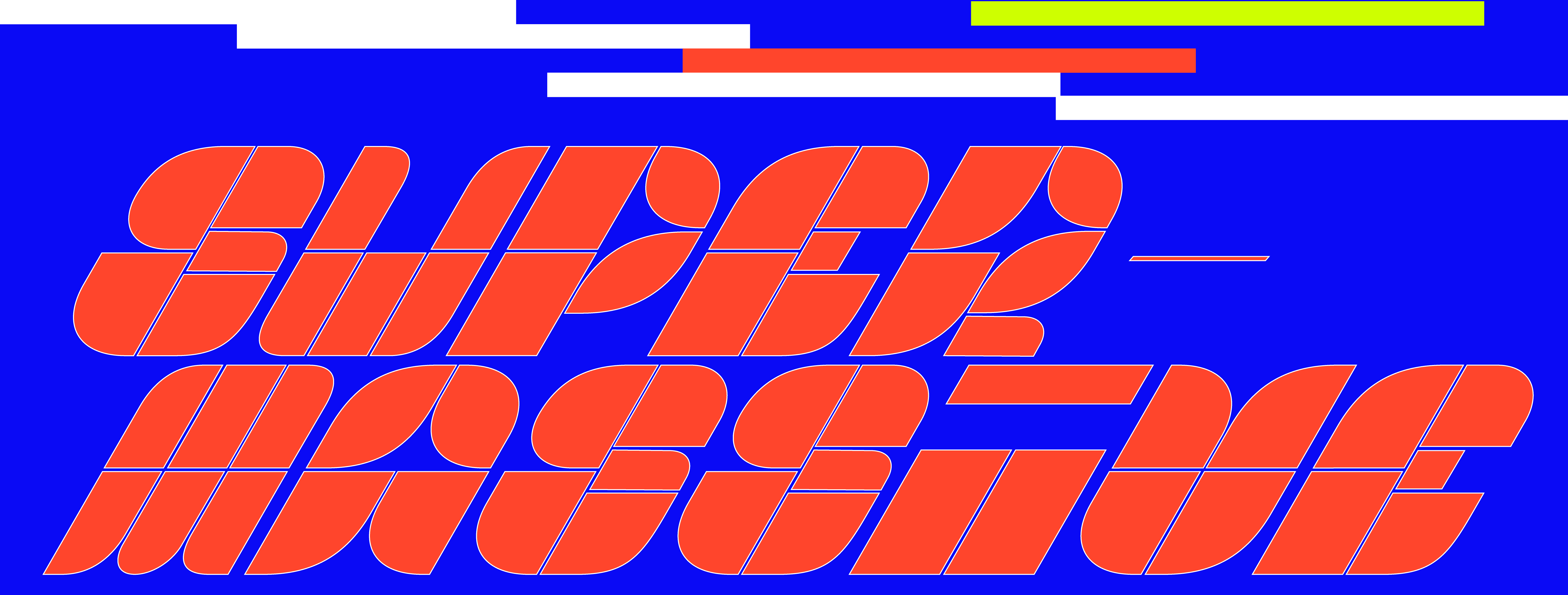
The Scuola Superiore di Arte Applicata del Castello Sforzesco is the most ancient school in town dedicated to the education in the applied arts field. Working with an internal team of professors, illustrators and comic artists we developed a new identity to shift the institution in the contemporary times, renaming the iconic Scuola del Castello in “Super”, a new platform for creative professionals.
for: Scuola Superiore d’Arte Applicata del Castello Sforzesco
team: Alessandro C. Busseni, Beatrice Mucci
team: Alessandro C. Busseni, Beatrice Mucci


and RitaRita travels the world
Shooting for the SS and FW 2018 catalogues by RitaRita.


makes it rain for Cleaf
Two video installations for Cleaf. A big animated forest and four views from a distopic far eastern megalopolis.
CLEAF AT MILANODESIGN WEEK
for: Cleaf
with: Studio Pepe, Francesco Gini, Painè Cuadrelli
team: Pierluigi Anselmi, Alessandro C. Busseni, Giovanni Cola, Letizia Tempesta Filisetti, Bianca Mancuso


lives in 64 small rooms
64 small views is an epic tale about 64 in media res actions in th form of 64 short movies showing the harshness in between reality, fiction and dream in our daily domestic routine.
64 SMALL VIEWS
for: Edison
with: Francesco Gini, Painè Cuadrelli, dotdotdot, ID-lab and Stefano Mirti
team: Pierluigi Anselmi, Alessandro C. Busseni, Giovanni Cola, Bianco Millan, Margherita Mazza, Duccio Zanone


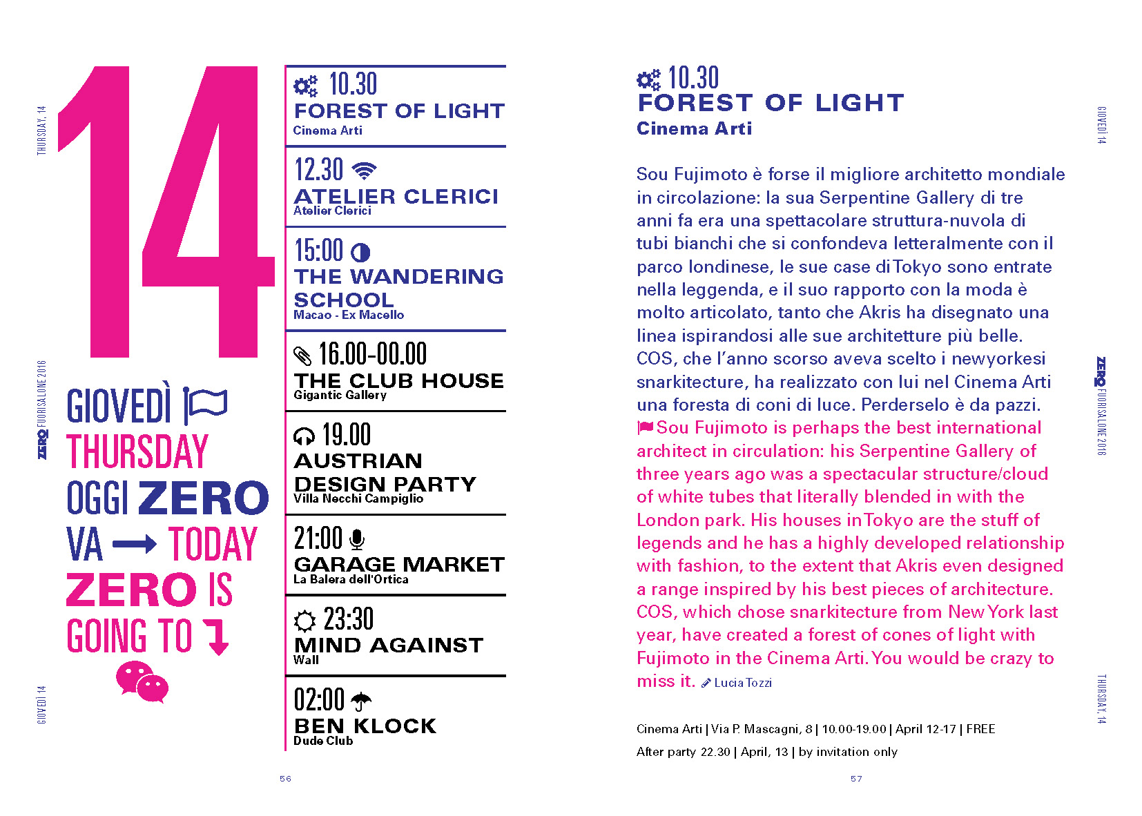
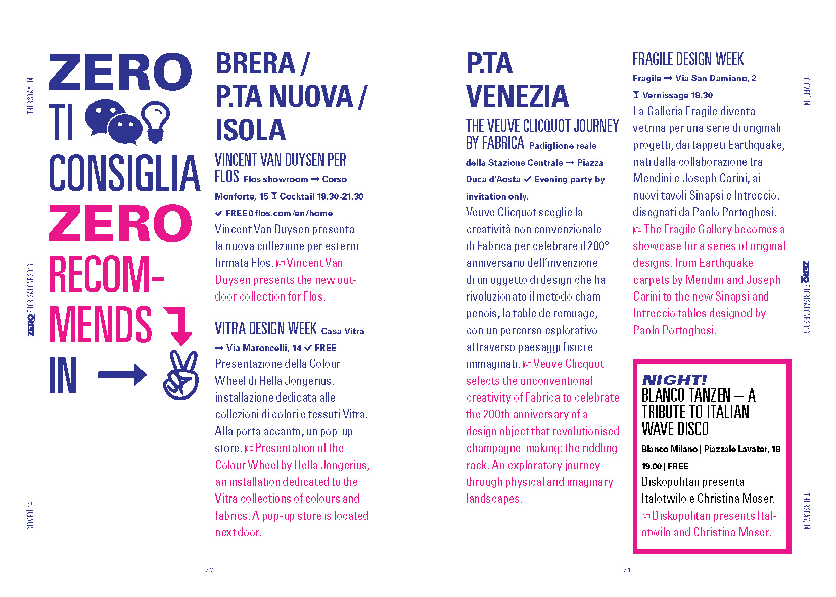
goes to Fuorisalone with Zero
The alternative guide to Fuorisalone Design Week and its parties, special issue for Samsung and San Carlo.
ZERO FUORISALONE
for: Samsung, San Carlo
with: ZERO's editorial team


celebrates the 20th ZERO's Birthday with a dance and drink marathon
ZERO’s 20 years birthday Party: a 4 volumes’ selection of the most irreverent articles published since 1996 + the corporate image of a 20hours party featuring the best djs and bartenders who has shaped the nightlife of Milan in the latest 20 years.


explains some basic body functions for Corporea
5 illustrated videos to show how 5 different hormones works within our body.
CORPOREA AT CITTÀ DELLA SCIENZA DI NAPOLI
for: Città della Scienza di Napoli
with: Joyce Bonafini, Anna Ciammitti, Benedetta Notarandrea
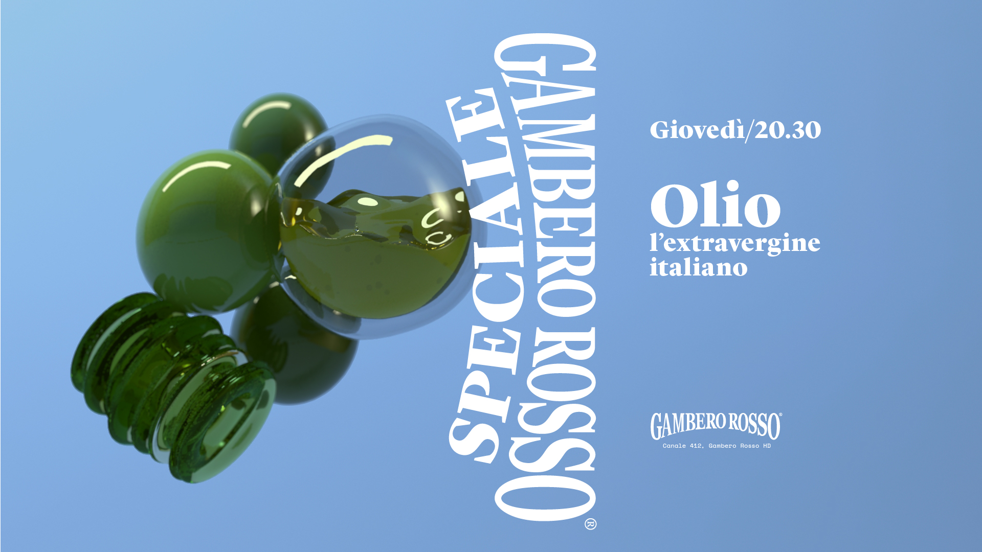
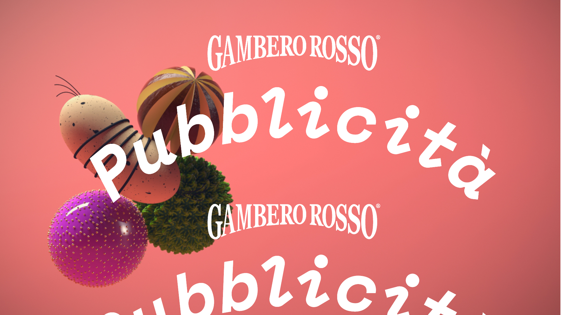
goes gourmet on air
Proposal for the Gambero Rosso channel new identity.
GAMBERO ROSSO IDENTITY
for: Gambero Rosso
with: Francesco Gini
Team: Pierluigi Anselmi, Alessandro Busseni, Giovanni Cola, Letizia Filisetti


and RitaRita goes outside
Shooting for the SS and FW 2017 catalogues by RitaRita.


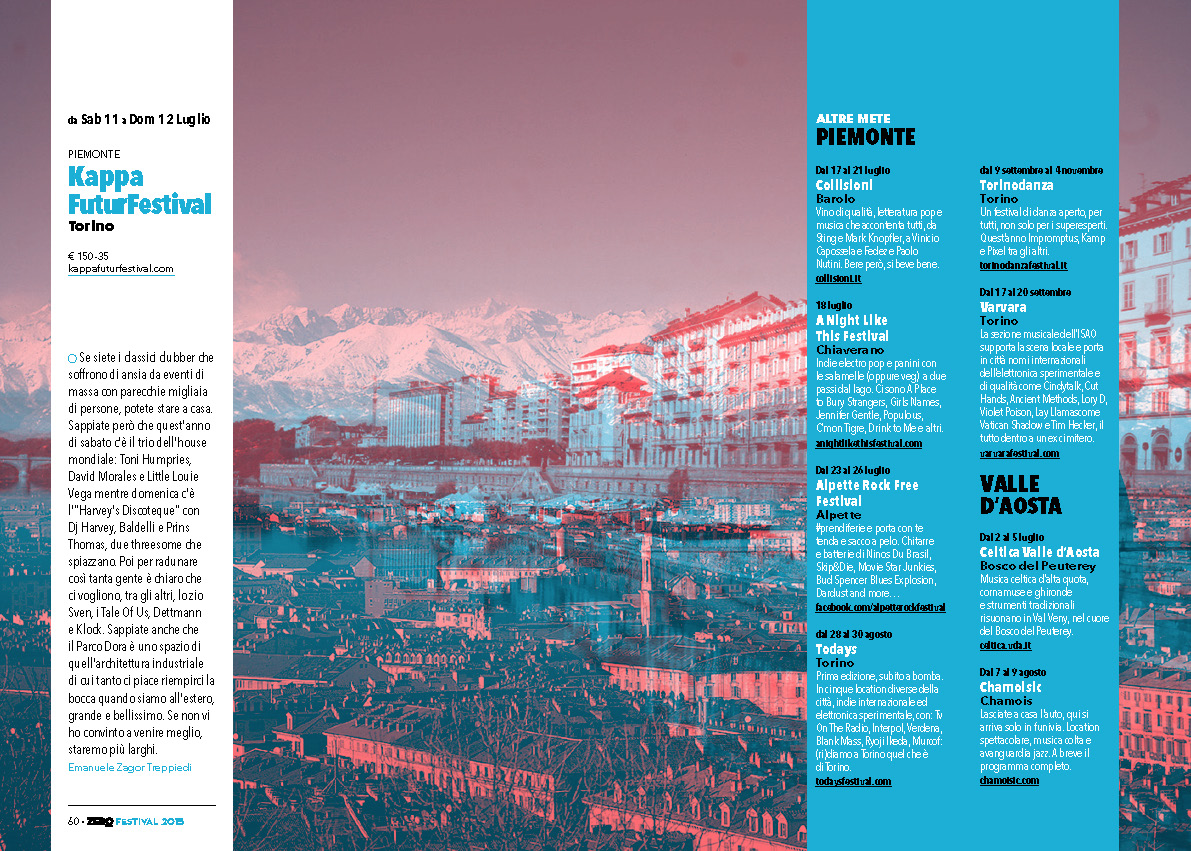
dances the whole Summer
ZERO Festival is guide to the best Summer Festivals in Europe and Italy, designed and printed with special ink, since 2014, inc collaboration with Corona.
ZERO SUMMER FESTIVAL
for: Edizioni ZERO, various clients
team: Alessandro C. Busseni


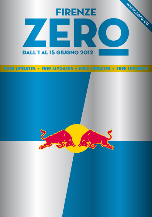
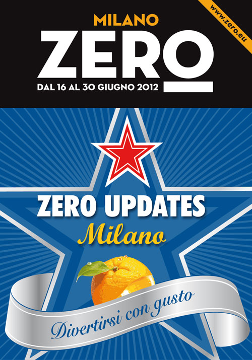
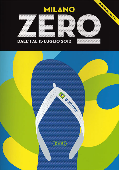
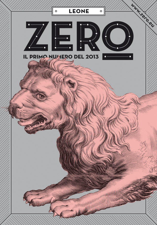
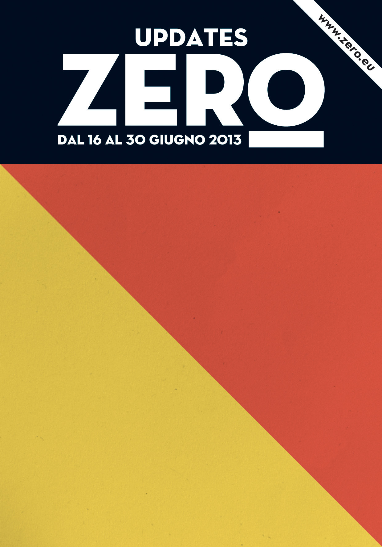
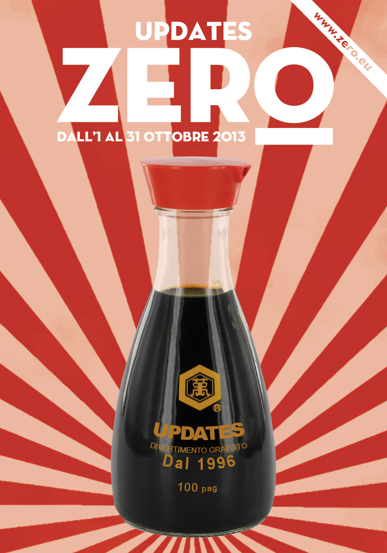
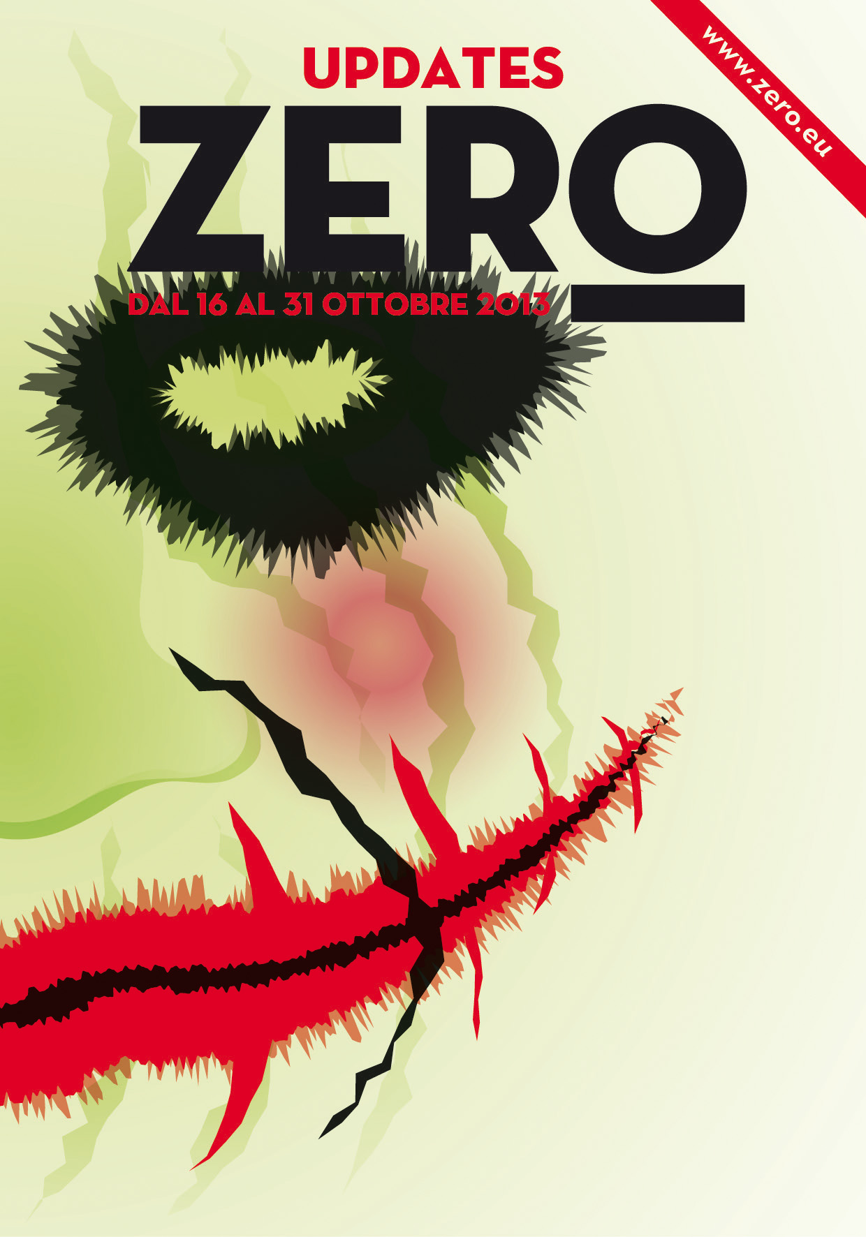
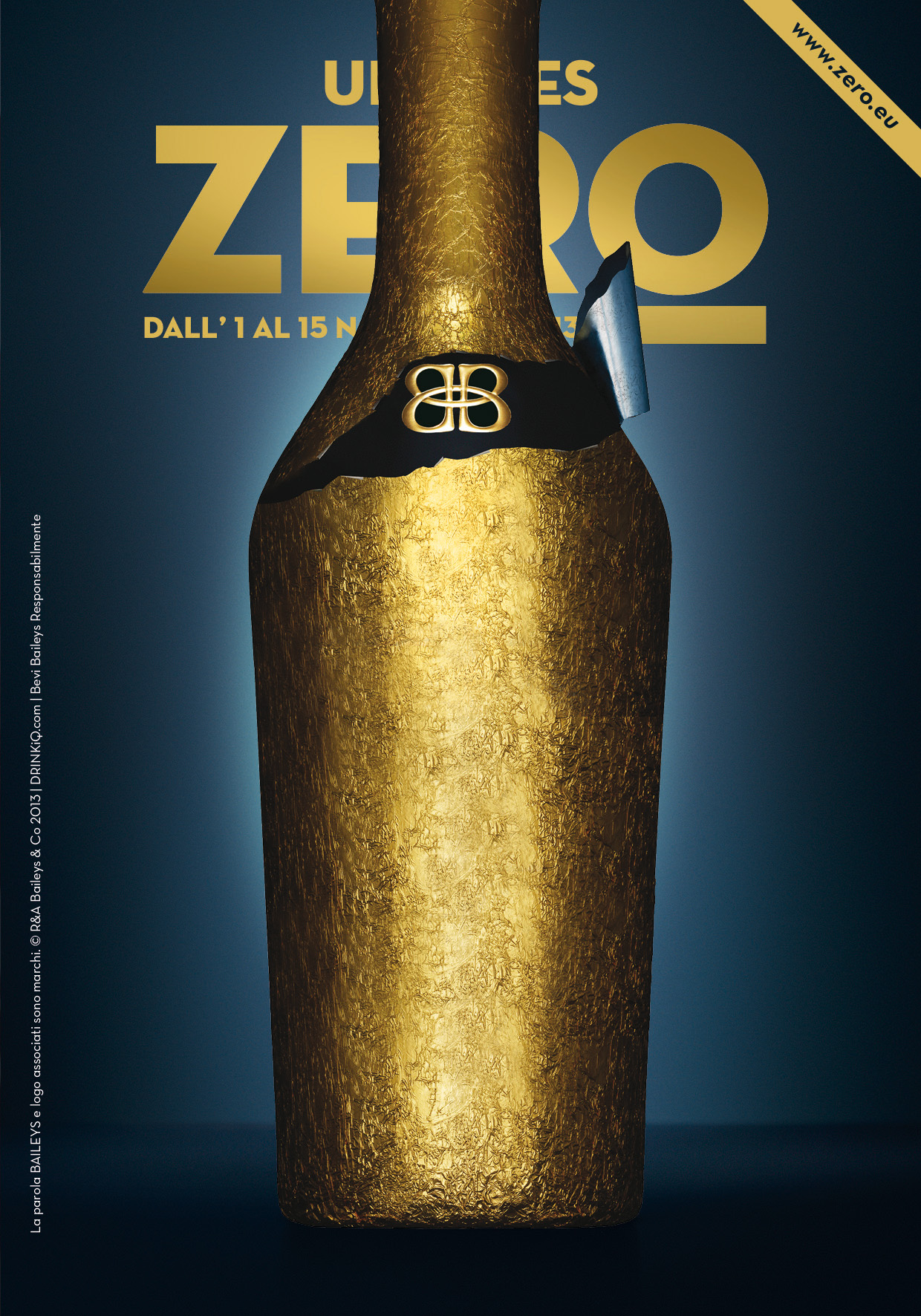
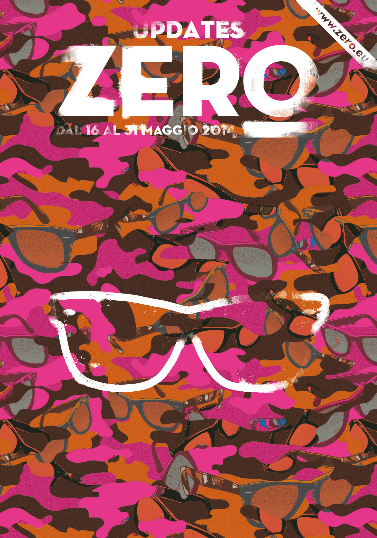
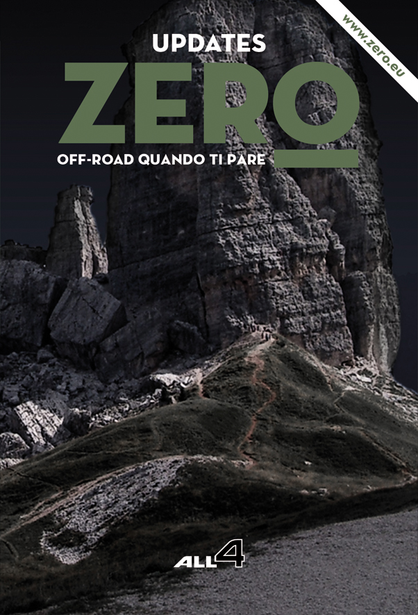
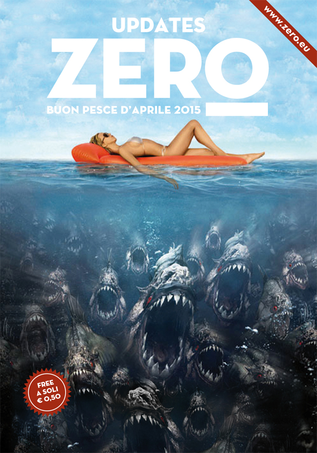
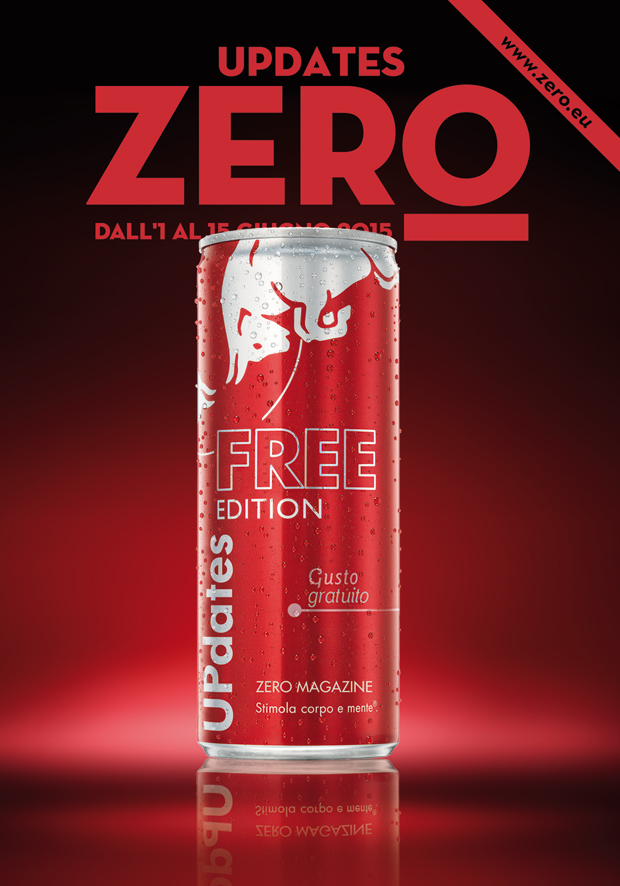
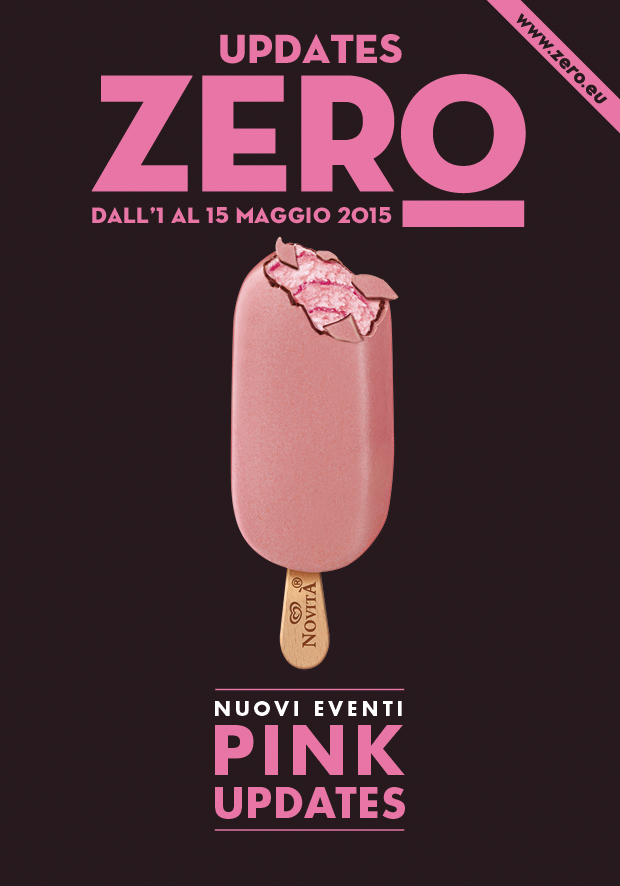
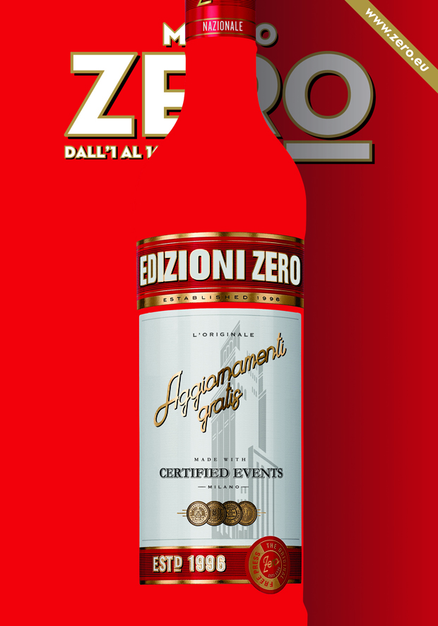
made some cover for Zero
Art direction for ZERO magazine and all Edizioni ZERO actvities, designing hundreds of issue for the city of Milan, Rome, Florence, Naples, Bologne, Turin and Istanbul plus special editorial projects tailor made for clients.
ZERO MAGAZINE’S COVER
for: Edizioni ZERO, various clients
team: Alessandro C. Busseni


deals with environmental graphics for city after city
Video, animation and technical’s development of a curved 30 meters long videowall showed at XXI Triennale in Expo Area (Milan 2016).
XXI TRIENNALE - City after the City - LANDSCAPE URBANISM
for: Editoriale Lotus, Triennale Milano
team: Pierluigi Anselmi, Giovanni Cola


#votagianni
For Gianni Romano’s first jump into politics we produced a series of “video-santini”. The whole campaign was a collective effort based upon a team of amazing professionals and dear friends.

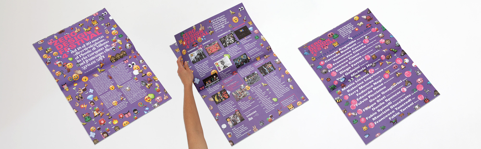
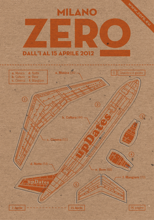
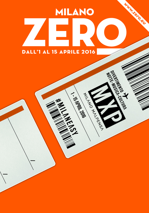
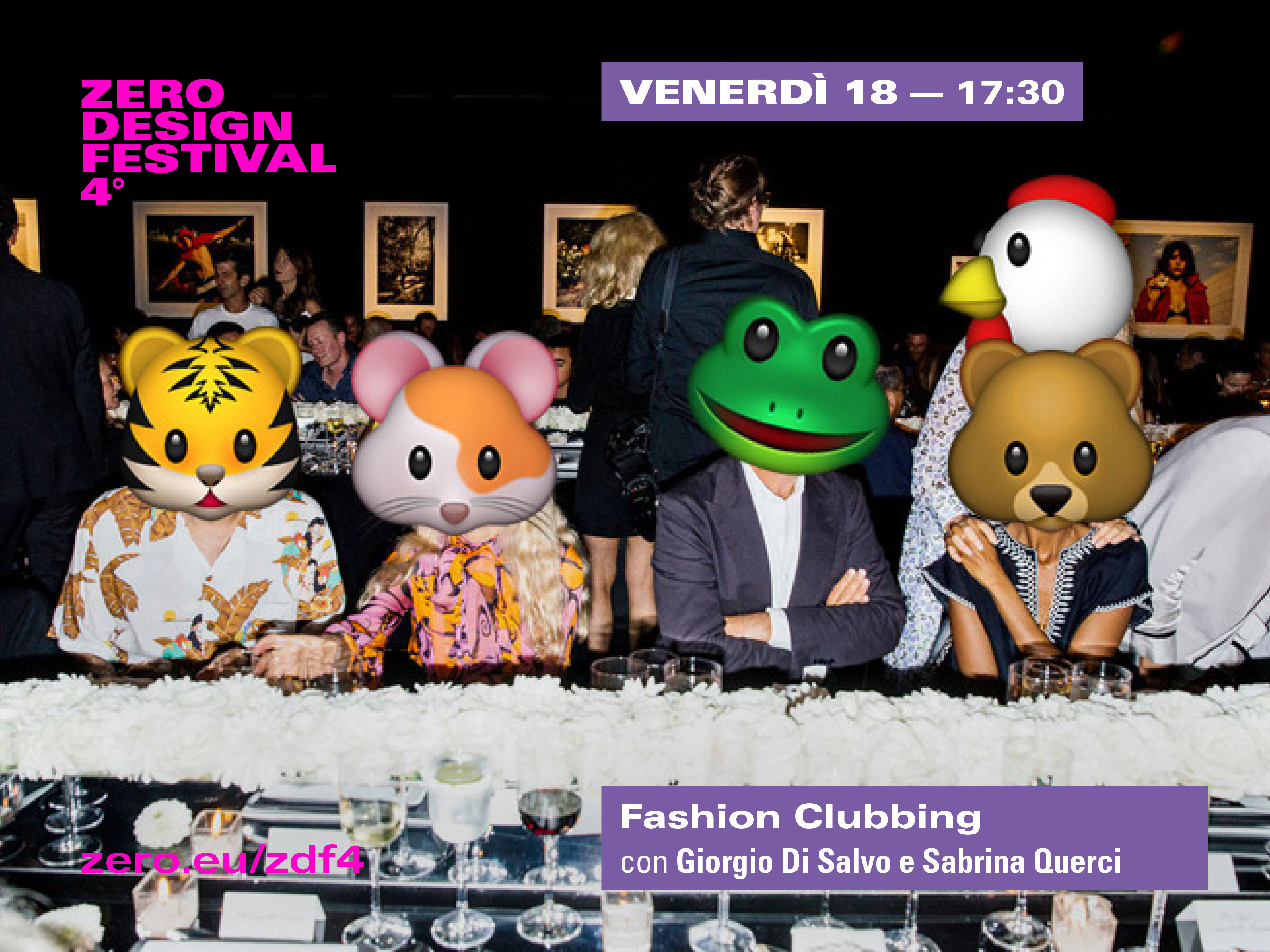
goes dancing for the 4th edition of ZERO Design Festival
ZERO design Festival anticipates the Design Week, giving preview of the coming brands, designers and projects.
The 4th edition is devoted to the design of the night experience, gathering clubs’ architects, shakers and glasses’ designers, fashion desgners, djs and dancers.
The 4th edition is devoted to the design of the night experience, gathering clubs’ architects, shakers and glasses’ designers, fashion desgners, djs and dancers.
ZERO DESIGN FESTIVAL 4
for: Edizioni ZERO
with: ZERO's editorial team
team: Pierluigi Anselmi, Alessandro Busseni, Giovanni Cola


for ASAP 1knit2wear
An innovative reversible knit by AsapLab, dances to a bass melody.
ASAP 1KNIT2WEAR
for: ASAP Lab
with: Duccio Servi, Marcello Pirovano
team: Pierluigi Anselmi, Giovanni Cola
spreads energy for everyone
An illustrated animation tale about how technical innovations will help to easily spread energy across the whole world.
MUST ENERGIA PER TUTTI
for: Museo Nazionale della Scienza e della Tecnologia Leonardo da Vinci
with: Duccio Servi
for Expo 2015: the community is the message
The social media Expo is played around a table as a big card game in which cards come from all the countries of the world.
EXPO 2015 SOCIAL MEDIA
for: Expo 2015
with: Stefano Mirti, Aurora Rapalino, Anne-Sophie Gauvin, Susanna Legrenzi, Duccio Servi
warms up RitaRita's Tropical Winter collection
During a storm, while being cuddled by his mother, Razoon, the fish-son, tries to realize his destiny and escapes from home: the young woman settle on a journey to rescue her son. Through a colourful jungle, a maze of textures, rivers and cliffs, will she finally be able to find him?


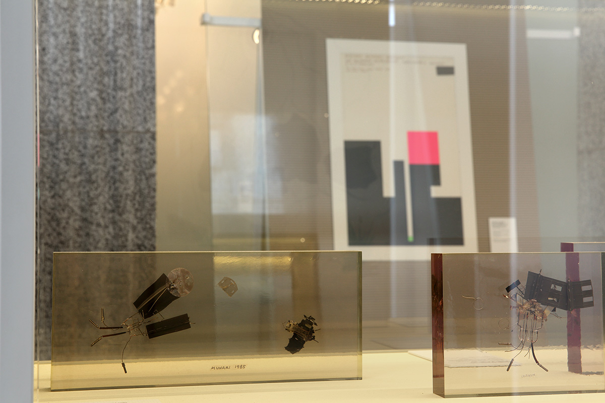
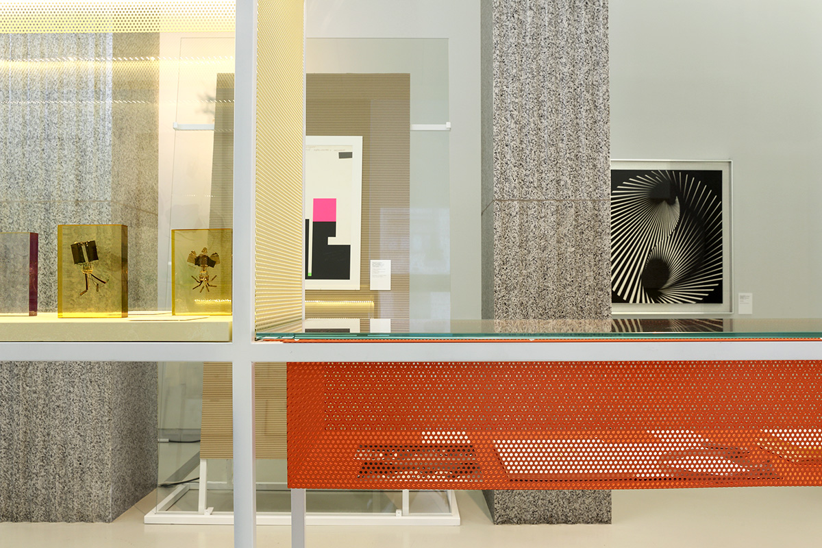
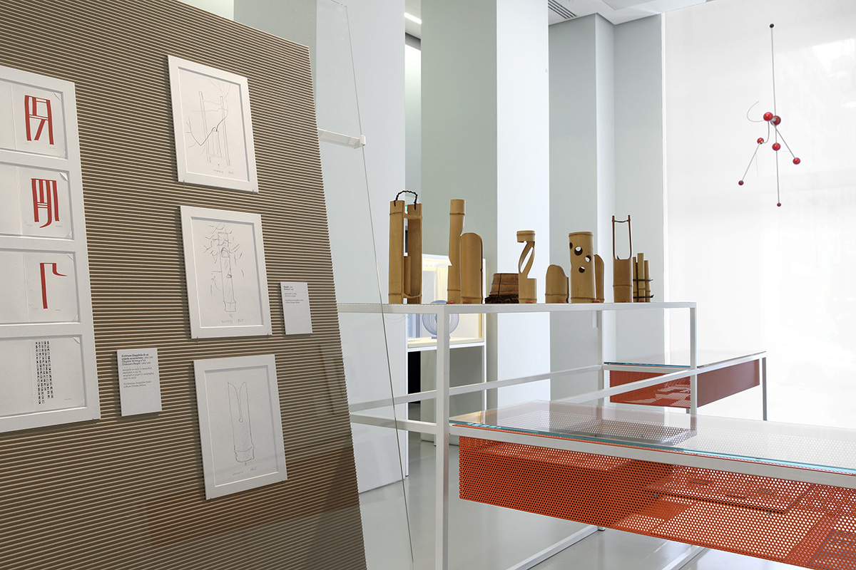
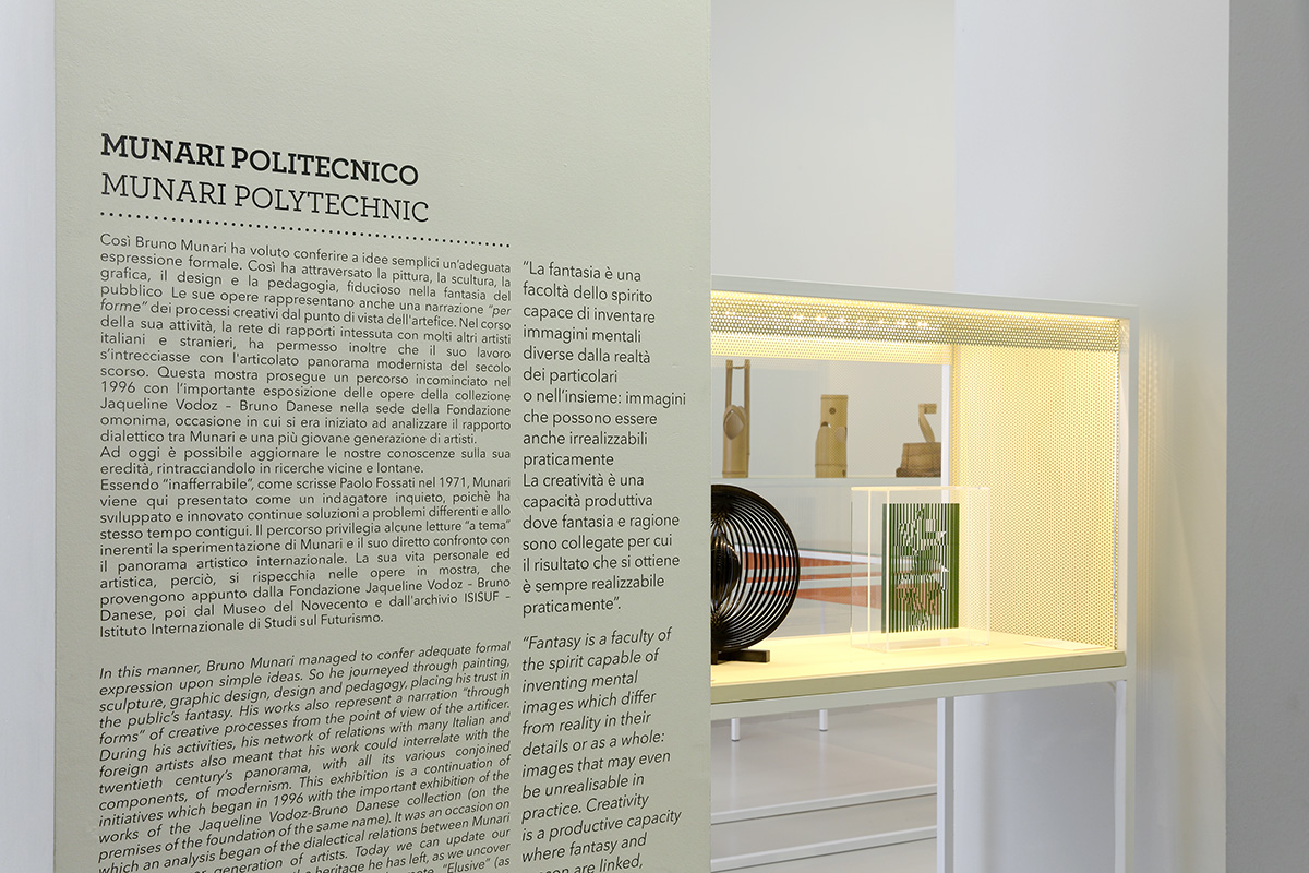
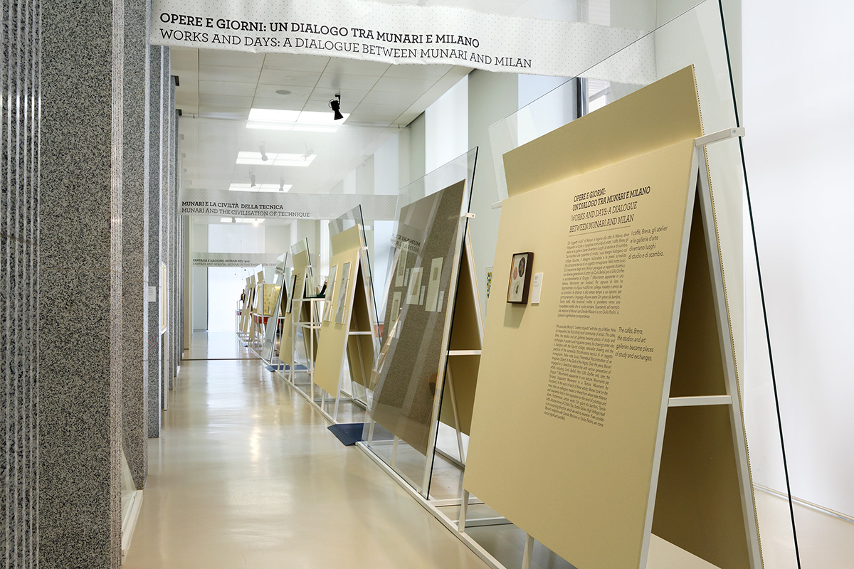
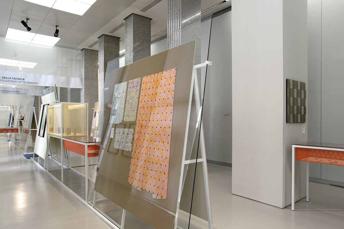
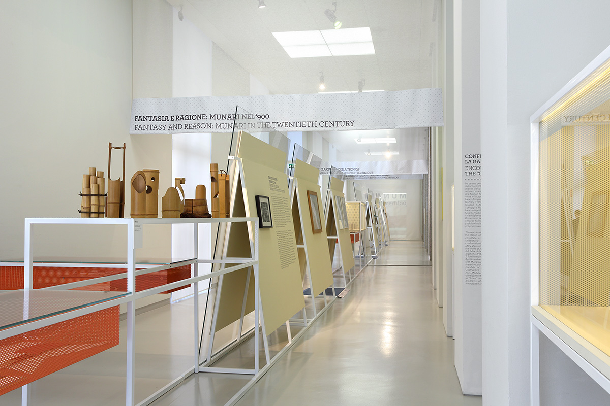
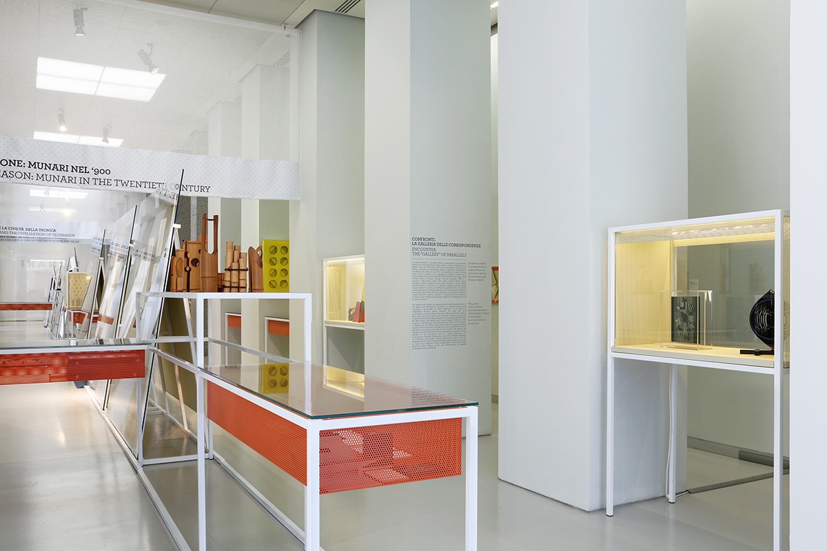
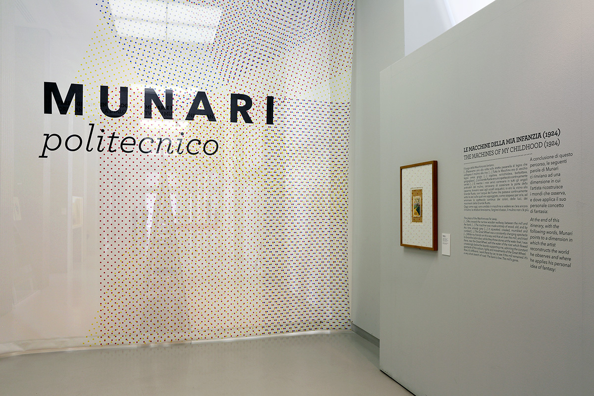
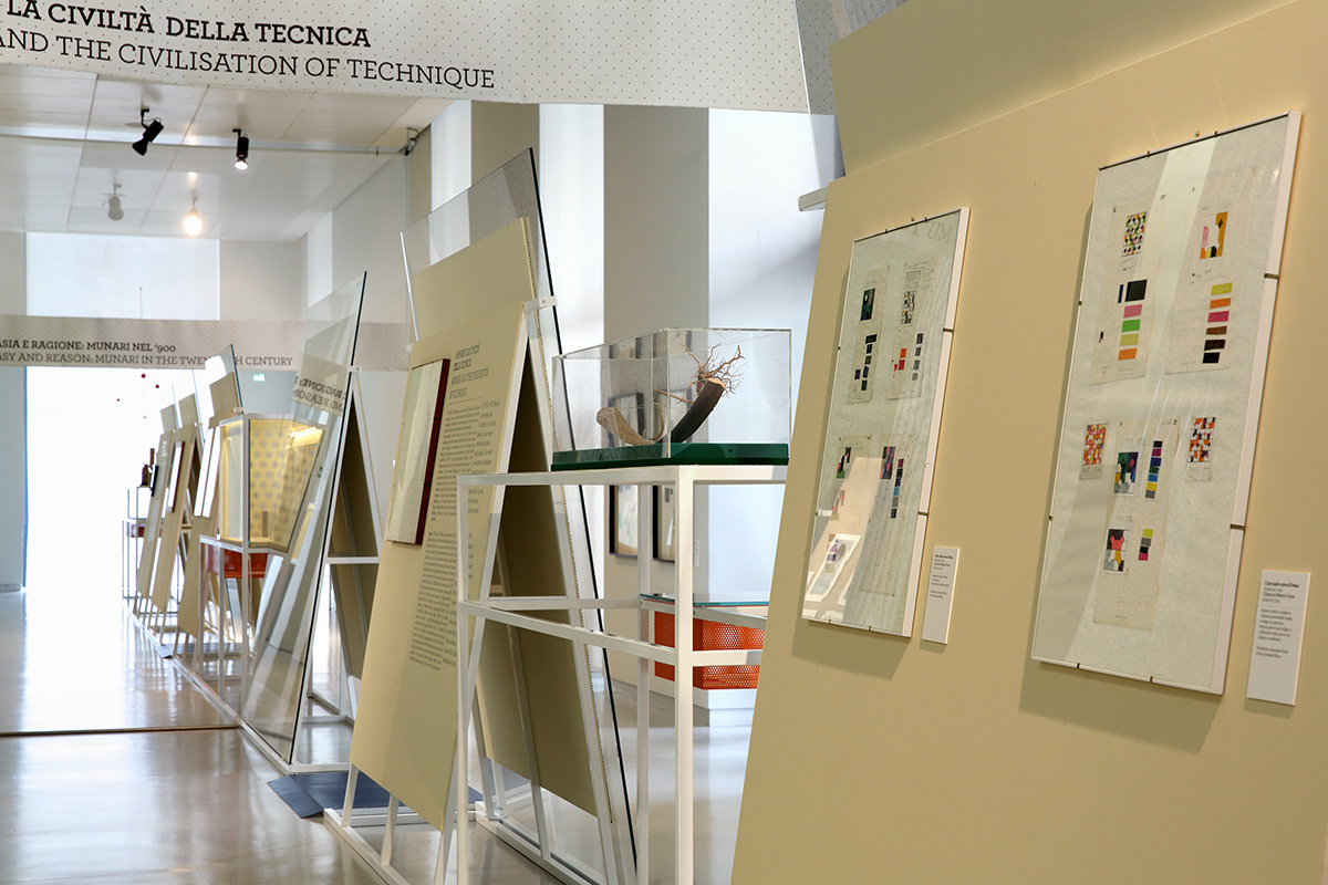
Pictures of the exhibition Munari Politecnico, showcased at the Museo del Novecento in Milan.
MUNARI POLITECNICO DOCUMENTATION
for: Museo del Novecento
team: Pierluigi Anselmi with Lucia Cavalieri


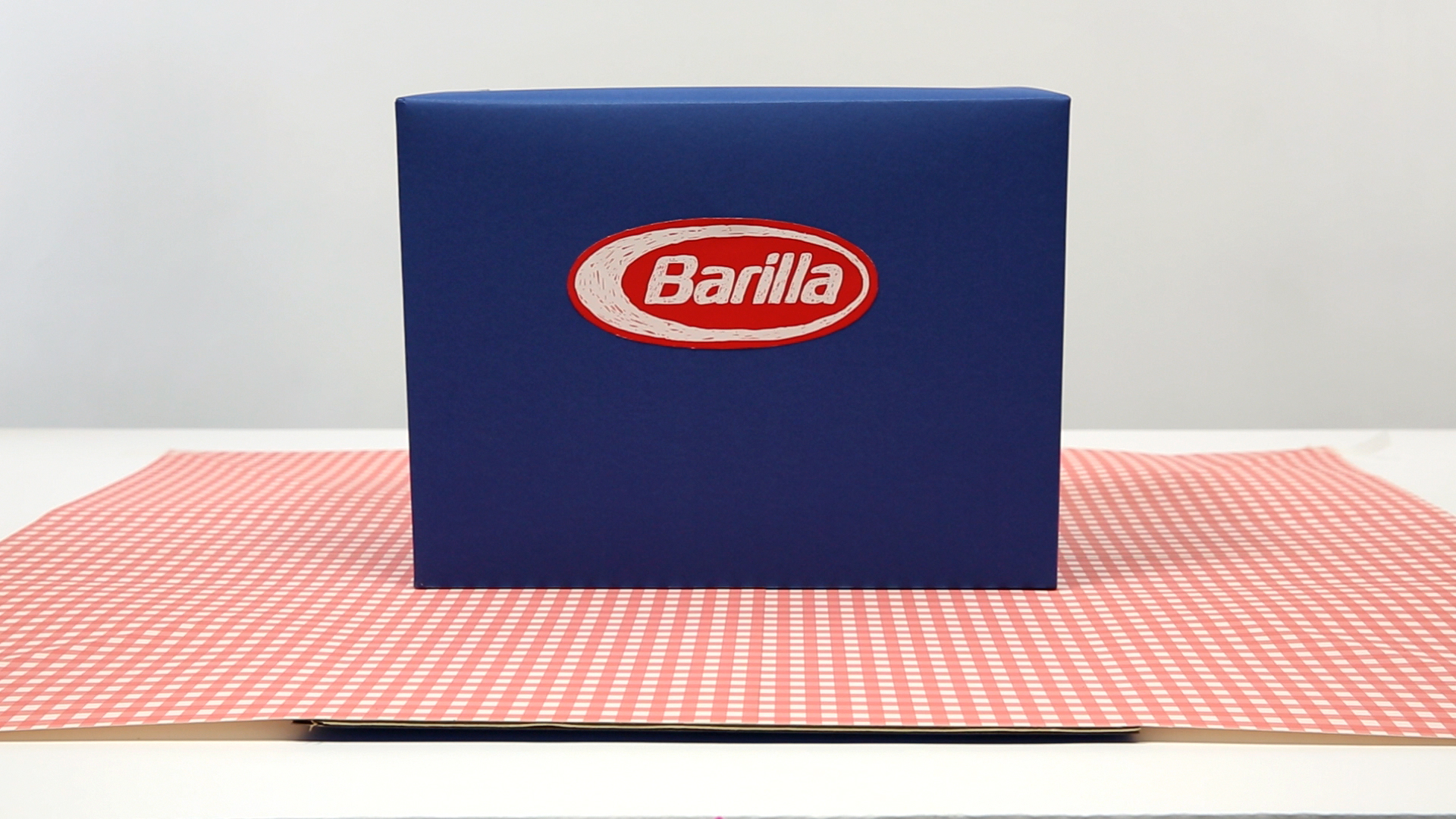
thinks outside of the box for Barilla
Barilla’s brand strategy is stored in a special box.
BARILLA’S BRAND STRATEGY BLUE BOX
for: Barilla, Future Brand
with: Joyce Bonafini, Duccio Servi
team: Pierluigi Anselmi, Lucia Cavalieri, Margherita Mazza


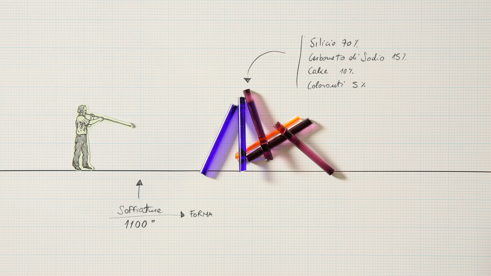
Rise and fall of a glass marble and of its creator, Murano Man.

sits in 100 different ways
Within “Munari, percorsi a mezz’aria” the visitor can experiment the restlessness of seeking a place in space, identifying himself with Bruno Munari, who could sit on an armchair in 100 different ways.
MUNARI, PERCORSI A MEZZ’ARIA
for: Francesco Librizzi, Matilde Cassani
with: Filippo Malerba
team: Pierluigi Anselmi, Giovanni Cola

witness an eternal struggle
The “Dialogues book” of Postmedia Books is a continuous struggle between Stategist and Creative.
POSTMEDIA BOOKS’ DIALOGUES BOOK
for: PostmediaBooks
with: Silvia Barbieri, Chiara Pomati
team: Pierluigi Anselmi, Carlo Altera
sends postcards
A video Portrait and Manifesto of Stefano Mirti, for the trailer of MOOC Design 101, and a selection of some of the video postcards from the course.
DESIGN 1o1 VIDEO MANIFESTO
for: Design 101 and Iversity
with: IDLab
team: Pierluigi Anselmi, Carlo Altera, Duccio Servi
interviews the Italian Design’s Masters
12 interviews recorded for the Triennale Design Museum, that lead us to know the design of the ’70 and its protagonists.
Alessandro Mendini, Enzo Mari, Alberto Alessi, Paolo Deganello, Paolo Rizzatto, Franco Raggi, Giulio Iacchetti, Vanni Pasca, Mario Bellini.
Alessandro Mendini, Enzo Mari, Alberto Alessi, Paolo Deganello, Paolo Rizzatto, Franco Raggi, Giulio Iacchetti, Vanni Pasca, Mario Bellini.
TRIENNALE DESIGN MUSEUM 6 INTERVIEWS
for: Triennale Milano
with: Editoriale Lotus
team: Pierluigi Anselmi
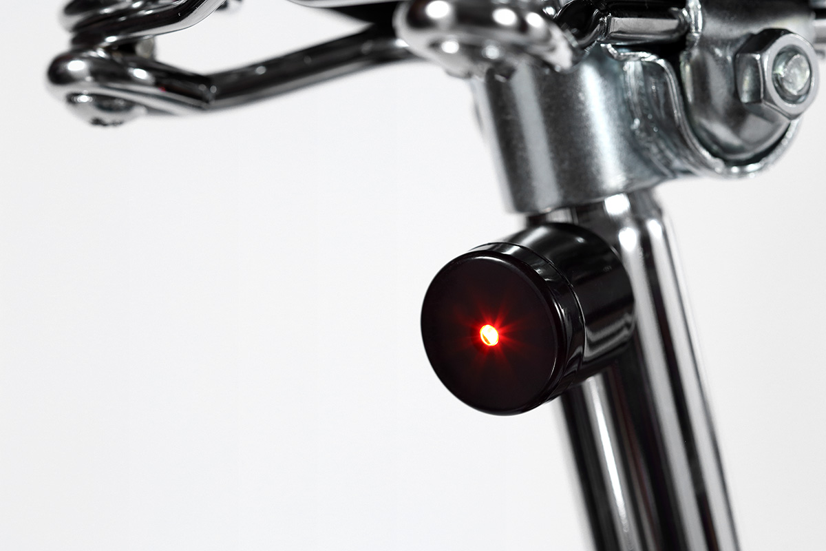
blinks
A smart video presentation for a smart system of bike lighting.
PALOMAR LUCETTA
for: Palomar
with: Emanuele Pizzolorusso, Fabio Rodaro
team: Pierluigi Anselmi, Gaetano Corica, Carlo Altera


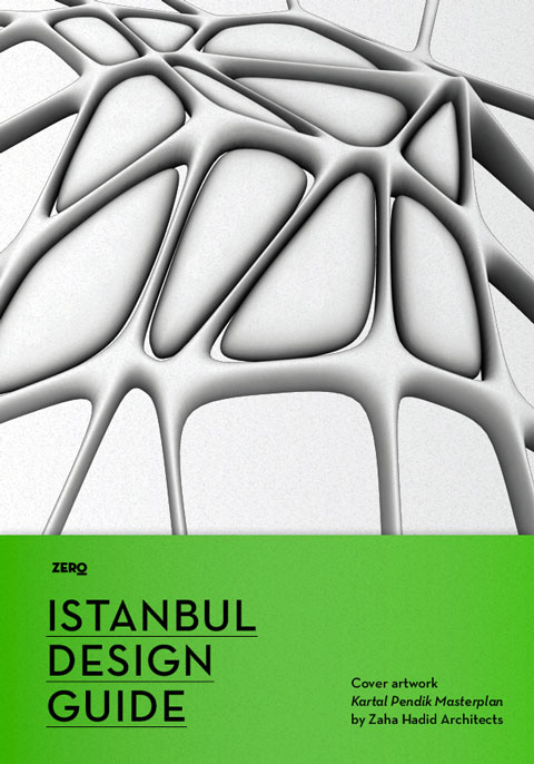
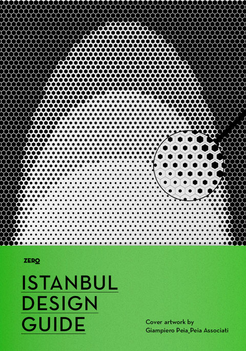
analyses Istanbul’s architectural history
A critic review on Instabul real estates development since the 80s: a book, a website, a workshop, an exhibition + a huge party.
ISTANBUL DESIGN GUIDE
for: Becks, MINI, Istanbul Design Biennial
with: Edizioni ZERO
team: Alessandro C. Busseni
for: Becks, MINI, Istanbul Design Biennial
with: Edizioni ZERO
team: Alessandro C. Busseni


dances at the Balera
Shooting for the Sartoria Vico’s Spring Summer collection.


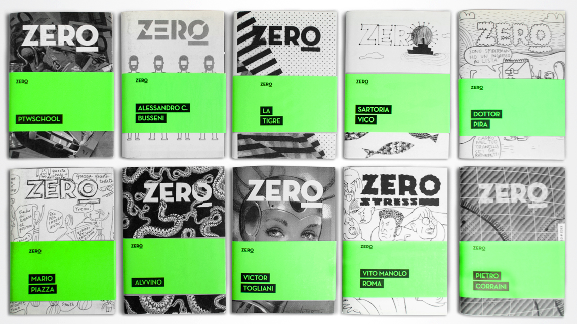
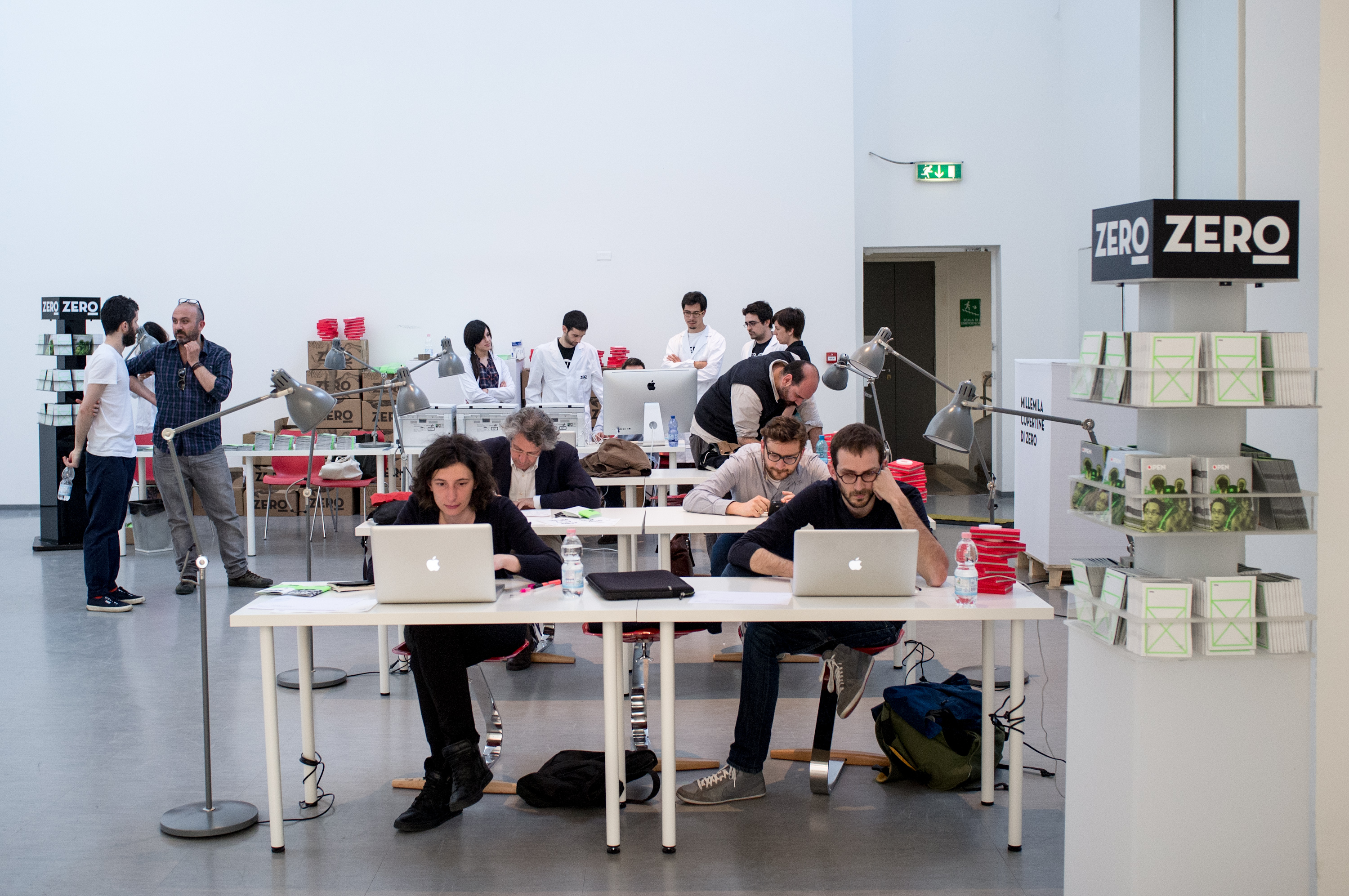
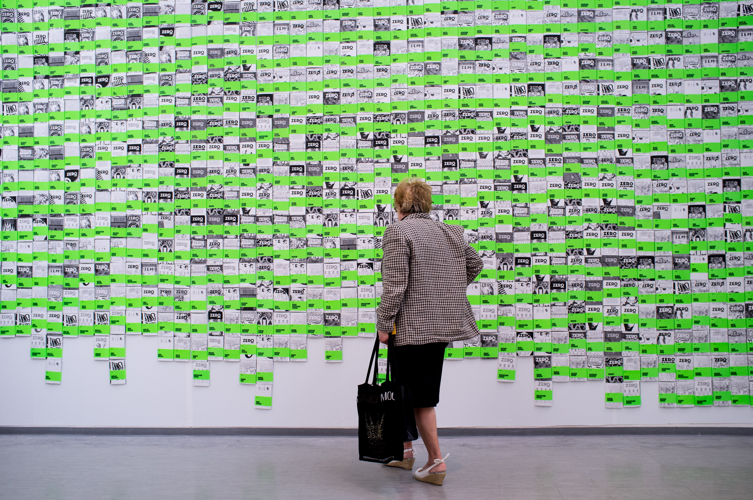
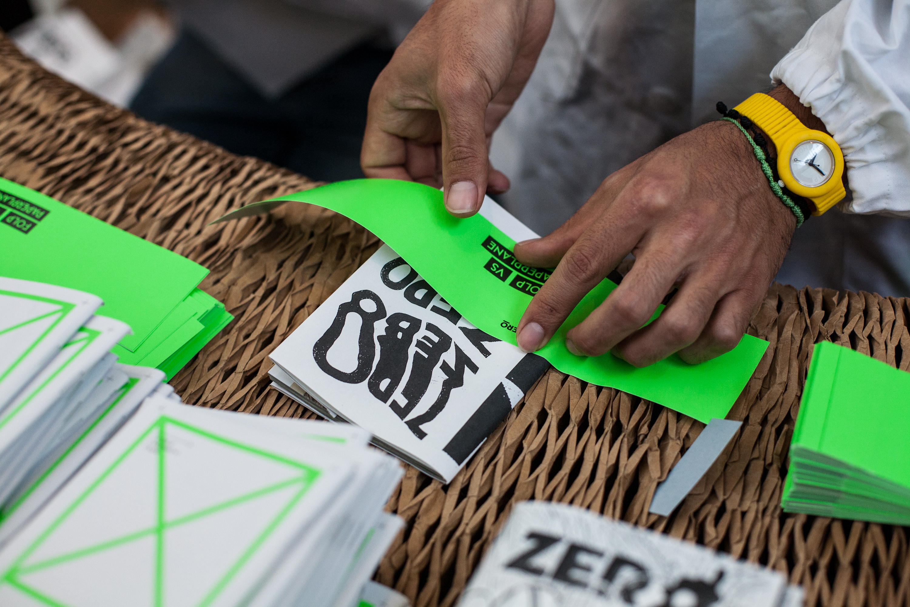
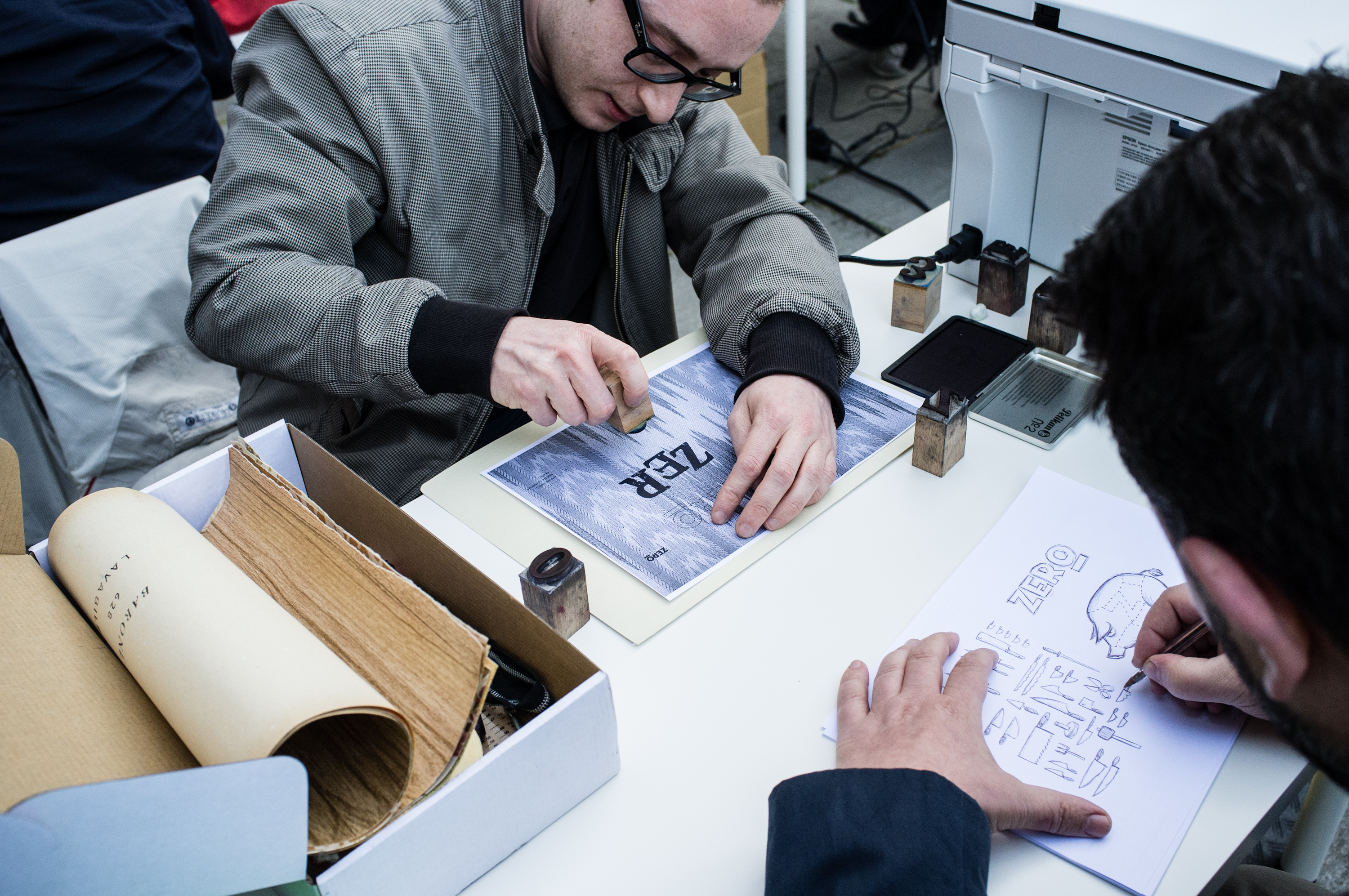
counts Millemila (tons of tons) covers for ZERO magazine
A series of workshop to celebrate the creative community of ZERO Magazine’s with professionals from the design, fashion and art world, readers form all over the city and children visiting the museum. The initiative was coinceived to animate the Triennale Design Museum in its edition devoted to graphic design.
The objective is to design, print and deliver thousands of unique and original cover for the magazine.
The objective is to design, print and deliver thousands of unique and original cover for the magazine.


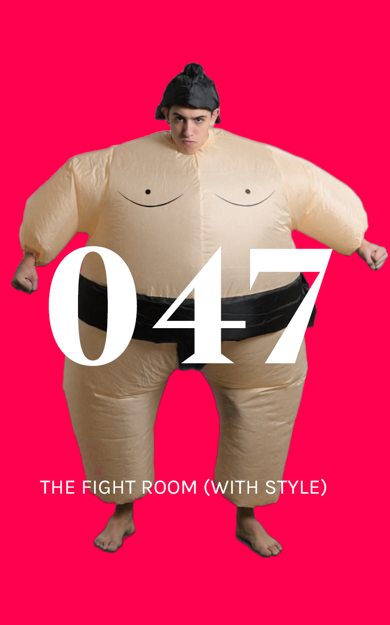
battles royale
12 trailers portray the installations and the spirit of the Design Royale event.
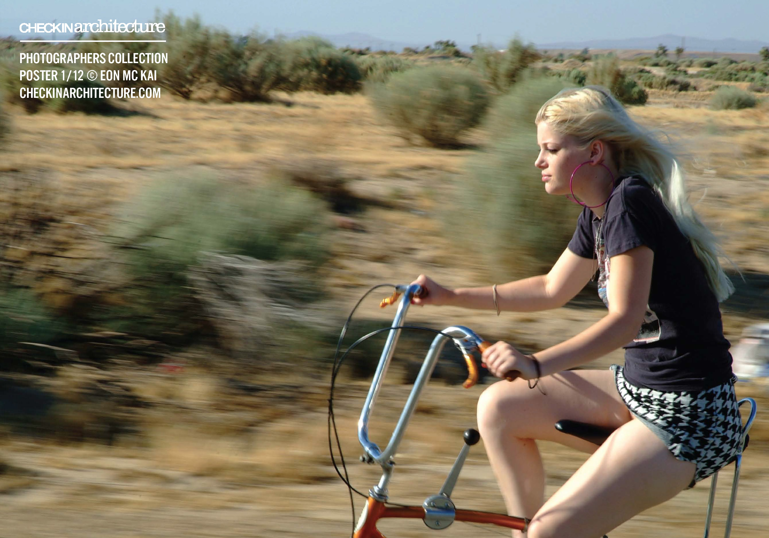
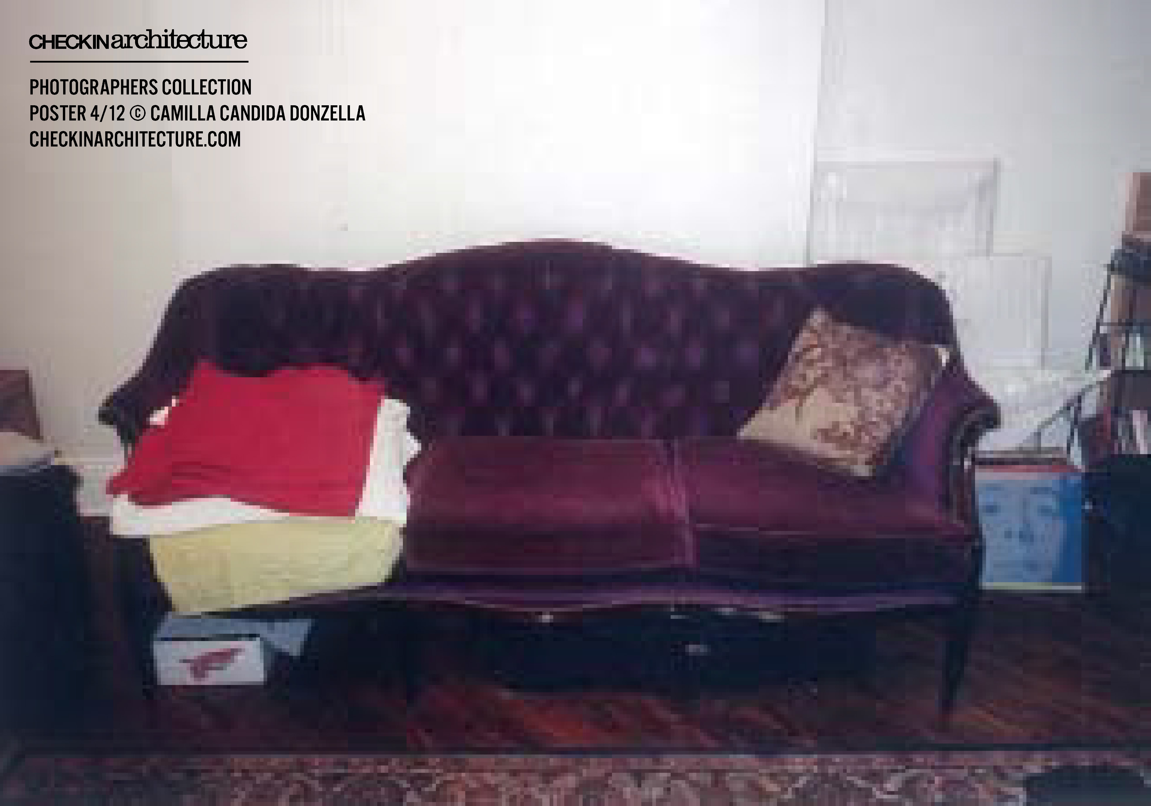
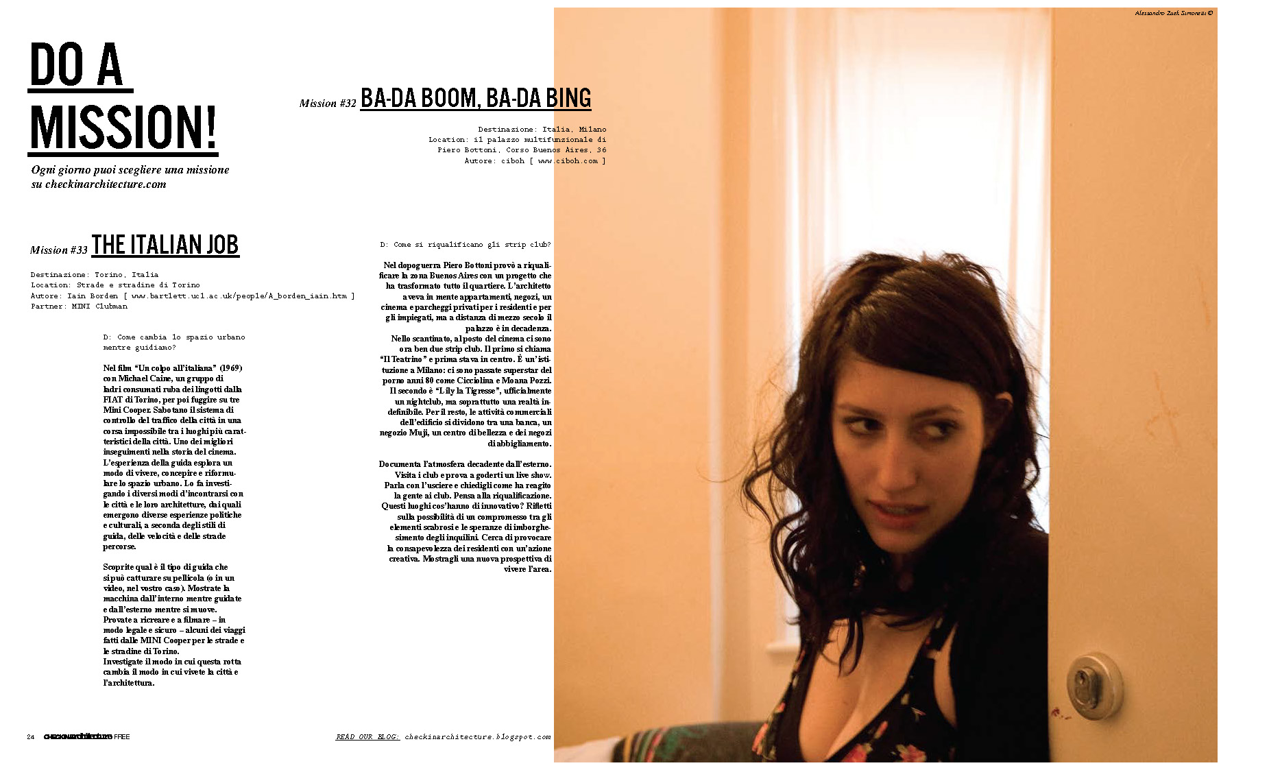
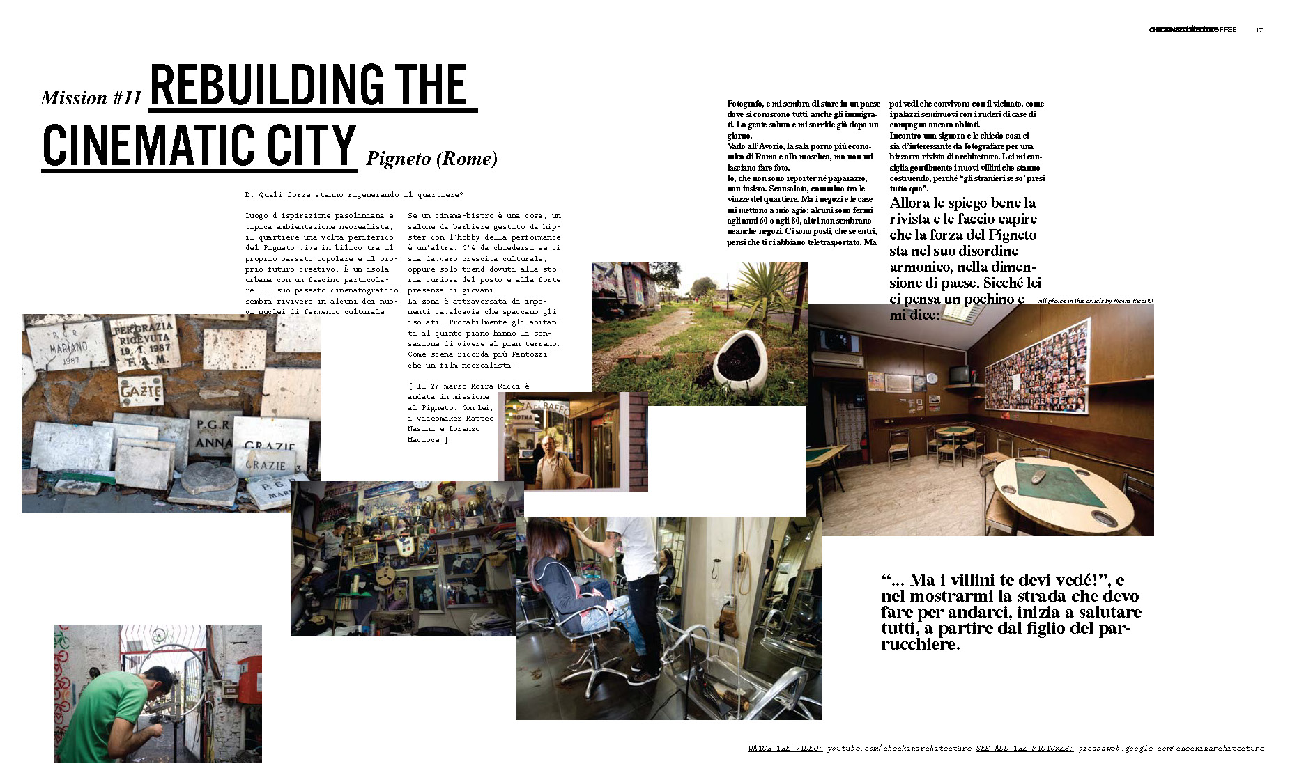
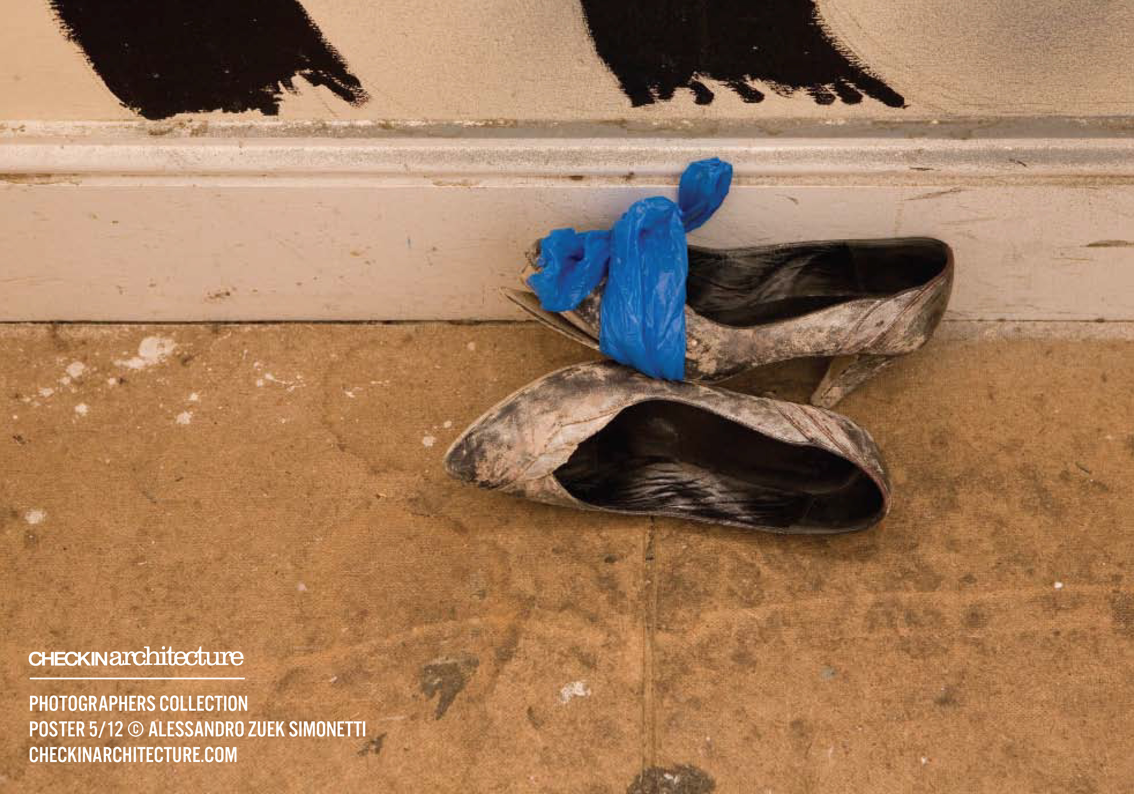
travels across Europe to document social changes with Checkin Architecture
A partecipative research project for creative students sent all over Europe to document urban and social changes all over the contintent: hundreds of hours of reportages, a magazine, two boooks and a series exhibitions for Milano Design Week, Torino Design World Capital, Festarch and Venice Biennal of Architecture.
CHECKIN ARCHITECTURE
for: Mini, Google
team: Alessandro C. Busseni


...
...


︎
...

︎
...