spells A B C with an original custom typeface
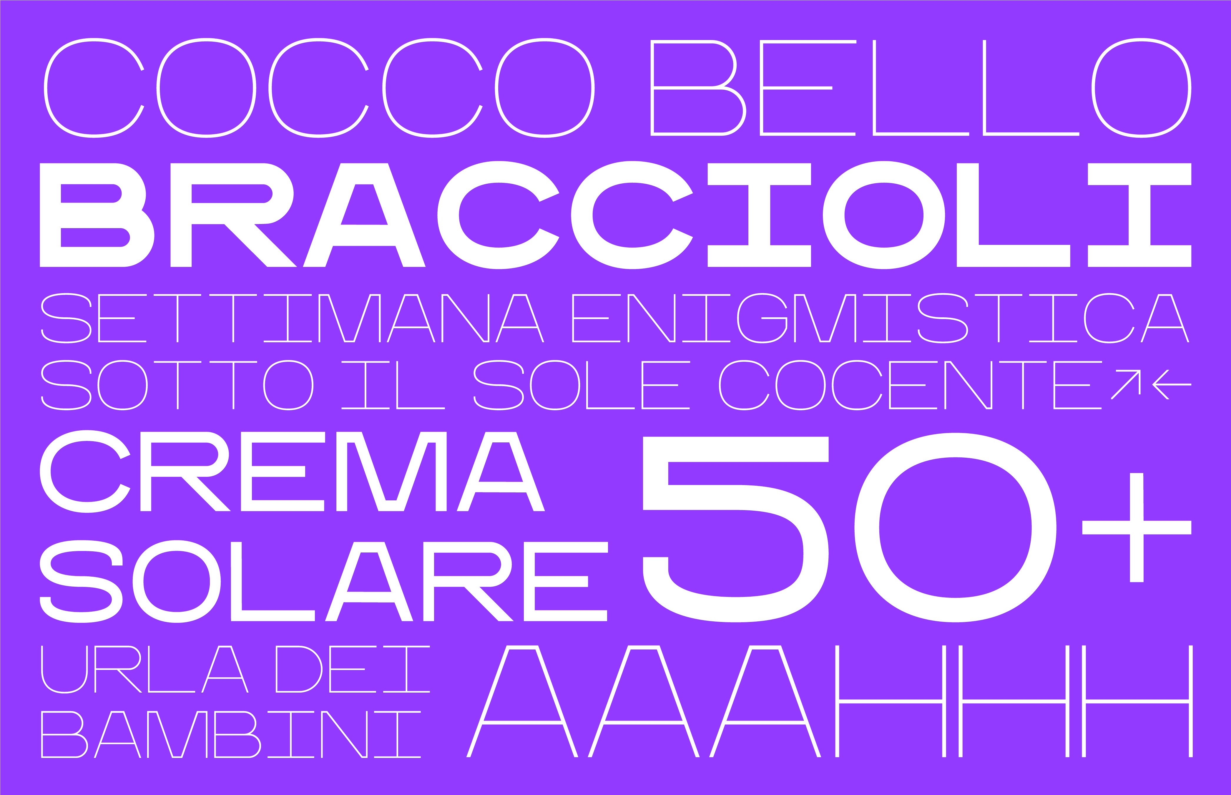
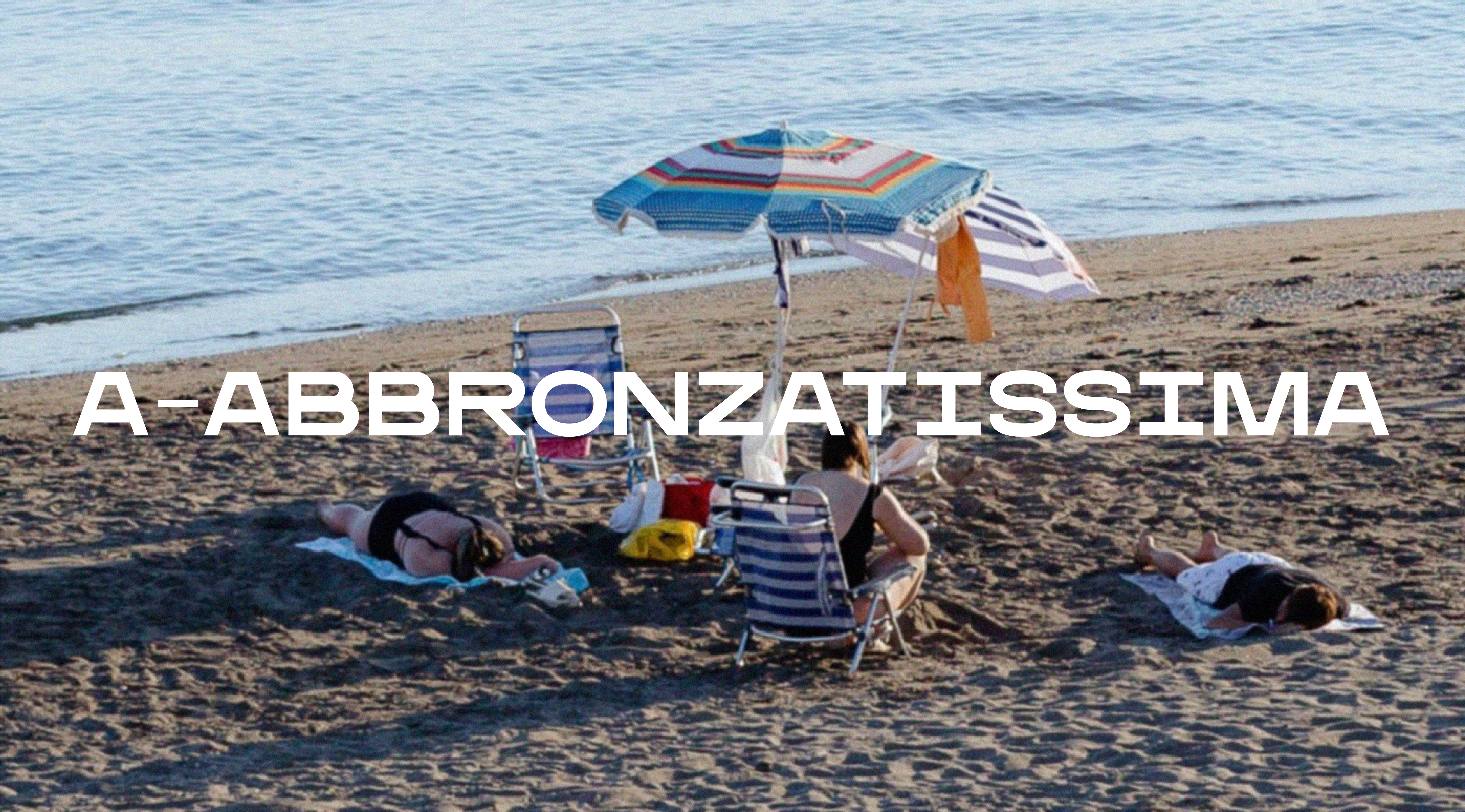
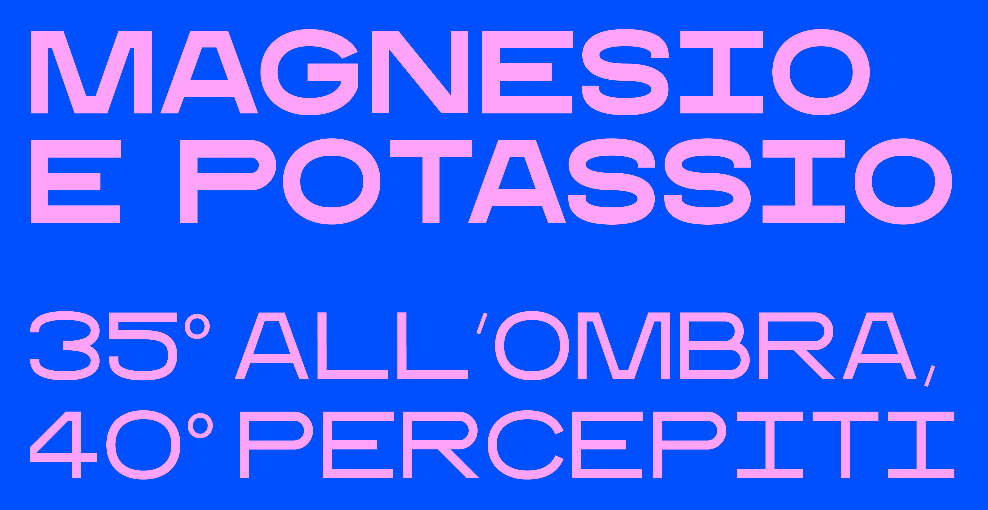
Ankòn Sans is a custom-designed geometric display typeface created exclusively for the ANCONA AUTENTICA, our Ancona City Branding International Competition’s project.
The typeface visually expresses the city’s identity through a clean and contemporary sans-serif system. International in scope, it supports multiple languages and alphabets, reflecting the brand’s clear and direct voice while translating Ancona’s cultural character into a versatile typographic language.
Developed in the Thin, Medium and Black weight is a perfect match for entitling messages throughout different media, devices and sizes.
The typeface visually expresses the city’s identity through a clean and contemporary sans-serif system. International in scope, it supports multiple languages and alphabets, reflecting the brand’s clear and direct voice while translating Ancona’s cultural character into a versatile typographic language.
Developed in the Thin, Medium and Black weight is a perfect match for entitling messages throughout different media, devices and sizes.
ANKÓN SANS
Ancona City Branding International Competition: 2nd place
for: Comune di Ancona
team: Pierluigi Anselmi, Pietro Buffa, Alessandro C. Busseni, Laura Bortolotti, Giada Fiorenza, Marco Gabriele